Accordion Item
Overview
The Dynamic Accordion Item is a collapsible section inside a Dynamic Accordion container.
Each item represents one expandable or collapsible segment with its own title, content, and layout.
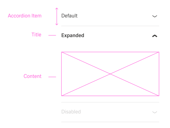
When expanded, the item displays its content, and when collapsed, only the header remains visible.
Specs
Structure
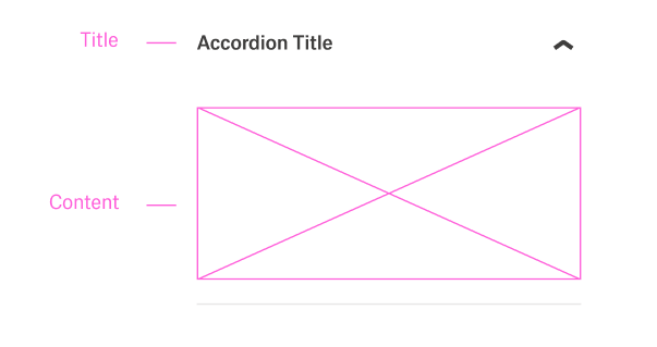
- Each item contains a title that is always visible.
- Each item also contains content that can be expanded or collapsed.
General Properties
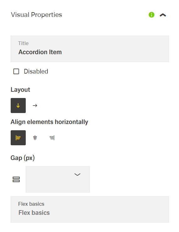
- displayName – Sets the display name of the component shown in the structure panel. For example,
"Product Details"allows for easy identification of this accordion item in the component structure.
Visual Properties
- title – Defines the header text displayed for the accordion item. It represents the visible label that users click to expand or collapse the item.
- titleTranslations – Sets the title text displayed in the accordion item header with support for multiple languages. For example,
{"en-US": "Product Specifications", "de-DE": "Produktspezifikationen"}ensures proper localization of the header text.
- titleTranslations – Sets the title text displayed in the accordion item header with support for multiple languages. For example,
- disabled – Controls whether the accordion item can be expanded or collapsed. When set to true, the item appears grayed out and cannot be clicked.
- layout – Defines the layout arrangement of elements within the accordion item. Options include "horizontal" (elements arranged side by side) or "vertical" (elements stacked on top of each other). For example, using "vertical" layout provides a clean presentation for form fields in an accordion item.
- alignItemsClass - Controls the vertical alignment inside the accordion item. For example, "align-items-center" centers all child elements vertically within the section.
- gapClass - Configures the spacing inside the accordion item. For example, {"row": "row-gap-4", "column": "column-gap-2"} creates consistent spacing between elements with more vertical than horizontal spacing.
Events
Configures the events that the component can trigger and respond to:
- ON_INIT – Triggered when the accordion item component is initialized. Can be used to perform setup operations like loading default data or setting initial states.
- ON_DESTROY – Triggered when the accordion item component is removed from the DOM. Useful for cleanup operations and releasing resources.
Testing Hooks
- dataTestId – Sets the testing hook ID for automated testing. For example, setting it to
"product-details-accordion-item"allows test scripts to reliably locate this component. - enableAsHotspot – Enables the component as a guided tour hotspot. When enabled, the accordion can be highlighted during guided tours of your application.
Links
- Figma: https://www.figma.com/design/yck1tcUXgdQ5aYX6iUAwrO/GE---Astronaut-Design-System?node-id=11521-150180&t=iosNC2AkSTGs5lMh-1
- Live style guide: https://e1-dev.k8s.myapp.de/live-style-guide/id5/1-accordion
Guidelines
Purpose & Usage
An Accordion Item represents one collapsible section inside an Accordion. It is used when a single topic, question, or step needs a header (title) and a revealable body (content). The item should always focus on one clear subject so users can decide quickly whether to expand it or not.
Layout & Spacing
The layout of the Accordion Item is chosen to match its content. A vertical layout is used for stacked text, longer explanations, or forms. A horizontal layout is used only for short information that fits naturally side by side (for example, an icon and a short label). Alignment classes keep icons and text in one clean row, and gap classes create consistent space between header elements and between blocks in the content. Padding classes ensure that text and controls do not touch the edges of the item.
States & Events
The disabled state is used when an item must be visible but not interactive. A disabled item looks inactive and does not expand on click. Item-level events such as ON_INIT and ON_DESTROY are used for light setup and cleanup related to that specific item, such as mapping incoming data, registering or removing listeners, or updating local state.
Content & Naming
The title field contains a short, descriptive label for the item header and supports localization so users see the right text for their language. The content area holds the detailed information, not the header. The Accordion Item uses a meaningful displayName in the structure panel, so authors can identify it easily (for example, “Contract details item” or “FAQ answer item”).
Visibility, Testing & Tours
Visibility properties such as displayConditions and visibilityPolicySetId are used to show the item only when it is relevant to the user and their permissions. Stable identifiers such as id and dataTestId are set so automated tests can target a specific item. enableAsHotspot is set when an item should be highlighted in a guided tour, not by default on every item.
Dos and Don’ts
Usage & Content
Dos
- Use the Accordion Item for a single, focused topic that can be expanded or collapsed.
- Use the
titlefield to describe exactly one subject so the item is easy to scan when collapsed. - Use a clear
displayNamesuch as “FAQ item – Shipping” so the item can be identified in the structure panel.
Don’ts
- Do not use one Accordion Item to cover several unrelated topics.
- Do not place critical content that must always be visible only inside a single item.
- Do not keep generic names such as “Item 1” when a descriptive
displayNamecan be set.
Layout & Spacing
Dos
- Use a vertical layout for longer text, multi-line content, or forms in the item body.
- Use a horizontal layout only for short, side-by-side content in the header or body.
- Use alignment classes to keep icons and text aligned in the header.
- Use gap classes and padding classes so header and content elements have clear, consistent spacing.
Don’ts
- Do not use a horizontal layout for long labels or dense forms, to avoid awkward wrapping.
- Do not leave icons and text misaligned when alignment classes are available.
- Do not let content touch the borders or press directly against neighboring components because padding is missing.
States & Events
Dos
- Use
disabledwhen an item should not be expandable but still needs to be visible.
Don’ts
- Do not mark an item as
disabledif users are expected to open it.
Content & Naming
Dos
- Write short, descriptive titles so the header clearly explains what the item contains.
- Localize the
titleso each language gets a meaningful label. - Align
displayNamewith the visible content so authors and testers can recognize the item.
Don’ts
- Do not use long sentences, technical codes, or internal IDs as item titles.
- Do not let
displayNameandtitlediffer so much that it is unclear which item is which. - Do not place large blocks of explanatory text in the header when they belong in the content area.
Accessibility
- Localize visible header text so assistive technologies announce accurate labels (
titleTranslations). Keep them concise and in plain language. - Prevent non-functional interaction by disabling the item until ready (
disabled). - Reduce cognitive load with appropriate content orientation (
layout). - Ensure deterministic automation and QA checks that support accessibility testing (
dataTestId). - Prefer hiding unauthorized sections to avoid confusing content (
visibilityPolicySetId).