Boardlet Library
Introduction
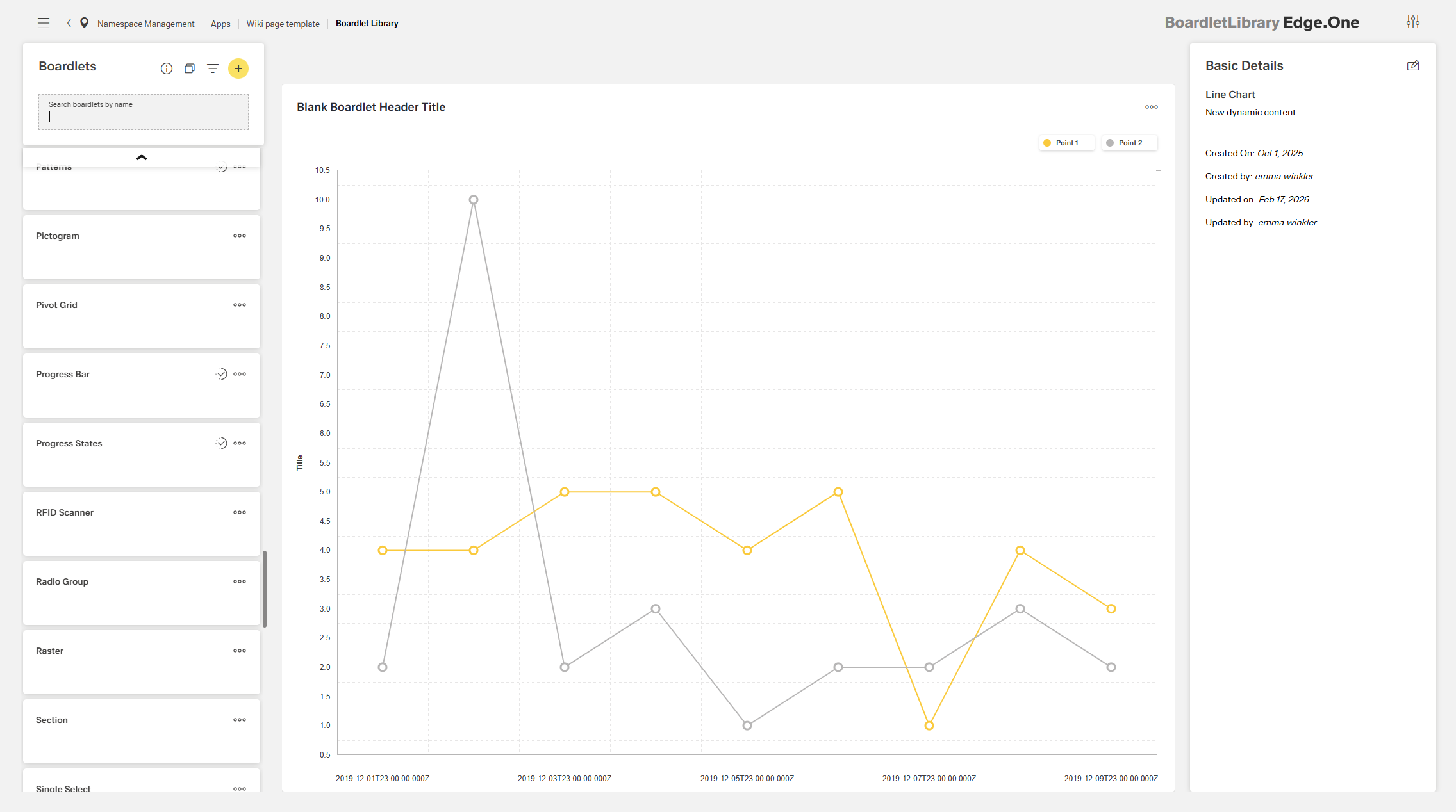
The Boardlet Library is the central place for browsing, previewing, and managing all boardlets defined in the selected app context.
Each boardlet is composed of reusable UI components such as buttons, charts, and forms. These can be further customized using the Boardlet Editor.
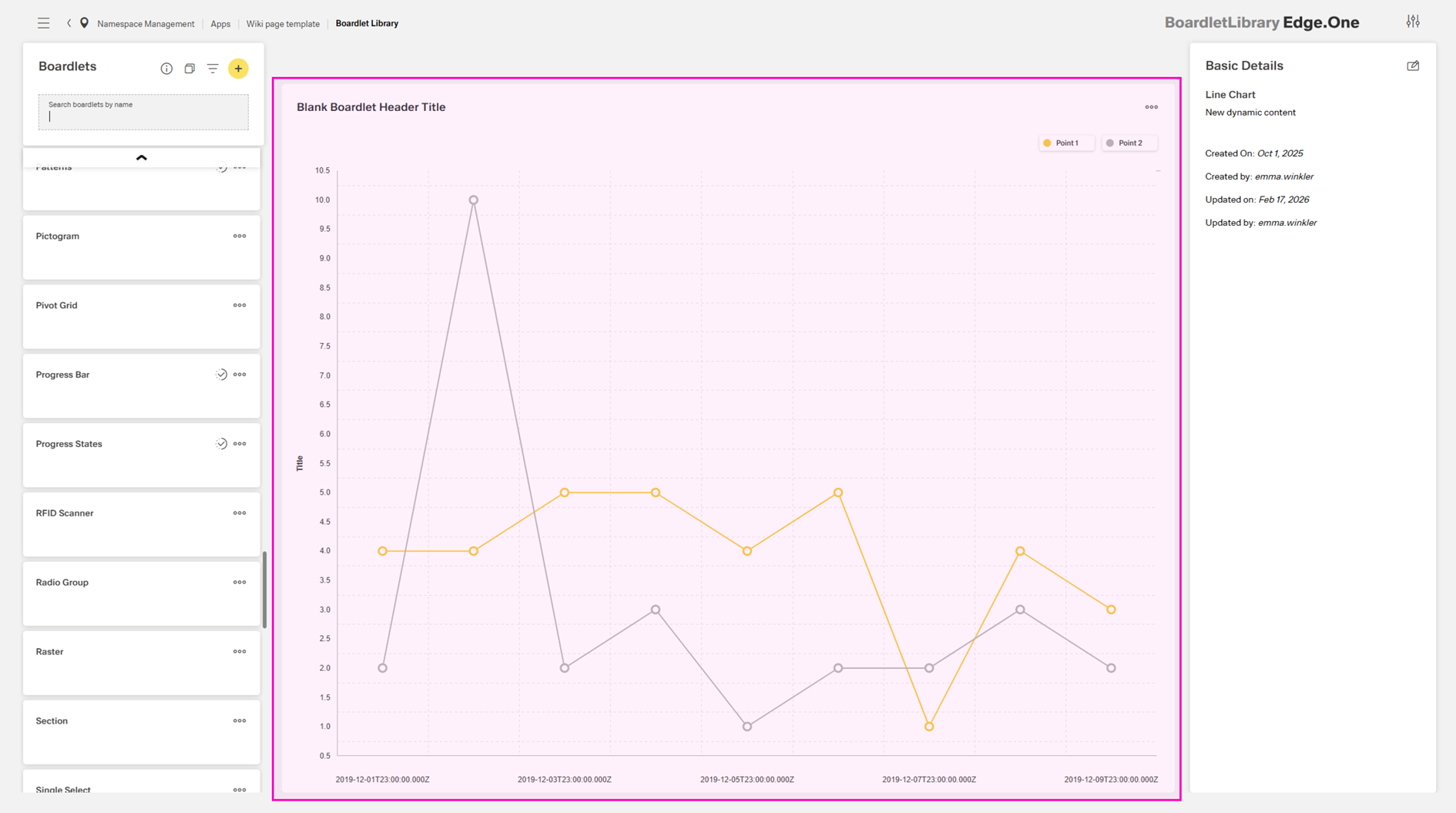
The view is split into three areas:
- List and management – Displays all boardlets and provides actions such as search, create, import, and export.
- Preview space – Shows a read-only preview of the selected boardlet.
- Metadata panel – Displays item metadata and allows property updates.
The library supports the following capabilities:
- Browsing and searching available boardlets
- Creating, editing, duplicating, deleting, and exporting items
- Filtering and sorting items by title and creation/update metadata
- Inspecting metadata and updating item properties
List and Management
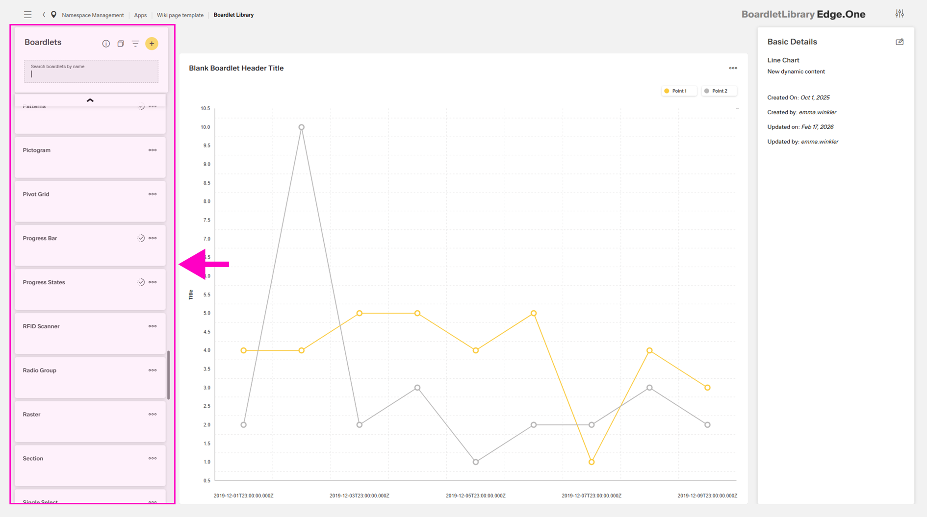
The left panel contains a scrollable list of cards representing the boardlets in the current app context.
At any time, one boardlet is selected (unless no boardlets exist in the current app context). When the page is opened, the first boardlet in the list is selected by default.
This section supports the actions described below.
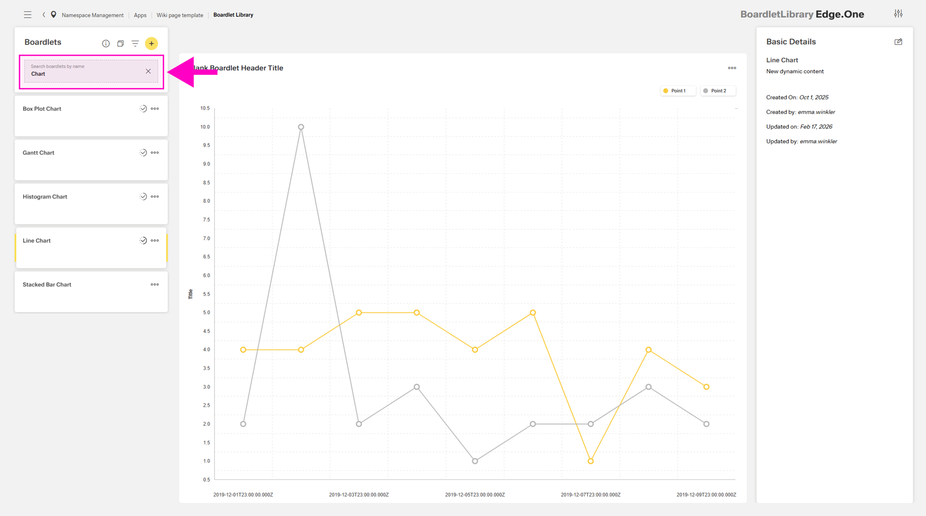
Search
The Search by name… field filters the list by boardlet title. Capitalization is ignored.
Create New
A new boardlet can be created via the Add action in the header.
A dialog is opened where a (preferably unique) name is entered and a template is selected. Templates are recommended when the intended layout matches one of the predefined structures, as basic formatting and Inspire Design guidelines are already applied. The available templates are:
- Blank - Standard boardlet without predefined content.
- Form - Boardlet with two sections (description and form). The form contains a grid with three inputs and a button. A footer bar with a preset primary button is also included.
- List - Empty card collection.
- Table - Empty table.
- Process - Two sections, each containing empty process states.
- Microfrontend - Boardlet with the Microfrontend. This template is discontinued.
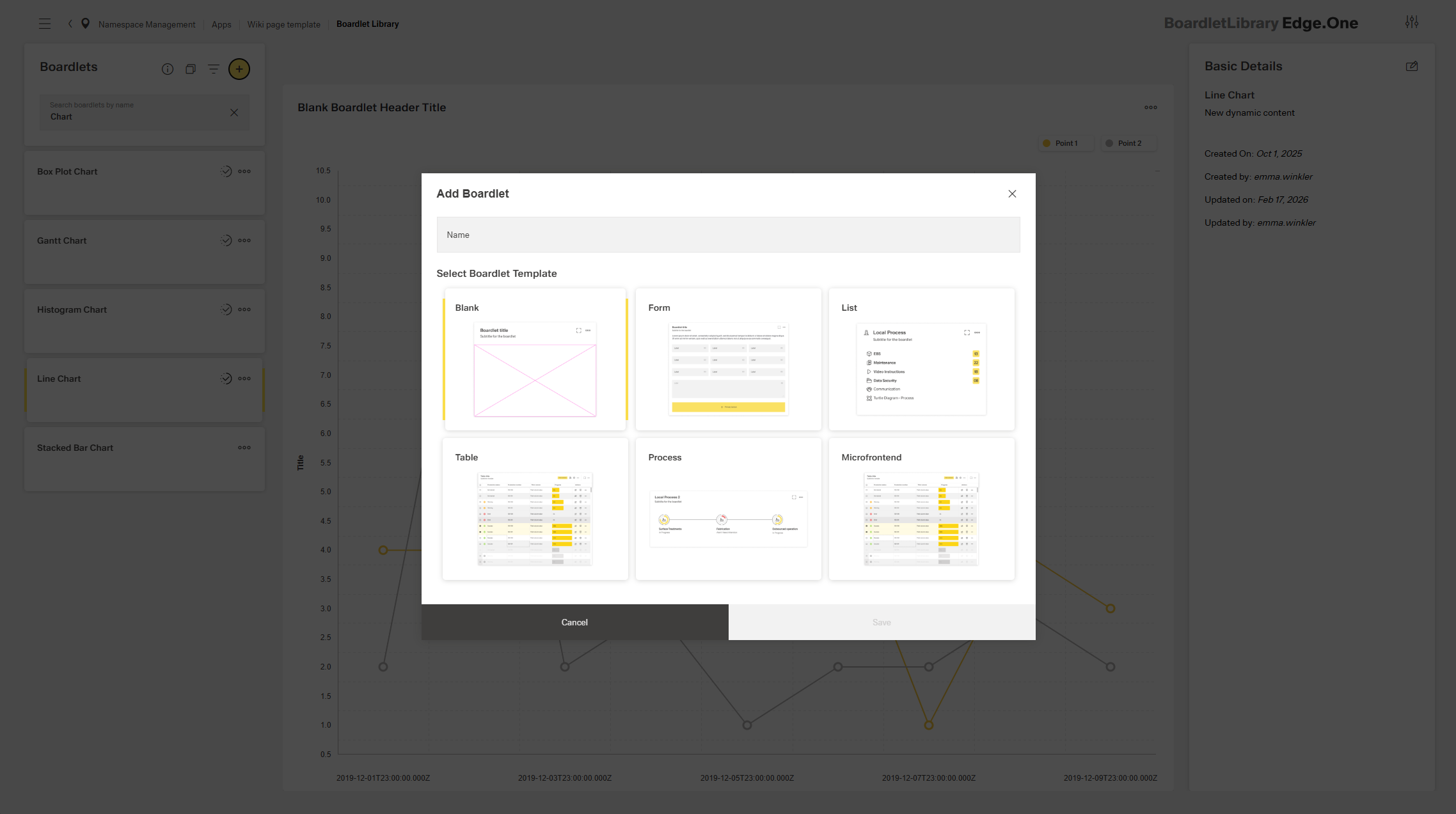
After saving, the item is opened in the Boardlet Editor for configuration.
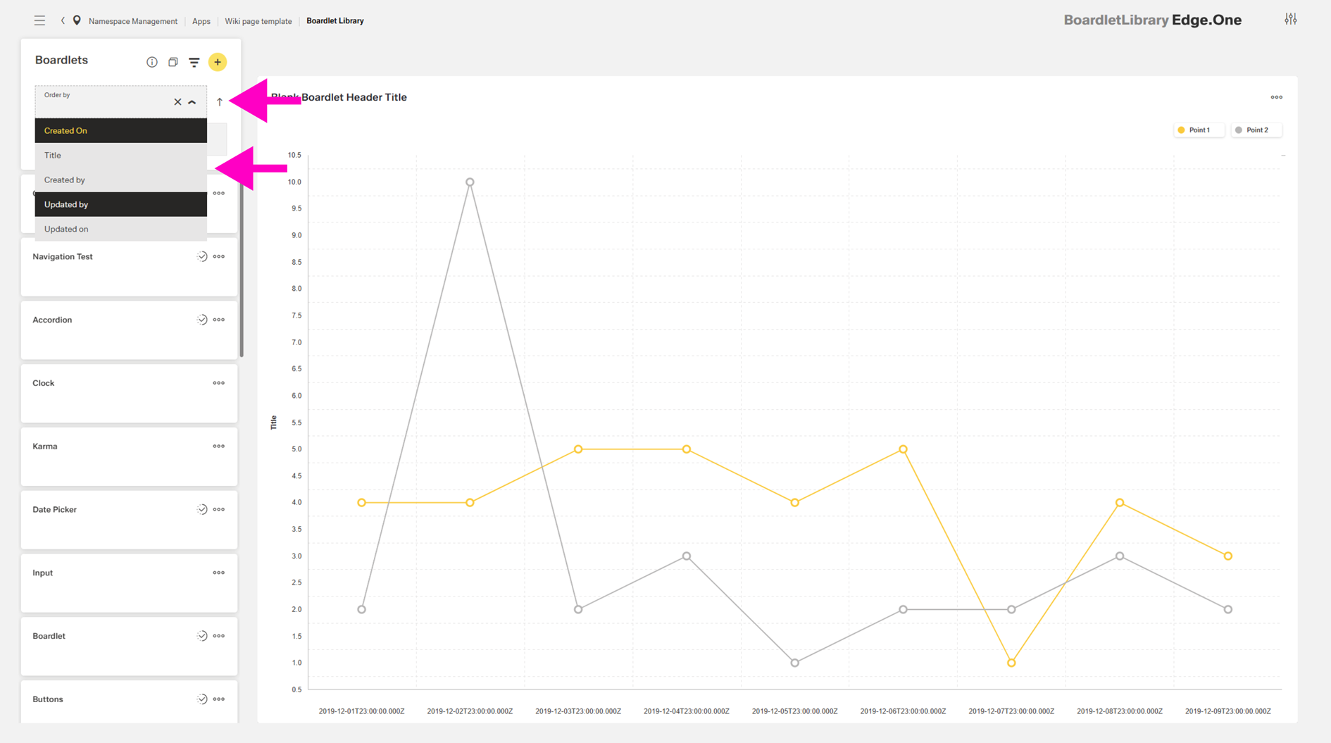
Filtering and Sorting
Filtering can be enabled via the Filter action. The list can be filtered by:
- Title
- Created by
- Created on
- Updated by
- Updated on
Sorting can be applied in ascending or descending order using the arrow icon next to the selected filter option.
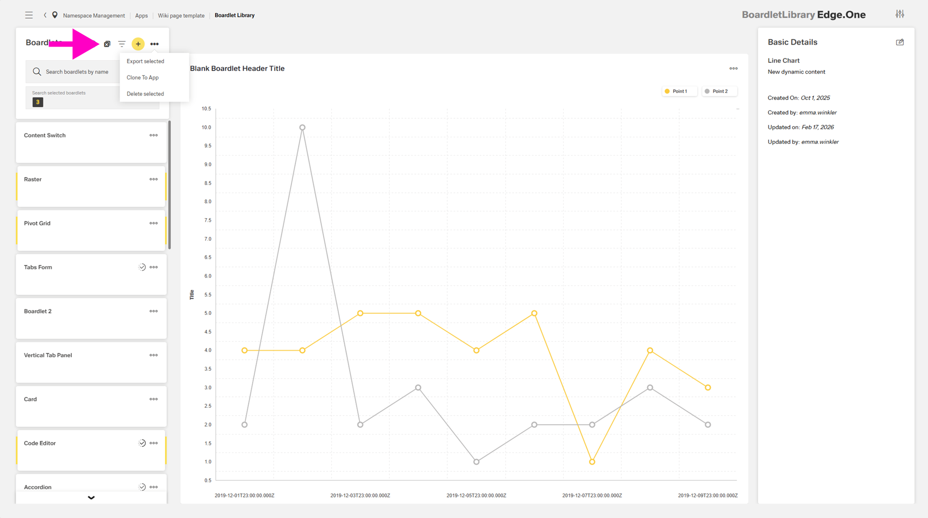
Multi-select and Export
Selection mode can be enabled via the multi-select icon (double checkboxes). When enabled, multiple boardlets can be selected and batch actions become available in the panel menu:
- Export selected - Saves the selected items as a file.
- Clone to app - Opens a dialog to clone the selected boardlets to another app.
- Delete selected - Removes the selected items after confirmation.
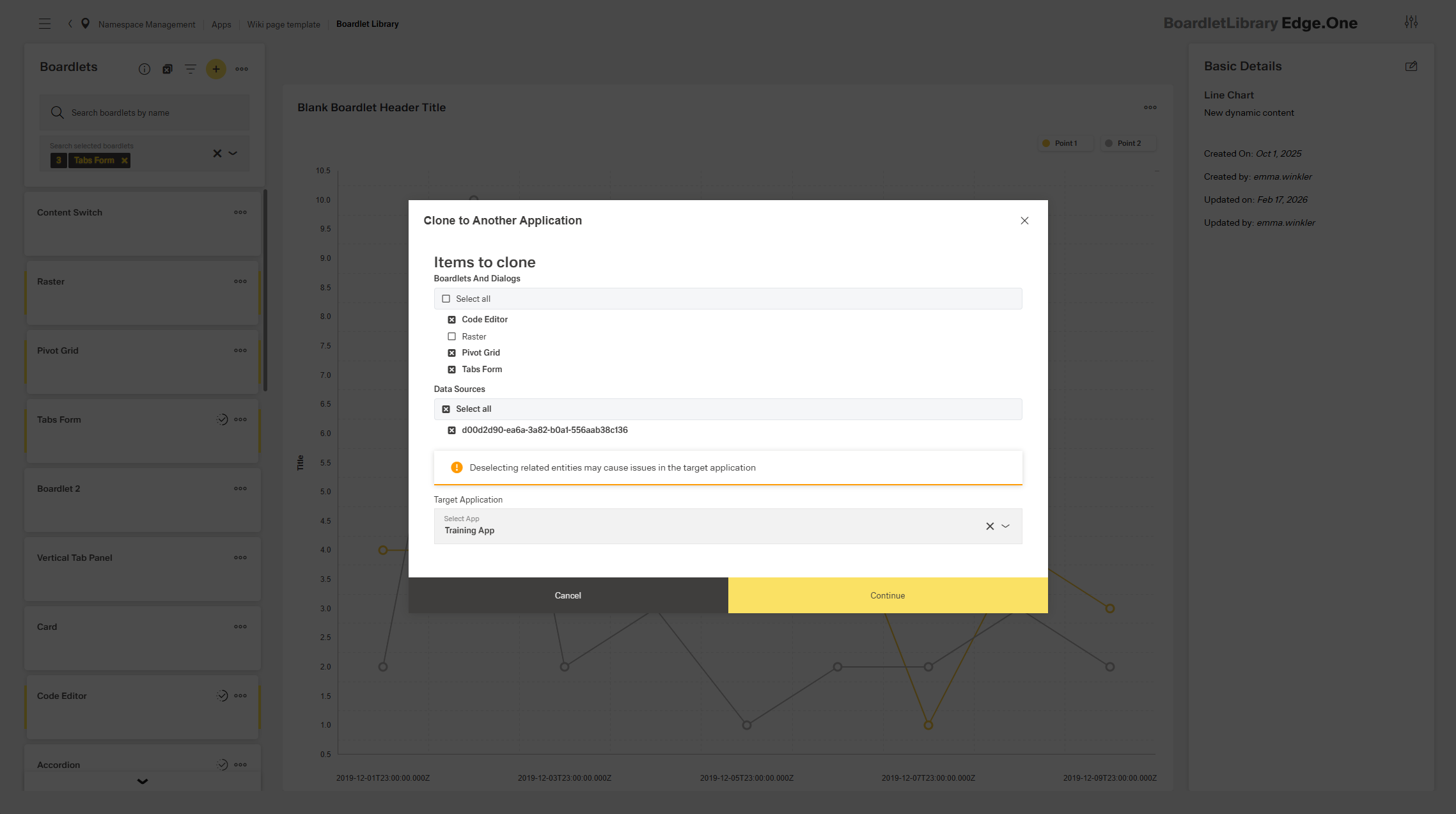
Cloning to another App
In the cloning dialog, the selection can be adjusted by deselecting previously selected boardlets. An option is available to also clone connected data sources. A target app is selected in the dropdown. Once selected, the process is confirmed using the primary action.
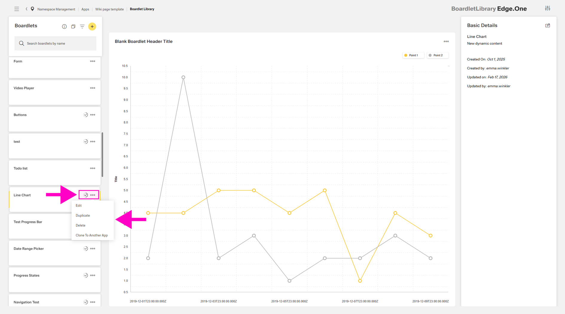
Item Cards
Each boardlet is displayed as a card showing its title. The More menu on each card provides the following actions:
- Edit - Opens the item in the App Composer.
- Duplicate - Creates a copy of the item.
- Delete - Opens a confirmation dialog.
- Clone to another app - Opens a dialog to clone the selected boardlet to another app.
When an item is currently being edited by another user, a progress icon is shown on the card. Hovering over the icon displays a tooltip with the editor’s name.
Preview Space
The preview space displays a static, non-interactive preview of the selected boardlet. The layout and components are shown as they would be rendered, without editing or interaction. This supports quick review and selection verification.
Metadata Panel
The right panel displays metadata and properties of the selected item.
Visible fields:
- Title
- Created by / on
- Last updated by / on
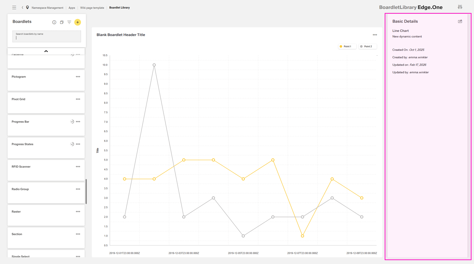
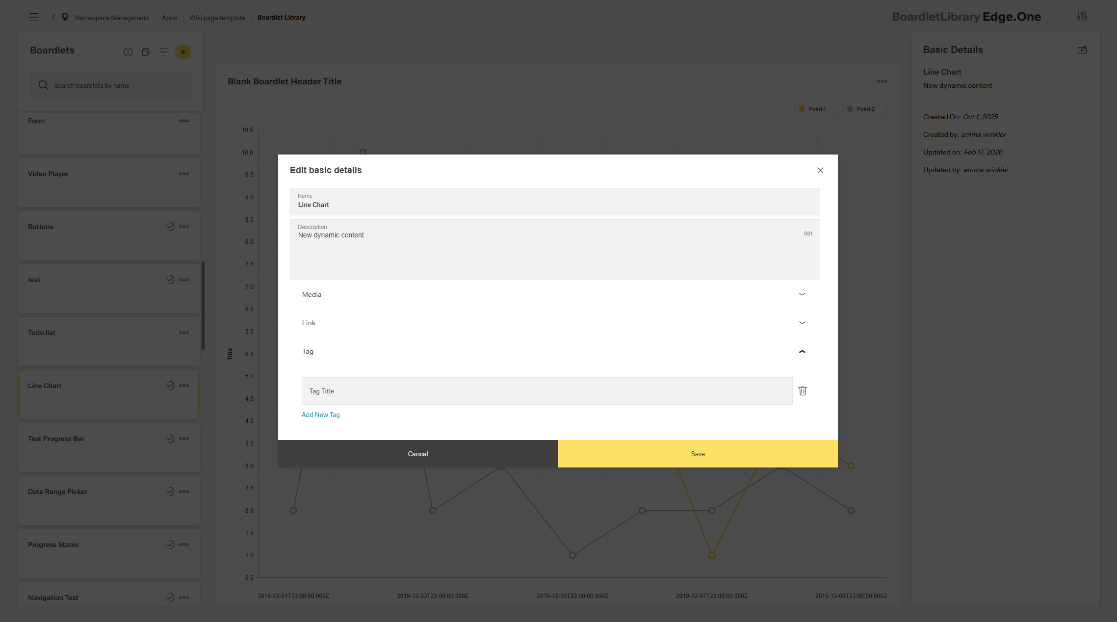
Properties can be modified using the edit icon in the top-right corner:
- Rename the item
- Add or change description
- Add media, links, or tags
These properties can only be edited in this panel.