Kanban Board
The Kanban Board page layout provides users with a structured visual workspace to view, search, and select process-related tasks or tickets. It acts as the starting point for initiating work by offering an organized overview of items across different workflow stages. Tasks are grouped by application relevant attributes for clarity. The progress of each task is clearly displayed.
Usage
This screen enables users to quickly locate the tasks they need - either by browsing through categorized columns or by searching directly - so they can begin or continue work efficiently. By presenting all tickets in a clear, status-based layout, the Kanban board supports smooth task management, prioritization, and progress tracking within the workflow.
When to Use This Page Layout
- Task Initialization - Users can browse the Kanban columns to identify and select the appropriate ticket for starting or continuing a process.
- Workflow Visibility - Teams can view all tickets organized by status, giving them a high-level understanding of ongoing, pending, and completed work.
- Prioritization & Planning - Users can visually assess workload distribution across stages and decide what to work on next.
- Context Access - Opening a card can allow users to view metadata, task details, and related actions before initiating the next step.
When Not to Use This Page Layout
- Large-scale data exploration - Not suitable for browsing extensive datasets, applying advanced filters, running bulk operations, or performing reporting. Use a list/table view built for data exploration.
- Step-by-step guided workflows - Not suitable when the user must follow a strict, sequential process with validations and guided progression. Use a wizard or process-focused page layout instead.
- High-density comparisons- Not suitable when users must compare many attributes per ticket at once. A table or split-detail layout will be more effective.
Limitations & Considerations
- Limited Information Displayed per Card - Cards typically show only high-level details (e.g., ID, title, status). Users may need to navigate further to view the full context or additional data.
- Dependent on Search Accuracy - If the system relies on exact matching or limited search parameters, users might struggle to locate the correct ticket without knowing its precise details.
- Not Designed for Large-Scale Data Browsing - This page layout is optimized for quick selection or creation—not for browsing large inventories or performing complex filtering. For extensive data exploration, a dedicated list or table view may be needed.
- Limited Action Scope - The screen focuses solely on initiating or selecting a process. Actions like editing, deleting, or rearranging cards are outside the scope and must be done elsewhere.
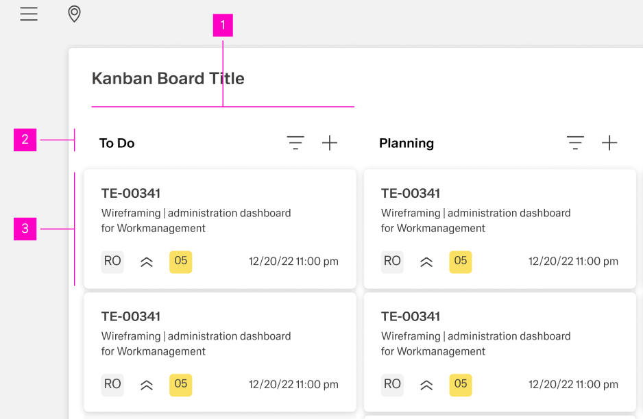
Anatomy
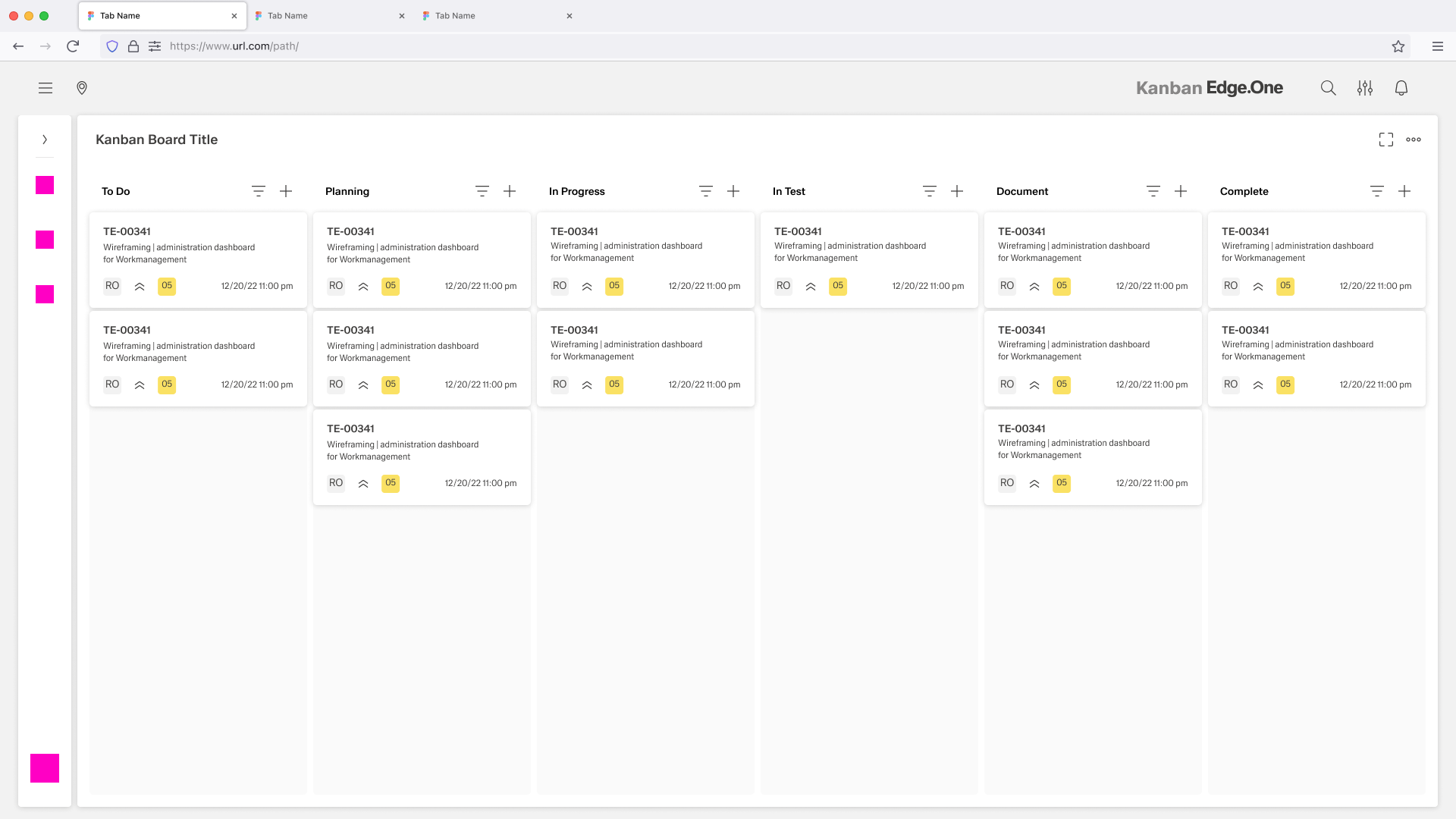
Kanban Columns (Workflow Stages)
Each column represents a distinct stage in the workflow (e.g., To Do, Planning, In Progress, In Test, Document, Complete). Columns provide a structured overview of all tasks at that particular status.
Column Header
Displays the name of the stage and may include controls for sorting, filtering, or adding new cards to that specific column.
Kanban Cards / Tickets
Each card represents an individual task or work item. Cards typically display key information such as:
- Ticket ID
- Title or short description
- Priority or status indicators
- Assignee or responsible role
- Due dates or timestamps
Behavior and Interaction
The Kanban Board supports a scan → find → open → start/continue work flow. Users use columns to understand status distribution, then open a ticket to view context and initiate the next step.
Scan and Navigate the Board
- Column-based overview. Users read the board left-to-right to understand workflow stages and current workload.
- Horizontal navigation. If columns exceed the viewport, the board scrolls horizontally while keeping column structure consistent.
- Independent column scrolling. Each column scrolls vertically to browse its tickets without losing the overall stage layout.
- Column header controls (optional). If present, controls apply to that column (e.g., “Add” or basic sort). Avoid dense controls—this view is for quick selection, not complex management.
Find a Ticket
- Search. Users type to locate tickets by known identifiers (ID/title/keywords). Results update quickly and keep the board layout stable.
- Result behavior. Non-matching tickets are hidden or visually deemphasized (choose one approach and apply consistently). Provide a clear “Reset” action.
- Light filters (if included). Keep filters simple (e.g., assignee, priority). Show active filters and allow “Clear all.”
Ticket Cards (Read and Select)
- Card glanceability. Cards show only key fields (ID, title, priority indicator, assignee, due date). Truncate long text with a tooltip or secondary view.
- Selection. Clicking a card highlights it and makes it the active item for the next interaction (e.g., open details, start task).
- No board reordering. Drag-and-drop, status changes, and rearranging cards are not part of this page layout. Users can’t move cards between columns here.
Open Details and Take Action (Primary Flow)
- Open details. Clicking a card (or a dedicated “Open” affordance) opens a detail view (side drawer or panel).
- Detail view contents. Metadata, description, related links, and the limited actions needed to begin/continue work.
- Actions. Provide one primary action (e.g., “Start work” / “Continue”) plus secondary actions relevant to initiation. Disable actions that don’t apply to the ticket’s current state.
- Close behavior. Closing returns users to the same scroll position and selection on the board. If the detail view supports edits and there are unsaved changes, confirm before closing.