Histogram Chart
Overview
- The Dynamic Histogram Chart displays data distribution across categories or bins.
- It helps show frequency distributions, density, and data patterns.
- The component works with different data sources and supports mock data.
- It offers configuration options for bars, axes, legends, and filtering.
- Common use cases include age distribution, transaction sizes, time analysis, and data quality checks.
Specs
Tokens
| Token | Description |
|---|---|
| showLegend | Show or hide legend. |
| barPadding | Space between bars (0–1). |
| barWidth | Width of bars (px/number). |
| ignoreEmptyPoints | Omit null/empty points. |
| argumentAxisTitle | Title for x-axis. |
| valueAxisTitle | Title for y-axis. |
| paddingClass | Component padding via CSS classes. |
| useMockData | Use sample data. |
| dataSourceId | ID of data source. |
| getEntityCollectionHttpRequestParametersMap | HTTP request parameters map. |
| dataPathExpression | Path to nested data array. |
| events | Configures component events. |
| ON_INIT (Events) | Triggered on initialization. |
| ON_DESTROY (Events) | Triggered on removal. |
| displayName | Display name in structure panel. |
| visibilityPolicySetId | Visibility by policy set. |
| displayConditions | Conditional display rules. |
| id | Unique identifier. |
| dataTestId | Testing hook ID. |
| enableAsHotspot | Enable guided tour hotspot. |
| guidedTourHotSpotTitle | Guided tour hotspot title. |
| guidedTourHotSpotDescription | Guided tour hotspot description. |
Data Format (category, value) | Expected fields in data items. |
Structure
- A Histogram Chart is a data visualization tool that shows how values are distributed across ranges or categories, called bins.
- Each bin is represented by a bar whose height indicates the number of data points within that range.
(Configured in General)
- displayName – Sets the display name of the component shown in the structure panel. For example,
"Customer Age Distribution"clearly identifies the purpose of this specific histogram in the component structure.
(Configured in Datasource Properties)
- useMockData – Determines whether sample data is used instead of an actual data source. When enabled, the histogram displays pre-defined sample data, which is useful for design and testing purposes.
- dataSourceId – Specifies the data source ID for retrieving histogram data. For example,
"api/customer-age-distribution"connects the chart to an endpoint that provides the appropriate data structure for visualization.- getEntityCollectionHttpRequestParametersMap – Configures HTTP request parameters for fetching data. This allows for customizing query parameters, path variables, or body parameters that are sent when requesting data.
- dataPathExpression – Defines the path to access the actual data array when the response has a nested structure. For example,
"data.analysis.distribution"allows accessing deeply nested data structures.
(Configured in Visibility)
- displayConditions – Defines conditions under which the histogram is displayed. This allows for context-aware visibility, showing the chart only when certain conditions are met (e.g., when a specific data set is selected).
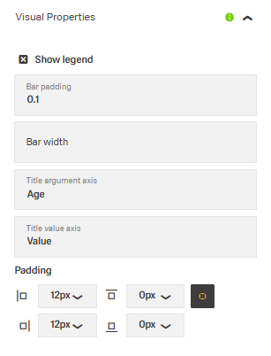
Styling
(Configured in Visual Properties)
- showLegend – Determines whether the legend is displayed alongside the chart. When enabled, a legend with the data series name and corresponding color will be displayed, providing context for the histogram bars.
- barPadding – Sets the padding between bars in the histogram, specified as a number between 0 and 1. For example, setting this to
"0.5"adds moderate spacing between bars for better visual distinction. - barWidth – Defines the width of individual bars in the histogram, specified as a number. For example, setting this to
"30"creates bars with a width of 30 pixels, allowing for control over the chart's density. - ignoreEmptyPoints – Determines whether empty or null data points are displayed in the chart. When enabled, gaps in the data are omitted rather than shown as zero-height bars.
- argumentAxisTitle – Sets the title text for the horizontal (x) axis of the histogram. For example, setting this to
"Age Groups"clarifies what the categories along the x-axis represent. - valueAxisTitle – Sets the title text for the vertical (y) axis of the histogram. For example, setting this to
"Number of Customers"clarifies what the height of each bar represents. - paddingClass – Configures the padding around the component using CSS classes. For example,
"p-4"adds substantial padding on all sides of the histogram component.
Actions & Variants
(Configured in Events)
- events – Configures events that the component can trigger and respond to.
- ON_INIT – Triggered when the component is initialized. This event can be used to perform setup operations or initial data processing.
- ON_DESTROY – Triggered when the component is removed from the DOM. This event can be used for cleanup operations or resource release.
Tests
(Configured in Testing Hooks)
- id – Specifies a unique identifier for the component, useful for programmatic access in testing or custom code.
- dataTestId – Sets a testing hook ID for automated testing, allowing test scripts to reliably identify this histogram component.
- enableAsHotspot – Enables the component as a guided tour hotspot. When enabled, this histogram can be highlighted during onboarding tours.
- guidedTourHotSpotTitle – Sets the title text displayed when this component is highlighted in a guided tour, with support for translations.
- guidedTourHotSpotDescription – Sets the descriptive text explaining the histogram's purpose during a guided tour, with support for translations.
Authorization
(Configured in Authorization)
- visibilityPolicySetId – Determines the visibility of the component based on user permissions and policy sets. For example, setting to
"marketingTeamPolicy"restricts the histogram to users with marketing team privileges.
Links
- Figma: tba
- Live style guide: https://e1-dev.k8s.myapp.de/live-style-guide/other-components/histogram
Guidelines
Usage
- Use when you need to visualize a distribution across bins/categories backed by a simple data shape; provide items with
categoryandvalueand label axes withargumentAxisTitleandvalueAxisTitle. - Keep the authoring surface understandable via
displayName. - Hide the chart when prerequisites aren’t met using
displayConditions. - Show or hide the legend as needed with
showLegend.
Sizing & Layout
- Control density with
barWidthand separation withbarPadding(0–1). - Add outer whitespace using
paddingClass. - Skip null/empty buckets with
ignoreEmptyPoints.
States & Feedback
- Clarify or declutter by toggling
showLegend. - Reduce noise in sparse datasets with
ignoreEmptyPoints.
Data-Driven / Conditional Behavior
- Gate rendering based on context with
displayConditions. - Improve visual stability by enabling
ignoreEmptyPoints.
Visibility & Authorization
- Restrict visibility with
visibilityPolicySetId. - Combine permissions and context via
visibilityPolicySetId+displayConditions.
Content & Localization
- Write short, descriptive axis titles with
argumentAxisTitleandvalueAxisTitle. - Use a clear author-facing name via
displayName.
Dos & Don’ts
| Do | Don’t | Article setting(s) |
|---|---|---|
| Provide concise axis titles to establish meaning and scale. | Leave axes unlabeled or ambiguous. | argumentAxisTitle, valueAxisTitle |
Adjust barWidth/barPadding so bars are distinct without excessive gaps. | Use extremes that cause overlapping bars or excessive whitespace. | barWidth, barPadding |
| Omit null buckets to avoid noise in sparse datasets. | Plot zero-height bars for missing data. | ignoreEmptyPoints |
| Show the legend only when the series label adds value. | Always show a legend that repeats obvious information. | showLegend |
| Drive the chart from a defined source and nested path if needed. | Assume data is top-level or hardcode sample values for production. | dataSourceId, dataPathExpression |
| Add HTTP params at init for deterministic requests. | Build ad-hoc query strings on click without lifecycle control. | getEntityCollectionHttpRequestParametersMap, ON_INIT |
| Hide the chart when preconditions aren’t satisfied. | Render an empty frame waiting for context. | displayConditions |
| Name the instance clearly for authors and tests. | Use default names that hinder maintenance. | displayName, dataTestId, id |
| Use mock data only for design/playback. | Ship with mock data enabled in production. | useMockData |
| Release subscriptions/timers on teardown. | Leave listeners running after navigation. | ON_DESTROY |
Accessibility
- Provide guided explanations during onboarding using
enableAsHotspot,guidedTourHotSpotTitle, andguidedTourHotSpotDescription. Keep it concise and scannable (shortguidedTourHotSpotTitle; 1–2 sentenceguidedTourHotSpotDescription). - Expose deterministic hooks for automated a11y checks via
idanddataTestId. - Ensure testing hooks (
dataTestId) are stable across releases to prevent broken a11y tests.
Datasource Requirements
The foundation of the histogram chart is a combination of categories with (multiple sets of) values. The categories build the points on the x axis. Which field of the data source object provides the category is deffined with the argumentField property. The values provide the respective data point to each category on the y axis. All categories and (sets of) values are delivered in the form of a data-source-array.
A histogram chart can have one or multiple set(s) of values, also referred to as value fields. Each value field can be configured separately with the series-array.
A histogram chart can include constant lines. They are delivered in the constant line array.

Example data:
{
    "dataSource": [],
    "series": [],
    "valueAxis": [],
    "argumentField"= "category"
}
The histogram chart offers flexible options to adapt its appearance and behavior:
- Bar appearance – Adjust the width, padding, and color of bars.
- Axis configuration – Define clear titles and control how values are displayed.
- Legend positioning – Enable or disable the legend and choose its placement.
- Data filtering – Decide whether to display empty values or omit them.
These options make the histogram suitable for different visualization needs while keeping the layout clear and professional.
Histogram Data
The data source array of the histogram component expects data in the following format.
Example Data:
[
  { "category": "0-10", "value": 12 },
  { "category": "11-20", "value": 25 },
  { "category": "21-30", "value": 47 },
  { "category": "31-40", "value": 35 },
  { "category": "41-50", "value": 28 },
  { "category": "51-60", "value": 18 },
  { "category": "61+", "value": 9 }
]
The component will automatically use the "category" field for the x-axis labels. It can also manually be set with the argumentField property outside this array.
The "value" field is used for the height of each bar. A chart can have multiple values per category. These (sets of) values, also called value fields, create one or multiple data series.
Example data:
[
  {
      "category": 1,
      "point1": 30,
      "point2": 10
  },
  {
      "category": 2,
      "point1": 30,
      "point2": 20
  }
]
Histogram Series
The histogram series is an array. If a histogram chart has multiple sets of values, it requires multiple histogram series arrays.
| Property | Data type | Required | Description |
|---|---|---|---|
| valueField | string | yes | which data source field provides values for series points |
| name | string | yes | name that identifies the series |
| color | string | yes | color of the series |
| visible | boolean | yes | whether the series is visible or not |
| type | string | yes | type of the series: line, bar, stackedBar |
| pane | string | no | which pane the series should belong to |
Example data:
  [
  {
      "valueField": "point1",
      "name": "Area 1",
      "visible": true,
      "color": "#fae164",
      "type": "bar"
  },
  {
      "valueField": "point2",
      "name": "Area 2",
      "visible": true,
      "color": "#65d0f7",
      "type": "line"
  }
  ]
Histogram Value Axis
The value axis array configures the value/y-axis of a histogram chart.
| Property | Data type | Required | Description |
|---|---|---|---|
| pane | string | no | which pane the series should belong to |
| name | string | no | name that identifies the pane |
| tickInterval | number | no | specifies the interval between major ticks. Does not apply to discrete axes |
| visualRange | boolean | no | defines the axis' displayed range, cannot be wider than the wholeRange |
| visible | boolean | no | makes the value axis line visible |
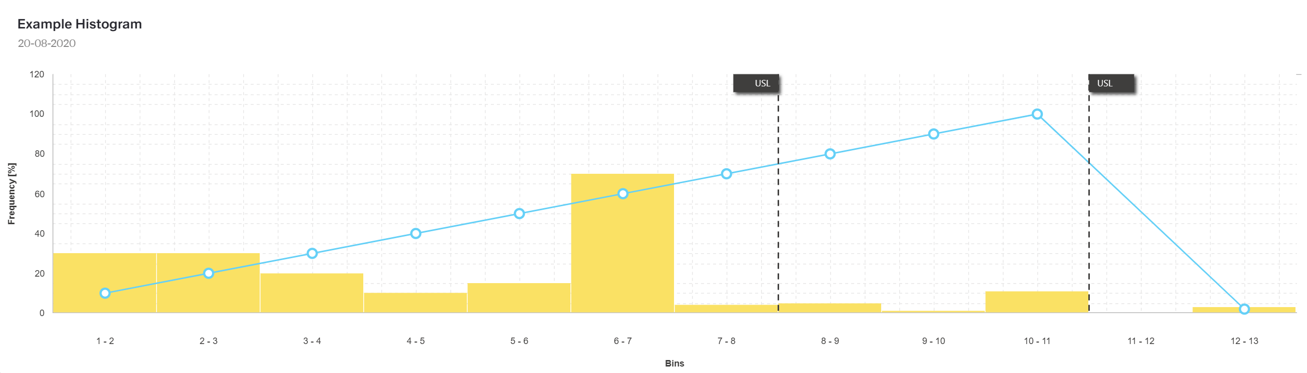
| constantLines | string | no | constant line is a straight line that extends over the entire chart and indicates an axis value |
| labelVisible | boolean | no | shows/hides value axis labels |
| title | string | yes | title for axis |
Example data:
  [
  {
      "title": "Frequency [%]",
      "visible": true,
      constantLines: []
  }
  ]
Chart Constant Line
In case a histogram chart has vertical constant lines, they are configured in the constant line array inside the value axis array.
| Property | Data type | Required | Description |
|---|---|---|---|
| color | string | yes | color of the line |
| type | string | yes | type of the line: solid, dash, longDash or dot |
| value | number | yes | value of the line |
| text | string | yes | name that identifies the line |
Example data:
  [
  {
      "color": "#3f3e3d",
      "value": 7.5,
      "type": "dash",
      "text": "USL"
  },
  {
      "color": "#3f3e3d",
      "value": 10.5,
      "type": "dash",
      "text": "USL"
  }
  ]
Optional: Common Series Settings
The following properties can be set as common settings for all series in the chart.
| Property | Data type | Required | Description |
|---|---|---|---|
| barPadding | number | no | padding and consequently the width of all bars in a series using relative units, values 0 to 1 |
| barWidth | number | no | fixed width for all bars in a series, measured in pixels |
| ignoreEmptyPoints | boolean | no | whether the series should ignore null data points |
| type | string | no | the type for all series |
Example data (optional options included):
{
    "dataSource": [],
    "series": [],
    "valueAxis": [],
    "argumentField"= "category",
    "panes":[]
    "barPadding": 0.1,
    "barWidth": 30,
    "ignoreEmptyPoints": true,
    "type": "bar"
}
Optional: Chart Panes
One histogram chart component may have multiple panes. These will result in multiple charts built out of the same data set. If a chart has multiple panes, all properties related to panes in the arrays mentioned above become mandatory.
| Property | Data type | Required | Description |
|---|---|---|---|
| name | string | no | which pane the series should belong to |
| height | number | no | the pane's height |
{
  "panes": [
    { "name": "topPane", "height": 60 },
    { "name": "bottomPane", "height": 40 }
  ]
}