Lookup Input
Overview
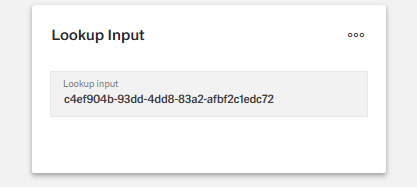
- The Lookup Input Component is a specialized form control for searching and selecting items from large datasets.
- It displays a read-only input field that opens a dialog with a searchable data grid when clicked.
- The component is useful when traditional dropdowns are impractical due to the dataset size.
- It improves efficiency by combining search, selection, and data persistence in one control.
Specs
Tokens
| Token | Description |
|---|---|
| displayName | Display name of the component shown in the structure panel |
| labelTranslations | Field label with localization support |
| dialogTitleTranslations | Title text for the lookup dialog with localization support |
| dialogSubtitleTranslations | Subtitle text for the lookup dialog with localization support |
| hidden | Controls whether the component is visible in the form |
| saveInLocalStorage | Determines if the value is preserved in local storage between sessions |
| defaultValue | Sets the initial value when the form is reset |
| readonly | Controls whether the lookup value can be changed |
| elements | Columns configuration for the data grid in the lookup dialog |
| getElementsDataSourceId | Data source ID for retrieving data to populate the lookup dialog |
| getEntityCollectionHttpRequestParametersMap | HTTP parameters for data fetching |
| enablePagination | Activates server-side pagination in the lookup dialog |
| pageSize | Sets the number of records displayed per page in the dialog |
| valueKey | Field used as the stored value when an item is selected |
| displayValueKey | Field shown in the input field after selection |
| dataField | Field name used when submitting form data |
| controlsRequestType | How field data is sent in HTTP requests (BODY, HEADER, PATH) |
| validation | Configures validation rules for the lookup input |
| required | Field must have a selection before form submission |
| authorizationDisable | Policy set that disables the component based on permissions |
| events | Configures the events that the component can trigger/respond to |
| ON_INIT (Events) | Event triggered when the component initializes |
| ON_DESTROY (Events) | Event triggered when the component is removed |
| dataTestId | Testing hook ID for automated testing |
Structure
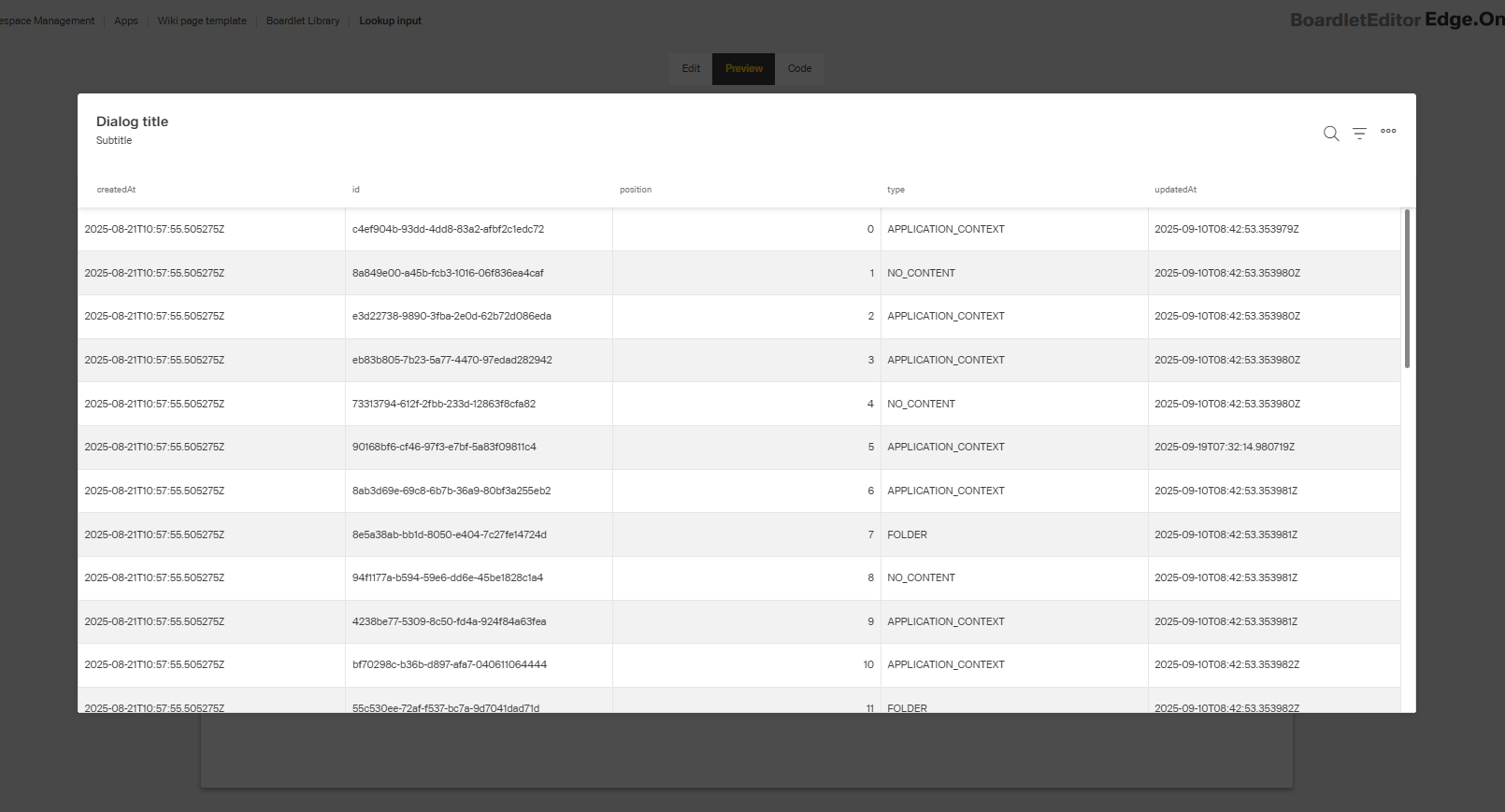
- The Lookup Input consists of a read-only input field and a dialog with a searchable data grid for item selection.
(Configured in General Properties)
- displayName – Sets the display name of the component shown in the structure panel. For example, "Customer Selector" allows for easy identification of the component's purpose in the component structure.
(Configured in Visual Properties)
- saveInLocalStorage – Determines whether the field's value is preserved in the user's local storage between sessions. When enabled, the selected value will persist if the user reloads the page, providing a better user experience for complex forms.
- defaultValue – Sets the initial value to be used when the form is reset. For example, setting to "00001" would pre-select the customer with ID "00001" when the form is initially loaded or reset.
(Configured in Column)
- elements – Defines the columns configuration for the data grid displayed in the lookup dialog. This array contains DynamicTableColumnComponent objects that specify which fields to display in the dialog grid and how they should be formatted. For example, you can configure columns for customer ID, name, and status to help users identify the correct record.

(Configured in Datasource)
- getElementsDataSourceId – Specifies the data source ID for retrieving data to populate the lookup dialog. For example, "api/customers" connects the component to the customers API endpoint.
- getEntityCollectionHttpRequestParametersMap – Configures HTTP parameters for data fetching. This object maps additional parameters needed for the API request, which can include query parameters, path parameters, or fixed values that should be sent with every request.
- enablePagination – Activates server-side pagination for large datasets in the lookup dialog. When enabled, data is loaded in pages rather than all at once, significantly improving performance for tables with many records.
- pageSize – Sets the number of records displayed per page in the lookup dialog. For example, setting to 25 will display 25 records per page when pagination is enabled, providing a balance between visibility and performance.

Submit
(Configured in Datasource)
- valueKey – Defines the field in the data objects that should be used as the value when an item is selected. For example, setting to "id" will store the ID of the selected customer as the field value.
- displayValueKey – Defines the field in the data objects that should be displayed in the input field after selection. For example, setting to "name" will show the customer's name in the input field, even though the ID might be stored as the actual value.
(Configured in Non-Visual Properties)
- dataField – Defines the field name that will be used when submitting form data. For example, setting to "customerId" ensures the selected customer ID is submitted with this field name in the data object.
- controlsRequestType – Specifies how the field data is sent in HTTP requests: 'BODY', 'HEADER', or 'PATH'. For example, setting to "BODY" includes the field in the request body, which is standard for most form submissions.
Styling
(Configured in Visual Properties)
- labelTranslations – Sets the field label with support for multiple languages. For example, {"en-US": "Customer", "de-DE": "Kunde"} ensures proper localization of the field label.
- dialogTitleTranslations – Sets the title text displayed at the top of the lookup dialog with support for multiple languages. For example, {"en-US": "Select Customer", "de-DE": "Kunde auswählen"} ensures users understand the purpose of the dialog.
- dialogSubtitleTranslations – Sets an optional subtitle text displayed below the dialog title with support for multiple languages. For example, {"en-US": "Active customers only", "de-DE": "Nur aktive Kunden"} provides additional context about the displayed data.
Actions & Variants
(Configured in Visual Properties)
- hidden – Controls whether the component is visible in the form. When set to true, the component remains in the form structure but is not displayed, which is useful for conditional rendering based on other field values.
- readonly – Controls whether the lookup value can be changed by the user. When set to true, the lookup field displays its value but cannot be modified, which is useful for display-only scenarios.
(Configured in Events)
- events – Configures the events that the component can trigger and respond to:
- ON_INIT – Triggered when the component is initialized. Can be used to perform setup operations like loading initial configuration.
- ON_DESTROY – Triggered when the component is removed from the DOM. Useful for cleanup operations and releasing resources.
Validation
(Configured in Validation)
- validation – Configures validation rules for the lookup input, including:
- required – When set to true, the field must have a selection before the form can be submitted. This ensures users make a selection when the information is essential.
Authorization
(Configured in Authorization)
- authorizationDisable – Specifies a policy set that determines when the component should be disabled. For example, setting to "readOnlyPolicy" will disable the field for users who don't have edit permissions according to the specified policy.
Tests
(Configured in Testing Hooks)
- dataTestId – Sets the testing hook ID for automated testing. For example, setting to "customer-lookup" allows test scripts to reliably locate this component.
Guidelines
Usage
- Use Lookup Input for large, searchable datasets. Connect to data with
getElementsDataSourceId, configure the grid viaelements, and keep performance withenablePagination+pageSize. - Store a stable identifier and show a readable label: use
valueKey(stored),displayValueKey(shown), and submit usingdataFieldwithcontrolsRequestType. - Persist frequent selections across sessions with
saveInLocalStorage. - Pre-fill only when it’s clearly correct using
defaultValue.
Sizing & Layout
- Curate columns to only what helps selection and order them by importance using
elements. - Balance density and scanning effort by tuning
pageSize. - Ensure the input shows a recognizable value by choosing an appropriate
displayValueKey.
States & Feedback
- Enforce mandatory selection with
validation.required.
Visibility & Authorization
- Show or hide the control with
hiddenwhen it’s irrelevant. - Indicate permission constraints by disabling interaction via
authorizationDisable.
Content & Localization
- Localize user-facing copy with
labelTranslations,dialogTitleTranslations, anddialogSubtitleTranslations. - Align the displayed value to user expectations by selecting an appropriate
displayValueKeyand reinforcing it inelements.
Dos & Don’ts
| Do | Don’t | Article setting(s) |
|---|---|---|
| Store a stable ID and show a readable name. | Store the display name as the value. | valueKey, displayValueKey, dataField |
| Localize label, dialog title, and subtitle. | Ship English-only strings. | labelTranslations, dialogTitleTranslations, dialogSubtitleTranslations |
| Keep the grid focused on decisive fields. | Show every backend column. | elements |
| Use pagination for large datasets. | Load thousands of rows at once. | enablePagination, pageSize |
| Persist frequent selections across sessions. | Force users to reselect on every visit. | saveInLocalStorage |
| Mark essential relationships as required. | Let forms submit with missing relations. | validation.required |
| Respect permissions by disabling interaction. | Hide the control when users need to see the value. | authorizationDisable |
| Hide the field when irrelevant. | Show an inert field with no purpose. | hidden |
| Submit data through the intended channel. | Rely on defaults that mismatch your API. | controlsRequestType, dataField |
| Provide a stable test hook for QA. | Select the control via brittle selectors. | dataTestId |
| Set a safe, obvious default only when appropriate. | Pre-fill with a misleading value. | defaultValue |
Accessibility
- Provide localized, descriptive labeling and dialog context via
labelTranslations,dialogTitleTranslations, anddialogSubtitleTranslations. - Keep titles concise and add secondary details in subtitles using
dialogTitleTranslationsanddialogSubtitleTranslations. - Convey input meaning through a readable
displayValueKey; reinforce with clear columns inelements. - Reflect input rules and state with
validation.requiredandreadonlyto ensure assistive tech announces necessity and non-editability. - Supply a stable selector for automated accessibility checks using
dataTestId. - Avoid cognitive overload by limiting columns in
elementsand tuningpageSizeto a manageable amount. - Manage focus and perception appropriately: remove irrelevant controls from the flow using
hidden, or keep them visible but non-interactive withauthorizationDisablewhen users must see existing values.
Datasource Requirements
The lookup input component expects an array of objects. Value keys inside the objects provide a title to the column while any single object inside the array represents one row of the lookup input table.
Example:
[
  {
    "name": "German (Germany)",
    "code": "de-DE"
  },
  {
    "name": "French (France)",
    "code": "fr-FR"
  },
  {
    "name": "English (United States)",
    "code": "en-US"
  },
  {
    "name": "Dutch (Netherlands)",
    "code": "nl-NL"
  },
  {
    "name": "Spanish (Spain)",
    "code": "es-ES"
  },
  {
    "name": "Chinese (China)",
    "code": "zh-CN"
  },
  {
    "name": "Polish (Poland)",
    "code": "pl-PL"
  }
]
Column Creation
After initially selecting a data source, the column chooser will open automatically with the keys added from the data source. If an existing and desired key is not among them, create an additional column and add the key under data field in the column. The columns can be edited individually as table columns.