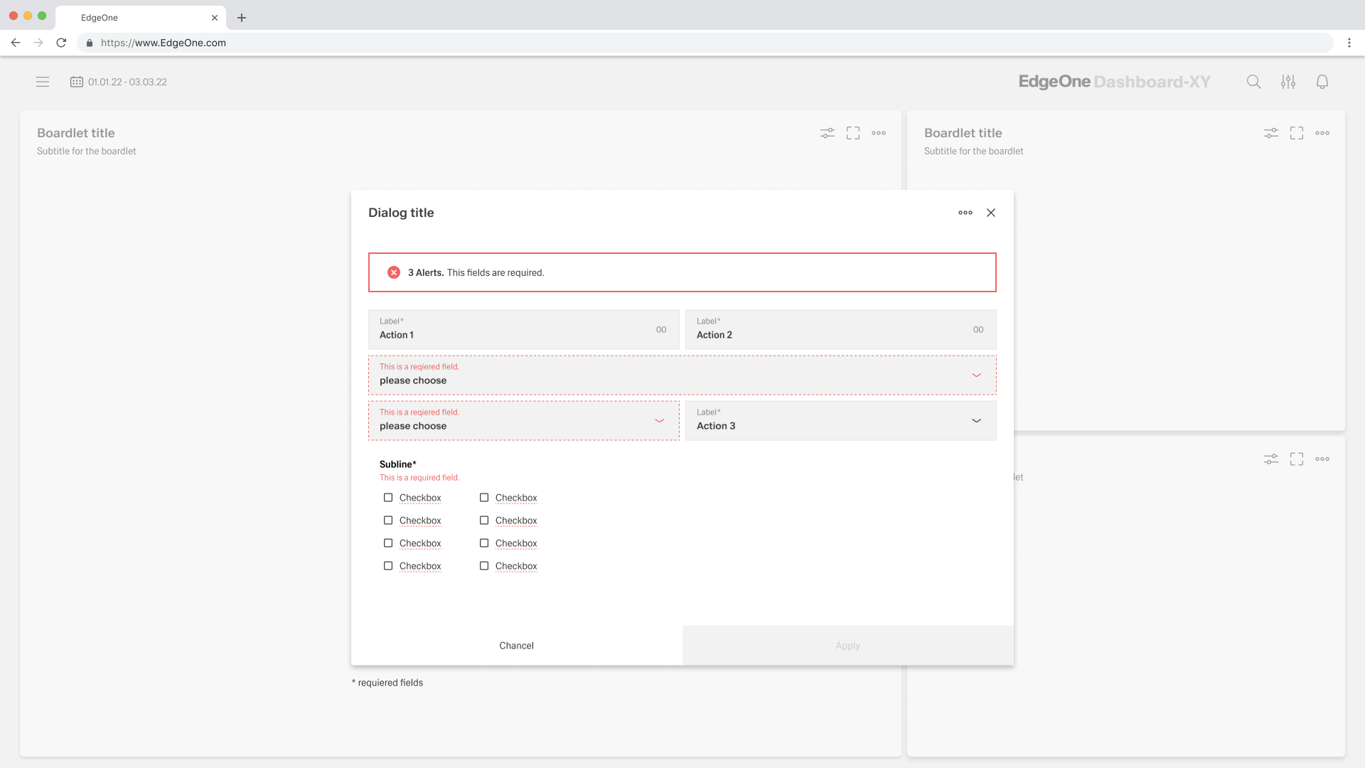
Checkbox
Overview
- The Checkbox component allows users to toggle a binary choice.
- It can display a label with support for multiple languages.
- The component supports default values, read-only mode, and disabled states.
- Data binding and validation options ensure correct handling in forms.
- Events enable dynamic interaction and lifecycle control.

Specs
Tokens
| Token | Description |
|---|---|
| displayName | Sets the display name of the component shown in the structure panel. |
| labelTranslations | Sets the label text displayed next to the checkbox, with support for multiple languages. |
| disabled | Determines whether the checkbox is interactive. |
| value | Sets the default checked state of the checkbox. |
| readonly | Controls whether the field is in read-only mode. |
| defaultValue | Sets an initial value for the checkbox when first loaded. |
| saveInLocalStorage | Enables persisting the checkbox state in browser's local storage. |
| dataField | Specifies the form field name where the checkbox value will be stored. |
| controlsRequestType | Specifies how the checkbox data should be included in API requests. |
| validation | Configures validation rules for the checkbox. |
| required | Validation rule: blocks form submission unless the checkbox is checked. |
| requiredTrue | Validation rule: specifically requires the checkbox to be checked (true). |
| events | Configures the events that the component can trigger and respond to. |
| ON_VALUE_CHANGE (Events) | Event triggered when the checkbox is toggled. |
| ON_INIT_BASED_ON_USER_VIEW (Events) | Event triggered when the component is initialized in user view. |
| ON_INIT (Events) | Event triggered when the component is initialized. |
| ON_DESTROY (Events) | Event triggered when the component is removed from the DOM. |
Structure
(Configured in General Properties)
- displayName – Sets the display name of the component shown in the structure panel. For example, "ConsentCheckbox" allows for easy identification of the component's purpose in the UI builder interface.
(Configured in Visual Properties)
- value - Sets the default checked state of the checkbox. When set to true, the checkbox will be checked by default when the form loads; when false, it will be unchecked.
- defaultValue - Sets an initial value for the checkbox when first loaded. This value will be used when the form is reset or initially displayed before any user interaction.
- saveInLocalStorage - Enables persisting the checkbox state in browser's local storage. When enabled, the state will be recalled even after page refresh, providing continuity in multi-page forms.
Non-Visual Structure
(Configured in Non-Visual Properties)
- dataField - Specifies the form field name where the checkbox value will be stored. For example, setting it to "acceptTerms" ensures the checkbox state is saved to that field in form submissions.
- controlsRequestType - Specifies how the checkbox data should be included in API requests. Options include "BODY" (in request body), "PATH" (in URL path), or "HEADER" (in HTTP headers).
Styling
(Configured in Visual Properties)
- label - Sets the label text
- labelTranslations – Sets the label text with support for multiple languages. For example, {"en-US": "I accept the terms", "de-DE": "Ich akzeptiere die Bedingungen"} provides localized text for users.
- paddingClass – Configures spacing around the button using CSS classes. For example, "p-2" adds light padding on all sides of the button, improving its visual spacing within its container.
Actions & Variants
(Configured in Visual Properties)
- disabled – Determines whether the checkbox is interactive. When set to true, the checkbox appears grayed out and cannot be toggled by the user, useful for read-only information or conditional form elements.
- readonly – Controls whether the field is in read-only mode. When set to true, the component will display its current state but prevent changes, allowing for display of decisions without allowing modifications.
(Configured in Events)
- events – Configures the events that the component can trigger and respond to:
- ON_VALUE_CHANGE – Triggered when the checkbox is toggled. Can be used to dynamically show/hide other fields based on checkbox state.
- ON_INIT_BASED_ON_USER_VIEW – Triggered when the component is initialized in user view. Useful for setup operations specific to normal viewing mode.
- ON_INIT – Triggered when the component is initialized. Can be used for general setup operations.
- ON_DESTROY – Triggered when the component is removed from the DOM. Useful for cleanup operations.
Validation
(Configured in Validation)
- validation – Configures validation rules for the checkbox:
- required – When set to true, form submission is blocked unless the checkbox is checked.
- requiredTrue – Specifically requires the checkbox to be checked (true) for validation to pass, commonly used for terms acceptance.
Links
- Figma: https://www.figma.com/design/yck1tcUXgdQ5aYX6iUAwrO/GE---Astronaut-Design-System?node-id=11523-164008&t=iosNC2AkSTGs5lMh-1
- Live style guide: https://e1-dev.k8s.myapp.de/live-style-guide/id3/6-checkbox
Guidelines
Usage
- Use for a binary, user-controlled choice; set a clear label and localize it with
label/labelTranslations. - Initialize a predictable starting state with either
value(current) ordefaultValue(initial before input/reset)—don’t set both to conflicting values. - Use
readonlyto show an uneditable decision; reservedisabledfor when the control is unavailable and non-interactive.
Sizing & Layout
- Add spacing with
paddingClassto keep the control readable and aligned with neighbors.
Data-Driven / Conditional Behavior
- Enforce mandatory confirmations with
validation.requiredTrue(orvalidation.requiredfor general must-check scenarios). - Persist the user’s choice across refreshes or long flows with
saveInLocalStorage; after first load, honor the stored state overdefaultValue. - Bind the value to a meaningful
dataFieldand specify how it is sent withcontrolsRequestType(BODY,PATH,HEADER).
Dos & Don’ts
| Do | Don’t | Article setting(s) |
|---|---|---|
Use validation.requiredTrue for explicit consent requirements. | Rely on helper text alone to imply consent. | validation.requiredTrue |
| Bind the value to a stable field name and choose the right transport. | Leave the field unbound or send it via an unexpected channel. | dataField, controlsRequestType |
| Initialize and reconcile defaults at mount, then keep them stable. | Change defaults mid-session, causing unexpected flips. | defaultValue, ON_INIT |
| Trigger downstream logic directly on user toggle. | Poll the value instead of responding to events. | ON_VALUE_CHANGE |
Accessibility
- Provide the accessible name through
label/labelTranslations. Keep labels short and unambiguous. - Use
validation.requiredTruefor explicit acknowledgment where necessary. - Prefer
readonly(notdisabled) when the state must be visible but not changeable.