Tag
Overview
- The Tag component is a versatile UI element that displays short, categorized text labels.
- It conveys status, category, or importance through visual styling.
- Tags are used to highlight attributes, mark items with specific properties, or create filterable keywords.
- It supports conditional display with rule-based styling and text.
- The component is useful for representing different states in an application.
Specs
Tokens
| Token | Description |
|---|---|
| displayName | Display name shown in structure panel |
| titleTranslations | Text shown in the tag with localization support |
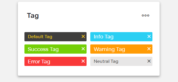
| type | Visual styling: default, info, success, warning, error, neutral |
| rules | Conditional formatting rules for text and appearance |
| showCloseButton | Shows a close “X” icon on the tag |
| paddingClass | Spacing around the tag via CSS classes |
| events | Configurable component events |
| ON_TAG_CLICK (Events) | Triggered when the tag is clicked |
| ON_INIT (Events) | Triggered when the component is initialized |
| ON_DESTROY (Events) | Triggered when the component is removed |
| visibilityPolicySetId | Policy set controlling visibility |
| displayConditions | Conditions to show or hide the component |
| id | Unique identifier for programmatic access |
| dataTestId | Testing hook ID for automated tests |
| enableAsHotspot | Enables guided tour hotspot |
| guidedTourHotSpotTitle | Guided tour hotspot title (translations supported) |
| guidedTourHotSpotDescription | Guided tour hotspot description (translations supported) |
Structure
(Configured in General Properties)
- displayName sets the display name of the component shown in the structure panel. For example, "Status Tag" allows for easy identification of the tag's purpose in the component structure.
(Configured in Visual Properties)
- rules configures conditional formatting rules that change the tag’s text and appearance based on context data.
(Configured in Visibility Properties)
- displayConditions defines conditions for displaying the component. This allows showing or hiding the tag based on complex rules involving form values, user roles, or application state.
Styling
(Configured in Visual Properties)
- titleTranslations sets the text displayed within the tag with support for multiple languages. For example, {"en-US": "Complete", "de-DE": "Abgeschlossen"} ensures proper localization.
- type determines the visual styling of the tag. Options include “default”, “info”, “success”, “warning”, “error”, or “neutral”.
- showCloseButton controls whether the tag displays a close icon. When true, the tag shows an “X” icon that can be clicked to trigger removal or dismissal actions.
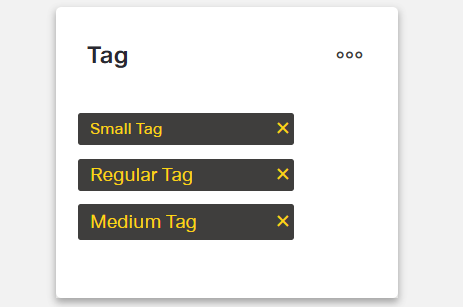
- paddingClass configures spacing around the tag using CSS classes. For example, "p-2" adds light padding on all sides.
Actions & Variants
(Configured in Event Actions Properties)
- events configures the events that the component can trigger and respond to:
- ON_TAG_CLICK is triggered when the tag is clicked. It can be used to trigger filtering, navigation, or other interactive behaviors based on the tag's value.
- ON_INIT is triggered when the tag component is initialized. It can be used to perform setup operations that need to happen when the tag first appears.
- ON_DESTROY is triggered when the tag component is removed from the DOM. Useful for cleanup operations and releasing resources.
Tests
(Configured in Testing Hooks Properties)
- id specifies a unique identifier for the component used for programmatic access. For example, "statusTag" enables targeted manipulation of this specific tag component.
- dataTestId sets the testing hook ID for automated testing. For example, setting it to "status-tag" allows test scripts to reliably locate this component during automated testing.
- enableAsHotspot enables the component as a guided tour hotspot. When enabled, the tag can be highlighted during onboarding or tutorial flows.
- guidedTourHotSpotTitle sets the title for the guided tour hotspot, supporting translations. For example, {"en-US": "Status Tag", "de-DE": "Status-Tag"} provides clear identification during guided tours.
- guidedTourHotSpotDescription sets the description for the guided tour hotspot, supporting translations. For example, {"en-US": "This tag shows the current status of the item", "de-DE": "Dieses Tag zeigt den aktuellen Status des Elements"} provides detailed context during guided tours.
Authorization
(Configured in Authorization Properties)
- visibilityPolicySetId determines the visibility of the component based on specified policy sets. For example, setting it to "confidentialContentPolicy" restricts the tag visibility to users with permissions to view potentially sensitive content classifications.
Link
- Figma: https://www.figma.com/design/yck1tcUXgdQ5aYX6iUAwrO/GE---Astronaut-Design-System?node-id=11613-41698&t=ftfrOGkPzlG2GaTo-1
- Live style guide: https://e1-dev.k8s.myapp.de/live-style-guide/id7/8-tag
Guidelines
Usage
- Use for short, categorical labels that communicate status or classification —
type,titleTranslations. - Show a dismiss control only when users can remove or clear the label —
showCloseButton,events.ON_TAG_CLICK.
Sizing & Layout
- Keep the label concise to avoid truncation and wrapping —
titleTranslations. - Adjust spacing to match surrounding density —
paddingClass.
States & Feedback
- Base variants:
default,info,success,warning,error,neutral—type.
Color & Contrast
- Convey meaning with semantic appearances, not ad-hoc colors.
- Avoid color-only meaning; pair the appearance with clear, localized text.
Data-Driven / Conditional Behavior
- Change text/appearance based on mutually exclusive conditions to avoid flicker —
rules. - Use visibility conditions for presence/absence; use rules for styling/text changes —
displayConditions,rules.
Visibility & Authorization
- Gate visibility by user policy —
visibilityPolicySetId. - Conditionally show/hide based on state —
displayConditions.
Content & Localization
- Provide localized, succinct labels —
titleTranslations. - If using guided tours, localize hotspot text —
enableAsHotspot,guidedTourHotSpotTitle,guidedTourHotSpotDescription. - Use a meaningful internal name for editors only —
displayName.
Dos & Don’ts
| Do | Don’t | Article setting(s) |
|---|---|---|
| Localize every visible label. | Ship English-only text. | titleTranslations |
Use semantic variants that match meaning (e.g., success, warning). | Encode meaning with arbitrary colors outside the component. | type |
| Show a close “X” only when the tag is removable. | Display a close icon that does nothing. | showCloseButton, events.ON_TAG_CLICK |
| Drive text/appearance from data rules. | Manually flip styles in multiple places. | rules, titleTranslations |
| Hide the tag entirely when a user must not see it. | Show a sensitive tag and rely only on wording. | visibilityPolicySetId |
| Show the tag only when prerequisites are met. | Keep it visible regardless of context. | displayConditions |
| Add or adjust spacing with the component’s padding setting. | Depend on external wrappers for spacing. | paddingClass |
| Localize guided-tour callouts if using hotspots. | Hard-code hotspot copy in one language. | enableAsHotspot, guidedTourHotSpotTitle, guidedTourHotSpotDescription |
Accessibility
- Provide clear, localized text so assistive tech announces meaningful labels —
titleTranslations.- Keep labels short and descriptive to minimize truncation/cognitive load.
- Communicate meaning with semantic appearance plus text (not color alone) —
type,titleTranslations.- Reflect status changes in both style and text via rules —
rules,titleTranslations.
- Reflect status changes in both style and text via rules —
- Hide content users must not access to reduce confusion —
visibilityPolicySetId,displayConditions.