Multi-Select
Overview
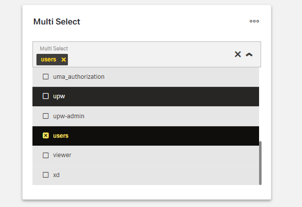
- The Multi-Select component is a form control that lets users choose multiple values from a dropdown list.
- It supports configuration for data sources, appearance, and behavior.
- It is useful when users need to select multiple items, such as tags, categories, or related elements.
- The component can handle large datasets through static lists or API integration.
Specs
Tokens
| Token | Description |
|---|---|
| placeholderTranslations | Placeholder text with localization support |
| hidden | Controls visibility of the component |
| saveInLocalStorage | Saves selected values in local storage |
| defaultValue | Sets initial selected values |
| readonly | Displays values without allowing changes |
| dataField | Field name used in form submission |
| useStaticData | Toggles between static list or dynamic source |
| emitObject | Emits full object instead of key value |
| staticData | Defines static options with value and text |
| dataSourcePath | Path in response where options are located |
| controlsRequestType | Specifies request data handling (BODY, HEADER, PATH) |
| dataSourceId | Data source ID for fetching dropdown options |
| getEntityCollectionHttpRequestParametersMap | Maps HTTP parameters for API requests |
| modelValue | Property used as the value in options |
| modelDisplayValue | Property used as display text in options |
| pageSize | Number of items per page when paginated |
| loadAll | Loads all options at once instead of paginating |
| validation | Configures validation rules |
| required | Requires at least one selection |
| authorizationDisable | Policy set controlling disabled state |
| events | Configurable component events |
| ON_INIT (Events) | Triggered when initialized |
| ON_DESTROY (Events) | Triggered when removed |
| ON_VALUE_CHANGE (Events) | Triggered when selection changes |
| ON_INIT_BASED_ON_USER_VIEW (Events) | Triggered when initialized in user view mode |
Structure
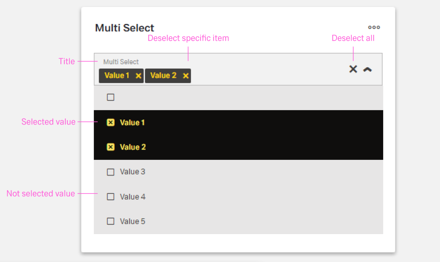
- Provides a dropdown field where users can select multiple options, with chosen items displayed inside the field.
- Supports both static lists defined in the configuration and external data sources for dynamic content.
(Configured in Visual Properties)
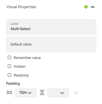
- saveInLocalStorage - Determines whether the component's selected values are preserved in local storage between sessions. When enabled, user selections persist between page reloads, improving user experience for complex forms that may take time to complete.
(Configured in Non-Visual Properties)
- dataField - Defines the field name that will be used when submitting form data. For example, setting to
"selectedCategories"ensures the selected values are submitted with this field name in the data object. - controlsRequestType - Specifies how the field data is sent in HTTP requests: 'BODY', 'HEADER', or 'PATH'. For example, setting to
"BODY"includes the field in the request body, which is standard for most form submissions.
Datasource
(Configured in Non-Visual Properties and Datasource)
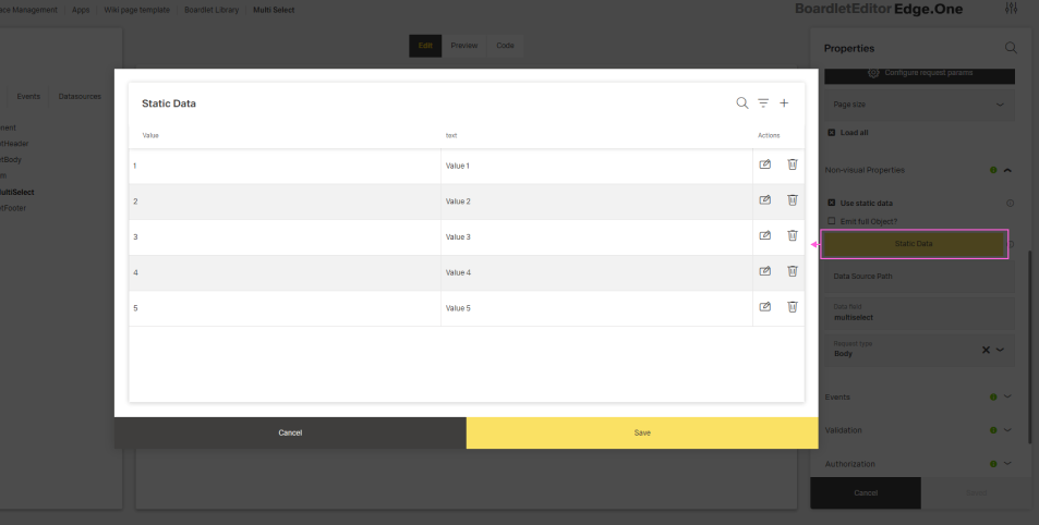
- useStaticData - Determines whether the dropdown options come from a static list defined in the component configuration or from a dynamic data source. When set to true, the component uses the staticData property instead of making API calls.
- staticData - Defines a static array of options to display in the dropdown when useStaticData is set to true. Each item should have a value and text property, for example:
[{"value": "cat1", "text": "Category 1"}, {"value": "cat2", "text": "Category 2"}].
- staticData - Defines a static array of options to display in the dropdown when useStaticData is set to true. Each item should have a value and text property, for example:
- dataSourceId - Specifies the data source ID for retrieving dropdown options. For example,
"api/categories"connects the component to the categories API endpoint. This property is used when useStaticData is false.- dataSourcePath - Specifies the path within the response data where the list of options is located. For example, setting to
"data.items"will extract the dropdown items from that location in the response structure.
- dataSourcePath - Specifies the path within the response data where the list of options is located. For example, setting to
- getEntityCollectionHttpRequestParametersMap - Configures HTTP parameters for data fetching. This object maps additional parameters needed for the API request, such as headers, query parameters, or path variables.
Display
(Configured in Non-Visual Properties and Datasource)
- emitObject - Controls whether the component emits the entire object or just the key value for each selected item. When set to true, the component will emit the complete object for each selected item, which is useful when additional properties besides the key value are needed.
- loadAll - Determines whether all available options should be loaded at once or paginated. When set to true, all options are loaded in a single request, which can be more efficient for smaller datasets.
- modelValue - Defines the property name in the data source items that should be used as the value for each option. For example, setting to
"id"means the component will use the"id"property from each item as the selectable value.- modelDisplayValue - Defines the property name in the data source items that should be displayed as the text for each option. For example, setting to
"name"means the component will show the"name"property from each item in the dropdown.
- modelDisplayValue - Defines the property name in the data source items that should be displayed as the text for each option. For example, setting to
Styling
(Configured in Visual Properties)
- placeholderTranslations - Sets the placeholder text displayed in the dropdown when no items are selected, with support for multiple languages. For example, setting this to
{"en-US": "Select categories", "de-DE": "Kategorien auswählen"}ensures proper localization of the placeholder text for different language settings. - defaultValue - Sets the initial values that will be used when the form is reset. For example, setting to
["category1", "category2"]would pre-select these values when the form initially loads or is reset.
(Configured in Datasource Properties)
- pageSize - Sets the number of items displayed per page in the dropdown. For example, setting to 10 will display 10 records per page when pagination is enabled, providing a balance between visibility and performance.
Actions & Variants
(Configured in Visual Properties)
- hidden - Controls whether the component is visible in the form. When set to true, the component remains in the form structure but is not displayed, which is useful for conditional rendering based on other field values or application states.
- readonly - Controls whether the selection can be changed by users. When set to true, the field displays the selected values but cannot be modified, which is useful for display-only scenarios or when values are determined programmatically.
(Configured in Events)
- events - Configures the events that the component can trigger and respond to:
- ON_INIT - Triggered when the component is initialized. Can be used to perform setup operations or initial state calculations.
- ON_DESTROY - Triggered when the component is removed from the DOM. Useful for cleanup operations and releasing resources.
- ON_VALUE_CHANGE - Triggered when the user changes the selected values. Can be used to perform immediate actions based on the selection, such as loading related data.
- ON_INIT_BASED_ON_USER_VIEW - Triggered specifically when the component initializes in user view mode rather than edit mode.
Authorization
(Configured in Authorization)
- authorizationDisable - Specifies a policy set that determines when the component should be disabled based on user permissions. For example, setting to
"readOnlyPolicy"will disable the dropdown for users who don't have edit permissions according to the specified policy.
Validation
(Configured in Validation)
- validation - Configures validation rules for the multi-select control, including:
- required - When set to true, at least one option must be selected before the form can be submitted. This ensures users make a selection when the information is essential.
Links
- Figma: https://www.figma.com/design/yck1tcUXgdQ5aYX6iUAwrO/GE---Astronaut-Design-System?node-id=14847-56066&t=ftfrOGkPzlG2GaTo-1
- Live style guide: https://e1-dev.k8s.myapp.de/live-style-guide/id3/3-dropdown/multi-combobox
Guidelines
(Technical Details Example)
{
  "content": [
    { "id": "1", "name": "Option 1" },
    { "id": "2", "name": "Option 2" }
  ],
  "totalElements": 100,
  "totalPages": 10,
  "number": 0,
  "size": 10,
  "first": true,
  "last": false,
  "empty": false
}
Usage
- Use Multi-Select when users must pick multiple values; prefill via
defaultValueand persist viasaveInLocalStorage. - Prefer dynamic data for long/volatile lists:
useStaticData: falsewithdataSourceId/dataSourcePath. UseuseStaticData: truewithstaticDatafor short, stable lists. - Map readable labels and stable IDs with
modelDisplayValue(label) andmodelValue(submitted value). - Make the field required only when necessary using
validation.required. - Tooltips may be used for added explanation but must stay concise and never carry essential information.
Sizing & Layout
- Keep lists scannable by tuning
pageSize; for small datasets, simplify withloadAll: true. - Maintain 24px spacing around form controls, and 8px spacing when fields are placed next to each other.
- Use sublines to separate input groups, with optional explanatory text below.
States & Feedback
- Present a non-editable summary with
readonly: true. - Initialize predictable selections with
defaultValue; react to edits usingevents.ON_VALUE_CHANGE. - Show validation errors inline with clear, actionable messages.
Visibility & Authorization
- Gate editability using
authorizationDisablewhen users may see but not change selections. - Remove the control entirely when inapplicable with
hidden: true.
Content & Localization
- Provide a concise, localized prompt using
placeholderTranslations. - For static lists, localize option
textvalues instaticData.
Dos & Don’ts
| Do | Don’t | Article setting(s) |
|---|---|---|
| Prefill common choices to speed completion. | Force users to reselect frequent values each visit. | defaultValue, saveInLocalStorage |
| Use dynamic data for long/volatile lists. | Hard-code large or frequently changing lists. | useStaticData: false, dataSourceId, dataSourcePath |
| Expose readable labels and stable IDs. | Display raw IDs or ambiguous labels. | modelDisplayValue, modelValue |
| Require only when truly needed. | Mark every Multi-Select as required. | validation.required |
| Tune list length for scanability. | Dump hundreds of items on one page. | pageSize, loadAll |
| Emit full objects when downstream logic needs attributes. | Add extra requests to rehydrate selected IDs. | emitObject: true |
| Disable for permission gaps; show selected values. | Hide controls users expect to see with missing feedback. | authorizationDisable, readonly |
| Hide the control when it must not appear. | Show a control that isn’t applicable and hope it’s ignored. | hidden: true |
| Localize the empty prompt. | Leave an English-only placeholder. | placeholderTranslations |
| Wire dependent updates to changes. | Rely on manual refresh after selection. | events.ON_VALUE_CHANGE |
| Clean up on teardown. | Leave subscriptions or requests hanging. | events.ON_DESTROY |
| Align submission location with backend. | Always send values in the body regardless of API contract. | controlsRequestType, dataField |
Accessibility
- Labels must be short (1–2 words) and never include colons.
- Provide help text below the form title for guidance; it must always remain visible.
- Provide a localized, descriptive empty-state prompt via
placeholderTranslations. - Ensure understandable options with
modelDisplayValue(human-readable label) and stable submissions withmodelValue. - Use
readonlyto clearly communicate non-editable state without misleading interaction affordances. - Avoid color-only meaning; rely on clear labels surfaced through
modelDisplayValue. - Keep option text concise and specific to reduce navigation effort in large lists (complemented by
pageSize/loadAllconfiguration handled in Guidelines).
Datasource & Payload Mapping
The Multi Select expects an array of objects, where each object represents a selectable option.
Each object should include:
- a unique identifier used as the submitted value (
modelValue) - a human-readable label displayed in the dropdown (
modelDisplayValue)
Example datasource:
[
    { "userId": 1, "name": "Alice" },
    { "userId": 2, "name": "Bob" }
]
Example mapping configuration:
{
    "dataField": "selectedUsers",
    "modelValue": "userId",
    "modelDisplayValue": "name"
}
When users select options, the component submits an array of values resolved from the property configured in modelValue.
Example submitted payload:
{
    "selectedUsers": [1, 2]
}
Payload structure:
{
    "<dataField>": ["<modelValue1>", "<modelValue2>"]
}
Where:
dataFielddefines the property name used in the request payloadmodelValue1,modelValue2are values extracted using themodelValuemapping
When emitObject is enabled, the component submits the full selected objects instead of only the mapped values.
Example payload with emitObject: true:
{
    "selectedUsers": [
        { "userId": 1, "name": "Alice" },
        { "userId": 2, "name": "Bob" }
    ]
}
This allows backend integrations to receive either lightweight identifier arrays or complete object representations depending on application requirements.