Inline Notification
Overview
- The component shows short messages inline within the page.
- Its style is set by tokens: choose a type (Warning, Success, System, or Error), provide the text, toggle the close button, and set padding with CSS utility classes.
- Visibility is controlled by display conditions or by policy sets for user roles.
- It emits events on initialization and when the close button is pressed.
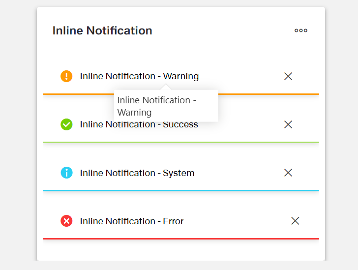
- Image (Types & Close Button): Show the four types side by side; for each type, include one with the close button and one without.

Specs
Tokens
| Token | Short description |
|---|---|
| displayName | Display name shown in the structure panel. |
| displayConditions | Rules for when the component is shown. |
| type | Notification style: Warning, Success, System, or Error. |
| text | Message text displayed in the notification. |
| hideCloseButton | Shows or hides the close (✕) button. |
| paddingClass | Internal spacing via CSS utility class (e.g., p-4). |
| events | Events the component can fire or handle. |
| ON_INIT (Events) | Fires when the component initializes. |
| ON_INLINE_NOTIFICATION_CLOSE_CLICK (Events) | Fires when the close button is clicked. |
| visibilityPolicySetId | Controls visibility via a policy set (e.g., admin-only). |
| id | Unique identifier for testing or code access. |
| dataTestId | Stable test hook for automated tests. |
| enableAsHotspot | Enables use as a guided tour hotspot. |
Structure
(Configured in General Properties)
- displayName – Sets the display name of the component shown in the structure panel. For example, "Notification success" allows for easy identification of the inline notifications's purpose in the component structure.
(Configured in Visibility)
- displayConditions — Defines conditions for displaying the component based on context values or expressions.
Styling
(Configured in Visual Properties)
- type - The type of notification, determining its visual style. Possible types are Warning, Success, System, and Error.
- text - The text content that will be displayed in the notification.
- hideCloseButton - This token configures wether the close button is displayed or hidden.

(Configured in Layout)
- paddingClass – Configures internal spacing around the tab panel using CSS class naming. For example, "p-4" adds medium padding on all sides, while "pt-2 pb-4" adds small padding at the top and larger padding at the bottom.
Actions & Variants
(Configured in Events)
- events – Configures the events that the component can trigger and respond to.
- ON_INIT – Triggered when the vertical tab panel component is initialized. Can be used to perform setup operations like loading initial data.
- ON_INLINE_NOTIFICATION_CLOSE_CLICK - Triggers when the close button is clicked.
Authorization
(Configured in Visual Properties)
- visibilityPolicySetId – Determines the visibility of the component based on policy sets. For example, setting to "adminOnlyPolicy" ensures the tab panel only appears for users with admin privileges.
Tests
(Configured in Testing Hooks)
- id – Specifies a unique identifier for the component, useful for programmatic access in testing or custom code.
- dataTestId — Sets the testing hook ID for automated testing. For example, setting it to featured-products-collection allows test scripts to reliably locate this component.
- enableAsHotspot — Enables the component as a guided tour hotspot. When enabled, the card collection can be highlighted during guided tours of your application.
Links
- Figma: https://www.figma.com/design/yck1tcUXgdQ5aYX6iUAwrO/GE---Astronaut-Design-System?node-id=11563-253110&t=ExcQFUXKvr1QdxTm-1
- Live style guide: https://e1-dev.k8s.myapp.de/live-style-guide/id4/5-inline-notification
Guidelines
Usage
- Use the component for short, inline status messages; select the semantic style with
typeto convey intent:Error(blocking problems),Warning(caution),Success(confirmation),System(neutral info). - Keep messages concise and specific; write the actionable point in the first sentence via
text. - Make critical or blocking messages persistent by hiding the dismiss control (
hideCloseButton: true). - Allow users to dismiss low-severity or informational messages (
hideCloseButton: false), and handle the click withON_INLINE_NOTIFICATION_CLOSE_CLICK. - Show the notification only when relevant using
displayConditions(e.g., after a failed save).
Sizing & Layout
- Control internal spacing using
paddingClass(e.g.,p-4for comfortable reading). - Prefer a single line or two short lines of
text; avoid long paragraphs to prevent layout strain. - Use a meaningful
displayNameso authors can identify the instance quickly in the structure panel.
States & Feedback
- Configure dismissible vs. persistent states with
hideCloseButton(false = dismissible, true = persistent). - Trigger setup logic (e.g., compute
displayConditions) onON_INIT.
Visibility & Authorization
- Restrict who can see sensitive messages using
visibilityPolicySetId(e.g., admin-only system notes). - Combine
visibilityPolicySetIdwithdisplayConditionsso authorized users see the message only when it applies.
Content & Localization
- Write plain, direct copy in
text; include the severity keyword when it improves clarity (e.g., “Error: Cannot save draft”). - Keep
textself-contained (no dependence on external tooltips or wrappers).
Dos & Don’ts
| Do | Don’t | Article setting(s) |
|---|---|---|
Choose the semantic type that matches the message (e.g., Error for failures). | Use Success styling for problems or Error for neutral info. | type, text |
| Keep the message short and actionable. | Write multi-paragraph blocks in the notification. | text |
| Make blocking errors persistent by hiding the close button. | Let users dismiss critical errors. | hideCloseButton, type |
| Allow dismissal for non-critical notices and handle the event. | Force users to live with low-value notices or ignore the click event. | hideCloseButton, events.ON_INLINE_NOTIFICATION_CLOSE_CLICK |
| Show only when conditions are met. | Display the notification at all times. | displayConditions |
| Restrict sensitive notices to allowed roles. | Expose internal/system notices to all users. | visibilityPolicySetId |
| Provide comfortable spacing for readability. | Let text touch edges or feel cramped. | paddingClass |
| Name the instance clearly for authors. | Leave a generic default name. | displayName |
| Use hotspot sparingly to teach context during tours. | Depend on the hotspot to convey critical instructions. | enableAsHotspot, text |
Accessibility
- Avoid color-only meaning: explicitly state severity and next step in
text(e.g., “Error: Check your connection and retry.”). Usestext,type. - If you make a message persistent (
hideCloseButton: true), indicate persistence intext(e.g., “Fix errors to continue”). UseshideCloseButton,text. - Keep one notification visible per condition set to reduce cognitive load; enforce via mutually exclusive
displayConditions. UsesdisplayConditions. - Front-load keywords in
text(e.g., start with “Error:” or “Success:”) so assistive tech users get context immediately. Usestext. - Avoid embedding interactive instructions that the component cannot provide (no inline links/controls); keep the message purely textual via
text. - Use comfortable spacing for readability only if not already set in your layout; adjust with
paddingClasswhen needed.