Dashboard Navigation
Overview
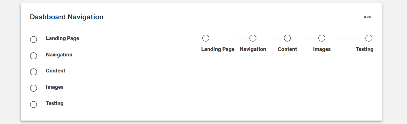
- The component provides a visual interface for switching between dashboards.
- It supports horizontal or vertical navigation layouts.
- The current dashboard is highlighted to guide users.
- Users can move between dashboards without returning to the library.
Specs
Tokens
| Token | Description |
|---|---|
| displayName | Display name of the component shown in the structure panel. |
| direction | Orientation of the navigation steps, horizontal or vertical. |
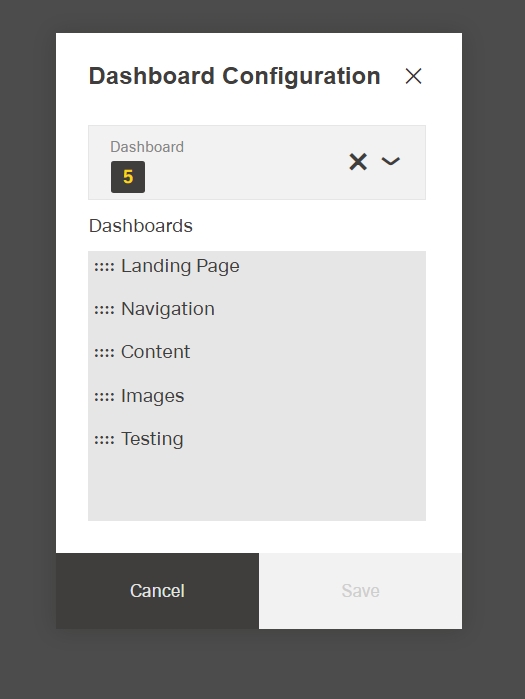
| dashboards | List of dashboards to include and their order. |
| paddingClass | CSS spacing classes applied around the component. |
| events | Configures events the component can trigger or respond to. |
| ON_INIT (Events) | Triggered when the component is initialized. |
| ON_DESTROY (Events) | Triggered when the component is removed from the DOM. |
| visibilityPolicySetId | Determines visibility based on policy sets. |
| displayConditions | Defines conditions for displaying the component. |
| dataTestId | Testing hook ID for automated testing. |
| enableAsHotspot | Enables the component as a guided tour hotspot. |
| guidedTourHotSpotTitle | Title for the guided tour hotspot, supports translations. |
| guidedTourHotSpotDescription | Description for the guided tour hotspot, supports translations. |
Structure
- The navigation is composed of an array of dashboard objects.
(Configured in Visibility Properties)
- displayConditions – Defines conditions for displaying the component. This allows showing or hiding the dashboard navigation based on complex rules involving form values, user roles, or application state. For example, the navigation might only be shown when a specific module is active or when the user has completed certain preliminary steps.
(Configured in Visual Properties)
- dashboards – Configures the list of dashboards to include in the navigation and their order. This accepts an array of dashboard objects, each containing an ID and name. For example,
[{"id": "dashboard-1", "name": "Overview"}, {"id": "dashboard-2", "name": "Details"}]creates a two-step navigation between these dashboards, with the names displayed as the navigation labels.
Styling
(Configured in Visual Properties)
- direction – Determines the orientation of the dashboard navigation steps. Options include "horizontal" (steps displayed in a row) or "vertical" (steps displayed in a column). For example, choosing "horizontal" creates a navigation bar that spans across the top of a container, while "vertical" creates a navigation panel that runs down the side, providing different layout options based on available space and design preferences.
- paddingClass – Configures spacing around the dashboard navigation using CSS classes. For example,
"p-4"adds medium padding on all sides of the component, improving its visual spacing within its parent container.

Actions & Variants
(Configured in Event Actions Properties)
- events – Configures the events that the component can trigger and respond to.
- ON_INIT – Triggered when the dashboard navigation component is initialized. Can be used to perform setup operations when the navigation first appears, such as loading user preferences or determining the starting dashboard.
- ON_DESTROY – Triggered when the dashboard navigation component is removed from the DOM. Useful for cleanup operations and releasing resources.
Tests
(Configured in Testing Hooks Properties)
- dataTestId – Sets the testing hook ID for automated testing. For example, setting it to
"production-dashboards-navigation"allows test scripts to reliably locate this component during automated testing. - enableAsHotspot – Enables the component as a guided tour hotspot. When enabled, the dashboard navigation can be highlighted during onboarding or tutorial flows to guide users on how to navigate between different dashboard views.
- guidedTourHotSpotTitle – Sets the title for the guided tour hotspot, supporting translations. For example,
{"en-US": "Dashboard Navigation", "de-DE": "Dashboard-Navigation"}provides clear identification during guided tours. - guidedTourHotSpotDescription – Sets the description for the guided tour hotspot, supporting translations. For example,
{"en-US": "Use this navigation bar to switch between different dashboard views", "de-DE": "Verwenden Sie diese Navigationsleiste, um zwischen verschiedenen Dashboard-Ansichten zu wechseln"}provides detailed context during guided tours.
Authorization
(Configured in Authorization Properties)
- visibilityPolicySetId – Determines the visibility of the component based on specified policy sets. For example, setting to
"analyticsDashboardsAccess"restricts the dashboard navigation to users with specific analytics permissions, allowing for role-based control of navigation access.
Links
- Figma: https://www.figma.com/design/yck1tcUXgdQ5aYX6iUAwrO/GE---Astronaut-Design-System?node-id=11746-27071&t=iosNC2AkSTGs5lMh-1
- Live style guide: https://e1-dev.k8s.myapp.de/help-and-resources/3_ui-components/feedback/progress_bar.html#guidelines
Guidelines
General Guidelines
- Local navigation is only needed when dashboards require elements such as nodes, dependencies, favorites, or subdashboards. Simple applications do not require it:contentReference[oaicite:0]{index=0}.
- The dashboard navigation boardlet must always remain the same in form and appearance within a breakpoint; it may not be changed:contentReference[oaicite:1]{index=1}.
- Local navigation always controls only the current dashboard and can vary from dashboard to dashboard:contentReference[oaicite:2]{index=2}.
- Local navigation tasks include navigating between dashboard nodes, filtering dependencies, and accessing subdashboards:contentReference[oaicite:3]{index=3}.
Usage
- Use the component to switch between a defined set of dashboards; specify the list and order via
dashboardsso users can move between views without returning to the library. - Match the navigation orientation to the available space by setting
directionto"horizontal"for row-based navigation or"vertical"for column-based navigation. - If onboarding is needed, make the control discoverable by enabling the hotspot and supplying localized helper copy with
enableAsHotspot,guidedTourHotSpotTitle, andguidedTourHotSpotDescription.
Sizing & Layout
- Choose
direction: "horizontal"when there are few items and scanning should be left-to-right; choose"vertical"when items are numerous or labels are longer. - Add outer breathing room using
paddingClassto prevent the control from touching adjacent UI.
Visibility & Authorization
- Gate visibility for roles or policy sets with
visibilityPolicySetIdto avoid exposing navigation to users who shouldn’t access those dashboards. - Use
displayConditionsto hide the navigation in steps of a flow where it should not be available.
Paired Do & Don’t
| Do | Don’t | Article setting(s) |
|---|---|---|
| Define all destinations and their order once during initialization to keep navigation stable. | Reorder items unpredictably during usage. | dashboards, events.ON_INIT |
| Combine conditional rules into a single, mutually exclusive predicate to prevent flicker. | Use overlapping displayConditions that rapidly toggle visibility. | displayConditions |
Accessibility
- Announce the current location clearly through unambiguous
dashboards[].namelabels so the built-in highlight is understandable in both orientations. - Avoid color-only meaning by ensuring each destination has a distinct, descriptive label in
dashboards[].name. - Present the control only when actionable by configuring
visibilityPolicySetIdanddisplayConditions.