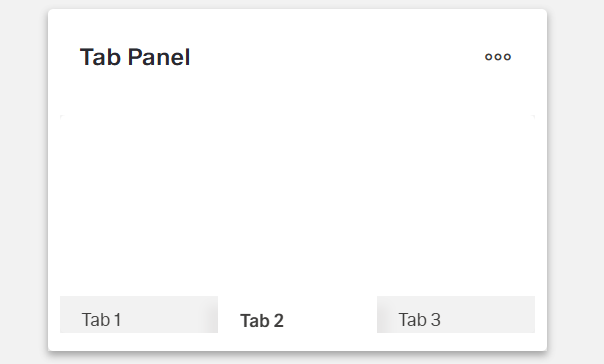
Tab panel
Overview
- The tab panel organizes content into multiple tabs on a single page.
- It lets users switch between different views without leaving the page.
- It provides an intuitive way to group related content while saving screen real estate.
- Each tab is a
DynamicTabComponentwith its own content.
Specs
Tokens
| Token | Description |
|---|---|
| displayName | Display name in structure panel |
| elements | Tabs contained in the panel |
| paddingClass | Internal spacing via CSS classes |
| visibilityPolicySetId | Visibility based on policy set |
| layout | Child arrangement: vertical or horizontal |
| events | Configurable component events |
| ON_INIT (Events) | Fired on initialization |
| ON_DESTROY (Events) | Fired on component removal |
| setActiveTab | Method to activate a tab |
Structure
(Configured in General Properties)
- displayName — Sets the display name of the component shown in the structure panel. For example, "ProductDetailsTabs" allows for easy identification of the tab panel's purpose in the component structure.
(Configured in Visual Properties)
- elements — Defines the tabs contained within this panel. This array contains DynamicTabComponent objects that represent individual tabs with their own content. Each tab needs at minimum a tabNameTranslations property and can contain nested components.
- layout — Determines how child elements are arranged within the tab panel. Options include "vertical" or "horizontal". For example, "vertical" stacks elements within each tab vertically.
(Configured in Visibility)
- visibilityPolicySetId — Determines the visibility of the component based on policy sets. For example, setting to "adminOnlyPolicy" ensures the tab panel only appears for users with admin privileges.
Styling
(Configured in Visual Properties)
- paddingClass — Configures internal spacing around the tab panel using CSS class naming. For example, "p-4" adds medium padding on all sides, while "pt-2 pb-4" adds small padding at the top and larger padding at the bottom.
Actions & Variants
(Configured in Events)
- events — Configures the events that the component can trigger and respond to:
- ON_INIT — Triggered when the tab panel component is initialized. Can be used to perform setup operations like loading initial data.
- ON_DESTROY — Triggered when the tab panel component is removed from the DOM. Useful for cleanup operations when navigating away from a page.
(Configured in Component Methods)
- setActiveTab — Programmatically activates a specific tab by its ID. This action accepts a parameter with the key of the tab to activate. For example, calling
setActiveTabwith{"key":"detailsTabId"}will switch to the tab with that ID.
Links
- Figma: tba
- Live style guide: https://e1-dev.k8s.myapp.de/live-style-guide/other-components/tab-panel
Guidelines
Usage
- Group related views into switchable tabs by adding each view as an entry in
elements(each entry is a DynamicTabComponent). - Set an author-friendly internal name with
displayName(e.g., “ProductDetailsTabs”). - Hide the entire panel for restricted audiences using
visibilityPolicySetId.
Sizing & Layout
- Add internal spacing with
paddingClass. - Arrange content within each tab using
layout: "vertical"for stacked flows or"horizontal"for side-by-side items. - Keep the number of tabs focused by curating
elements. - Order tabs by importance by arranging the
elementsarray accordingly.
States & Feedback
- Select or change the active tab programmatically via
setActiveTab.
Visibility & Authorization
- Show or hide the entire tab panel using
visibilityPolicySetId.
Content & Localization
- Provide user-facing tab labels via each tab’s
tabNameTranslationsinsideelements. - Keep labels short and scannable; reserve
displayNamefor authoring only.
Dos & Don’st
| Do | Don’t | Article setting(s) |
|---|---|---|
| Keep tab labels short and localized. | Use long sentences or English-only labels. | elements (per-tab tabNameTranslations) |
| Add only necessary tabs and split topics clearly. | Stuff unrelated content into one tab. | elements |
| Order tabs by importance/task flow. | Leave tabs in arbitrary creation order. | elements |
| Add internal spacing for readability. | Let content touch the panel edges. | paddingClass |
Arrange tab content with layout for readability. | Force dense side-by-side layouts for long text. | layout |
| Gate the entire panel by audience. | Show the panel and rely on empty/disabled inner content. | visibilityPolicySetId |
| Clean up on removal. | Leave timers/listeners running after navigation. | events.ON_DESTROY |
Accessibility
- Localize tab labels using each tab’s
tabNameTranslationsinsideelements.- Keep
tabNameTranslationsshort, plain-language, and avoid emoji-only labels. - Ensure all tabs include
tabNameTranslationsfor every supported locale.
- Keep
- Improve reading comfort using
paddingClassand an appropriatelayout. - Remove ineligible content from view by gating the panel with
visibilityPolicySetId.