Image Point Viewer
Overview
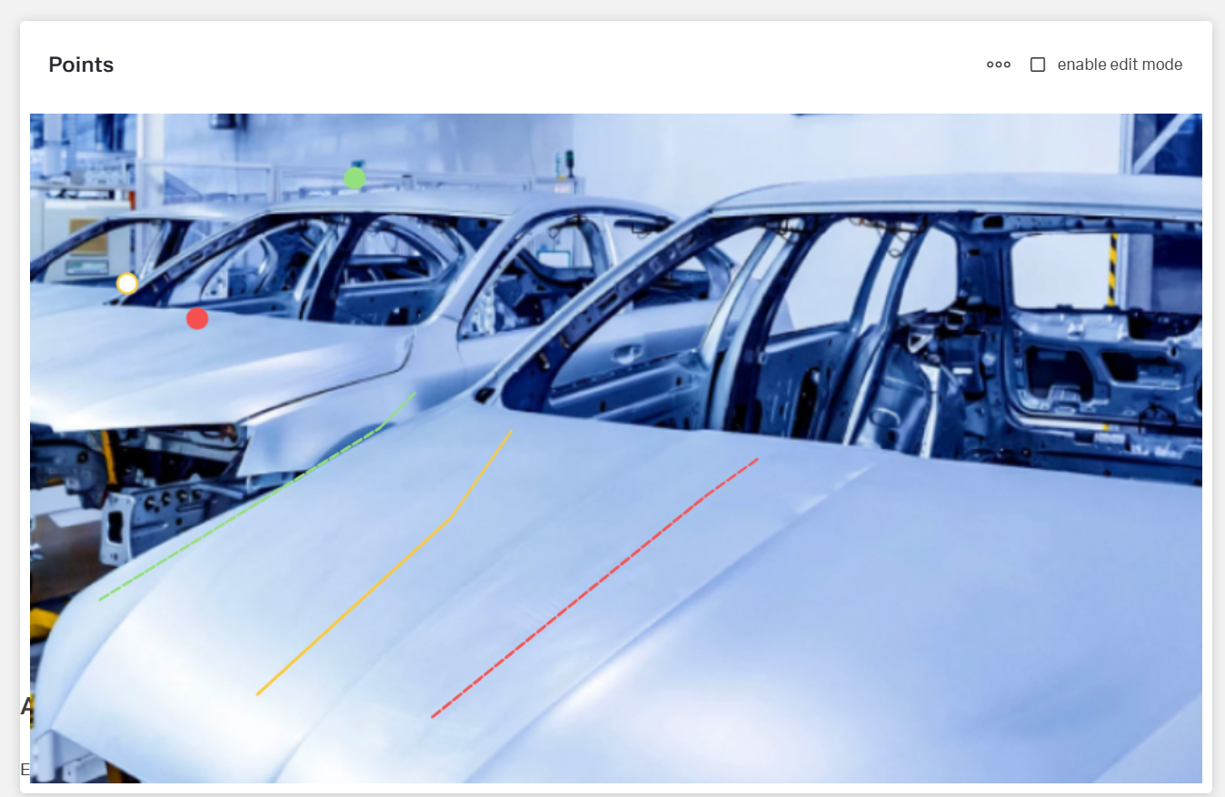
- The Dynamic Image Point Viewer displays an image with interactive points overlaid.
- It allows users to view and interact with specific locations on an image.
- Points can change appearance based on data values.
- It is suited for interactive maps, facility diagrams, or process visualizations.
- The component supports dynamic data sources for images and points.
Specs
Tokens
| Token | Description |
|---|---|
| displayName | Display name shown in the structure panel |
| imageUrl | URL of the image displayed in the viewer |
| resizeImageStrategy | Strategy for resizing image |
| fitToContainer | Scales the image to fit the container |
| useStaticSize | Uses specified width and height values |
| fillWholeContent | Fills the entire container, may crop |
| useRealSize | Displays the image at actual size |
| width | Fixed width when using static size strategy |
| widthAuto | Automatically adjusts width to content |
| height | Fixed height when using static size strategy |
| heightAuto | Automatically adjusts height to content |
| disableScrollbar | Controls visibility of scrollbars |
| paddingClass | Adds spacing around the image viewer |
| thresholdConfig | Conditional styling rules for points |
| imageDataSourceId | Data source ID for retrieving the image |
| getImageHttpRequestParametersMap | HTTP parameters for image fetching |
| pointsDataSourceId | Data source ID for retrieving points |
| getPointsHttpRequestParametersMap | HTTP parameters for points fetching |
| positionXFieldName | Field name for X coordinate |
| positionYFieldName | Field name for Y coordinate |
| keyFieldName | Field name for unique point identifier |
| displayFieldName | Field name for tooltip display text |
| events | Configurable events the component can trigger |
| ON_IMAGE_POINT_CLICK (Events) | Event when a point is clicked |
| ON_IMAGE_CLICK (Events) | Event when the image is clicked |
| ON_IMAGE_POINT_DRAG_ENDED (Events) | Event when a point drag ends |
| ON_IMAGE_POINT_VIEWER_CONTEXT_MENU_ACTION (Events) | Event when a context menu action is selected |
| ON_GLOBAL_PARAMETERS_CHANGE (Events) | Event when global parameters change |
| ON_INIT (Events) | Event when the component is initialized |
| ON_DESTROY (Events) | Event when the component is destroyed |
| contextMenuLabel | Text label for context menu actions |
| visibilityPolicySetId | Policy set ID controlling visibility |
| displayConditions | Rules for showing or hiding the component |
| dataTestId | Identifier for automated testing |
| enableAsHotspot | Enables guided tour hotspot |
| guidedTourHotSpotTitle | Title for guided tour hotspot |
| guidedTourHotSpotDescription | Description for guided tour hotspot |
Structure
- Renders a base image as the canvas and overlays viewer points; each viewer point combines spatial coordinates, a unique key, and a display label sourced from datasource fields.
- Retrieves the base image and viewer points from dedicated datasources.
(Configured in General Properties)
- displayName – Sets the display name of the component shown in the structure panel. For example,
"Warehouse Floor Map"allows for easy identification of the component's purpose in the component structure, making it easier for developers to locate and work with this specific image viewer.
(Configured in Visual Properties)
- imageUrl – Sets the URL of the image to be displayed in the viewer. For example,
"https://example.com/floorplans/warehouse-a.jpg"provides the base image on which points will be overlaid. This property can also accept relative URLs to images stored within your application. - disableScrollbar – Controls whether scrollbars appear when the image is larger than its container. When set to true, scrollbars are hidden even if the image exceeds its container size, which can provide a cleaner appearance but may limit access to parts of the image.
(Configured in Visibility)
- displayConditions – Defines conditions for displaying the component. This allows showing or hiding the image viewer based on complex rules involving form values, user roles, or application state. For example, the image viewer might only be shown when a specific building is selected.
Datasource
(Configured in Datasource)
- imageDataSourceId – Specifies the data source ID for retrieving the image. For example,
"api/images/floorplans"connects to an API endpoint that returns image data, allowing dynamic loading of images from a server.- getImageHttpRequestParametersMap – Configures HTTP parameters for image fetching. This object maps additional parameters needed for the image request, such as
{"buildingId": "${context.selectedBuilding}"}to load the image for a specific building.
- getImageHttpRequestParametersMap – Configures HTTP parameters for image fetching. This object maps additional parameters needed for the image request, such as
- pointsDataSourceId – Specifies the data source ID for retrieving points to overlay on the image. For example,
"api/safety-sensors/status"would connect to an API that returns data about safety sensor locations and their statuses.- getPointsHttpRequestParametersMap – Configures HTTP parameters for points data fetching. This object maps additional parameters needed for the points data request, such as
{"floorId": "${context.selectedFloorId}"}to load points for a specific floor.
- getPointsHttpRequestParametersMap – Configures HTTP parameters for points data fetching. This object maps additional parameters needed for the points data request, such as
Data Allocation
(Configured in Datasource)
- positionXFieldName – Specifies the field name in the data source that contains the X coordinate for each point. For example,
"locationX"tells the component which field in the data represents the horizontal position of each point on the image. - positionYFieldName – Specifies the field name in the data source that contains the Y coordinate for each point. For example,
"locationY"tells the component which field in the data represents the vertical position of each point on the image. - keyFieldName – Specifies the field name that uniquely identifies each point. For example,
"sensorId"helps the component track individual points and associate them with data records. - displayFieldName – Specifies the field name that contains the display text for each point's tooltip. For example,
"sensorName"determines what text is shown when users hover over a point.

Styling
(Configured in Visual Properties)
- width – Sets the width of the image when using
"useStaticSize"strategy. For example,"800px"sets a fixed width for the image viewer. This property accepts any valid CSS size value including pixels, percentages, or other units.- widthAuto – Controls whether the component width automatically adjusts to its content. When set to true, the component will take only as much width as needed; when false, it follows fixed width settings based on the container or specified values.
- height – Sets the height of the image when using
"useStaticSize"strategy. For example,"600px"sets a fixed height for the image viewer. This property accepts any valid CSS size value including pixels, percentages, or other units.- heightAuto – Controls whether the component height automatically adjusts to its content. When set to true, the component height is determined by its content; when false, it follows fixed height settings based on the container or specified values.
- paddingClass – Configures spacing around the image viewer using CSS classes. For example,
"p-3"adds medium padding on all sides of the component, improving its visual spacing within its container. - thresholdConfig – Configures conditional styling rules that change the color of points based on data values. For example, you can configure rules that render points as green when a status is
"normal", yellow for"warning", and red for"critical", providing at-a-glance status information.
Actions & Variants
(Configured in Events)
- events – Configures the events that the component can trigger and respond to:
- ON_IMAGE_POINT_CLICK (Events) – Triggered when a specific point on the image is clicked. Can be used to show detail panels or trigger actions related to the clicked point.
- ON_IMAGE_CLICK (Events) – Triggered when the image itself (not a point) is clicked. Can be used to capture coordinates for new points or to close detail panels.
- ON_IMAGE_POINT_DRAG_ENDED (Events) – Triggered when a point is dragged to a new position (when editing is enabled). Can be used to save new point coordinates.
- ON_IMAGE_POINT_VIEWER_CONTEXT_MENU_ACTION (Events) – Triggered when a context menu item is selected. Can be used to execute specific actions on points.
- ON_GLOBAL_PARAMETERS_CHANGE (Events) – Triggered when global parameters affecting the points viewer change.
- ON_INIT (Events) – Triggered when the component is initialized. Can be used to perform setup operations.
- ON_DESTROY (Events) – Triggered when the component is removed from the DOM. Useful for cleanup operations.
- contextMenuLabel – Sets the text for context menu actions that appear when right-clicking on points. For example,
"Edit Sensor"would create a context menu option for editing point properties.
(Configured in Visual Properties)
- resizeImageStrategy – Determines how the image should be sized within its container. Options include:
- fitToContainer – Scales image to fit container while maintaining aspect ratio.
- useStaticSize – Uses specified width and height.
- fillWholeContent – Fills entire container, may crop image.
- useRealSize – Displays image at its actual size.
Tests
(Configured in Testing Hooks)
- dataTestId – Sets the testing hook ID for automated testing. For example, setting it to
"warehouse-safety-map"allows test scripts to reliably locate this component during automated testing. - enableAsHotspot – Enables the component as a guided tour hotspot. When enabled, the image viewer can be highlighted during onboarding or tutorial flows to explain important visualization features to users.
- guidedTourHotSpotTitle – Sets the title for the guided tour hotspot, supporting translations. For example,
{"en-US": "Warehouse Safety Map", "de-DE": "Lagerhaus-Sicherheitskarte"}provides clear identification during guided tours. - guidedTourHotSpotDescription – Sets the description for the guided tour hotspot, supporting translations. For example,
{"en-US": "This map shows real-time safety sensor data", "de-DE": "Diese Karte zeigt Echtzeitdaten der Sicherheitssensoren"}provides detailed context during guided tours.
Authorization
(Configured in Authorization)
- visibilityPolicySetId – Determines the visibility of the component based on specified policy sets. For example, setting to
"safetyMonitoringAccess"restricts the image viewer to users with specific safety monitoring permissions, allowing for role-based display of sensitive information.
Links
- Figma:
- Live style guide: https://e1-dev.k8s.myapp.de/live-style-guide/other-components/image-point-viewer
Guidelines
Usage
- Present an image with interactive points by binding the image and point sources and mapping fields:
imageUrlorimageDataSourceId(+getImageHttpRequestParametersMap),pointsDataSourceId(+getPointsHttpRequestParametersMap),positionXFieldName,positionYFieldName,keyFieldName,displayFieldName. - Gate availability with
displayConditionsandvisibilityPolicySetId. - Expose test and onboarding affordances via
dataTestId,enableAsHotspot,guidedTourHotSpotTitle,guidedTourHotSpotDescription.
Sizing & Layout
- Choose scaling with
resizeImageStrategy:fitToContainer,fillWholeContent,useStaticSize(width,height,widthAuto,heightAuto), oruseRealSize. - Control scroll affordances with
disableScrollbar. - Add outer spacing with
paddingClass.
Color & Contrast
- Set point colors through
thresholdConfigand ensure readability against the image; pair color with text fromdisplayFieldName.
Tooltips
- Keep hover text concise and recognizable by pointing
displayFieldNameto an appropriate label field.
Visibility & Authorization
- Conditionally render via
displayConditions. - Apply role-based visibility using
visibilityPolicySetId.
Content & Localization
- Localize guided tour copy with
guidedTourHotSpotTitle,guidedTourHotSpotDescription; enable withenableAsHotspot. - Use
displayNamefor authoring clarity in the structure panel.
Dos & Don’ts
| Do | Don’t | Article setting(s) |
|---|---|---|
| Bind both image and points from datasources so overlays match current data. | Mix a hardcoded image with dynamic points from another source. | imageDataSourceId, getImageHttpRequestParametersMap, pointsDataSourceId, getPointsHttpRequestParametersMap |
| Map coordinates and identity explicitly. | Assume default field names. | positionXFieldName, positionYFieldName, keyFieldName |
| Use exclusive rules for visual states. | Overlap thresholds that cause flicker. | thresholdConfig |
| Keep hover text short and clear. | Cram long descriptions into hover. | displayFieldName |
| Capture add-point coordinates on image click. | Infer coordinates from unrelated UI. | ON_IMAGE_CLICK |
| Persist edited positions when drag ends. | Leave position changes uncommitted. | ON_IMAGE_POINT_DRAG_ENDED |
| Offer explicit per-point actions. | Overload single-click with many meanings. | contextMenuLabel, ON_IMAGE_POINT_VIEWER_CONTEXT_MENU_ACTION |
| Choose a predictable sizing mode. | Stretch/crop unpredictably. | resizeImageStrategy, width, height, widthAuto, heightAuto |
| Hide the viewer until prerequisites are met. | Show an empty/misleading canvas. | displayConditions |
| Restrict sensitive imagery to authorized users. | Expose restricted maps to all users. | visibilityPolicySetId |
| Expose a stable automation hook. | Use brittle DOM selectors. | dataTestId |
| Localize onboarding copy. | Ship a single-language tour. | enableAsHotspot, guidedTourHotSpotTitle, guidedTourHotSpotDescription |
Accessibility
- Provide recognizable per-point text:
displayFieldName. Keep the hover labels brief and specific. - Pair color with text to avoid color-only meaning:
thresholdConfig+displayFieldName. - Reduce cognitive load by hiding non-applicable/restricted views:
displayConditions,visibilityPolicySetId. - Localize tour copy when hotspots are enabled:
enableAsHotspot,guidedTourHotSpotTitle,guidedTourHotSpotDescription. - Ensure high contrast for threshold-driven colors configured in
thresholdConfig. - Prefer
fitToContainerwhen dense markers require readability; usepaddingClassto prevent edge crowding. - Guarantee unique point identity for stable updates:
keyFieldName.
Datasource Requirements
Points Data Structure
The Points Data Source should return an array of objects, where each object represents a point on the image.
[
  {
    "<positionXFieldName>": <x_coordinate>,
    "<positionYFieldName>": <y_coordinate>,
    "<keyFieldName>": <unique_identifier>,
    "<displayFieldName>": <display_text>
    // Additional fields for thresholds if needed
  }
]
Field Descriptions
X Coordinate Field (specified by positionXFieldName)
Contains the horizontal position of the point on the image. Numeric value representing the X coordinate.Y Coordinate Field (specified by positionYFieldName)
Contains the vertical position of the point on the image. Numeric value representing the Y coordinate.Key Field (specified by keyFieldName)
Contains a unique identifier for the point. Used for tracking and identifying points. Can be a string or number.Display Field (specified by displayFieldName)
Contains the text to display when hovering over the point. Usually a descriptive name or label.Additional Fields
Can include thresholds or custom data for event handlers.
[
  {
    "xPos": 100,
    "yPos": 150,
    "pointId": "point1",
    "label": "Control Valve",
    "status": "normal",
    "temperature": 72
  },
  {
    "xPos": 250,
    "yPos": 200,
    "pointId": "point2",
    "label": "Pressure Gauge",
    "status": "warning",
    "temperature": 95
  },
  {
    "xPos": 400,
    "yPos": 300,
    "pointId": "point3",
    "label": "Flow Meter",
    "status": "critical",
    "temperature": 120
  }
]
Nested Properties Support
The component supports accessing nested properties using dot notation.
[
  {
    "metadata": {
      "position": {
        "x": 100,
        "y": 150
      }
    },
    "id": "point1",
    "details": {
      "name": "Control Valve"
    }
  }
]- positionXFieldName =
"metadata.position.x" - positionYFieldName =
"metadata.position.y" - keyFieldName =
"id" - displayFieldName =
"details.name"