Table View
The Table View page layout provides a structured way to present and work with complex, column-based data in a consistent and scalable format. It supports both column-based filtering directly within the table and optional filtering through a dedicated search bar. The pattern also enables editing and creation of rows and table columns, while ensuring that available actions match the user’s role and access rights. In addition, the Table View allows users to move from the dashboard to related tables or connected dashboards to continue their workflow.
Usage
A Table View layout is used when work depends on scanning and selecting items from a large dataset, especially when each item must be compared across multiple attributes. It supports fast scanning and selection across many attributes. It also allows data management tasks such as sorting, filtering, adding, editing, and deleting items.
When to Use This Page Layout
- Working with large datasets where users need to process many items in one session and cannot rely on browsing cards one by one.
- Selecting items based on multiple attributes when side-by-side comparison is required.
- Data management workflows that depend on sorting, filtering, and search to narrow down results and find the right records quickly.
- Auditing and quality checks when users must validate data completeness and correctness, identify outliers, and fix issues efficiently through structured columns and repeatable actions.
- Managing a dataset when the primary task is maintaining data quality and structure through actions such as adding new entries, editing existing fields, and deleting outdated or incorrect records.
When Not to Use This Page Layout
- Small datasets where a table adds unnecessary structure and a simpler layout (cards or a short list) is easier to scan.
- Visual-first content where understanding depends on previews, images, or rich layouts that do not fit well into rows and columns.
- In depth single-item work where users spend most of the time reading details, reviewing context, or completing a form for one object.
- Time-based monitoring of trends where the primary need is to see how values change over time and interpret patterns or movement.
- Mobile-first contexts where a dense table layout becomes hard to use and a simplified list or card layout is more reliable.
Limitations & Considerations
- Column overload reduces clarity — Too many columns make scanning difficult. Tables need column prioritization, sensible defaults, and optional/expandable columns rather than showing everything at once.
- Responsive behavior must be defined — On smaller screens, tables can break down. Define rules for column hiding, horizontal scrolling, stacked row layouts, or switching to a simplified list.
- Bulk actions increase risk — Multi-select and batch actions make destructive mistakes easier. Selection states must be obvious, destructive actions should require confirmation, and undo should be offered where feasible.
- Inline editing can cause errors — Editing inside cells is fast but easier to misclick or miss validation. Define when inline edit is allowed and when editing should move to a dedicated detail form.
- Performance matters — Large tables can be slow to load and render. Consider pagination, and use loading/empty/error states that preserve context and guide next actions.
Anatomy
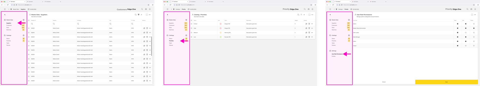
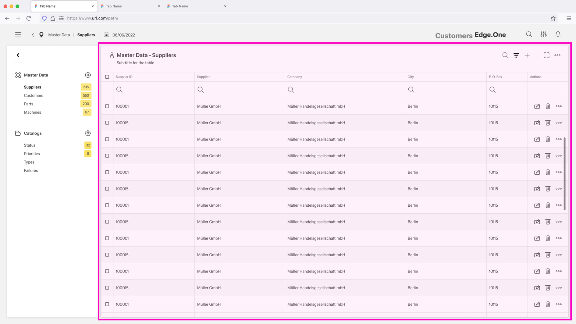
The Table View page layout has two main sections: the Navigation Boardlet and the Table.
Optional sections such as Filter Bar and Footerbar Actions can be added for advanced filtering or editing-focused workflows.
Navigation Boardlet
The Navigation Boardlet sits on the left side of the dashboard and acts as a secondary navigation panel for localized navigation. It contains links to other tables or dashboards related to the current view. These links can be grouped into meaningful categories. The Navigation Boardlet should stay consistent across these related pages to keep orientation stable.
For more information, see Navigation Boardlet.
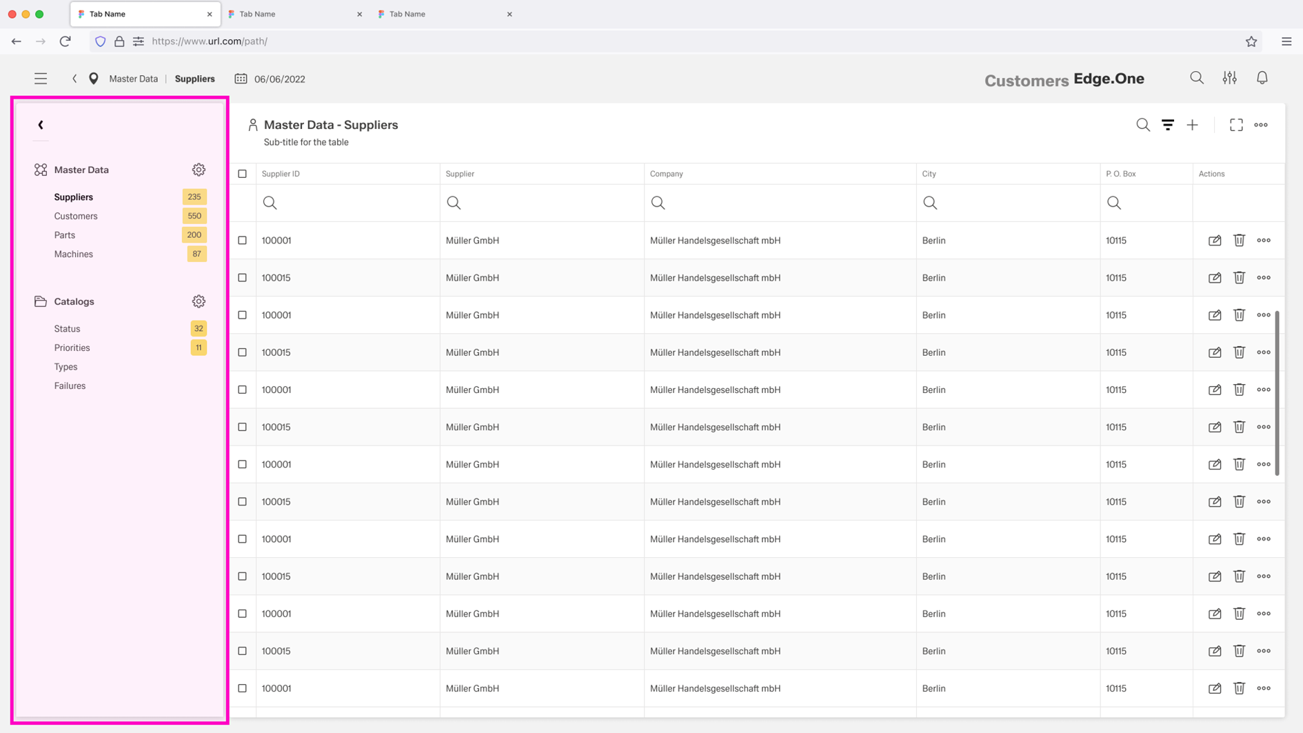
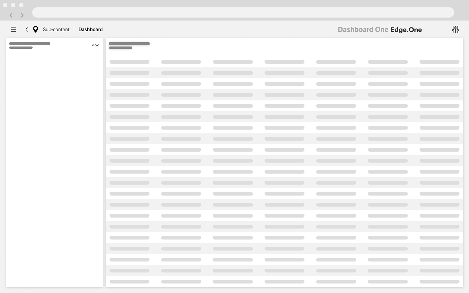
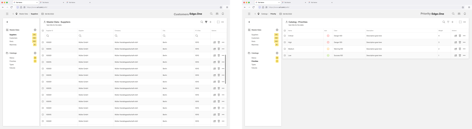
Table
The Table is the main area of the screen and shows multiple items across a set of columns. It uses the table component. Visible columns can be predefined, and a column chooser may allow users to add or remove columns. Each column is individually searchable to support fast narrowing and comparison. Actions such as adding, editing, or deleting items can be available depending on user permissions.
Filter Bar (Optional)
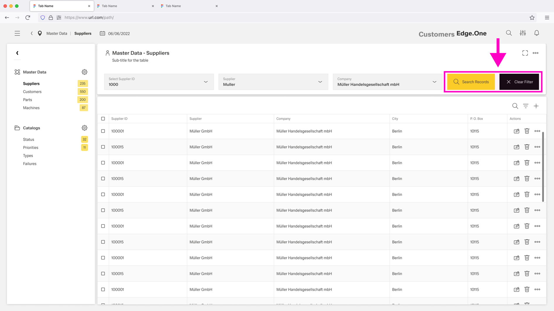
The Filter Bar is placed in a separate boardlet above the table but connected to the data of the table. It is used when filtering across multiple categories is required. It can include dropdowns, toggle switches, or icon buttons. Filters are applied manually using a search button, and a reset action clears all filters and returns to the default view.
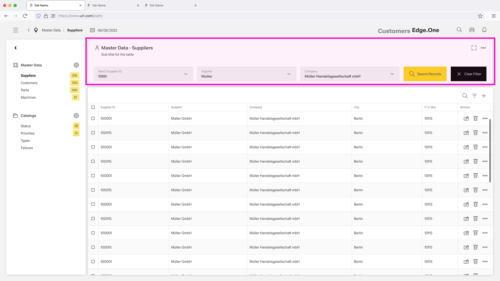
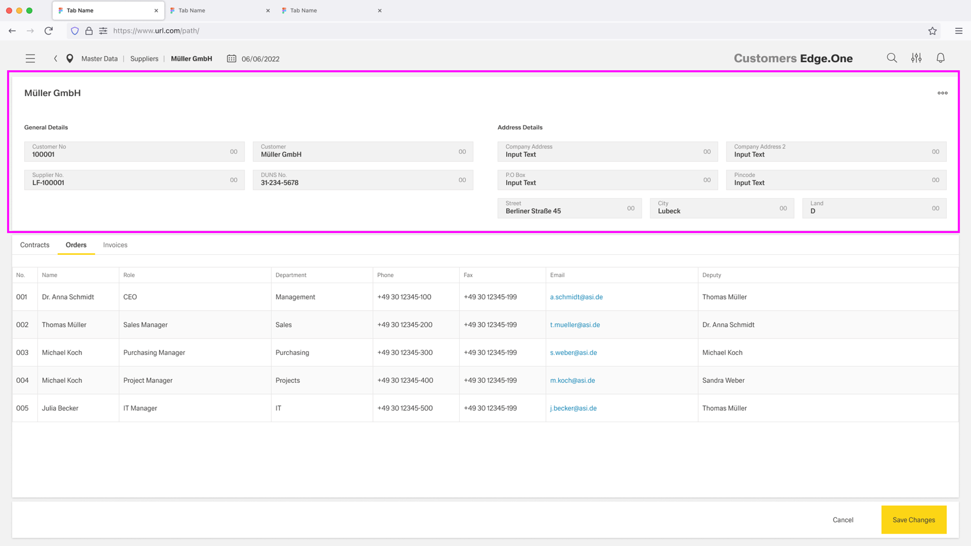
Table Meta Data (Optional)
Table metadata is placed in a separate boardlet above the table. It usually spans two rows to improve readability. When a filter bar is present, the metadata boardlet and the filter bar are placed next to each other.
The metadata contains information related to the table, such as a description or creation time. This information does not directly impact the data displayed in the table.
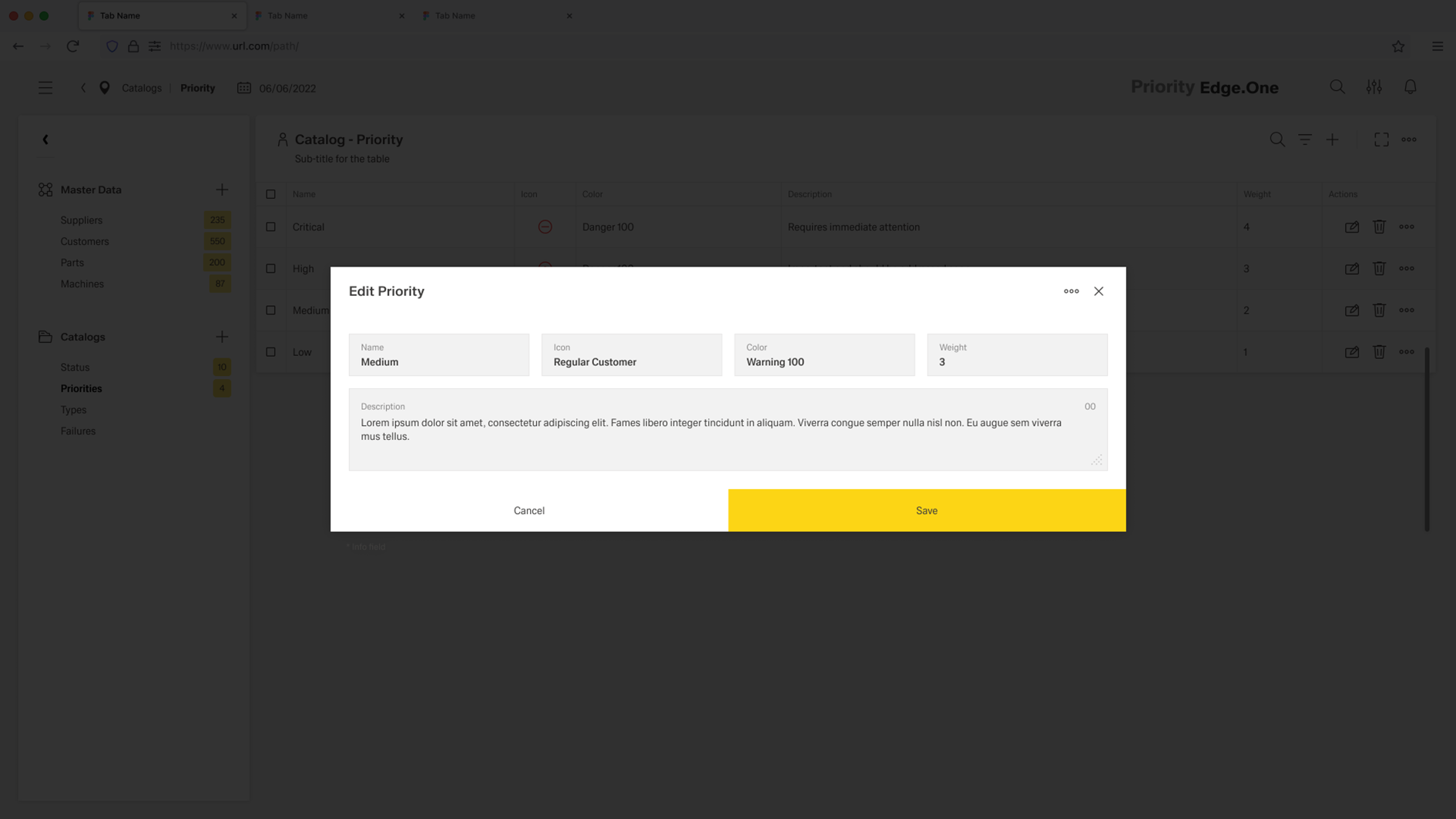
Optionally, the metadata can be editable. In this case, it is shown as prefilled input fields containing the current information. Editable metadata is usually accompanied by Footerbar Actions that allow users to save or discard their changes.
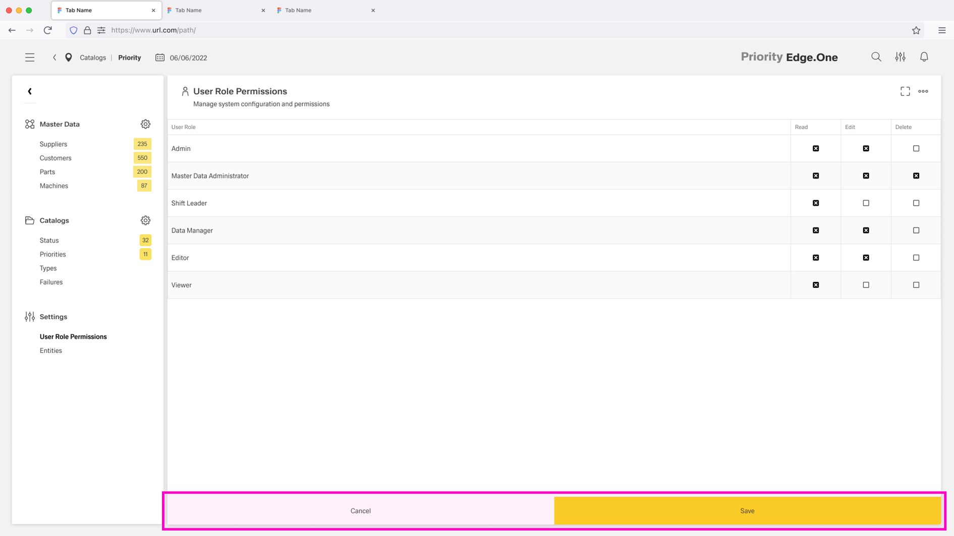
Footerbar Actions (Optional)
Footerbar Actions are used when the table is primarily edited, such as settings-style tables. The footerbar sits at the bottom of the table boardlet. It provides a clear action pair with a ghost action Cancel and a primary action Save.
Behavior and Interaction
The Table View page layout is built for repeatable work on large datasets. Interactions focus on moving between related screens, narrowing results through filtering, and performing common row actions like editing, adding, and deleting in a consistent way.
Navigating
Navigation between related tables or connected dashboards is handled through the Navigation Boardlet. Selecting an entry switches the main content to the chosen table or screen while keeping the navigation area stable, supporting quick movement within a localized workflow.
Filtering
Filtering happens in two layers.
- Column filters are used for quick search within a single column and support fast narrowing of results.
- The optional Filter Bar is used for more complex filtering across the table and can combine any number of filter options to refine the result set.
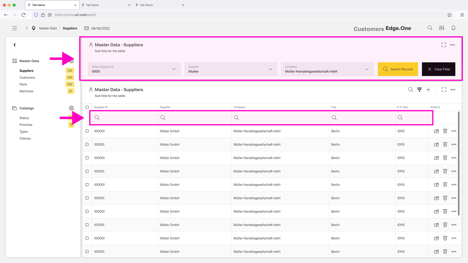
Active filters should remain visible and easy to reset to return to the default view.
Editing
Editing is initiated through a row action. Inline editing is used for low-risk changes where quick adjustments are needed and validation is straightforward. For high-risk changes or complex inputs, editing is handled through a dialog (or dedicated edit surface) to provide additional context, stronger validation, and clearer confirmation.
Adding
Adding new items is handled through a separate flow, typically on a different dashboard or dedicated screen. This flow can be multi-step when creation requires more input than the table can reasonably support, and it should return users to the table view once creation is complete.
Deleting
Deleting items is initiated through a row action. Deletion should always include a warning message and require confirmation before the item is removed.
Guidelines
The Table View page layout should optimize for efficient scanning and comparison, which requires a clear default column set that matches the primary user tasks. Columns should be chosen for decision-making first, while secondary attributes are moved to optional columns, details views, or progressive disclosure.
Filtering
Filtering should be purposeful and readable. Active filters and sorts should always be visible, and returning to a default state should be easy.
The Filter Bar should include a "Reset" and "Filter" for maual application of complex filters.
Actions
Actions should be aligned with user roles and permissions. Only actions that are valid for the current user and current selection should be available. Destructive actions should require confirmation and should offer undo where feasible.
Editing
Editing should follow a clear rule set. Inline editing should be limited to safe, low-risk fields and supported by validation and clear error messaging. Fields that require context, complex input, or multi-step logic should route to a dedicated detail view or form dialog.
Navigation Boardlet
The Navigation Boardlet should remain consistent across related pages, keep the active destination visible, and avoid unexpected resets of user context unless a destination view requires it.