Ruler
Overview
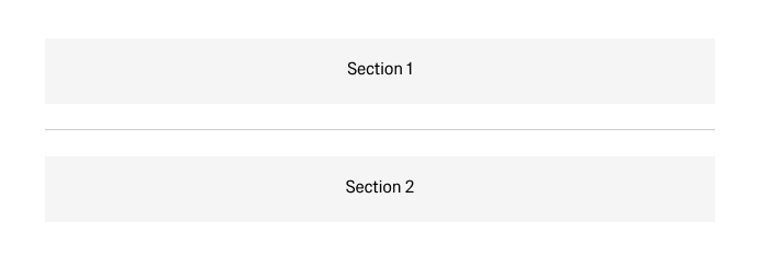
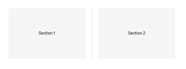
- The Ruler component is a thin visual divider line used to separate distinct sections of content within a layout.
- Comes in two orientations: Horizontal Ruler (
ADK / Horizontal Ruler) for row-based separation, and Vertical Ruler (ADK / Vertical Ruler) for column-based separation. - Renders as a 1 px line styled with the design system's
#Rulertheme token (Theme 30), ensuring consistent color across light and dark themes. - Use in boardlets and panels to group logically distinct content, improve scanning in dense layouts, and provide visual hierarchy when spacing alone is insufficient.
Specs
Tokens
| Token | Description |
|---|---|
| orientation | Controls whether the ruler renders as a horizontal or vertical line. Accepted values: "horizontal" / "vertical". |
| color | Line color driven by the #Ruler design token (Theme 30). Should not be overridden manually. |
| thickness | Line stroke thickness. Fixed at 1px per design spec. |
| length | Extent of the r along its primary axis. Defaults to 100% of available container space. |
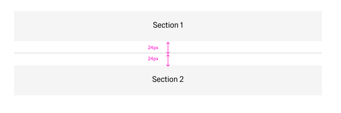
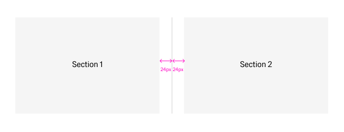
| paddingClass | CSS spacing classes applied around the ruler to enforce the required 24 px clearance on both sides. |
| displayName | Display name shown in the structure panel for identification. |
| visibilityPolicySetId | Determines visibility of the ruler based on authorization policy sets. |
| displayConditions | Conditions under which the ruler is rendered in the layout. |
| dataTestId | Testing hook identifier for automated testing. |
| enableAsHotspot | Enables the ruler as a guided tour hotspot anchor. |
| guidedTourHotSpotTitle | Title for the guided tour hotspot (supports i18n). |
| guidedTourHotSpotDescription | Description for the guided tour hotspot (supports i18n). |
| ON_INIT (Events) | Triggered when the Ruler component is initialized. |
| ON_DESTROY (Events) | Triggered when the Ruler component is removed from the DOM. |
Sizing
| Property | Values | Default |
|---|---|---|
| Thickness | 1px (fixed) | 1px |
| Length / Height (horizontal) | Any valid CSS length or 100% | 100% of container |
| Height / Length (vertical) | Any valid CSS length or auto | Varies by content height |
| Spacing (both sides) | Fixed at 24px per design spec | 24px |
Structure
- Ruler line — The single 1 px rendered line, horizontal or vertical, styled via the
#Rulertheme token. - Spacing region — The 24 px clearance zone applied on both sides of the ruler line via
paddingClass. - Container slot — The parent layout region (boardlet, panel, or frame) within which the ruler is placed and from which it derives its length.
(Configured in General Properties)
- displayName — Sets the display name shown in the structure panel. For example,
"Section Divider"helps identify the ruler's role within a complex boardlet layout.
(Configured in Visual Properties)
- orientation — Switches between
"horizontal"and"vertical"rendering. For example, set to"vertical"to divide two side-by-side content columns within a row layout. - length — Controls how far the ruler extends along its primary axis. For example, setting to
"50%"creates a centered half-width divider for subtle visual breaks. - paddingClass — Applies spacing on both sides of the ruler. For example,
"py-6"(vertical padding of 24 px) enforces the required clearance for a horizontal ruler.
(Configured in Non-Visual Properties)
- displayConditions — Determines when the ruler renders. For example,
{"showWhen": "hasMultipleSections"}hides the divider in single-section views where it adds no value.
Styling
(Configured in Visual Properties)
- color — Driven by the
#Rulerdesign token (Theme 30). Do not override manually; let the theme token govern the color so both light and dark themes render correctly. - thickness — Fixed at
1px. Deviation from this value breaks the visual consistency of the design system. - paddingClass — Enforces the required 24 px clearance. For example,
"px-6"applies horizontal margin on each side of a vertical ruler.
Actions & Variants
(Configured in Event Actions Properties)
- events — Configures lifecycle callbacks for the component:
- ON_INIT — Triggered when the ruler is initialized. Use to run setup logic if the ruler's visibility or length depends on dynamic data.
- ON_DESTROY — Triggered when the ruler is removed from the DOM. Use for cleanup when the surrounding layout section is conditionally unmounted.
Orientation variants:
- ADK / Horizontal Ruler — Standard horizontal line, full container width, used between stacked content rows.
- ADK / Vertical Ruler — Vertical line, height matches surrounding content, used between side-by-side columns.
Authorization
(Configured in Authorization Properties)
- visibilityPolicySetId — Determines the visibility of the ruler based on specified policy sets. For example, setting to
"internalOnlyPolicy"hides the divider and the content section it separates from external users.
Tests
(Configured in Testing Hooks Properties)
- dataTestId — Sets the testing hook ID for automated testing. For example, setting to
"section-divider-ruler"allows test scripts to assert the ruler is present between expected content blocks. - enableAsHotspot — Enables the ruler as a guided tour hotspot anchor. When enabled, the ruler can serve as the position anchor for an onboarding tooltip pointing to an adjacent section.
- guidedTourHotSpotTitle — Sets the title for the guided tour hotspot, supporting translations. For example,
{"en-US": "Section Boundary", "de-DE": "Abschnittsgrenze"}. - guidedTourHotSpotDescription — Sets the description for the guided tour hotspot, supporting translations.
Links
- Figma: GE Astronaut Design System — Ruler (ID 7.12)
- Live style guide:
Guidelines
Usage & Content
- Use a Horizontal Ruler inside a boardlet when separating clearly distinct content sections that cannot be differentiated by spacing alone; set
paddingClassto apply the required 24 px clearance on both sides. - Use a Vertical Ruler when separating two side-by-side content columns within a row layout; set
orientationto"vertical"and ensure its height matches or stretches to the tallest adjacent column. - Apply rulers when multiple logical groups exist within one boardlet, when content topics change clearly, or when visual hierarchy cannot be achieved with spacing alone.
- Prefer rulers over decorative borders or background fills; the Ruler component ensures theme-consistent color via the
#Rulertoken and avoids hard-coded color values. - Use
displayConditionsto suppress the ruler in contexts where the content below it is hidden or the boardlet contains only a single section.
Sizing & Layout
- Always maintain a minimum of 24 px spacing on both sides of the ruler; configure this with
paddingClass(e.g.,"py-6"for horizontal,"px-6"for vertical). - Allow length to default to
100%of the container in most cases; only set an explicit length when deliberately creating a partial divider for decorative sub-grouping. - Do not adjust
thicknessbeyond the default1px; thicker rulers violate design system conventions and create unintended visual weight. - When using a Vertical Ruler, ensure the parent container uses a flex or grid row layout so the ruler stretches correctly to match the tallest sibling.
States & Feedback
- The Ruler is a purely structural, non-interactive element — it has no hover, focus, active, or disabled states of its own.
- Use
displayConditionsorvisibilityPolicySetIdto conditionally show or hide the ruler rather than toggling opacity or visibility manually. - If the content section below a ruler becomes conditionally hidden, hide the ruler alongside it to avoid orphaned dividers in the layout.
Visibility & Authorization
- Gate visibility for role-restricted sections with
visibilityPolicySetId; the ruler should be hidden whenever the content it divides is also hidden. - Use
displayConditionsto hide the ruler in single-section or simplified views where dividers add visual noise without aiding comprehension.
Dos & Don'ts
| Do | Don't |
|---|---|
| Use rulers to separate clearly distinct content sections within boardlets where spacing alone is insufficient. | Use rulers when spacing already provides sufficient separation — unnecessary rulers create clutter. |
Apply 24 px clearance on both sides via paddingClass to keep the ruler from crowding adjacent content. | Place rulers directly against content with no surrounding space; cramped dividers look unintentional. |
Let the #Ruler theme token govern color so the line adapts correctly to both light and dark themes. | Hard-code a hex color on the ruler; it will break in the opposite theme and bypass the design token system. |
Hide the ruler alongside its adjacent content section using displayConditions when that section is conditionally removed. | Leave a ruler visible when the content it separates has been hidden — orphaned dividers confuse layout hierarchy. |
| Use rulers only in boardlets and panels with multiple logical groups or distinct topic changes. | Use rulers in small or simple containers where a card border or panel grouping already provides clear visual separation. |
Accessibility
- The Ruler renders as a presentational element (
<hr>or an equivalent ARIA-hidden line); it does not convey semantic meaning to screen readers and should not be relied upon as the sole structural cue for content groupings. - Pair the Ruler with semantic heading hierarchy or ARIA landmark regions so that assistive technology users can navigate section boundaries without depending on a visual divider.
- Do not use color alone to communicate grouping; ensure the content sections separated by the ruler also have distinct headings or labels that are legible in text form.
- Ensure the 24 px spacing enforced by
paddingClassis preserved on all screen sizes to maintain touch-friendly clearance and visual breathing room around the ruler. - Use
dataTestIdto expose the ruler to automated accessibility audits, enabling checks that verify dividers are not orphaned when adjacent content is conditionally hidden. - In guided tour flows, provide meaningful
guidedTourHotSpotTitleandguidedTourHotSpotDescriptionvalues in all supported locales so the hotspot is announced correctly to screen reader users navigating the tour.