Gantt Chart
Overview
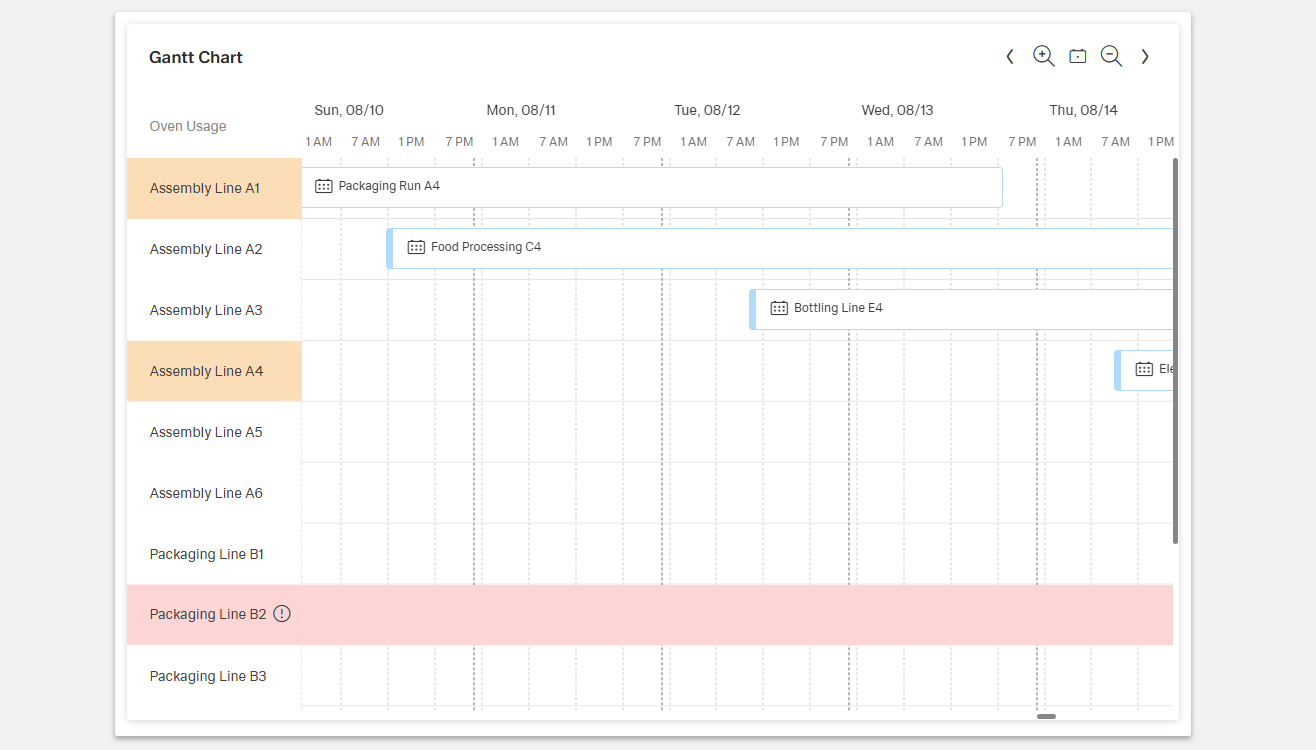
- The Dynamic Gantt Chart component provides a visual timeline of tasks, events, or activities.
- It is designed for project management, scheduling, and resource allocation visualization.
- Users can see how activities are distributed over time and across resources.
- The chart highlights task durations, start and end dates, and dependencies.
Specs
Tokens
| Token | Description |
|---|---|
| displayName | Display name of the component shown in the structure panel |
| titleTranslation | Title text above the Gantt chart with multi-language support |
| globalEventColor | Default color used for events |
| globalEventIconName | Default icon displayed with events |
| resourceColumnCaptionTranslation | Header text for the resource column with translations |
| resourceColumnFieldExpression | Data field for displaying resource names |
| resourceColumnAutoWidth | Adjusts resource column width automatically |
| resourceColumnWidth | Fixed width in pixels for resource column |
| eventNameExpression | Data field for event names |
| eventResourceIdExpression | Data field for linking events to resources |
| eventStartDateExpression | Data field for event start date |
| eventEndDateExpression | Data field for event end date |
| currentTimeLineEnabled | Displays a line for current time in the chart |
| currentTimeLineUpdateIntervalInMs | Interval in milliseconds to update current time line |
| relativeTimeViewEnabled | Enables relative time frames for chart view |
| relateTimeView | Defines which relative time frame to use |
| dynamicTimeView | Enables automatic updates of the time view |
| paddingClass | Configures spacing around the chart with CSS classes |
| useMockData | Enables sample mock data for development |
| getResourcesDataSourceId | Data source ID for fetching resource data |
| getResourcesSourceHttpRequestParametersMap | HTTP request parameters for resource data |
| getEventsDataSourceId | Data source ID for fetching event data |
| getEventsDataSourceHttpRequestParametersMap | HTTP request parameters for event data |
| events | Configurable component events |
| ON_GLOBAL_PARAMETERS_CHANGE (Events) | Event triggered when global parameters change |
| ON_INIT (Events) | Event triggered when the component is initialized |
| ON_DIALOG_DATA_SUBMIT (Events) | Event triggered when dialog data is submitted |
| ON_DESTROY (Events) | Event triggered when the component is removed |
| id | Unique identifier for the component |
| dataTestId | Testing hook ID for automated testing |
| enableAsHotspot | Enables component as a guided tour hotspot |
| guidedTourHotSpotTitle | Title for guided tour hotspot (supports translations) |
| guidedTourHotSpotDescription | Description for guided tour hotspot (supports translations) |
Structure
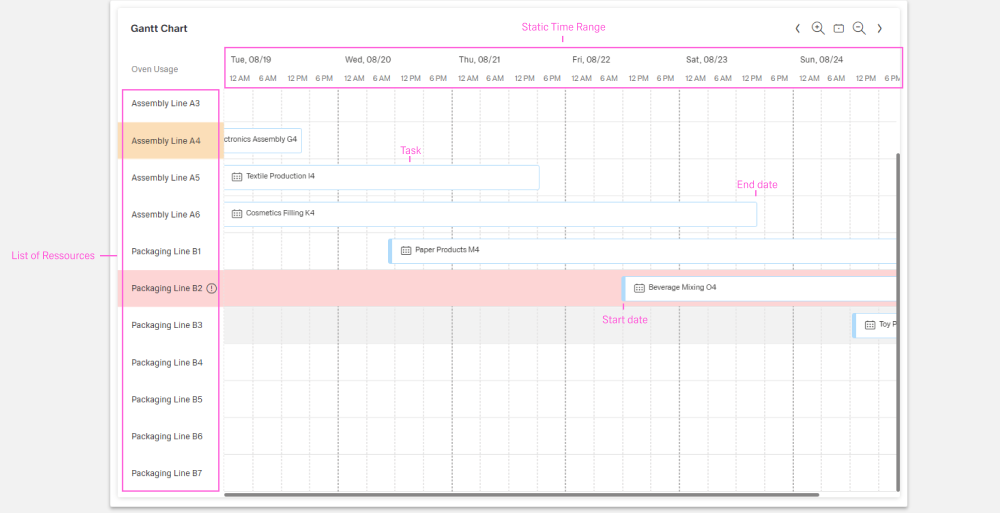
- The left-hand column lists resources with configurable captions and widths.
- The timeline on the right shows tasks as colored bars, spanning their start and end dates.
- Tasks are aligned with their assigned resources.
- The view supports absolute and relative ranges (e.g., today, this week, this month).
Datasource
(Configured in Datasource)
- useMockData – Determines whether the component should use sample mock data instead of fetching from an API. When enabled during development, the chart displays realistic sample data without requiring backend connections.
- getResourcesDataSourceId – Specifies the data source ID for retrieving resource data. For example,
"api/resources"connects the chart to a backend endpoint that provides resource information.- getResourcesSourceHttpRequestParametersMap – Configures HTTP request parameters for fetching resource data. This allows for customization of the resource data request, such as filtering for specific resource types.
- getEventsDataSourceId – Specifies the data source ID for retrieving event data. For example,
"api/tasks"connects the chart to a backend endpoint that provides task or event information.- getEventsDataSourceHttpRequestParametersMap – Configures HTTP request parameters for fetching event data. This allows for customization of the event data request, such as filtering for a specific time period.
Data Configuration
(Configured in Data Configuration)
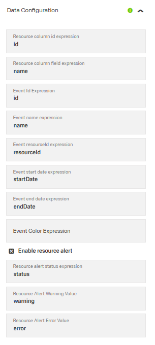
- resourceColumnFieldExpression – Specifies which data field to use for displaying resource names. For example,
"fullName"would display the full name of each resource. - eventNameExpression – Defines which data field to use for event names. For example,
"taskName"would display the task name for each event in the chart. - eventResourceIdExpression – Specifies which data field contains the resource ID for each event. For example,
"assignedToId"would link events to resources based on this field. - eventStartDateExpression – Determines which data field contains the start date for each event. For example,
"plannedStartDate"would use the planned start date for positioning events. - eventEndDateExpression – Specifies which data field contains the end date for each event. For example,
"plannedEndDate"would define when each event is scheduled to complete.
Timeline
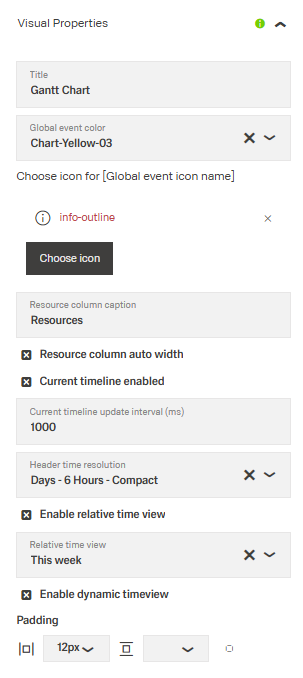
(Configured in Visual Properties)
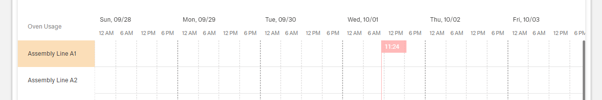
- currentTimeLineEnabled – Controls whether to display a line indicating the current time in the chart. When enabled, users can easily see which tasks are past, current, or future.
- currentTimeLineUpdateIntervalInMs – Sets how frequently (in milliseconds) the current time line updates. For example,
60000would update the line position every minute.
- currentTimeLineUpdateIntervalInMs – Sets how frequently (in milliseconds) the current time line updates. For example,
- relativeTimeViewEnabled – Determines whether to use relative time frames for the chart view. When enabled, the chart will display time periods relative to the current date.
- relateTimeView – Defines which relative time frame to use when
relativeTimeViewEnabledis true. Options include"today","this_week","this_month", etc. For example,"this_month"shows the current month’s timeline.
- relateTimeView – Defines which relative time frame to use when
- dynamicTimeView – Controls whether the time view updates automatically over time. When enabled, the view will shift as time progresses to keep the current period visible.
Styling
(Configured in General Properties)
- displayName – Sets the display name of the component shown in the structure panel. For example,
"Project Timeline"allows for easy identification of this Gantt chart's purpose in the component structure.- titleTranslation – Sets the title text displayed above the Gantt chart with support for multiple languages. For example,
{"en-US": "Project Schedule", "de-DE": "Projektplan"}ensures proper localization of the header text.
- titleTranslation – Sets the title text displayed above the Gantt chart with support for multiple languages. For example,
(Configured in Visual Properties)
- globalEventColor – Specifies the default color used for events in the Gantt chart. For example, setting it to a brand color ensures visual consistency with the application's design system.
- globalEventIconName – Sets the default icon displayed with events in the Gantt chart. For example,
"calendar"could be used to indicate scheduled tasks. - resourceColumnCaptionTranslation – Sets the header text for the resource column with language support. For example,
{"en-US": "Team Members", "de-DE": "Teammitglieder"}provides localized column headers. - resourceColumnAutoWidth – Determines whether the resource column width should adjust automatically based on content. When enabled, the column will expand or contract to fit the resource names.
- resourceColumnWidth – Sets a fixed width in pixels for the resource column. For example,
150pixels provides enough space for typical resource names while conserving screen space for the timeline. - paddingClass – Configures spacing around the Gantt chart using CSS classes. For example,
"p-3"adds medium padding around the chart for better visual spacing.
Actions & Variants
(Configured in Events)
- events – Configures the events that the component can trigger and respond to:
- ON_GLOBAL_PARAMETERS_CHANGE – Triggered when global parameters affecting the chart change.
- ON_INIT – Triggered when the component is initialized. Can be used to perform setup operations.
- ON_DIALOG_DATA_SUBMIT – Triggered when dialog data is submitted, such as when editing an event.
- ON_DESTROY – Triggered when the component is removed from the DOM. Useful for cleanup operations.
Tests
(Configured in Testing Hooks)
- id – Specifies a unique identifier for the component used for programmatic access. For example,
"projectGanttChart"enables targeted manipulation of this specific chart. - dataTestId – Sets the testing hook ID for automated testing. For example, setting it to
"project-gantt-chart"allows test scripts to reliably locate this component. - enableAsHotspot – Enables the component as a guided tour hotspot. When enabled, this chart can be highlighted during guided tours of the application.
- guidedTourHotSpotTitle – Sets the title for the guided tour hotspot, supporting translations. For example,
{"en-US": "Project Timeline", "de-DE": "Projektzeitplan"}provides localized titles for the hotspot. - guidedTourHotSpotDescription – Sets the description for the guided tour hotspot, supporting translations. For example,
{"en-US": "This chart shows your project schedule", "de-DE": "Diese Grafik zeigt Ihren Projektzeitplan"}provides localized descriptions.
Links
- Figma: https://www.figma.com/design/yck1tcUXgdQ5aYX6iUAwrO/GE---Astronaut-Design-System?node-id=11613-77302&t=2GNf1jEXqXOrnDUK-1
- Live style guide: https://e1-dev.k8s.myapp.de/live-style-guide/other-components/gantt-chart/common
Guidelines
Usage
- Title the chart for quick orientation using
titleTranslation; keep it concise and localized for all supported locales. - Prefer time windows relative to today for status views (e.g., “This week”) using
relativeTimeViewEnabled+relateTimeView; for fixed retrospectives, turn relative off. - Keep the current period visible in long-running dashboards with
dynamicTimeView: trueso the viewport advances automatically. - Bind the visible labels and bars deterministically by setting the required data expressions:
resourceColumnFieldExpression,eventNameExpression,eventResourceIdExpression,eventStartDateExpression,eventEndDateExpression. - Use a predictable default visual for bars with
globalEventColorand an optional default glyph viaglobalEventIconName; do not rely on color alone—ensureeventNameExpressionprovides clear text.
Sizing & Layout
- Allocate resource column width intentionally: turn on
resourceColumnAutoWidthto adapt to content, or set a fixed pixel width withresourceColumnWidthfor stable alignment. - Add breathing room around the chart using spacing tokens in
paddingClass(e.g.,p-3) instead of ad-hoc CSS. - Provide a clear label for the resource column header with
resourceColumnCaptionTranslation.
States & Feedback
- Current-time indicator: toggled by
currentTimeLineEnabled; motion/refresh rate set bycurrentTimeLineUpdateIntervalInMs. - Time-window mode:
relativeTimeViewEnabled+relateTimeView(relative) vs. disabled (absolute). - Auto-advance viewport for “live” boards using
dynamicTimeView.
Color & Contrast
- Set the baseline bar color with
globalEventColor; when contrast is tight, pair with a default icon viaglobalEventIconNameand ensure clear labels througheventNameExpression.
Data-Driven / Conditional Behavior
- Point the component to live data by setting
getResourcesDataSourceIdandgetEventsDataSourceId; refine queries usinggetResourcesSourceHttpRequestParametersMapandgetEventsDataSourceHttpRequestParametersMap(e.g., limit to a visible time span). - During development, preview layouts with realistic content by enabling
useMockData: true, then disable it for production. - Prevent jitter and excessive reflow by choosing a sensible
currentTimeLineUpdateIntervalInMsand avoiding overly frequent parameter updates in your*HttpRequestParametersMap.
Content & Localization
- Localize user-facing chrome: chart title via
titleTranslationand resource column header viaresourceColumnCaptionTranslation. - Ensure task labels are readable and descriptive through
eventNameExpression; keep them short to reduce truncation. - Provide deterministic hooks for QA and accessibility tooling with
dataTestId; usedisplayNamefor authoring clarity without affecting end-user text.
Dos & Don’ts
| Do | Don’t | Article setting(s) |
|---|---|---|
| Localize the chart title and resource header. | Ship English-only labels. | titleTranslation, resourceColumnCaptionTranslation |
| Use relative time windows for status views (e.g., this week). | Hard-code a past date range for live dashboards. | relativeTimeViewEnabled, relateTimeView |
| Keep the current period in view automatically. | Make users pan every hour to find “now”. | dynamicTimeView |
| Show a current-time line and update it at a reasonable cadence. | Leave users guessing where “now” is or update every 100 ms. | currentTimeLineEnabled, currentTimeLineUpdateIntervalInMs |
| Use auto-width for varied names, fixed width for strict layouts. | Let long names clip or cause column thrash. | resourceColumnAutoWidth, resourceColumnWidth |
| Add padding using tokens for readability. | Let bars touch the edges. | paddingClass |
| Pair color with text (and optional default icon). | Encode meaning by color alone. | globalEventColor, globalEventIconName, eventNameExpression |
| Clean up timers/listeners on teardown. | Leak intervals after navigation. | ON_DESTROY, currentTimeLineUpdateIntervalInMs |
Accessibility
- Localized headings for meaningful announcementss Keep them short and scannable (
titleTranslation,resourceColumnCaptionTranslation). - Descriptive task labels bound to data (
eventNameExpression). - Non-color redundancy using labels and an optional default glyph (
globalEventIconName) alongsideglobalEventColor. - Readability safeguards via column sizing (
resourceColumnAutoWidthorresourceColumnWidth). - Optional instructional context through guided-tour metadata (
enableAsHotspot,guidedTourHotSpotTitle,guidedTourHotSpotDescription). - Use readable time windows and keep “now” visible on live boards (
relativeTimeViewEnabled,relateTimeView,currentTimeLineEnabled,dynamicTimeView). - Choose update intervals that avoid distracting motion (
currentTimeLineUpdateIntervalInMs). - Provide sufficient chart padding to separate content (
paddingClass).
Datasource Requirements
The gantt chart requires two seperat datasources, which are connected seperatly through getResourcesDataSourceId and getEventsDataSourceId. Both inputs require arrays.
Resources Data
| Property | Data type | Required | Description |
|---|---|---|---|
| id | string | yes | unique id for the ressource |
| name | string | yes | name of the ressource displayed in the column |
| role | string | no | role this ressource belongs to |
| availability | number | no | total availability of the ressource between 0 and 1 (percent) |
Example data:
json
[
  {
    "id": "resource-1",
    "name": "John Smith",
    "role": "Developer",
    "availability": 0.8
  },
  {
    "id": "resource-2",
    "name": "Jane Doe",
    "role": "Designer",
    "availability": 1.0
  }
]
Events Data
| Property | Data type | Required | Description |
|---|---|---|---|
| id | string | yes | unique id for the event |
| name | string | yes | name of the event displayed in the event |
| resourceId | string | yes | unique id of the ressource the event belongs to |
| startDate | number | yes | start date of the event in the YYYY-MM-DDThh:mm:ssZ format |
| endDate | string | yes | end date of the event in the YYYY-MM-DDThh:mm:ssZ format |
| completion | number | no | completion rate between 0 and 100 of the event |
| color | string | no | display color of the event in HEX code |
json
[
  {
    "id": "task-1",
    "name": "Research Phase",
    "resourceId": "resource-1",
    "startDate": "2025-05-01T08:00:00Z",
    "endDate": "2025-05-05T17:00:00Z",
    "completion": 100,
    "color": "#4CAF50"
  },
  {
    "id": "task-2",
    "name": "Design Phase",
    "resourceId": "resource-2",
    "startDate": "2025-05-06T08:00:00Z",
    "endDate": "2025-05-12T17:00:00Z",
    "completion": 50,
    "color": "#2196F3"
  }
]