Card
Overview
- The Card component is a container for grouped information.
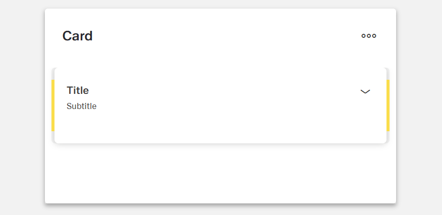
- It supports a title and subtitle as visual identifiers.
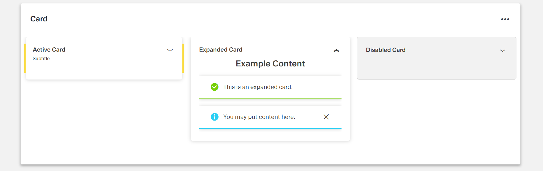
- Cards can exist in active, disabled, or expanded states.
- Actions can be assigned to trigger events, such as On Change.
Specs
Tokens
| Token | Description |
|---|---|
| component name | Name visible in the structure. Can be changed or left as default. |
| title | Text title of the card. |
| subtitle | Subtitle of the card. |
| state: active | Card is marked as active. |
| state: disabled | Card is marked as disabled. |
| state: expanded | Card is expanded, can be combined with active. |
| event: On Change | Event triggered when a change occurs. |
| add event action | Defines a custom action added via the Action Editor. |
Structure
- A Card consists of a title and a subtitle.
- The component name can be set or left unchanged.
Actions & Variants
Cards can exist in the following states:
Active → Card is marked as active.
Disabled → Card is marked as disabled.
Expanded → Card is expanded and can be combined with Active.
Actions can be added through the Action Editor.
Supported event: On Change.
Links
- Figma: https://www.figma.com/design/yck1tcUXgdQ5aYX6iUAwrO/GE---Astronaut-Design-System?node-id=11550-252909&t=iosNC2AkSTGs5lMh-1
- Live style guide: https://e1-dev.k8s.myapp.de/live-style-guide/id5/4-card/card
Guidelines
Configuring Toolbars
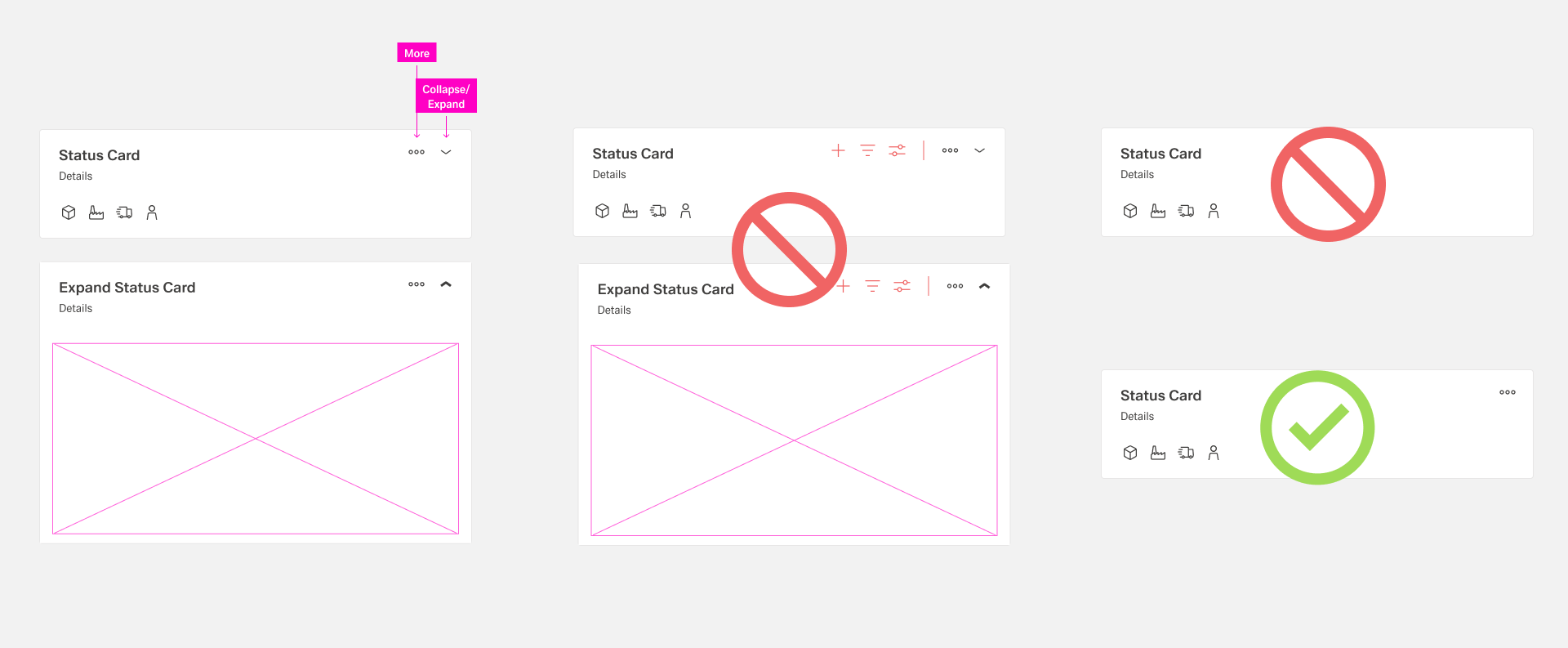
- Cards do not have a first and second toolbar.
- Within all cards, only two actions are allowed:
- More
- Expand/Collapse (if the card supports this function).
- Every card must always include a More icon.
Usage
- Use a Card to group related information and identify it with a concise
titleand optionalsubtitle; keep both clear and scannable. Express the main idea intitleand supportive detail insubtitle; avoid duplicating content between the two. - Prevent interaction when prerequisites aren’t met by setting
state: disabled. - Keep the
titleshort enough to avoid wrapping; place secondary context insubtitleso the header remains compact and readable.
Interactions & Events
- Use
On Changeto react to data or configuration changes inside the card (e.g., update related content, sync status). - Define custom behaviors with
add event actionso the card can trigger the exact workflow you need.
Data-Driven / Conditional Behavior
- Drive presentation by setting
state: expandedwhen data indicates details should be visible (e.g., initially show details for the most relevant card). - Use
state: disabledto reflect data-guarded conditions where the card should be visible but non-interactive until ready.
Dos & Don’ts
| Do | Don’t | Article setting(s) |
|---|---|---|
| Write a short, specific title that names the card’s content. | Use vague titles or full sentences that wrap. | title |
| Use the subtitle for secondary qualifiers (e.g., status or brief context). | Repeat the title in the subtitle or add unrelated info. | subtitle |
| Mark the selected card as active for clear emphasis. | Indicate selection with content changes alone. | state: active |
| Disable cards that users shouldn’t interact with yet. | Leave non-functional cards appearing interactive. | state: disabled |
| Expand a card to show extended details when they’re needed. | Stuff all details into the collapsed view. | state: expanded |
| Combine expanded + active when the open card is also the current focus. | Toggle conflicting states unpredictably across cards. | state: expanded, state: active |
| Trigger logic on data changes instead of relying on silent updates. | Leave changes unhandled so the UI drifts out of sync. | event: On Change, add event action |
| Name the component clearly for maintainers. | Keep the default, non-descriptive component name. | component name |
Accessibility
- Provide meaningful, concise
titletext so assistive tech conveys purpose even when the card is collapsed. - Keep
subtitlebrief to avoid verbose announcements; place only supportive context there. - Avoid relying on color or decoration alone; communicate status via explicit
title/subtitletext and supported states (active,disabled,expanded). - Use
state: disabledto clearly communicate non-interactivity. - Use
state: expandedto control when additional content is exposed, reducing cognitive load in the collapsed view.