Card Collection
Overview
- The Dynamic Card Collection displays a grid of interactive cards from a data source.
- It supports pagination, customizable templates, and expandable card content.
- Users can select cards and interact with their contents.
- It is suited for presenting item collections in an organized, visual way.

Specs
Tokens
| Token | Description |
|---|---|
| displayName | Display name in structure panel. |
| id | Unique identifier for programmatic access. |
| visibilityPolicySetId | Policy controlling component visibility. |
| displayConditions | Rules to show/hide the collection. |
| showHeader | Toggles header section visibility. |
| titleTranslations | Localized header title text. |
| fullWidth | Expands collection to full container width. |
| changeBackgroundOnHover | Changes card background on hover. |
| activeCollapsedTemplate | Enables custom collapsed card template. |
| activeExpandedTemplate | Enables custom expanded card template. |
| columnCount | Number of grid columns when fullWidth is enabled. |
| customHeight | Custom container height (px or %). |
| elements | Template components (header, collapsed, expanded). |
| scrollingEnabled | Allows scrolling when content exceeds height. |
| paddingClass | Spacing via CSS classes. |
| titleKey | Data field used as card title. |
| subtitleKey | Data field used as card subtitle. |
| showLoader | Shows loading indicator while fetching data. |
| emptyDataSourceText | Text shown when no data results. |
| dataSourceId | Data source ID for collection data. |
| getEntityCollectionHttpRequestParametersMap | HTTP params map for data requests. |
| enablePagination | Activates server-side pagination. |
| pageSize | Cards per page when pagination enabled. |
| keyExpression | Unique key field for each card. |
| events | Configures component events. |
| ON_CARD_CLICK (Events) | Event when a card is clicked. |
| ON_GLOBAL_PARAMETERS_CHANGE (Events) | Event when global parameters change. |
| ON_FIRST_CARD_LOADED (Events) | Event when first card loads. |
| ON_INIT (Events) | Event on initialization. |
| ON_DESTROY (Events) | Event on removal from DOM. |
| dataTestId | Testing hook ID. |
| enableAsHotspot | Enables guided tour hotspot. |
| guidedTourHotSpotTitle | Guided tour hotspot title (localized). |
| guidedTourHotSpotDescription | Guided tour hotspot description (localized). |
Structure
(Configured in General Properties)
- displayName - Sets the display name of the component shown in the structure panel. For example, "Product Catalog" allows for easy identification of the component's purpose in the component structure.
(Configured in Visual Properties)
- elements — Contains all template components used by the card collection, including header templates, collapsed content templates, and expanded content templates. These elements define the structure and appearance of the cards.
- Card content states — Collapsed and expanded views are defined via the provided templates, enabling different structures for default and expanded card content.
- activeCollapsedTemplate — Enables the use of a custom template for collapsed card content. When enabled, you can define a specialized view for cards in their default collapsed state, allowing for more customized card appearances.
- activeExpandedTemplate — Enables the use of a custom template for expanded card content. This option is only available when activeCollapsedTemplate is enabled, allowing you to create different views for collapsed and expanded states of cards.
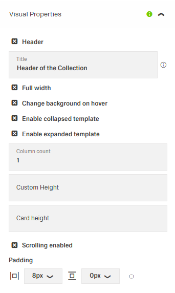
- showHeader — Controls visibility of the collection header section. When enabled, displays the title above the card collection.
- titleTranslations — Sets the title text displayed in the header, with support for multiple languages.

(Configured in Visibility)
- displayConditions — Defines conditions for displaying the component based on context values or expressions.
Datasource
(Configured in Datasource)
- titleKey — Specifies which field from the data source should be used as the card title. For example, if your data has a productName field, setting titleKey to productName will display that value as the card title.
- subtitleKey — Specifies which field from the data source should be used as the card subtitle. For example, if your data has a description field, setting subtitleKey to description will display that value as the subtitle.
- emptyDataSourceText — Sets the text to display when the data source returns no results. For example, {"en-US": "No products found"} provides clear feedback when the collection is empty.
- dataSourceId — Specifies the data source ID for retrieving card collection data. For example, api/featured-products connects the component to the products API endpoint.
- getEntityCollectionHttpRequestParametersMap — Configures HTTP parameters for data fetching, including query parameters, path parameters, and headers. This object maps additional parameters needed for the request.
- keyExpression — Defines the field used to uniquely identify each card. For example, if your data has an id field, setting keyExpression to id ensures each card can be uniquely identified and tracked.
Styling
(Configured in Visual Properties)
- fullWidth — Determines if the card collection should take up the full width of its container. When enabled, the cards span the entire available width rather than being constrained to a default size.
- columnCount — Specifies the number of columns in the card collection grid when fullWidth is enabled. For example, setting to 3 will arrange the cards in three columns across the available width.
- customHeight — Sets a custom height for the card collection container. For example, 400px creates a fixed-height scrollable container, while percentage values like 50% make it relative to its parent element’s height.
- scrollingEnabled — Controls whether the card collection should be scrollable. When enabled, the collection will become scrollable if its content exceeds the defined height.
- changeBackgroundOnHover — Controls whether cards change their background color when hovered over. Provides visual feedback to users that the card is interactive.
- paddingClass — Configures spacing around the card collection using CSS classes. For example, "p-4" adds medium padding on all sides.
(Configured in Datasource)
- showLoader — Determines whether a loading indicator is shown while data is being retrieved. Provides visual feedback during loading operations.
- enablePagination — Activates server-side pagination for large datasets. When enabled, data is loaded in pages rather than all at once.
- pageSize — Sets the number of cards loaded per page when pagination is enabled. For example, setting to 12 will load 12 cards per page.
Actions
(Configured in Events)
- events — Configures the events that the component can trigger and respond to.
- ON_CARD_CLICK — Triggered when a user clicks on a card. Can be used to navigate to detail pages or show additional information.
- ON_GLOBAL_PARAMETERS_CHANGE — Triggered when global parameters that affect the component are modified.
- ON_FIRST_CARD_LOADED — Triggered when the first card is loaded from the data source. Useful for performing actions once data is initially available.
- ON_INIT — Triggered when the component is initialized. Can be used to perform setup operations.
- ON_DESTROY — Triggered when the component is removed from the DOM. Useful for cleanup operations.
Tests
(Configured in Testing Hooks)
- dataTestId — Sets the testing hook ID for automated testing. For example, setting it to featured-products-collection allows test scripts to reliably locate this component.
- enableAsHotspot — Enables the component as a guided tour hotspot. When enabled, the card collection can be highlighted during guided tours of your application.
- guidedTourHotSpotTitle — Sets the title for the guided tour hotspot, supporting multiple languages. For example, {"en-US": "Browse Products", "de-DE": "Produkte durchsuchen"} provides localized titles.
- guidedTourHotSpotDescription — Sets the description for the guided tour hotspot, supporting translations. For example, {"en-US": "Click on a product card to see details", "de-DE": "Klicken Sie auf eine Produktkarte, um Details zu sehen"} provides contextual information.
Authorization
(Configured in Authorization)
- visibilityPolicySetId — Determines the visibility of the component based on specified policy sets. For example, setting to "customerOnlyPolicy" restricts the collection to authenticated customers only.
Links
- Figma: https://www.figma.com/design/yck1tcUXgdQ5aYX6iUAwrO/GE---Astronaut-Design-System?node-id=11550-252909&t=iosNC2AkSTGs5lMh-1
- Live style guide: https://e1-dev.k8s.myapp.de/live-style-guide/id5/4-card/card-collection
Guidelines
Usage
- Present a data-backed grid of items by binding a data source and mapping title/subtitle fields; ensure each card uses a stable unique key.
- Show a localized header when it adds context; hide it when redundant. Keep strings concise to avoid truncation.
- Use collapsed and expanded templates to control information density.
- Display a loader during fetches and a localized empty-state message when no results are returned.
- Provide stable testing hooks and, when used, localized guided-tour titles and descriptions.
Sizing & Layout
- Enable full-width grids and specify the column count for predictable scanning.
- Constrain height and enable internal scrolling to prevent page reflow.
- Use server pagination with a sensible page size for large datasets.
- Adjust surrounding spacing with the padding utility for clear breathing room.
Visibility & Authorization
- Gate visibility with policy sets when needed.
- Use conditional display rules to show the collection only in valid contexts.
Dos & Don’ts
| Do | Don’t |
|---|---|
| Give the component a meaningful display name for clear identification in the structure panel. | Leave a generic or misleading display name that obscures purpose. |
| Use the “first card loaded” event to start dependent logic after content appears. | Rely on timers or polling to guess when data is ready. |
| Choose a page size that aligns well with your column count (e.g., multiples) to avoid awkward partial rows. | Pick arbitrary page sizes that cut rows mid-scan. |
| Only set a column count when full-width grids are enabled (where the setting applies). | Set a column count while full-width is off, expecting it to affect layout. |
Accessibility
- The component exposes no ARIA- or focus-specific settings; rely on clear, plain-language text in templates and headers for screen-reader clarity.
- Avoid hover-only cues as the sole indicator of interactivity; ensure interactive content remains understandable without hover.
- Keep localized strings short and unambiguous to reduce cognitive load.