Single Select
Overview
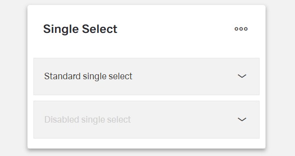
- The Single Select component is a dropdown form control.
- It allows users to select a single option from a list.
- Options can come from a static list or a dynamic API endpoint.
- It is useful for forms where one choice must be made, such as categories, statuses, or roles.

Specs
Tokens
| Token | Description |
|---|---|
| placeholderTranslations | Placeholder text with localization |
| initValue | Initial selected value on first render |
| disabled | Disables user interaction |
| showClearIcon | Shows icon to clear selection |
| hidden | Keeps in structure but hides visually |
| saveInLocalStorage | Persists selection in local storage |
| defaultValue | Value used on form reset |
| readonly | Shows value but blocks changes |
| dataField | Field name used on submit |
| useStaticData | Toggle static vs. dynamic options |
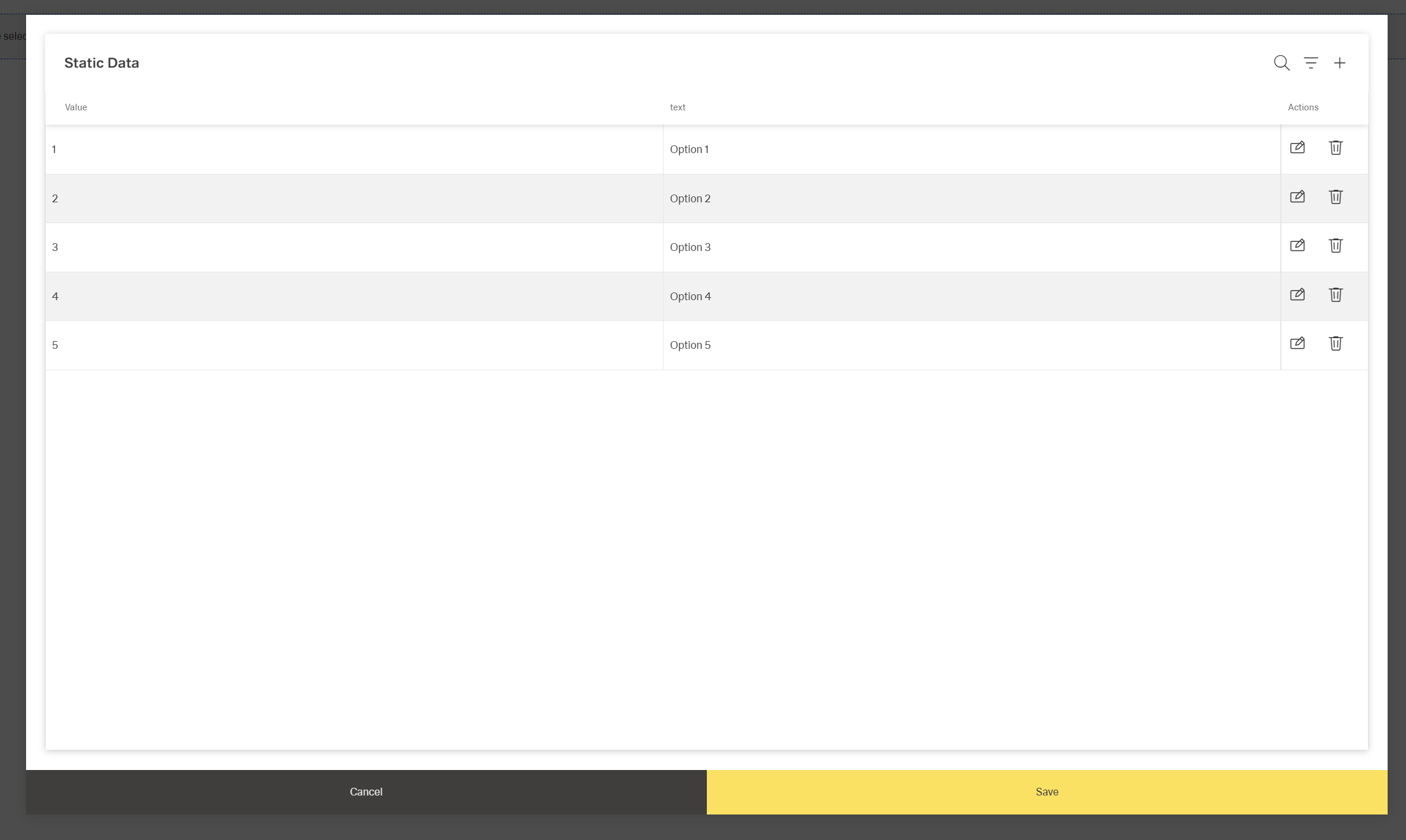
| staticData | Predefined options list when static |
| dataSourcePath | Path to options in API response |
| dataSourceId | API endpoint ID for options |
| getEntityCollectionHttpRequestParametersMap | HTTP params map for fetch requests |
| modelValue | Field holding option value |
| modelDisplayValue | Field holding option label |
| emitObject | Emit full object instead of value |
| controlsRequestType | Placement of value in request |
| pageSize | Page size for options pagination |
| loadAll | Auto-fetch all pages of options |
| validation | Validation rules container |
| required | Enforces a selection is made |
| authorizationDisable | Policy that disables component |
| events | Configurable event handlers |
| ON_VALUE_CHANGE (Events) | Fires when selection changes |
| ON_INIT_BASED_ON_USER_VIEW (Events) | Fires on init in user view mode |
| ON_INIT (Events) | Fires when component initializes |
| ON_DESTROY (Events) | Fires when component is removed |
Structure
(Configured in Visual Properties)
- saveInLocalStorage - Determines whether the component's selected value is preserved in local storage between sessions.
Load Data
(Configured in Visual Properties)
- initValue - Defines an initial value that will be selected when the component is first rendered.
- defaultValue - Sets the value that will be used when the form is reset.
(Configured in Non-Visual Properties)
- useStaticData - Determines whether the dropdown options come from a static list or a dynamic data source.
- staticData - Specifies the predefined list of options when useStaticData is true.
- dataSourcePath - Specifies the path in the response data where the list of options can be found.
(Configured in Datasource Properties)
- dataSourceId - Specifies the API endpoint ID for retrieving dropdown options when useStaticData is false.
- getEntityCollectionHttpRequestParametersMap - Configures HTTP parameters for data fetching requests.
- loadAll - Determines whether all options should be loaded at once regardless of pagination settings.
- pageSize - Sets the number of options to load per page when pagination is enabled.
Submit Data
(Configured in Non-Visual Properties)
- dataField - Defines the field name that will be used when submitting form data.
- controlsRequestType - Specifies how the field data is sent in HTTP requests: 'BODY', 'HEADER', or 'PATH'.
- emitObject - Determines whether the entire object or just the value is submitted when an option is selected.
(Configured in Datasource Properties)
- modelValue - Identifies which field in the API response contains the value to be submitted when an option is selected.
- modelDisplayValue - Identifies which field in the API response contains the text to display for each option.
Styling
(Configured in Visual Properties)
- placeholderTranslations - Sets the placeholder text displayed when no option is selected, with support for multiple languages.
- showClearIcon - Determines whether to display an icon that allows users to clear the current selection.
Actions & Variants
Actions
(Configured in Event Actions)
- events - Configures the events that the component can trigger and respond to.
- ON_VALUE_CHANGE - Triggered when the user selects a different option.
- ON_INIT_BASED_ON_USER_VIEW - Triggered specifically when the component initializes in user view mode rather than edit mode.
- ON_INIT - Triggered when the dropdown component is initialized.
- ON_DESTROY - Triggered when the component is removed from the DOM.
Variants
(Configured in Visual Properties)
- hidden - Controls whether the component is visible in the form.
- disabled - Controls whether the dropdown can be interacted with by users.
- readonly - Controls whether the selection can be changed by users.
Validation
(Configured in Validation Properties)
- validation - Configures validation rules for the single select dropdown.
- required - When set to true, an option must be selected before the form can be submitted.
Authorization
(Configured in Authorization Properties)
- authorizationDisable - Specifies a policy set that determines when the component should be disabled based on user permissions.
Links
- Figma: https://www.figma.com/design/yck1tcUXgdQ5aYX6iUAwrO/GE---Astronaut-Design-System?node-id=11528-200611&t=ftfrOGkPzlG2GaTo-1
- Live sytle guide: https://e1-dev.k8s.myapp.de/live-style-guide/id3/3-dropdown/single-dropdown
Guidelines
Usage
- Use when exactly one value must be selected; enforce completion with
required: true. - Provide a meaningful, localized prompt by setting
placeholderTranslations(e.g., “Select status”). - Establish predictable state: set
initValuefor first render anddefaultValuefor form resets. - Persist a user’s last choice across sessions with
saveInLocalStoragewhen appropriate.
States & Feedback
- Prevent interaction when unavailable with
disabled. - Show a fixed, visible value that cannot be changed using
readonly. - Only show a clear action when an empty state is valid using
showClearIcon.
Data-Driven / Conditional Behavior
- Control loading strategy for large datasets with
pageSize; fetch all at once only when appropriate usingloadAll. - Decide emitted payload shape with
emitObject(scalar value vs. full option object).
Visibility & Authorization
- Keep the control visible but non-interactive per policy using
authorizationDisable. - Remove the control’s visual footprint (while retaining structure) with
hidden.
Content & Localization
- Localize placeholder text via
placeholderTranslations; keep phrasing short and action-oriented. - Ensure option text is human-readable by mapping
modelDisplayValuecorrectly.
Dos & Don’ts
| Do | Don’t | Article setting(s) |
|---|---|---|
| Localize a concise prompt like “Select status”. | Leave a generic or English-only placeholder. | placeholderTranslations |
| Preselect a safe default on first render. | Start with an undefined state that confuses submit rules. | initValue |
| Restore the expected value on form reset. | Hack resets outside the component. | defaultValue |
| Disable while options are loading or not allowed. | Let users open an empty or nonfunctional dropdown. | disabled |
| Use read-only to show a fixed, non-editable value. | Fake read-only by disabling when the value must remain visible. | readonly |
| Show a clear icon only if clearing is valid. | Offer “clear” on fields that must never be empty. | showClearIcon, required |
| Use static data for small, stable lists. | Call an API for options that never change. | useStaticData, staticData |
| Map value/label fields to your API correctly. | Display IDs to users or submit labels instead of IDs. | modelValue, modelDisplayValue, dataSourcePath |
| Page large lists for responsiveness. | Fetch every option by default when lists are huge. | pageSize, loadAll: false |
| Emit the full object when downstream logic needs it. | Parse labels later to recover metadata. | emitObject |
| Persist last selection only where it’s helpful. | Persist sensitive/temporary selections unnecessarily. | saveInLocalStorage |
| Wire reactions to selection changes. | Poll externally for selection state. | events.ON_VALUE_CHANGE |
Accessibility
- Announce meaningful guidance by localizing the placeholder with
placeholderTranslations. - Communicate availability accurately: use
disabledwhen interaction isn’t allowed; usereadonlywhen the value must remain visible but fixed. - Prevent accidental blank submissions by configuring
validationwithrequiredwhere a choice is mandatory. - Expose an explicit clear affordance only when an empty state is valid using
showClearIcon. - Respect permission states by disabling the control via
authorizationDisableinstead of hiding essential information. - Display human-readable text by mapping
modelDisplayValueto the correct label field. - Provide predictable behavior for assistive tech by defining
initValueanddefaultValue. - Reduce cognitive load in long lists by paginating with
pageSizeand reservingloadAllfor short lists.
Datasource Requirements
The Single Select expects an array of objects, each representing an object for selection. Each object should include a unique identifyer - the model value - and a title to display in the list - the model display value.
Example:
json
[
  { "userId": 1, "name": "Alice" },
  { "userId": 2, "name": "Bob" }
]
Mapping:
json
{
    "modelValue": "userID",
    "modelDisplayValue: "name"
}