Library View
The library page page layout provides a structured layout for browsing, selecting, and reviewing items within a collection. It supports users in efficiently navigating large sets of content while accessing detailed information for any selected item. Users can monitor status, edit items, or open a detailed view.
Usage
The library page layout is used when users need to browse, search, and act on items within a large collection. It is ideal for scenarios where users must quickly locate relevant items, compare them, and view associated details without navigating away from the main context. This pattern supports efficient exploration and decision-making across a broad set of data.
When to Use This Page Layout
- Large sets of items - Best suited for collections containing many entries, such as templates, components, tasks, documents, configurations, or reusable assets.
- Mid-level granularity - Works well for both high-level summaries (names, tags, statuses) and moderate detail displays (metadata, descriptions, item properties).
- View–select–act workflows - Designed for scenarios where users browse many items, select one, and then perform actions such as previewing, editing, or assigning it.
- Supporting discovery and comparison - Ideal when users need to scan lists, open details in-place, and compare similar items side-by-side.
When Not to Use This Page Layout
- Highly complex item editing Not suitable when editing requires multi-step forms, deep data structures, or full-screen workflows. Use a dedicated editor instead.
- Processes requiring step-by-step guidance If the user must follow a sequential workflow, a wizard or process-focused page layout is better suited.
Limitations
- Screen space dependency - The pattern performs best on larger screens; limited space reduces visibility of both the list and the detail panels.
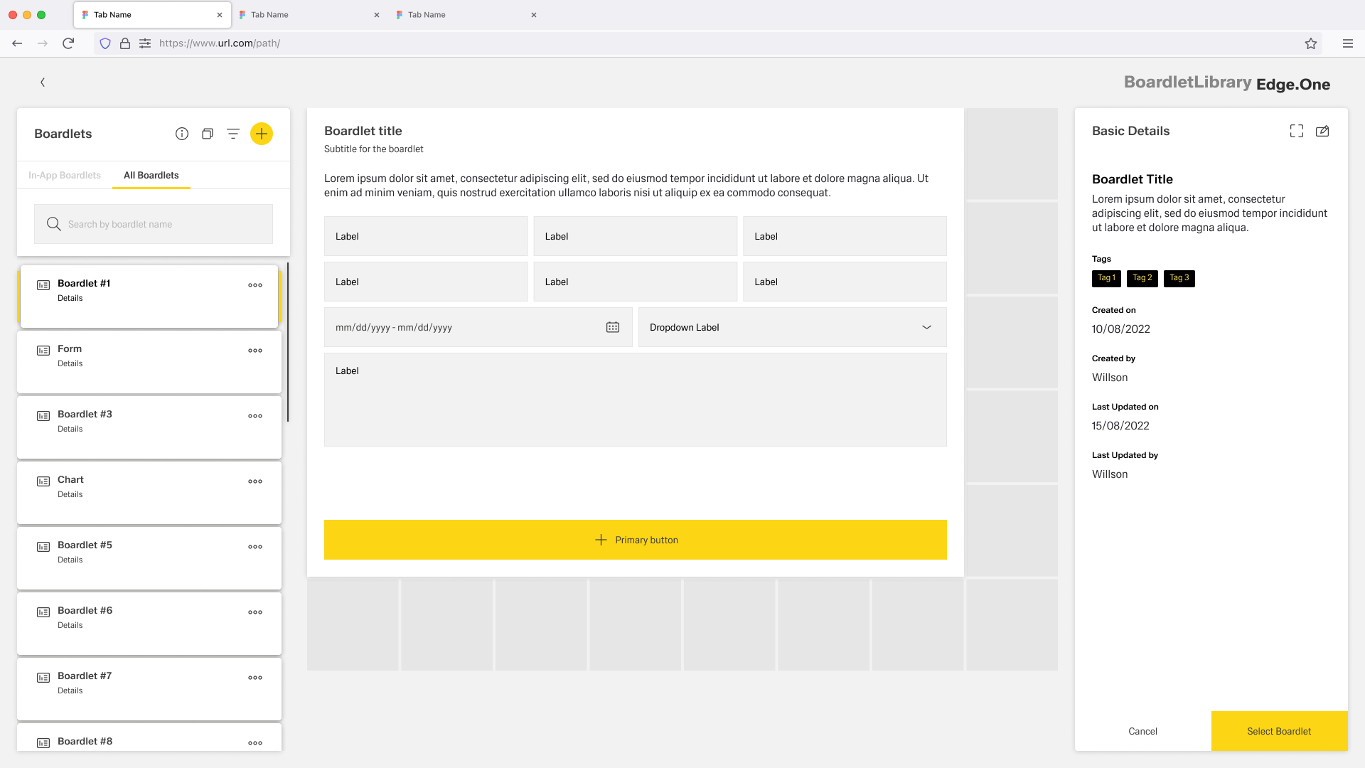
Anatomy
The Library page layout follows a structured, two-pane layout that balances efficient browsing with clear item inspection. It is built using standard components from the design system and aligned to the App Composer grid to ensure consistency and scalability across applications.
Primary Layout Structure
The page layout consists of three main regions:
- Navigation & Item List Panel (Left) - A vertical list displaying the full collection of items.
- Content / Detail Area (Center) - The main viewing area for inspecting item details or previewing content.
- Contextual Information Panel (Right) - A supporting pane showing metadata, actions, tags, history, or status information related to the selected item.
Navigation & Item List Panel
Common components:
- Content Switch
- Search bar
- Filter, sort, or grouping controls
- Cards for listing
Placement rules:
- Search and controls are always at the top.
- Items are displayed as a vertically scrollable list aligned to the grid.
- Selected state must be active.
Content / Detail Area (Main Panel)
The center panel hosts the main content for the selected item.
Contextual Information Panel (Right Pane)
This optional pane provides supporting information and metadata.
Common components:
- Metadata list (Created on, Updated on, Created by…)
- Tags
- Secondary actions such as Select, Export, Assign
Placement rules:
- The panel maintains a fixed width aligned to the grid.
- Sticky positioning keeps the panel visible while scrolling the main area.
Spacing & Layout Rules
To ensure consistency across applications, apply the following:
- Vertical spacing follows system spacing tokens (e.g., s, m, l, xl).
- Internal spacing in list items is 8px.
- Panels (left, center, right) should maintain minimum widths to avoid crowding.
- On smaller screens, the layout collapses from three columns → two → single panel.
Behavior and Interaction
The Library Page supports a browse → select → inspect → act flow, keeping users in context while they work through large collections.
Browse and Narrow the List (Left Panel)
- Content switch - Changes the collection scope (e.g., All/Favorites). Updates the list and keeps the user in the Library context.
- Search - Typing filters results with lightweight loading feedback. Clear resets to the previous full list state.
- Filter / sort / grouping - Updates the list immediately. Show applied filters clearly and allow removing single filters or “Clear all.”
- Scrolling - The list scrolls independently. Keep scroll position when users inspect items and return to browsing.
Select Items (Left → Center/Right)
- Single selection (default) - Clicking an item sets a visible selected state and updates:
- Center panel: item preview/details
- Right panel: metadata and contextual actions
- Selection persistence: If filters/sort remove the selected item from the result set, clear selection and show a short message with an option to reset filters.
Contextual Info and Actions (Right Panel)
- Sticky behavior - The right panel remains visible while the center panel scrolls.
- Actions - Show one clear primary action plus secondary actions. Disable actions that don’t apply to the item’s current state. Provide inline success/error feedback without leaving the page.