Home Dashboard
The home dashboard provides a centralized view of key information, actions, and performance indicators, allowing users to quickly understand the current state of their workspace or system. This layout is designed to present essential insights at a glance - such as summaries, activity trends, and item listings - helping users monitor progress, identify priorities, and efficiently navigate to deeper functionality when needed.
Usage
The page layout is used when users need a high-level overview of key information, metrics, and activities across a system or workspace. It is ideal for presenting diverse data sources in a unified layout, enabling users to quickly assess status, identify issues, and navigate to more detailed views when necessary.
When to Use This Page Layout
Data Type & Volume
- Best suited for high-level summaries.
- Can display a mix of data types such as KPIs, activity logs, summaries, listings, or configuration statuses.
- Works well when users need to interact with many items at a glance (e.g., a list of applications, system statuses), but only at a summary level.
Purpose & User Tasks
- Ideal when the main goal is to monitor, track, or review system states or project progress.
Supports tasks like
- Scanning KPIs and performance indicators.
- Reviewing top-level statuses or alerts.
- Accessing frequently used actions quickly.
- Navigating to deeper detail pages for further analysis.
- Primarily optimized for viewing, monitoring, and decision-making, with light interaction (sorting, filtering, quick actions).
Granularity
- Designed for broad overviews, providing users with a snapshot of the most important data.
When Not to Use This Page Layout
- Not suitable for pages where users need to edit complex data, perform multi-step processes, or manage detailed records.
- Not intended for highly detailed forms, multi-step editing workflows, or data-heavy analysis.
Limitations & Considerations
Performance
- Dashboards aggregating large volumes of data or many visual elements may require optimized loading strategies.
Screen Size
- Complex dashboards may not scale well on smaller screens unless responsive design is specifically addressed.
Cognitive Load
- Overloading the dashboard with too many widgets, charts, or panels can reduce usability. Prioritization is essential.
Anatomy
The page layout is organized into clearly defined regions, each serving a specific purpose. It follows the platform’s grid system to ensure consistency, scalability, and visual clarity across applications. This section describes the key parts, available components, spacing rules, and possible variations.
Page Frame (Global Structure)
The Home Dashboard is built within the standard App Composer page frame, consisting of:
- Header Area - Displays the page title, optional subtitle, global actions (e.g., refresh, settings), and sometimes date selectors or filters.
- Navigation Panel (Left Sidebar) - Provides access to main sections, modules, or app categories. This remains persistent across the entire workspace.
- Content Area - The main area of the dashboard where widgets, summaries, and visualizations are displayed. This area makes full use of the grid layout.
Dashboard Content Regions
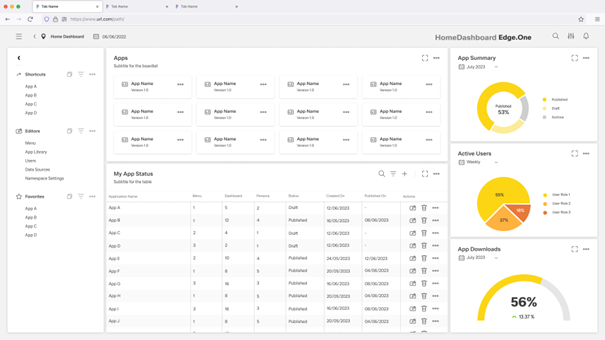
Home Dashboard content is typically composed of tiles, cards, or widgets placed on the grid. These components communicate key metrics or give access to recently used items.
Summary Header
A horizontal band at the top of the content area that may include:
- Key KPIs.
- Quick filters (e.g., time range).
- Contextual information (e.g., last updated).
Use when the dashboard benefits from a global, high-level snapshot.
Main Widget Grid
This is the central part of the home dashboard. It supports:
Metric Cards (KPIs)
- Show single-value indicators like Last updated, Count, or Status.
Charts & Data Visualizations
- Provide visual insights into the selected item’s performance, composition, usage, or structure.
- Common Chart Types: Histogram, Stacked Bar Charts, Line Charts, Box Plot Charts.
- Use cases
- To quickly communicate patterns or anomalies.
- To summarize large datasets visually.
- To add context about performance, composition, or trend behavior.
- Best practices
- Don’t make them too small. They need space to be interpretable.
- Use the simplest chart possible tp avoid visual noise.
- Label them clearly. Axes, units, and legends should be intuitive.
- Avoid unnecessary colors. Use a small palette aligned with the design system.
- Use pie charts sparingly. Limit them to 2–4 slices for readability.
- Ensure accessibility by providing text summaries for visually impaired users.
Lists or Status Tables
- Display structured related data tied to the selected item (e.g., configurations, entries, links).
- Use case
- Data with rows and columns or repeatable records.
- Best practices
- Prioritize readability, don’t overload with too many columns.
- Keep table actions predictable (inline edit, delete, view).
- Use sticky headers for longer lists.
App or Item Tiles
- Display the collection of items in scannable form. You can add a row for actions like "create new" or "app library".
- Use case
- Any time there is a set of repeatable items to browse.
Widgets should be arranged according to the grid to maintain alignment and spacing.
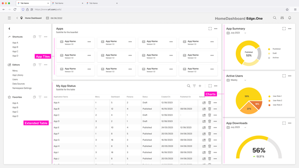
Detail Section / Extended Table (Optional)
Placed at the bottom or in a larger dedicated panel for showing:
- Detailed app status.
- Activity logs.
- Data tables or lists.
Use this area when the home dashboard needs a combination of overview and actionable detail.
Behavior and Interaction
The page layout supports a range of interactions that allow users to view, explore, and act on key information. Users can interact with individual widgets, cards, and tables through actions such as filtering data, opening details, navigating to related pages, or triggering quick actions (edit, delete, publish, etc.). Elements like charts may support hover states, drill-downs, or expanded views, while tables can offer sorting, filtering, and inline actions.
In addition to viewing the dashboard, users can switch into a Dashboard Editor View, where the layout and components can be customized. In this mode, users can rearrange widgets, add or remove or configure components.