Form
Overview
- The Form component is used to create interactive forms with various input controls.
- It supports data binding, validation, and automatic form generation based on data schemas.
- Dynamic Forms can handle data entry, editing, and submission.
- They are suited for create and update operations in applications.

Specs
Tokens
| Token | Description |
|---|---|
| displayName | Display name shown in the structure panel |
| layout | Arrangement of form elements (horizontal or vertical) |
| paddingClass | Spacing around the form using CSS classes |
| gapClass | Spacing between form elements with row and column gaps |
| alignItemsClass | Vertical alignment of form elements |
| justifyContentClass | Horizontal alignment of form elements |
| canGrow | Allows the form to expand vertically |
| canShrink | Allows the form to contract vertically |
| defaultHeight | Initial height of the form component |
| dataFormat | Format for submitting form data (json or formdata) |
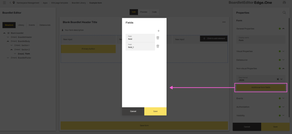
| additionalFormFields | Extra non-visual fields included in form data |
| dataSourceId | Data source ID for submitting form data |
| dataSourceHttpRequestParametersMap | HTTP parameters mapping for form submission |
| staticValues | Constant values included with each submission |
| getEntityDataSourceId | Data source ID for retrieving entity data |
| getEntityHttpRequestParametersMap | HTTP parameters mapping for retrieving entity data |
| events | Configurable form events |
| ON_VALUES_CHANGE (Events) | Event triggered when form values change |
| ON_INIT (Events) | Event triggered when the form is initialized |
| ON_DESTROY (Events) | Event triggered when the form is removed from the DOM |
| ON_FORM_SUBMIT (Events) | Event triggered when the form is submitted |
Structure
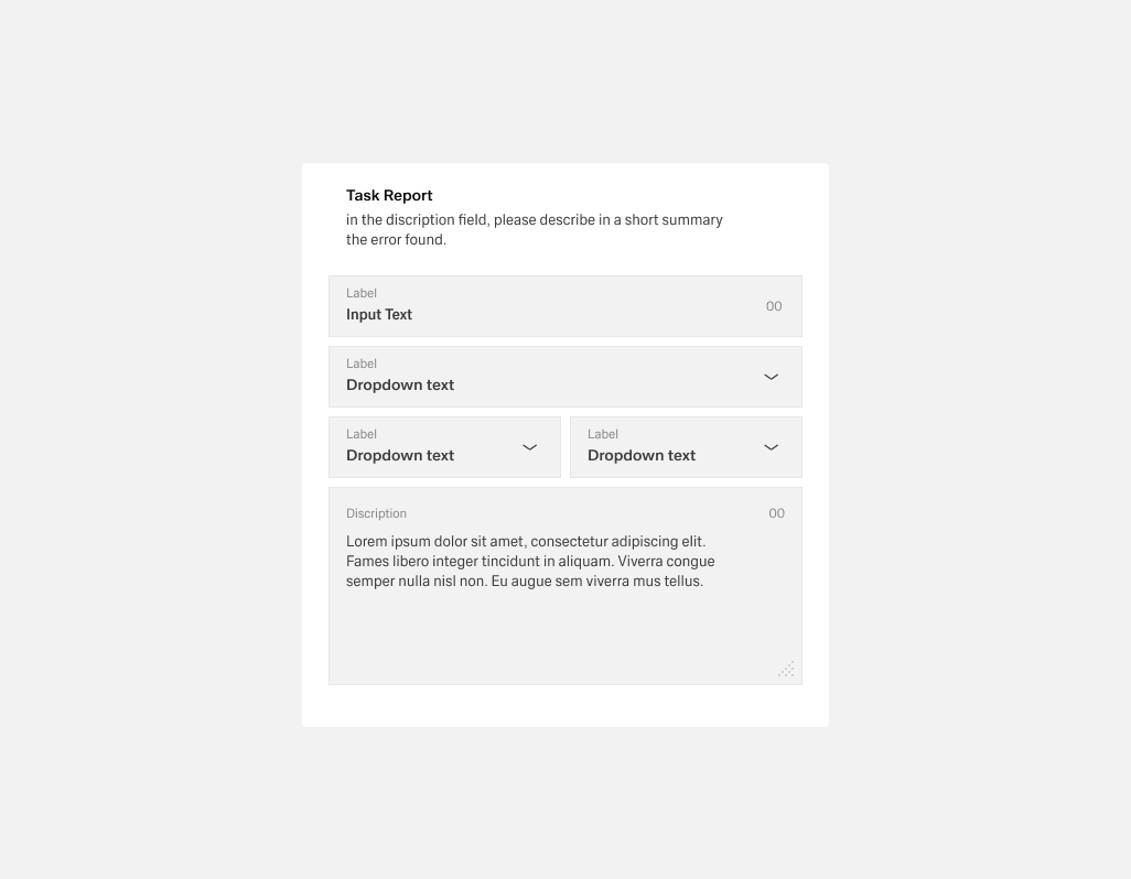
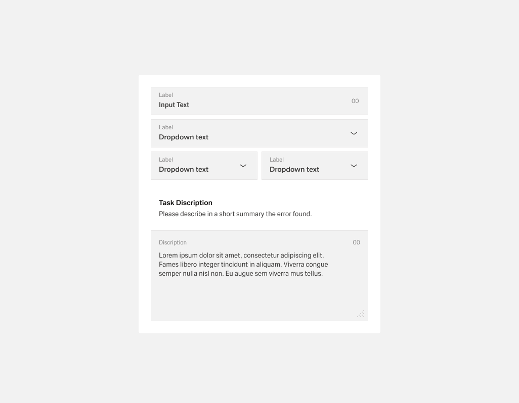
- The form is a container that organizes input controls for data entry, editing, and submission.
- It supports automatic form generation based on data schemas.
(Configured in General Properties)
- displayName – Sets the display name of the component shown in the structure panel. For example,
"Customer Registration Form"allows for easy identification of the form's purpose in the component structure.
(Configured in Datasource)
- dataSourceId – Specifies the data source ID for submitting form data. For example,
"api/customers/create"connects the form to the customer creation endpoint.- dataSourceHttpRequestParametersMap – Configures HTTP parameters for form submission. This object maps form values to request parameters needed by the endpoint.
- staticValues – Defines constant values to include with every form submission. For example,
{"source": "web", "version": "1.2"}adds these fixed values to all submissions. - getEntityDataSourceId – Specifies the data source ID for retrieving entity data. For example,
"api/customers/{id}"defines the endpoint for fetching customer data to populate the form.- getEntityHttpRequestParametersMap – Configures HTTP parameters for retrieving entity data. This object maps context values to request parameters needed by the fetch endpoint.
(Configured in Non-Visual Properties)
- dataFormat – Specifies the format for submitting form data, either as
"json"or"formdata". For example, selecting"json"sends data as a JSON object, while"formdata"uses FormData format for file uploads. - additionalFormFields – Defines extra form fields that don't have a visual representation but are included in form data. For example,
["createdBy", "timestamp"]adds these fields to form submissions.
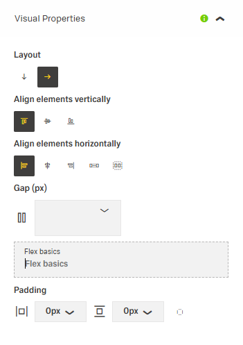
(Configured in Visual Properties)
- layout – Defines the arrangement of form elements as either
"horizontal"or"vertical". For example, setting"horizontal"arranges controls side by side while"vertical"stacks them.
Styling
(Configured in Visual Properties)
- paddingClass – Configures spacing around the form using CSS classes. For example,
"p-4"adds medium padding on all sides of the form container. - gapClass – Sets the spacing between form elements using row and column gap classes. For example,
{"row": "gap-3", "column": "gap-2"}creates consistent spacing between form fields. - alignItemsClass – Controls the vertical alignment of form elements. For example,
"align-items-center"vertically centers all elements within their containers. - justifyContentClass – Controls the horizontal alignment of form elements. For example,
"justify-content-between"evenly spaces elements across the form width. - canGrow – Determines whether the form can expand vertically. When enabled, the form will grow to accommodate its content rather than being constrained by its container.
- canShrink – Determines whether the form can contract vertically. When enabled, the form will shrink to fit its content when there's less than expected.
- defaultHeight – (flexBasics) Sets the initial height of the form component. For example,
"500px"creates a form with a fixed starting height that may adjust based on canGrow/canShrink settings.
Actions & Variants
(Configured in Events)
- events – Configures the events that the form can trigger and respond to:
- ON_VALUES_CHANGE – Triggered when form values change. Provides the current form values for validation or dynamic UI updates.
- ON_INIT – Triggered when the form is initialized. Can be used to perform setup operations like loading reference data.
- ON_DESTROY – Triggered when the form is removed from the DOM. Useful for cleanup operations.
- ON_FORM_SUBMIT – Triggered when the form is submitted. Can be used to perform custom validation or processing before submission.
Links
- Figma: https://www.figma.com/design/yck1tcUXgdQ5aYX6iUAwrO/GE---Astronaut-Design-System?node-id=11547-229074&t=ftfrOGkPzlG2GaTo-1
- Live style guide: https://e1-dev.k8s.myapp.de/live-style-guide/introduction/forms
Guidelines
Tooltip
- Tooltips should be used sparingly:
- Use the outlined “i” (info) icon for explanatory or added information.
- Keep tooltips concise, never place essential information inside them.

- Helper text:
- Appears below the form title or individual fields.
- Always available, even when the field is focused.
- Use it for necessary guidance; use placeholder text or tooltips for optional background info.
Usage
- Use for create/update data entry flows: connect to a submission endpoint via
dataSourceId, map payload withdataSourceHttpRequestParametersMap, and choosedataFormat("json"or"formdata"). - Set a clear authoring label with
displayName. - Choose a reading direction with
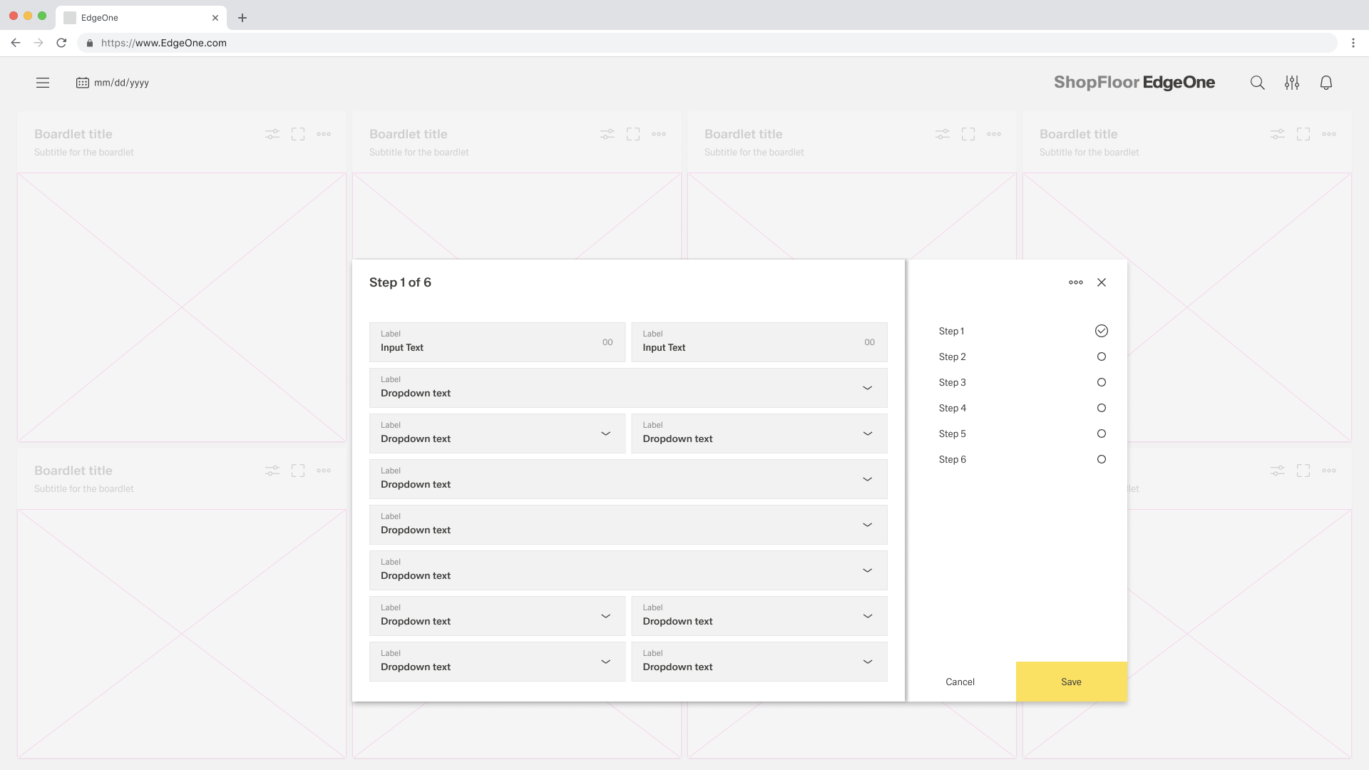
layout("vertical"for sequential flows;"horizontal"for short parallel groups). - Longer Forms:
- Break long forms into steps or sections to avoid overwhelming users. (See "Tabs Form")
- Interactive Forms:
- Allow users to dynamically add segments (e.g., add task, add incident, add note, add attachment) depending on scenario. (See "Tabs Form")
Sizing & Layout
- Control outer spacing with
paddingClassand intra-field rhythm withgapClass(use bothrowandcolumngaps). - Align content consistently via
alignItemsClass(vertical) andjustifyContentClass(horizontal). - Pair a baseline
defaultHeightwithcanGrow/canShrinkso the form adapts to content without overflow.
States & Feedback
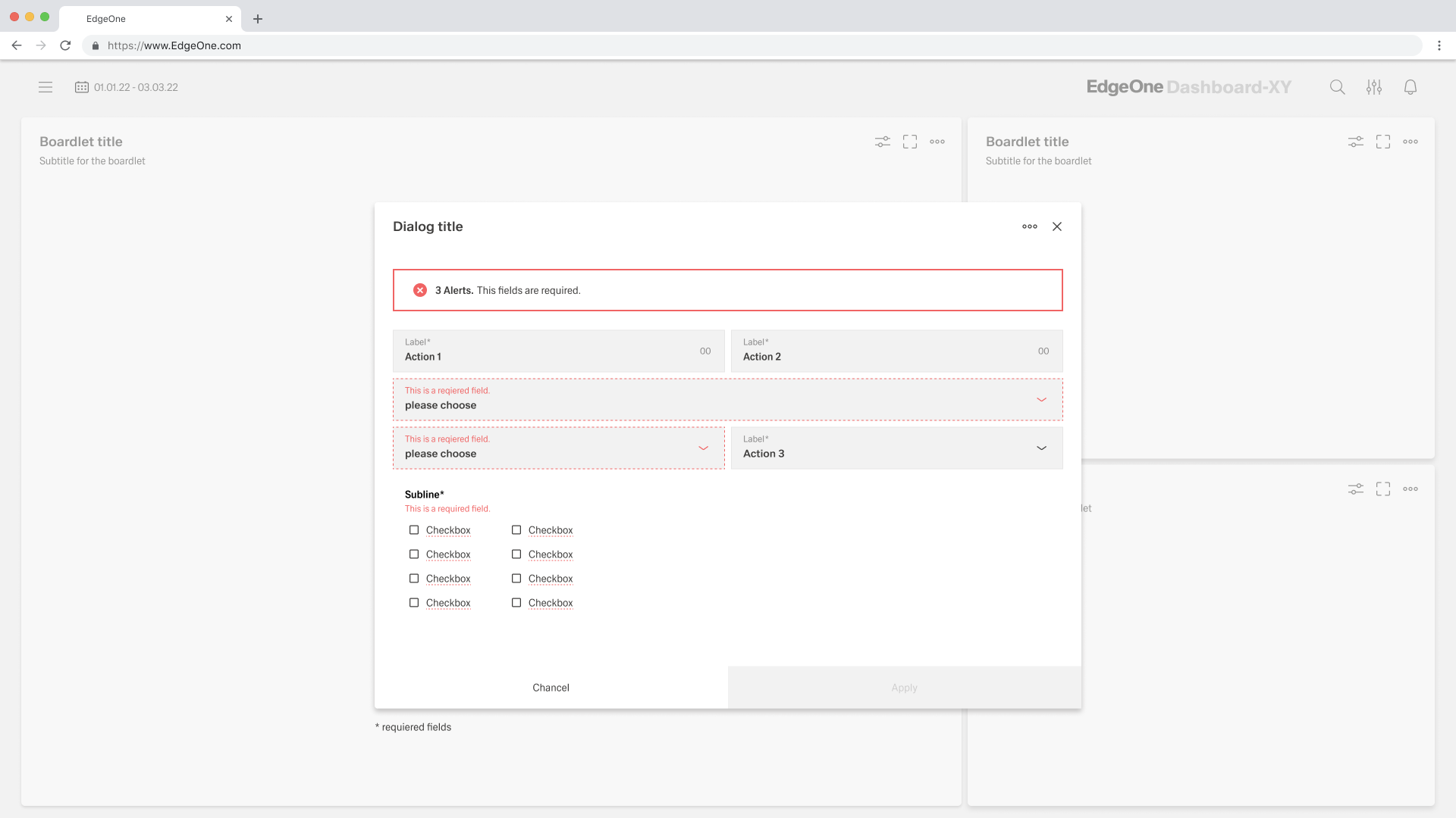
- Error and Validation:
- Errors must be shown inline whenever possible.
- Provide immediate, effective error messages that explain the problem and suggest solutions.
- A form cannot be closed until errors are resolved (primary button should be disabled in error state).
- Server-side validation should be supported with clear inline feedback.
Data-Driven / Conditional Behavior
- Configure submission deterministically using
dataSourceHttpRequestParametersMap; addstaticValuesandadditionalFormFieldsfor always-on metadata. - Configure entity retrieval via
getEntityHttpRequestParametersMapandgetEntityDataSourceId. - Set
dataFormat="formdata"for file uploads; prefer"json"for purely textual/numeric payloads.
Dos & Don’ts
| Do | Don’t | Article setting(s) |
|---|---|---|
Choose dataFormat to match the endpoint (use "formdata" for uploads). | Mix uploads into a "json" payload the API won’t accept. | dataFormat |
| Fetch the record on init so fields open pre-filled. | Wait until first edit to request entity data. | events.ON_INIT, getEntityDataSourceId, getEntityHttpRequestParametersMap |
| Map every required parameter explicitly. | Assume backend defaults will infer missing keys. | dataSourceHttpRequestParametersMap, dataSourceId |
| Keep long forms readable with a vertical flow. | Cram many fields side-by-side. | layout: "vertical" |
| Space and align consistently using classes. | Insert spacer elements or rely on random defaults. | paddingClass, gapClass, alignItemsClass, justifyContentClass |
| Let the form adapt to content growth. | Fix the height and allow content to overflow. | defaultHeight, canGrow, canShrink |
| Block submit when client checks fail. | Submit and rely only on server errors. | events.ON_FORM_SUBMIT |
| Add constant metadata in one place. | Scatter hidden fields across child controls. | staticValues, additionalFormFields |
Accessibility
- Maintain predictable reading order and grouping via
layout, with consistent spacing usinggapClassandpaddingClass. - Keep layout stable by combining
defaultHeightwithcanGrow/canShrink. - Ensure deterministic data operations with explicit mappings for fetch and submit:
getEntityDataSourceId,getEntityHttpRequestParametersMap,dataSourceId,dataSourceHttpRequestParametersMap. - Stage validation: provide live checks during edits (
events.ON_VALUES_CHANGE) and block final submission when needed (events.ON_FORM_SUBMIT). - Keep alignment consistent to aid scanning using
alignItemsClassandjustifyContentClass.