Tab
Overview
- The DynamicTabComponent shows a clickable label that switches the visible content panel.
- It supports localization for the label text.
- Interaction can be disabled to prevent selection.
- The panel renders configurable content composed of nested UI elements.
- Layout and spacing of inner elements are adjustable.
Specs
Tokens
| Token | Description |
|---|---|
| displayName | Display name shown in the structure panel for this tab. |
| title | Label text displayed on the tab. |
| titleTranslations | Localized label values for the tab. |
| disabled | Prevents the tab from being selectable. |
| elements | Child components rendered inside this tab’s panel. |
| layout | Arrangement of child elements within the panel. |
| alignItemsClass | Vertical alignment utility for children in the panel. |
| gapClass | Spacing between child elements within the panel. |
| events | Configurable events the tab can emit or handle. |
| ON_INIT (Events) | Fired when the tab panel initializes. |
| ON_DESTROY (Events) | Fired when the tab panel is removed. |
| id | Unique identifier for programmatic access to this tab/panel. |
| dataTestId | Test hook identifier for automated tests. |
| enableAsHotspot | Enables this tab/panel to be highlighted as a guided tour hotspot. |
Structure
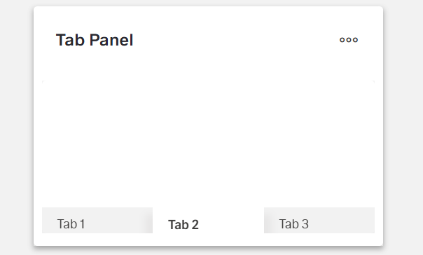
- A tab pairs a selectable header with its linked content panel. Selecting the header shows the associated panel within the container.
- elements — Contains all components to be rendered within this tab panel when it is active. This array can include any dynamic components like forms, fields, images, or other UI elements that form the content of the tab panel.
(Configured in General Properties)
- displayName — Sets the display name of the component shown in the structure panel. For example, “ProductDetailsTabs” allows for easy identification of the tab panel’s purpose in the component structure.
Styling
(Configured in Visual Properties)
- layout — Defines the layout arrangement of elements within the tab panel. Options include “horizontal” (elements arranged side by side) or “vertical” (elements stacked). For example, using a “vertical” layout provides a clean presentation for form fields in a tab panel.
- alignItemsClass — Controls the vertical alignment of child elements within the tab panel. For example, “align-items-center” centers all child elements vertically within the panel.
- gapClass — Configures the spacing between child elements within the tab panel. For example, {"row": "row-gap-4", "column": "column-gap-2"} creates consistent spacing with more vertical than horizontal spacing.
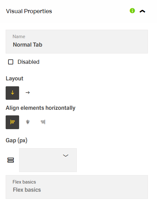
- disabled – Controls whether the tab can be expanded or collapsed. When set to true, the item appears grayed out and cannot be clicked.

Actions
(Configured in Event Actions)
- events — Configures the events that the component can trigger and respond to:
- ON_INIT — Triggered when the tab panel is initialized. Can be used to perform setup operations when its content first appears, such as loading additional data or setting initial states.
- ON_DESTROY — Triggered when the tab panel is removed from the DOM. Useful for cleanup operations and releasing resources, such as closing connections or clearing cached data.
Testing Hooks
(Configured in Testing Hooks)
- id — Specifies a unique identifier for the tab or its panel used for programmatic access. For example, “userProfileTab” enables targeted manipulation of this specific tab through scripts or automated tests.
- dataTestId — Sets the testing hook ID for automated testing. For example, setting it to “user-profile-tab” allows test scripts to reliably locate this tab during automated testing.
- enableAsHotspot — Enables the tab (or its panel) as a guided tour hotspot. When enabled, it can be highlighted during onboarding or tutorial flows to explain important sections to new users.
Links
- Figma: tba
- Live style guide: https://e1-dev.k8s.myapp.de/live-style-guide/other-components/tab-panel
Guidelines
Usage
- Use a Tab when users need to switch between peer views while keeping each panel’s contents isolated within
elements(elements,id). - Give each tab a short, specific label using
titleand localize withtitleTranslations(title,titleTranslations). - Prevent navigation to incomplete or restricted panels by setting
disabled: true(disabled). - Keep panel content cohesive; place only related UI within the same tab and order it in
elements(elements). - Name the component for authors (not end-users) with
displayNameso it’s easy to find in structure tools (displayName).
Sizing & Layout
- Arrange panel content with
layout: use"vertical"for stacked reading and forms; use"horizontal"for side-by-side comparisons (layout). - Align inner elements consistently using
alignItemsClass(e.g., center or baseline alignment) (alignItemsClass). - Space items evenly with
gapClass(define row/column gaps), and keep these values consistent across similar tabs (gapClass). - Keep labels concise to avoid wrapping/truncation; prefer 1–3 words via
title/titleTranslations(title,titleTranslations). - Order inner components intentionally inside the panel via
elementsto match the tab label’s promise (elements).
States & Feedback
- Reflect non-interactive states by toggling
disabled; a disabled tab should not be selectable (disabled).
Content & Localization
- Localize all visible labels via
titleTranslations; keeptitleas a sensible default (title,titleTranslations). - Use plain, action-oriented text; avoid emoji/icon-only labels since selection meaning must remain in text (
title). - Provide deterministic automation hooks using
idanddataTestIdfor each tab/panel (id,dataTestId).
Dos & Don’ts
| Do | Don’t | Article setting(s) |
|---|---|---|
| Localize each tab label. | Ship English-only labels. | titleTranslations, title |
| Disable tabs until content is ready. | Let users open empty/incomplete panels. | disabled |
| Keep labels 1–3 words. | Use long sentences that wrap. | title, titleTranslations |
| Stack form content vertically. | Force dense side-by-side fields. | layout |
| Use consistent inner spacing. | Mix random ad-hoc margins. | gapClass |
| Align content to a common baseline. | Leave misaligned inputs and text. | alignItemsClass |
| Group only related UI per panel. | Scatter unrelated items in one tab. | elements |
Accessibility
- Accessible name & localization: Provide the tab’s programmatic name via
title; localize withtitleTranslations.- Label clarity: Keep
titleshort, specific, and scannable; ensure eachtitleTranslationsentry is concise.
- Label clarity: Keep
- Actionability state: Use
disabledto prevent navigation to incomplete or restricted content. - Predictable structure: Maintain a logical reading order and grouping with
layout, and consistent spacing/alignment usinggapClassandalignItemsClass. - Guided focus surfaces: When tutorials are present, you can make the tab/panel a highlightable target with
enableAsHotspot. - Stability reduces cognitive load: Avoid frequent runtime changes to
layout,alignItemsClass, orgapClasswithin the same session.