Document Viewer
Overview
- The Document Viewer displays PDF documents directly inside the application.
- It offers configurable display options for document viewing.
- It helps users read documents like contracts, reports, or manuals without external viewers.
- It supports localized titles and optional text selection.
- It can connect to a datasource to fetch the PDF content.
Specs
Tokens
| Token | Description |
|---|---|
| displayName | Display name shown in the structure panel. |
| title | Title text displayed above the document viewer (supports multiple languages). |
| originalSize | Shows the document in its original dimensions when true; otherwise scales to fit. |
| allowSelectText | Allows users to select and copy text from the document when enabled. |
| paddingClass | Spacing around the component via CSS classes. |
| dataSourceId | Data source ID used to retrieve the PDF document. |
| getEntityCollectionHttpRequestParametersMap | HTTP parameters mapping used when fetching the document. |
| visibilityPolicySetId | Policy set ID controlling component visibility. |
| displayConditions | Rules that determine when the component is shown or hidden. |
| id | Unique identifier for programmatic access. |
| dataTestId | Testing hook ID for automated tests. |
| enableAsHotspot | Enables this component as a guided tour hotspot. |
| guidedTourHotSpotTitle | Title for the guided tour hotspot (supports translations). |
| guidedTourHotSpotDescription | Description for the guided tour hotspot (supports translations). |
Structure
(Configured in Visual Properties)
- title – Sets the title text displayed above the document viewer, with support for multiple languages. For example,
{"en-US": "Contract Details", "de-DE": "Vertragsdetails"}ensures proper localization of the title based on the user's language settings. This title helps users understand what document they're viewing. - allowSelectText – Controls whether users can select and copy text from the document. When enabled, users can highlight and copy text content from the displayed document, which is useful for research or citation purposes. When disabled, the document is view-only without text selection capabilities.
(Configured in Datasource Properties)
- dataSourceId – Specifies the data source ID for retrieving the document. This identifies the endpoint that will provide the PDF document data. For example, setting to
"api/documents/contractPdf"connects the viewer to the specific API endpoint that serves the contract document.- getEntityCollectionHttpRequestParametersMap – Configures HTTP parameters for document data fetching. This object maps parameters needed for the document request, such as query parameters or path variables. For example,
{"documentId": "context.selectedDocumentId"}passes the selected document ID from the context to the API request.
- getEntityCollectionHttpRequestParametersMap – Configures HTTP parameters for document data fetching. This object maps parameters needed for the document request, such as query parameters or path variables. For example,
(Configured in General Properties)
- displayName – Sets the display name of the component shown in the structure panel. For example, "Contract Document Viewer" allows for easy identification of the component's purpose in the application structure, making it easier for developers to locate and work with this specific document viewer.
(Configured in Visibility Properties)
- displayConditions – Defines conditions for displaying the component. This allows showing or hiding the document viewer based on complex rules involving other form values, user roles, or application state.
Styling
(Configured in Visual Properties)
- originalSize – Determines whether the document is displayed in its original size or scaled to fit the container. When set to true, the document maintains its original dimensions, which is useful for preserving exact layout and readability of carefully formatted documents. When set to false, the document scales to fit the available space.
- paddingClass – Configures spacing around the document viewer component using CSS classes. For example,
"p-4"adds medium padding on all sides of the component to improve visual spacing within its container.
Tests
(Configured in Testing Hooks Properties)
- id – Specifies a unique identifier for the component used for programmatic access. For example,
"contractDocumentViewer"enables targeted manipulation of this specific document viewer component. - dataTestId – Sets the testing hook ID for automated testing. For example, setting to
"contract-document-view"allows test scripts to reliably locate this component for automated testing scenarios. - enableAsHotspot – Enables the component as a guided tour hotspot. When enabled, the document viewer can be highlighted during onboarding or tutorial flows to explain its functionality to new users.
- guidedTourHotSpotTitle – Sets the title for the guided tour hotspot, supporting translations. For example,
{"en-US": "Document Viewer", "de-DE": "Dokumentenbetrachter"}provides clear identification during guided tours. - guidedTourHotSpotDescription – Sets the description for the guided tour hotspot, supporting translations. For example,
{"en-US": "View documents directly in the application", "de-DE": "Dokumente direkt in der Anwendung anzeigen"}provides detailed instructions during guided tours.
Authorization
(Configured in Authorization Properties)
- visibilityPolicySetId – Determines the visibility of the component based on specified policy sets. For example, setting to
"documentAccessPolicy"restricts the document viewer visibility to users with document access privileges according to the specified policy.
Links
- Figma: https://www.figma.com/design/yck1tcUXgdQ5aYX6iUAwrO/GE---Astronaut-Design-System?node-id=11613-105271&t=iosNC2AkSTGs5lMh-1
- Live style guide: https://e1-dev.k8s.myapp.de/live-style-guide/id7/5-document-viewer
Guidelines
Usage
- Choose rendering behavior based on intent: preserve exact layout with
originalSize: true(e.g., contracts), or fit to available space withoriginalSize: falsefor general reading. - Control copying according to content policy by toggling
allowSelectText(enable for research/citation workflows; disable for view-only or sensitive PDFs). - Optionally aid discovery during onboarding by enabling a guided-tour hotspot via
enableAsHotspot,guidedTourHotSpotTitle, andguidedTourHotSpotDescription(all translatable).
Sizing & Layout
- Add breathing room around the viewer with
paddingClass(e.g., “p-4”), using only the component’s own spacing token. - Use
originalSizeto govern scaling; whenfalse, the viewer scales to fit its allotted area; whentrue, it uses the document’s native dimensions.
States & Feedback
- Represent selection capability as a binary state using
allowSelectText(enabled/disabled).
Data-Driven / Conditional Behavior
- Show the viewer only when a valid document is available by defining
displayConditions(e.g., check a bounddocumentIdor fetch status that the component can “see”). - Prevent UI “flicker” by making
displayConditionsmutually exclusive and tied to stable values (e.g., only switch to “show” after required parameters are present).
Visibility & Authorization
- Gate access without leaking content by assigning a policy set to
visibilityPolicySetIdso the viewer is hidden for unauthorized users. - Use
displayConditionsfor contextual visibility (e.g., only show after a selection) and reservevisibilityPolicySetIdfor permission-based gating.
Content & Localization
- Localize user-visible text with
title(language map). - Localize guided-tour copy with
guidedTourHotSpotTitleandguidedTourHotSpotDescription. - Keep
titleconcise to avoid truncation in tight spaces; use the document itself for detailed naming, not the title line.
Dos & Don’ts
| Do | Don’t | Article setting(s) |
|---|---|---|
| Localize the title so users understand what they’re viewing. | Hard-code an English-only title. | title |
| Preserve exact layout for formal documents. | Force-fit precise layouts that become blurry or misaligned. | originalSize |
| Disable text selection for sensitive PDFs. | Leave selection on when copying must be prevented. | allowSelectText |
| Add spacing using the component’s own token. | Hack spacing with external CSS not controlled by the component. | paddingClass |
| Hide the viewer until a document is available. | Show an empty/blank frame. | displayConditions |
| Hide confidential documents from unauthorized users. | Show the component and rely on the document to say “no access.” | visibilityPolicySetId |
| Use localized copy for guided tours. | Show untranslated hotspot text. | enableAsHotspot, guidedTourHotSpotTitle, guidedTourHotSpotDescription |
Accessibility
- The component does not expose ARIA roles, focus management, or keyboard-handling props; accessibility relies on readable rendering (
originalSize), text-selection capability (allowSelectText), and localized textual surfaces (title,guidedTourHotSpotTitle,guidedTourHotSpotDescription). - Ensure locale keys in
title,guidedTourHotSpotTitle, andguidedTourHotSpotDescriptionmatch the user’s language so assistive technologies announce text in the correct voice. - If users must extract passages for assistive tools, enable
allowSelectText; if content is sensitive, disable it and communicate restrictions via thetitleor the PDF content itself. - Choose
originalSizeonly when it materially increases legibility for dense PDFs; otherwise keep scaling enabled to minimize horizontal scrolling for low-vision users.
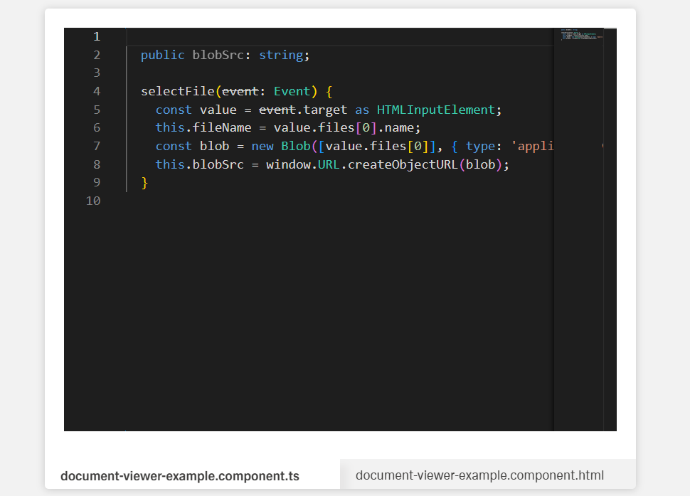
Data Source
The Document Viewer requires a backend endpoint that returns the file as a binary stream (application/octet-stream). There are two ways to connect it.
Option 1: Data Source category (App Composer)
Open the component settings and go to the Data Source category. Set the endpoint URL directly — the viewer will fetch the file on load and render it automatically.
The endpoint must return a blob response. Example:
Response: 200 OK, Content-Type: application/octet-stream
Option 2: Action Editor (HTTP Request + Data Action)
Use this approach when you need to control when the file loads (e.g., on button click, after a form step).
- In the Action Editor, add a new HTTP Request action.
- Configure it to call the file endpoint (e.g.,
GET /api/v1/buckets/{bucket}/files/{id}). - Set the response type to FILE.
- Add a Data Action targeting the Document Viewer and bind the response blob as its data source.
The viewer will render the file once the action completes.
Note: In both cases the endpoint must return a binary response (
application/octet-stream). Returning a URL or JSON is not supported — the viewer expects raw file bytes.