Icon
Overview
- The Icon component is a versatile UI element that displays an interactive icon.
- It supports customizable appearance, behavior, and conditional display options.
- The component includes styling options, tooltips, and hover states.
- Icons can change appearance dynamically based on data context.
- It is useful for interactive indicators, status displays, or clickable action buttons.
Specs
Tokens
| Token | Description |
|---|---|
| displayName | Sets the display name of the component shown in the structure panel. |
| name | Specifies the icon to display from the icon library. |
| thresholdConfig | Configures conditional display rules that change the icon’s appearance based on data context. |
| size | Sets the size of the icon (e.g., "sm" or "lg"). |
| iconOnHover | Defines an alternate icon shown when hovering over the component. |
| widthAuto | Controls whether the icon automatically sizes to its content or fills the container. |
| showTooltip | Determines whether a tooltip appears when hovering over the icon. |
| tooltipTextTranslations | Sets the tooltip text with support for multiple languages. |
| tooltipPlacement | Defines the position of the tooltip (top, bottom, left, right). |
| tooltipDelay | Sets the delay in ms before the tooltip appears on hover. |
| paddingClass | Configures spacing around the icon with CSS classes. |
| events | Configures the events the component can trigger or respond to. |
| ON_ICON_CLICK (Events) | Triggered when the icon is clicked. |
| ON_INIT (Events) | Triggered when the component is initialized. |
| ON_DESTROY (Events) | Triggered when the component is removed from the DOM. |
| visibilityPolicySetId | Defines visibility based on specified policy sets. |
| displayConditions | Defines rules for when the component is shown or hidden. |
| id | Sets a unique identifier for programmatic access. |
| dataTestId | Defines the testing hook ID for automated tests. |
| enableAsHotspot | Enables the component as a guided tour hotspot. |
| guidedTourHotSpotTitle | Sets the translated title for the guided tour hotspot. |
| guidedTourHotSpotDescription | Sets the translated description for the guided tour hotspot. |
Structure
(Configured in General Properties)
- displayName – Sets the display name of the component shown in the structure panel. For example, "Status Indicator Icon" allows for easy identification of the icon's purpose in the component structure, making it easier for developers to locate and work with this specific icon.
(Configured in Visual Properties)
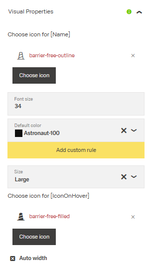
- name – Specifies the icon to display from the available icon library. For example, setting to "check-circle" displays a checkmark icon that can represent completion or success. This is the primary visual element of the component.
- thresholdConfig – Configures conditional display rules that change the icon's appearance based on context data. For example, you can set rules to display a green check icon when a status is "complete" and a red warning icon when status is "overdue". This enables dynamic visual feedback based on data values.
(Configured in Visibility)
- displayConditions – Defines conditions for displaying the component. This allows showing or hiding the icon based on complex rules involving form values, user roles, or application state. For example, the icon might only be shown when certain data conditions are met or when the user has specific permissions.
Variants
| Variant | Description | Typical Usage |
|---|---|---|
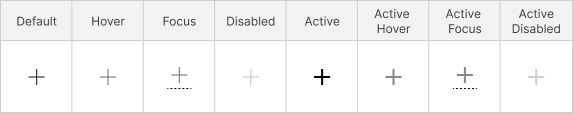
| Default | The standard appearance of the icon in its normal idle state. Usually neutral color and standard stroke weight. | Displayed when no interaction is happening. |
| Hover | The icon appearance when a user hovers the cursor over it. Often slightly darker, highlighted, or emphasized. | Desktop web interactions. |
| Focus | Indicates keyboard or accessibility focus. The dotted underline/border in the screenshot suggests focus visibility. | Keyboard navigation, accessibility compliance. |
| Disabled | Indicates the icon is inactive or unavailable for interaction. Usually displayed with reduced opacity or lighter contrast. | Disabled buttons, unavailable actions, restricted states. |
| Active | Represents the icon while being clicked, selected, or pressed. Usually bolder or darker. | Button press or selected action state. |
| Active Hover | Combination of active + hover states. The item is already selected and the user hovers over it. | Selected menu items or toggles. |
| Active Focus | Combination of active + focus states. Used when a selected item also has keyboard focus. | Accessible interactive controls. |
| Active Disabled | Represents a previously active or selected icon that is currently unavailable for interaction. Usually shown with reduced opacity while retaining active styling cues. | Disabled selected states, inactive toggles, unavailable active controls. |
Tooltip
(Configured in Visual Properties)
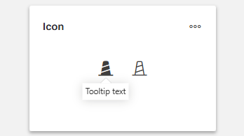
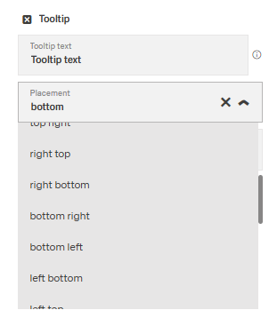
- showTooltip – Determines whether a tooltip appears when hovering over the icon. When enabled, provides additional context or instructions about the icon's purpose to users who may not immediately recognize its meaning.
- tooltipTextTranslations – Sets the text displayed in the tooltip with support for multiple languages. For example, {"en-US": "Complete Task", "de-DE": "Aufgabe abschließen"} ensures proper localization of tooltip messages. This property can use template expressions to show dynamic content from context data.
- tooltipPlacement – Determines the position of the tooltip relative to the icon. Options include "top", "bottom", "left", and "right". For example, "top" places the tooltip above the icon, which is useful in most standard layouts.
- tooltipDelay – Sets the delay in milliseconds before the tooltip appears when hovering over the icon. For example, setting to "500" will delay the tooltip appearance by half a second, preventing tooltips from appearing too quickly during casual mouse movements.
Styling
(Configured in Visual Properties)
- size – Sets the size of the icon. Options include "sm" (small) or "lg" (large). For example, choosing "lg" creates a more prominent icon that can serve as a focal point, while "sm" works well for inline indicators or dense layouts.
- widthAuto – Controls whether the icon component automatically sizes to fit its content. When set to true, the icon will take only as much width as needed; when false, it will fill available space in its container according to specified dimensions.
- iconOnHover – Specifies an alternate icon to display when the user hovers over the component. For example, setting "edit" as the hover icon on a "view" primary icon indicates that clicking will allow editing the item. This provides interactive feedback to users.
- paddingClass – Configures spacing around the icon using CSS classes. For example, "p-2" adds light padding on all sides of the icon, improving its visual spacing within its container.
Actions & Variants
(Configured in Events)
- events – Configures the events that the component can trigger and respond to.
- ON_ICON_CLICK – Triggered when the icon is clicked. Can be used to execute workflows, navigate to other screens, or perform data operations based on user interaction.
- ON_INIT – Triggered when the icon component is initialized. Can be used to perform setup operations when the icon first appears.
- ON_DESTROY – Triggered when the icon component is removed from the DOM. Useful for cleanup operations and releasing resources.
Authorization
(Configured in Authorization)
- visibilityPolicySetId – Determines the visibility of the component based on specified policy sets. For example, setting to "adminAct
Links:
- Figma: https://www.figma.com/design/yck1tcUXgdQ5aYX6iUAwrO/GE---Astronaut-Design-System?node-id=4473-363995&t=ftfrOGkPzlG2GaTo-1
- Live style guide: https://e1-dev.k8s.myapp.de/live-style-guide/id1/1-icons-24
Guidelines
Usage
- Use the Icon to present a recognizable symbol via
namewhen a compact, tappable affordance or status indicator is needed. - Use an Icon as an actionable control when you can wire outcomes to
ON_ICON_CLICK. - Use an Icon for data or status feedback when the graphic should react to context using
thresholdConfig. - Provide contextual hints with tooltips only as supplemental help by enabling
showTooltipand supplyingtooltipTextTranslations. Do not put critical information exclusively in the tooltip.
Sizing & Layout
- Select an appropriate icon scale using
size(e.g.,"sm","lg") to match density and emphasis. - Control horizontal growth with
widthAuto; set it totruefor intrinsic sizing, orfalsewhen the icon should fill its available width. - Adjust local spacing around the icon using
paddingClassto achieve comfortable touch or click targets and visual balance.
States & Feedback
- Provide hover affordance by specifying
iconOnHoverso the icon swaps on pointer hover. - Convey dynamic status by mapping data-driven rules to
thresholdConfigthat switchnameto appropriate status glyphs. - Surface explanatory help on hover via
showTooltipwith a consideratetooltipDelayto avoid accidental popups.
Tooltips
- Turn on tooltips with
showTooltipand provide localized copy withtooltipTextTranslations. - Position the tooltip so it does not occlude nearby content by choosing
tooltipPlacementthat best fits the context. - Use
tooltipDelayto reduce flicker during transient hovers; 300–500 ms is a common range. - Treat tooltips as supplemental only; never put essential instructions exclusively in the tooltip.
Data-Driven / Conditional Behavior
- Define robust rule sets in
thresholdConfigthat map clear conditions to specificnamevalues, and include a default rule to prevent unmapped states. - To minimize jarring oscillation when incoming data flutters near a boundary, prefer non-overlapping, explicit conditions in
thresholdConfig.
Visibility & Authorization
- Gate visibility based on policies using
visibilityPolicySetIdwhen the icon should appear only for allowed audiences. - Show or hide the icon contextually by configuring
displayConditionstied to relevant data or state.
Content & Localization
- Localize all user-facing strings by supplying
tooltipTextTranslationsfor tooltips and localizedguidedTourHotSpotTitle/guidedTourHotSpotDescriptionwhen using hotspots.
Dos & Don’ts
| Do | Don’t | Article setting(s) |
|---|---|---|
Do provide a localized tooltip using tooltipTextTranslations when the icon meaning may be ambiguous. | Don’t rely on a tooltip as the only place to explain a critical action. | showTooltip, tooltipTextTranslations |
Do use iconOnHover to give immediate hover feedback on interactive icons. | Don’t change the icon on hover if the icon is not clickable. | iconOnHover |
Do configure a default rule in thresholdConfig to handle unexpected data. | Don’t leave gaps in conditions that cause the icon to flicker between states. | thresholdConfig |
Do choose tooltipPlacement that avoids obscuring nearby UI. | Don’t cover the icon itself with the tooltip if an alternate side is available. | tooltipPlacement |
Do use paddingClass to enlarge the tap target area visually and comfortably. | Don’t cram the icon against neighboring elements without padding. | paddingClass |
Do hide icons the user must not see using visibilityPolicySetId or displayConditions. | Don’t show unauthorized or contextually irrelevant icons. | visibilityPolicySetId, displayConditions |
Accessibility
- Provide localized, concise tooltip content using
tooltipTextTranslationswhenshowTooltipis enabled to assist recognition without depending on language-specific icons. - Avoid color-only meaning by swapping to distinct glyphs or filled or outlined variants via
thresholdConfig. - Ensure icons intended as actions clearly indicate interactivity by defining
iconOnHoverso hover state is perceivable. - Expose stable hooks for automated accessibility tests and focus workflows with
dataTestIdandid. - For guided help, provide descriptive, localized copy through
guidedTourHotSpotTitleandguidedTourHotSpotDescriptionwhenenableAsHotspotis set. - Pair data-driven icon changes from
thresholdConfigwithtooltipTextTranslationsso meaning is not conveyed by color or shape alone. - Use
paddingClassto create comfortable hit areas and reduce accidental clicks, supporting motor accessibility. - Prevent surprise tooltips by setting a considerate
tooltipDelayand choosing non-obscuringtooltipPlacement.