Table Selection
Overview
- The Dynamic Table Selection Component is a form control for choosing items.
- It lets users select one or many entries from a table-based dropdown.
- It combines a form field with a data grid to handle large or complex datasets.
- It is used when a table view is clearer than a standard dropdown.
- It supports single and multiple selection behaviors.
Specs
Tokens
| Token | Description |
|---|---|
| keyExpr | Row unique identifier field. |
| hidden | Controls visibility in form. |
| saveInLocalStorage | Persist selection in local storage. |
| defaultValue | Initial value on reset/load. |
| readonly | Prevent user changes. |
| selectionMode | "single" or "multiple" selection. |
| elements | Columns configuration for dialog grid. |
| fieldsUsedInSearch | Fields included in search. |
| getElementsDataSourceId | Data source ID for fetching items. |
| getEntityCollectionHttpRequestParametersMap | HTTP parameters mapping for requests. |
| enablePagination | Enable server-side paging. |
| pageSize | Records per page. |
| paginationRequestParamsMap | Map client paging params to server names. |
| paginationResponseFieldsMap | Map server paging fields to client. |
| useFiltersInRequestBody | Send filters in request body. |
| paginationFilterFieldsMap | Map filter field names for paging. |
| filterOperatorsMap | Map client filter operators to server. |
| dataSourcePath | Path to options list in response. |
| dataField | Submission field name. |
| controlsRequestType | Where to send field data (BODY/HEADER/PATH). |
| validation | Validation rules configuration. |
| required | Field must have a selection. |
| authorizationDisable | Policy that disables the component. |
| events | Configurable component events. |
| ON_INIT (Events) | Triggered on initialization. |
| ON_DESTROY (Events) | Triggered on removal. |
| ON_VALUE_CHANGE (Events) | Triggered on selection change. |
| ON_INIT_BASED_ON_USER_VIEW (Events) | Triggered on init in user view mode. |
| dataTestId | Testing hook ID. |
Structure
(Configured in General Properties)
- keyExpr — Defines the field used to uniquely identify rows in the table. For example, setting keyExpr to "customerId" ensures each row can be uniquely identified by its customer ID, which is essential for tracking selections and data operations.
(Configured in Column Properties)
- elements — Defines the columns configuration for the data grid displayed in the selection dialog. This array contains DynamicTableColumnComponent objects that specify which fields to display in the dialog grid and how they should be formatted. For example, you can configure columns for user ID, name, and email to help users identify the correct record.
- fieldsUsedInSearch — Specifies which data fields are included when searching within the component. For example, setting to ["name", "email", "companyName"] ensures the search functionality looks through these specific fields when users type in the search box.
(Configured in Non-Visual Properties)
- dataField — Defines the field name that will be used when submitting form data. For example, setting to "selectedEmployeeIds" ensures the selected employee IDs are submitted with this field name in the data object.
- controlsRequestType — Specifies how the field data is sent in HTTP requests: 'BODY', 'HEADER', or 'PATH'. For example, setting to "BODY" includes the field in the request body, which is standard for most form submissions.
(Configured in Visual Properties)
- saveInLocalStorage — Determines whether the component's selected value is preserved in local storage. When enabled, user selections persist between page reloads, improving user experience for complex forms that may take time to complete.
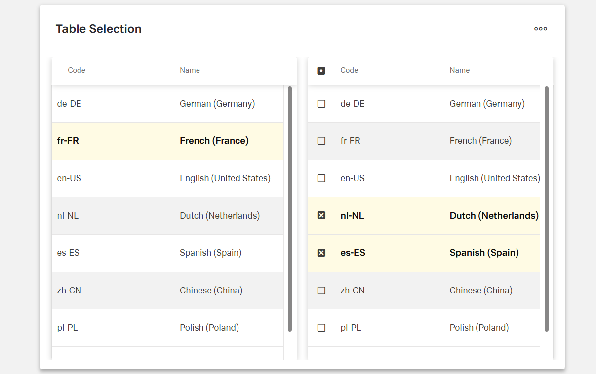
- selectionMode — Sets the selection behavior of the component: "single" (one row) or "multiple" (many rows). For example, "multiple" allows selecting several customers for a bulk operation, while "single" restricts to one selection only.
Datasource
(Configured in Datasource)
- dataSourcePath — Specifies the path within the response data where the list of options is located. For example, setting this to "data.items" will extract the dropdown items from that location in the response structure.
- getElementsDataSourceId — Specifies the data source ID for retrieving data to populate the table. For example, "api/employees" connects the component to the employees API endpoint.
- getEntityCollectionHttpRequestParametersMap — Configures HTTP parameters for data fetching. This object maps additional parameters needed for the API request, which can include query parameters or fixed values that should be sent with every request.
- useFiltersInRequestBody — Places filters in the request body instead of URL parameters. When enabled, filter data is sent in the request body, which is better for complex filters or when URL length limitations might be a concern.
- filterOperatorsMap — Configures the mapping between client-side filter operators and server-side filter operators. For example, {"contains": "like", "=": "eq"} ensures that the filtering operations use the correct syntax for the backend API.
Pagination
(Configured in Datasource)
- enablePagination — Activates server-side pagination for large datasets. When enabled, data is loaded in pages rather than all at once, significantly improving performance for tables with many records.
- pageSize — Sets the number of records displayed per page in the table. For example, setting to 25 will display 25 records per page when pagination is enabled, providing a balance between visibility and performance.
- paginationRequestParamsMap — Maps client-side pagination parameters to server-expected parameters. For example, {"page": "pageNumber", "size": "pageLimit"} adapts to server naming conventions when making pagination requests.
- paginationResponseFieldsMap — Maps server pagination fields to client expectations. For example, {"content": "data", "totalElements": "count"} handles different response structures from the server.
- paginationFilterFieldsMap — Maps filter field names for pagination requests. For example, {"value": "filterValue", "key": "filterField"} adapts to server filter naming conventions.
Styling
(Configured in Visual Properties)
- defaultValue — Sets the initial value that will be used when the form is reset. For example, setting to "10001" would pre-select the record with ID "10001" when the form initially loads.
Actions & Variants
(Configured in Visual Properties)
- hidden — Controls whether the component is visible in the form. When set to true, the component remains in the form structure but is not displayed, which is useful for conditional rendering based on other field values.
- readonly — Controls whether the selection can be changed by users. When set to true, the field displays its selected value but cannot be modified, which is useful for display-only scenarios.
(Configured in Events)
- events — Configures the events that the component can trigger and respond to:
- ON_INIT — Triggered when the component is initialized. Can be used to perform setup operations like loading initial configuration.
- ON_DESTROY — Triggered when the component is removed from the DOM. Useful for cleanup operations and releasing resources.
- ON_VALUE_CHANGE — Triggered when the user changes their selection. Can be used to perform immediate actions based on the selection, such as loading related data.
- ON_INIT_BASED_ON_USER_VIEW — Triggered specifically when the component initializes in user view mode rather than edit mode.
Tests
(Configured in Testing Hooks)
- dataTestId — Sets the testing hook ID for automated testing. For example, setting to "employee-selection-table" allows test scripts to reliably locate this component.
Authorization
(Configured in Authorization)
- authorizationDisable — Specifies a policy set that determines when the component should be disabled. For example, setting to "readOnlyPolicy" will disable the field for users who don't have edit permissions according to the specified policy.
Validation
(Configured in Validation)
- validation — Configures validation rules for the table selection control, including:
- required — When set to true, the field must have a selection before the form can be submitted. This ensures users make a selection when the information is essential.
Links
- Figma: https://www.figma.com/design/yck1tcUXgdQ5aYX6iUAwrO/GE---Astronaut-Design-System?node-id=4830-274143&t=2GNf1jEXqXOrnDUK-1
- Live style guide: https://e1-dev.k8s.myapp.de/live-style-guide/app-composer/table
Guidelines
Usage
- Prefer this control when users must pick from structured records and a table view clarifies choice. Configure visible columns with
elementsand uniquely identify rows withkeyExprto keep selections stable across paging and refresh. - Match the cardinality of the business field to the component by setting
selectionModeto"single"for one value or"multiple"for sets. - Use
readonly: trueto show the current selection without permitting edits (e.g., confirmation or audit views). - Require a choice when the field is mandatory via
validation.required: true; initialize known defaults withdefaultValue. - For large datasets, enable server-side paging with
enablePagination: trueand a tunedpageSize; align API naming viapaginationRequestParamsMapandpaginationResponseFieldsMap. - Persist user progress in long flows by turning on
saveInLocalStorage. - Make search effective by scoping it to the most discriminative fields using
fieldsUsedInSearch.
Sizing & Layout
- Show only columns that help decision-making and put the most informative ones first by ordering
elementsaccordingly. - Balance scan length with paging by tuning
pageSize(e.g., fewer rows for denser columns, more rows for sparse tables).
Visibility & Authorization
- Hide the field completely when it must not appear by setting
hidden: true; when it may appear but not be changeable, disable interaction withauthorizationDisable.
Content & Localization
- Name the submitted field explicitly with
dataFieldand route it to the correct HTTP location usingcontrolsRequestType(BODY/HEADER/PATH). - Provide stable automation hooks via
dataTestIdfor tests and accessibility checks.
Dos & Don’ts
| Do | Don’t | Article setting(s) |
|---|---|---|
Set selectionMode: "single" for single-value fields; "multiple" only when sets are valid. | Leave the default and allow incorrect cardinality. | selectionMode |
Use a stable backend key for selection by setting keyExpr (e.g., customerId). | Use a label column or non-unique field as the key. | keyExpr |
Show only decisive columns and order them for scanning via elements. | Expose every attribute; bury key info at the end. | elements |
Enable paging and set a sensible pageSize for large data. | Load entire collections at once. | enablePagination, pageSize |
| Map client/server paging and data fields explicitly. | Assume server names match the client’s defaults. | paginationRequestParamsMap, paginationResponseFieldsMap, dataSourcePath |
| Persist the user’s picks across reloads in long flows. | Force users to reselect after a refresh. | saveInLocalStorage |
Make the field required when it’s mandatory; seed a known defaultValue when appropriate. | Depend on external validation alone. | validation, required, defaultValue |
| Disable for permission gaps to explain in-place why it can’t change. | Hide the control when users should see but not edit it. | authorizationDisable |
| React immediately to changes using the value-change event. | Poll for changes or delay updates. | events.ON_VALUE_CHANGE |
| Send complex filters in the request body and normalize operators. | Pack long filters into query strings with mismatched operators. | useFiltersInRequestBody, filterOperatorsMap |
Accessibility
- Maintain stable, unique selection references using backend IDs via
keyExpr. - Prevent non-functional interaction by setting
readonly: trueduring view-only states and disabling by policy withauthorizationDisable. - Ensure mandatory input is programmatically determinable with
validation.required. - Reduce cognitive load by exposing only necessary columns and ordering them with
elements, and by paging long lists usingenablePaginationandpageSize. - Avoid color-only meaning; convey state via explicit
readonly/authorizationDisablesettings and clear column labels configured inelements. - Improve findability with targeted search fields using
fieldsUsedInSearch.
Datasource Requriements
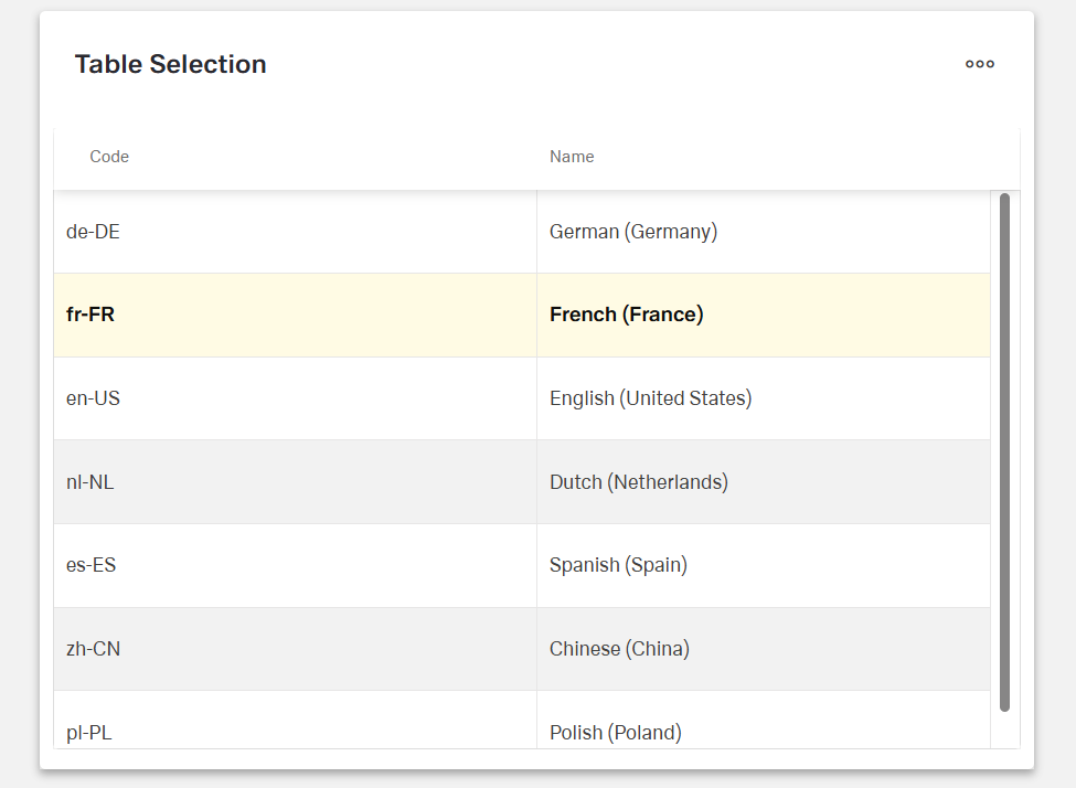
The table selection component expects an array of objects. Value keys inside the objects provide a title to the column while any single object inside the array represents one row of the table selection.
Example:
[
  {
    "name": "German (Germany)",
    "code": "de-DE"
  },
  {
    "name": "French (France)",
    "code": "fr-FR"
  },
  {
    "name": "English (United States)",
    "code": "en-US"
  },
  {
    "name": "Dutch (Netherlands)",
    "code": "nl-NL"
  },
  {
    "name": "Spanish (Spain)",
    "code": "es-ES"
  },
  {
    "name": "Chinese (China)",
    "code": "zh-CN"
  },
  {
    "name": "Polish (Poland)",
    "code": "pl-PL"
  }
]
Column Creation
After initially selecting a data source, the column chooser will open automatically with the keys added from the data source. If an existing and desired key is not among them, create an additional column and add the key under data field in the column. The columns can be edited individually as table columns.