Grid Container
Overview
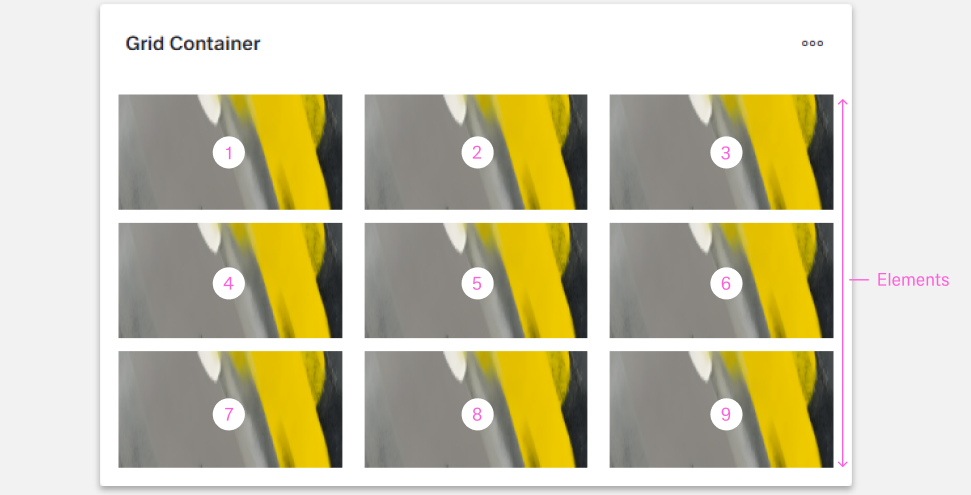
- The Dynamic Grid Container is a layout component built on the CSS grid system.
- It organizes child components into rows and columns.
- It supports responsive and flexible layouts.
- It is suitable for dashboards, forms, and other structured interfaces.

Specs
Tokens
| Token | Description |
|---|---|
| displayName | Display name in the structure panel |
| elements | Components rendered inside the grid container |
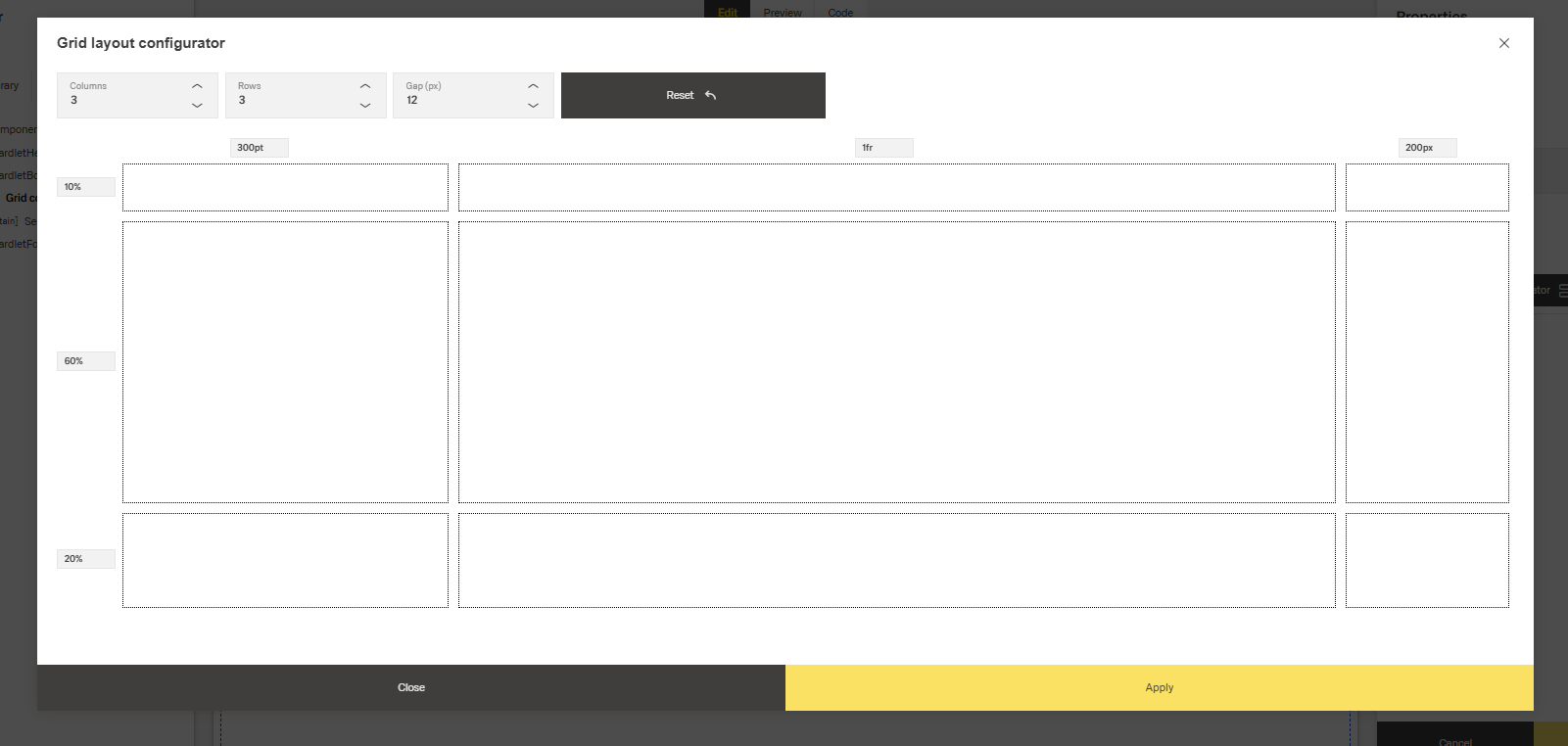
| gridLayout | Configuration object for CSS grid properties |
| gridTemplateColumns | Defines column layout using CSS grid syntax |
| gridTemplateRows | Defines row layout using CSS grid syntax |
| gridGap | Sets spacing between grid items |
| fullHeight | Expands grid to fill parent height |
| events | Configurable component events |
| ON_INIT (Events) | Event triggered on initialization |
| ON_DESTROY (Events) | Event triggered on removal |
| dataTestId | Testing hook ID for automated testing |
| visibilityPolicySetId | Controls visibility based on policy sets |
| displayConditions | Conditions for showing the component |
Structure
(Configured in General Properties)
- displayName – Sets the display name of the component shown in the structure panel. For example, "Dashboard Layout" provides clear identification of the grid's purpose in the component hierarchy.
- elements – Contains all components to be rendered within the grid container. This array can include any dynamic components that will be positioned according to the defined grid layout.
(Configured in Visibility)
- displayConditions – Defines conditions for displaying the component based on context data or expressions. For example, configuring it to display only when "userType === 'advanced'" ensures the grid appears only for advanced users, providing a conditional layout experience.
Styling
(Configured in Visual Properties)
- fullHeight – Controls whether the grid container should expand to fill its parent container's height. When set to true, the grid will occupy 100% of the available vertical space, which is useful for creating full-height layouts in panels or tabs.
- gridLayout – Defines the grid structure using CSS Grid properties. This configuration object contains:
- gridTemplateColumns – Specifies the column layout using CSS grid syntax. For example, "1fr 1fr 1fr" creates three equal-width columns, while "200px 1fr 2fr" creates a fixed width column followed by two proportional columns.
- gridTemplateRows – Specifies the row layout using CSS grid syntax. For example, "auto 1fr 100px" creates a row that sizes to content, a flexible middle row, and a fixed height bottom row.
- gridGap – Sets the spacing between grid items. For example, "8px" creates uniform spacing between all grid cells.
Actions & Variants
(Configured in Events)
- events – Configures the events that the component can trigger and respond to:
- ON_INIT – Triggered when the component is initialized. Can be used to perform setup operations like setting initial data or calculating dimensions.
- ON_DESTROY – Triggered when the component is removed from the DOM. Useful for cleanup operations or releasing resources.
Tests
(Configured in Testing Hooks)
- dataTestId – Sets the testing hook ID for automated testing. For example, setting it to "main-dashboard-grid" allows test scripts to reliably locate this grid container during automated testing.
Authorization
(Configured in Authorization)
- visibilityPolicySetId – Determines the visibility of the component based on specified policy sets. For example, setting to "adminOnlyPolicy" restricts the grid container to users with admin privileges, hiding it from other users without the required permissions.
Links
Guidelines
Usage
- Use the Grid Container to arrange child components into rows/columns by defining tracks in
gridTemplateColumns/gridTemplateRowsand rendering children viaelements. - Prefer flexible layouts that adapt to content using fractional tracks (e.g.,
1fr 1fr) andautoingridTemplateColumns/gridTemplateRows. - When the layout must occupy the available vertical space (e.g., dashboards), enable
fullHeight: true. - Label complex screens clearly with
displayNameso the container is recognizable in the structure panel.
Sizing & Layout
- Define the column system explicitly with
gridTemplateColumns; keep track patterns consistent within a grid to avoid visual drift. - Control spacing between cells at the grid level using
gridGaprather than ad-hoc spacing in children to maintain a uniform rhythm. - Mix fixed (
px) and flexible (fr,auto) row heights ingridTemplateRows—e.g., headers/footers asautoor fixed and the body as1fr. - The foundation of the design system is a modified Bootstrap grid with 24 columns in dashboards and 12 columns in boardlets.
- The 24 Columns Grid applies only within the content area. The header and content area are treated as separate zones.
- The grid has no column space; spacing is solved using margins, ensuring consistent distances across layouts.
- Boardlet grids come in two types: for graphic content and for regular content, differing only slightly in padding.
- Gutters may be optional:
- Use a gutter if content requires stronger separation.
- Avoid gutters if content is closely related and should appear grouped.
Visibility & Authorization
- Restrict access to sensitive layouts using
visibilityPolicySetIdso unauthorized users never see the container.
Dos & Don’ts
| Do | Don’t | Article setting(s) |
|---|---|---|
Use gridTemplateColumns to define a consistent track system (e.g., 1fr 1fr 1fr). | Mix arbitrary widths across items without defining tracks, causing misalignment. | gridTemplateColumns |
Set gridGap once to establish uniform spacing rhythm. | Depend on inconsistent child spacing to fake gutters. | gridGap |
Combine auto/fixed rows for headers/footers with a flexible middle (1fr). | Force all rows to fixed heights, causing clipping or overflow. | gridTemplateRows |
Enable fullHeight when the layout must fill the viewport/panel. | Leave vertical space unused when full-height composition is required. | fullHeight |
Initialize track strings during ON_INIT to keep the layout stable. | Recompute tracks repeatedly during interaction, causing jumps. | ON_INIT, gridTemplateColumns, gridTemplateRows |
| Hide the grid when its data/prereqs are absent. | Show an empty grid that implies missing content without context. | displayConditions |
| Restrict visibility by role/policy. | Show sensitive layout regions to everyone and rely on content to block use. | visibilityPolicySetId |
| Expose a stable test hook. | Select the grid by brittle DOM paths or nth-child selectors. | dataTestId |
Accessibility
- Establish a deterministic structure and reading order by defining stable tracks in
gridTemplateColumns/gridTemplateRowsand a fixed child order viaelements, set duringON_INIT. - Maintain predictable spatial relationships with a single grid spacing value using
gridGap. - Avoid exposing confusing empty structures by hiding non-applicable layouts through
displayConditions. - Prevent disclosure of restricted content structures by applying
visibilityPolicySetId. - Prefer flexible tracks (
fr,auto) ingridTemplateColumns/gridTemplateRowsso content reflows instead of clipping. - Use
fullHeightwhen the grid should occupy the available vertical space to avoid awkward internal scroll cutoffs and preserve reading order.