Translation Textarea
Overview
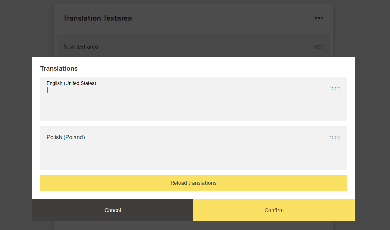
- The Translation Textarea is a specialized form control for multi-line localized text.
- It allows users to create and edit lengthy multilingual content.
- The component includes integrated language selection for translations.
- It is useful for internationalization scenarios requiring long text in different languages.
- Typical use cases include descriptions, instructions, terms, or user-facing content that needs localization.
Specs
Tokens
| Token | Description |
|---|---|
| displayName | Display name of the component in the structure panel |
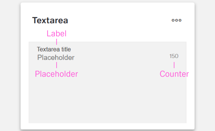
| labelTranslations | Label text above the textarea, supports multiple languages |
| rows | Number of visible rows in the textarea |
| maxLength | Maximum number of characters allowed per language |
| hidden | Controls visibility of the component in the form |
| saveInLocalStorage | Preserves translations in local storage between sessions |
| defaultValue | Initial translation values on load or reset |
| readonly | Prevents user modifications when true |
| paddingClass | Configures spacing using CSS classes |
| dataField | Defines the field name for submitted form data |
| controlsRequestType | Defines how translation data is sent in HTTP requests |
| validation | Configures validation rules for translations |
| authorizationDisable | Policy set controlling when the component is disabled |
| visibilityPolicySetId | Policy set controlling when the component is visible |
| displayConditions | Defines conditions for displaying the component |
| events | Configures component events |
| ON_VALUE_CHANGE (Events) | Event fired when a translation value changes |
| ON_INIT_BASED_ON_USER_VIEW (Events) | Event fired when initialized in user view mode |
| ON_INIT (Events) | Event fired when the component is initialized |
| ON_DESTROY (Events) | Event fired when the component is destroyed |
| id | Unique identifier for programmatic access |
| dataTestId | Identifier for automated testing |
| enableAsHotspot | Enables the component as a guided tour hotspot |
| guidedTourHotSpotTitle | Title text for guided tour hotspot, supports translations |
| guidedTourHotSpotDescription | Description text for guided tour hotspot, supports translations |
Structure
(Configured in General Properties)
- displayName - Sets the display name of the component shown in the structure panel. For example, "Product Description Translations" allows for easy identification of the component's purpose in the application structure, making it easier for developers and content editors to locate this specific translation textarea field.
(Configured in Non-Visual Properties)
- dataField - Defines the field name that will be used when submitting form data. For example, setting to "productDescription" ensures the translations are submitted with this field name in the form data object, making it clear what the translations represent on the server side.
- controlsRequestType - Specifies how the translation data is sent in HTTP requests: 'BODY', 'HEADER', or 'PATH'. For example, setting to "BODY" includes the translations in the request body, which is standard for most form submissions with multilingual data.
(Configured in Visual Properties)
- saveInLocalStorage - Determines whether the component's entered translations are preserved in local storage between sessions. When enabled, translation data persists between page reloads, improving user experience for complex multilingual forms that may take time to complete.
(Configured in Visibility)
- displayConditions - Defines conditions for displaying the component. This allows showing or hiding the translation textarea based on complex rules involving other form values, user roles, or application state.
Styling
(Configured in Visual Properties)
- labelTranslations - Sets the label text displayed above the textarea field, with support for multiple languages. For example, {"en-US": "Enter Product Description", "de-DE": "Produktbeschreibung eingeben"} ensures proper localization of the field label based on the user's language settings.
- maxLength - Sets the maximum number of characters allowed in the textarea for each language. This helps enforce content length restrictions and provides visual feedback to users about their remaining character count. For example, setting to "1000" limits each language translation to 1000 characters, which is useful for ensuring translations don't exceed space constraints.
- paddingClass - Configures spacing around the translation textarea component using CSS classes. For example, "p-4" adds medium padding on all sides of the component to improve visual spacing within its container.
- defaultValue - Sets the initial translation values that will be used when the form is reset. For example, setting to {"en-US": "Default product description goes here", "de-DE": "Standardproduktbeschreibung geht hier"} would pre-populate these translations when a form is first loaded or reset.
Actions & Variants
(Configured in Events)
- events - Configures the events that the component can trigger and respond to:
- ON_VALUE_CHANGE - Triggered when any translation value changes. Can be used to perform immediate actions based on translation changes, such as updating preview text or validating language-specific content.
- ON_INIT_BASED_ON_USER_VIEW - Triggered specifically when the component initializes in user view mode rather than edit mode.
- ON_INIT - Triggered when the translation textarea component is initialized. Can be used to perform setup operations like loading default translations from external sources.
- ON_DESTROY - Triggered when the component is removed from the DOM. Useful for cleanup operations and releasing resources.
(Configured in Visual Properties)
- hidden - Controls whether the component is visible in the form. When set to true, the component remains in the form structure but is not displayed, which is useful for conditional translation fields that should only appear in specific scenarios.
- readonly - Controls whether the translations can be modified by users. When set to true, the translation textarea displays the existing translations but prevents changes, which is useful for reference-only scenarios or when translations are managed through another system.
Validation
(Configured in Validation)
- validation - Configures validation rules for the translation textarea field. This allows you to set requirements such as mandatory translations for specific languages or character limits. For example, setting required validation ensures that at least one language translation is provided before the form can be submitted.
Authorization
(Configured in Authorization)
- authorizationDisable - Specifies a policy set that determines when the component should be disabled based on user permissions. For example, setting to "translatorOnlyPolicy" will disable the translation textarea for users who don't have translation privileges according to the specified policy.
- visibilityPolicySetId - Determines the visibility of the component based on specified policy sets. For example, setting to "contentEditorsPolicy" restricts the translation textarea visibility to users with content editing privileges.
Testing
(Configured in Testing Hooks)
- id - Specifies a unique identifier for the component used for programmatic access. For example, "productDescriptionTranslations" enables targeted manipulation of this specific translation textarea field.
- dataTestId - Sets the testing hook ID for automated testing. For example, setting to "product-description-translations" allows test scripts to reliably locate this component for automated testing of multilingual content.
- enableAsHotspot - Enables the component as a guided tour hotspot. When enabled, the translation textarea can be highlighted during onboarding or tutorial flows to explain its multilingual functionality to new users.
- guidedTourHotSpotTitle - Sets the title for the guided tour hotspot, supporting translations. For example, {"en-US": "Product Description Translations", "de-DE": "Produktbeschreibung Übersetzungen"} provides clear identification during guided tours.
- guidedTourHotSpotDescription - Sets the description for the guided tour hotspot, supporting translations. For example, {"en-US": "Enter product descriptions in multiple languages", "de-DE": "Geben Sie Produktbeschreibungen in verschiedenen Sprachen ein"} provides detailed instructions during guided tours.
Links
- Figma: https://www.figma.com/design/yck1tcUXgdQ5aYX6iUAwrO/GE---Astronaut-Design-System?node-id=2531-190302&t=ftfrOGkPzlG2GaTo-1
- Live style guide: https://e1-dev.k8s.myapp.de/live-style-guide/id3/2-text-area
Guidelines
Usage
- Use for long, multi-line localized input where users must provide content per language, and label the field via
labelTranslations. - Pre-seed known copy with
defaultValueto reduce initial typing and clarify expected structure. - Limit verbosity with
maxLengthso each language stays within the allowed character budget. - Preserve in-progress work on long tasks by enabling
saveInLocalStorage. - Switch to review/read-only scenarios by setting
readonly: trueinstead of hiding the field.
Sizing & Layout
- Set the visible height using
rows; increase rows for drafting, reduce for compact forms. - Add breathing room around the field with
paddingClassto maintain consistent spacing. - Keep the field present but out of view when unnecessary by toggling
hidden.
States & Feedback
- Enforce mandatory content and per-language rules through
validation(e.g., required languages, length). - Reflect non-editable states explicitly with
readonlyto signal view-only content. - React to text edits in real time with
events.ON_VALUE_CHANGE(e.g., to trigger checks or previews).
Visibility & Authorization
- Gate visibility by policy with
visibilityPolicySetIdwhen users must not see the field. - Keep visible but disabled using
authorizationDisablewhen users should understand they lack edit rights.
Content & Localization
- Keep labels concise and localized with
labelTranslations(1–2 words, no trailing colon). - Align validation limits with
validationandmaxLengthso users see consistent, locale-appropriate rules.
Dos & Don’ts
| Do | Don’t | Article setting(s) |
|---|---|---|
Use labelTranslations for a short, localized label (e.g., “Description”). | Hard‑code an English label or add a trailing colon. | labelTranslations |
Pre-fill per‑language text with defaultValue to guide structure. | Start empty when templates are known. | defaultValue |
Cap length per language with maxLength. | Allow unbounded text that overflows downstream limits. | maxLength |
Use rows to make long‑form editing comfortable. | Force a tiny viewport that requires constant scrolling. | rows |
Turn on saveInLocalStorage for lengthy authoring. | Risk data loss on reloads for multi‑paragraph input. | saveInLocalStorage |
Drive real-time checks from ON_VALUE_CHANGE. | Validate only on submit when immediate feedback is needed. | events, ON_VALUE_CHANGE, validation |
Use readonly for review mode. | Hide the field (hidden) when users must read existing text. | readonly, hidden |
Gate access with visibilityPolicySetId/authorizationDisable. | Expose sensitive fields without policy controls. | visibilityPolicySetId, authorizationDisable |
Control presence with displayConditions. | Show the field in contexts where it isn’t applicable. | displayConditions |
Name payloads predictably with dataField and set controlsRequestType. | Rely on implicit server parsing or defaults. | dataField, controlsRequestType |
Accessibility
- Provide stable automation and a11y selectors with
dataTestIdandidfor targeting and verification. - Optionally support comprehension via guided tours using
enableAsHotspotwith localizedguidedTourHotSpotTitleandguidedTourHotSpotDescription(supplemental only; not for critical info). - Reduce accidental data loss during long authoring by enabling
saveInLocalStorage, which can benefit users who need more time to complete inputs. - Keep labels short and specific through
labelTranslations; avoid relying on placeholder-style guidance. - Increase
rowswhen long content is expected to minimize excessive scrolling.