Dashboard Editor
Introduction
The Dashboard Editor is used to create and edit dashboards. It allows boardlets to be collected, arranged, and configured for use inside an application.
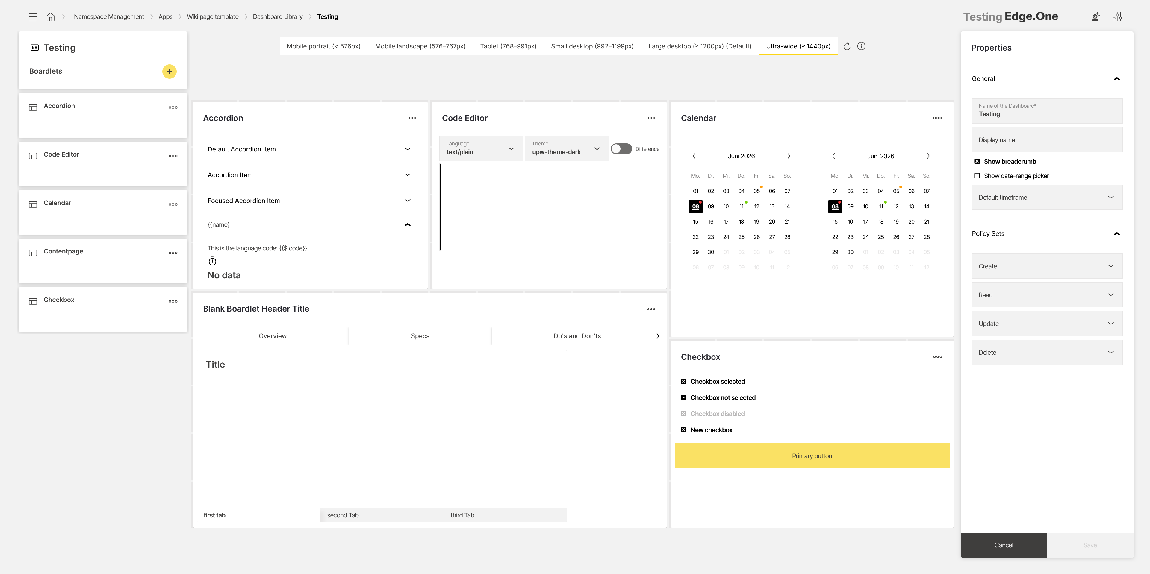
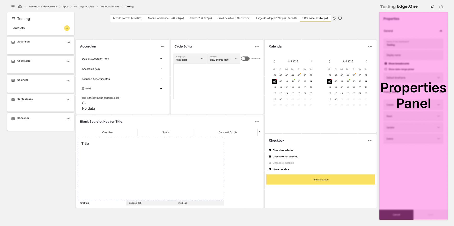
The editor is divided into three areas:
- Boardlet selection panel: Adding and managing boardlets that are placed inside the dashboard
- Viewer: Visual representation of the dashboard for editing, simulation, and code inspection
- Properties panel: Configuration of dashboard-level properties and policy settings
The editor supports the following capabilities:
- Collecting boardlets and placing them on a dashboard.
- Creating and editing dashboards for multiple screen layouts.
- Managing policies for dashboard access and editing.
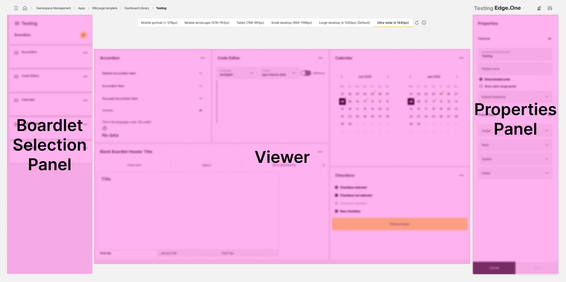
Boardlet selection panel
The boardlet selection panel lists all boardlets that have been selected for this dashboard. Boardlets in this list can be dragged and dropped into the Viewer.
A button at the top of the panel is used to add boardlets from the Boardlet Library. After a boardlet has been added, it is shown at the bottom of the selection panel and can be placed inside the dashboard.
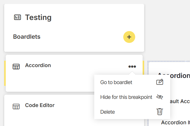
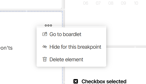
Each boardlet provides an overflow menu with additional actions:
- Go to boardlet: Opens the selected boardlet in the Boardlet Editor.
- Hide/Show for this breakpoint: Removes or adds the boardlet for the currently selected breakpoint.
- Delete: Removes the boardlet from the dashboard.
Adding another boardlet is disabled while a newly added boardlet has not yet been placed inside the Viewer.
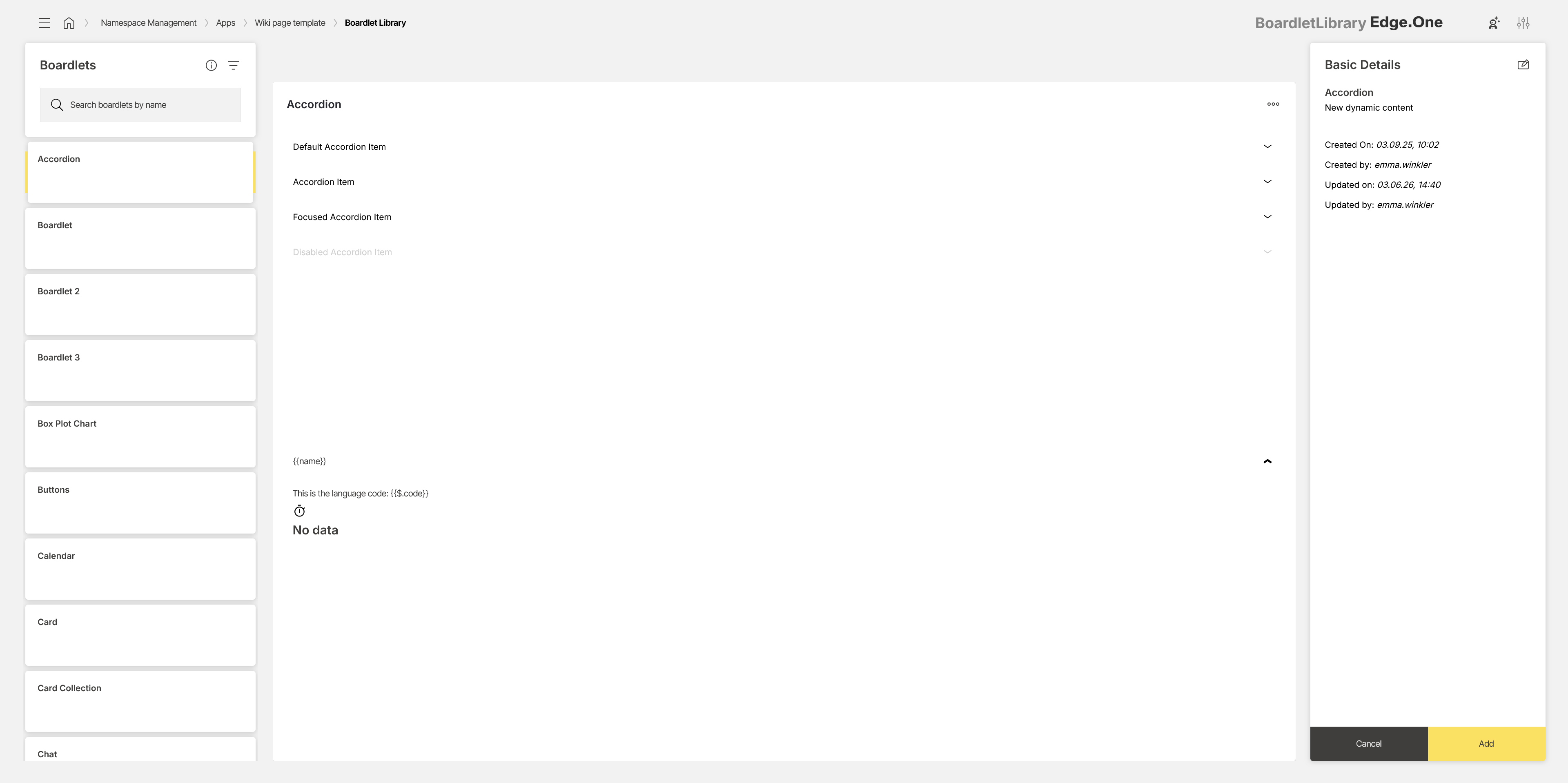
Adding a boardlet to the list
Selecting the add button opens a modified version of the Boardlet Library. This view is used to select an existing boardlet and add it to the dashboard.
The view is divided into three areas:
- Left panel: Lists all boardlets available in the application. A search and filter option is provided to locate boardlets quickly. Selecting a boardlet displays it in the Preview.
- Preview: Shows a non-interactive visual representation of the selected boardlet.
- Detail panel: Displays boardlet metadata and allows the metadata to be edited.
At the bottom of the detail panel, the process can either be cancelled or confirmed. Confirming adds the selected boardlet to the boardlet selection panel.
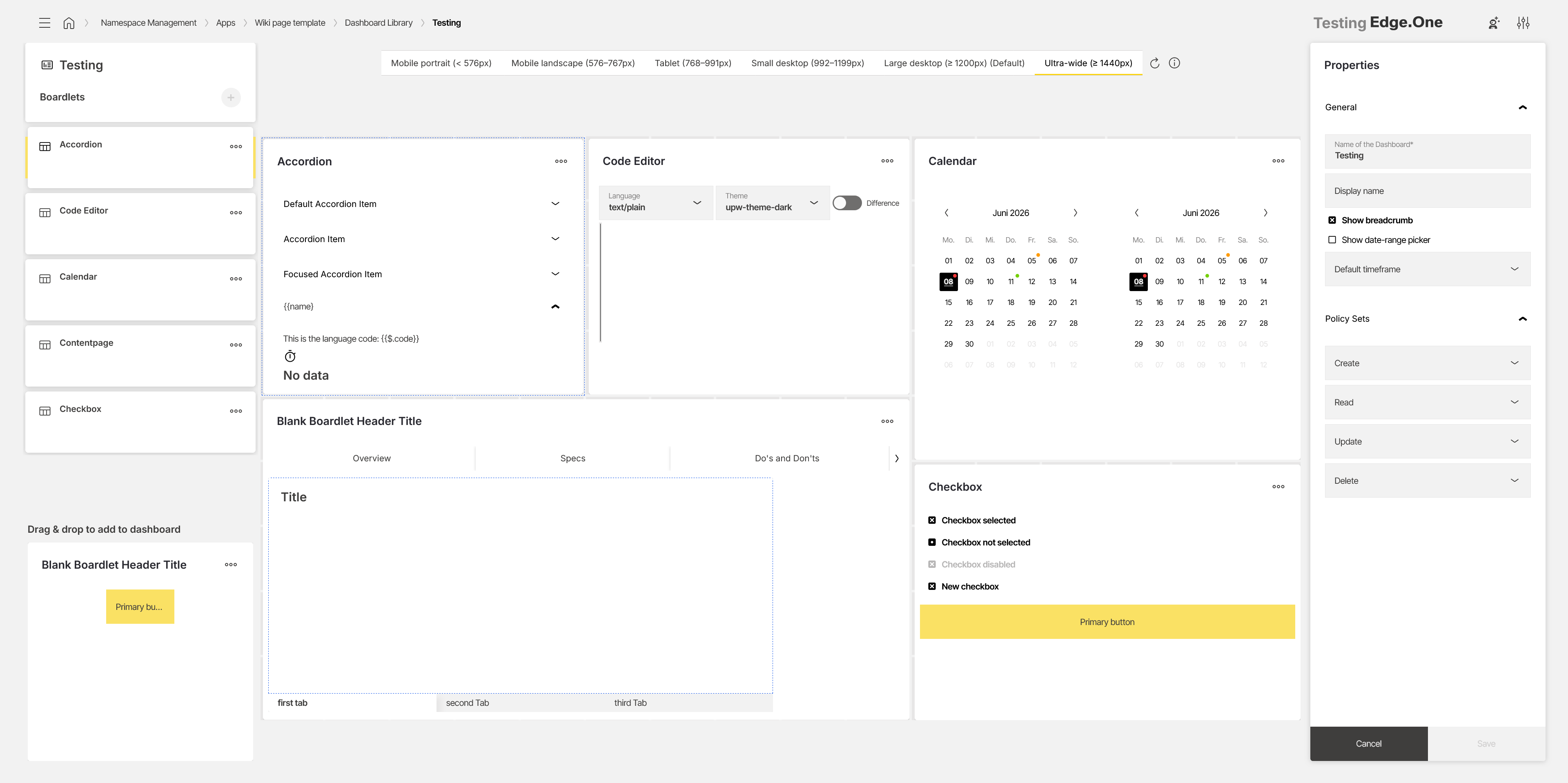
Viewer
The Viewer displays a visual preview of the finished dashboard. It is used to place, arrange, and resize boardlets.
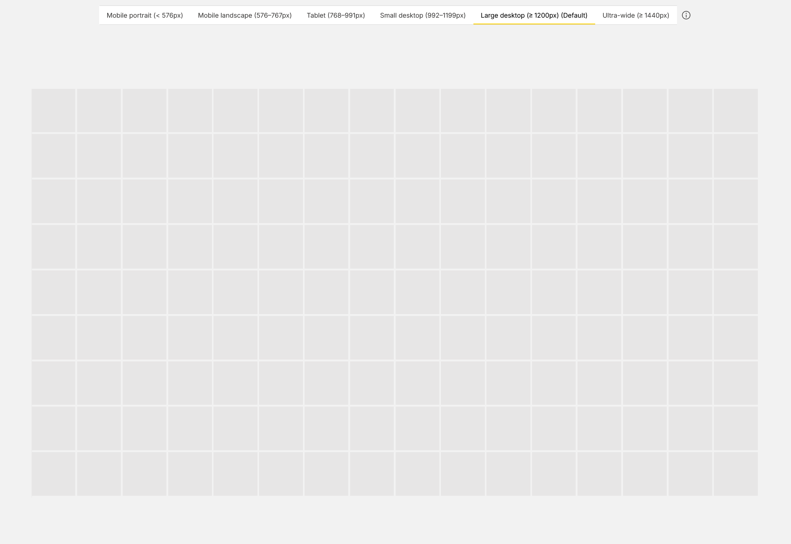
Tabs at the top of the Viewer show the dashboard for different breakpoints. Each breakpoint represents a separate screen layout. More information is available in the Breakpoints documentation.

The preview area shows the dashboard grid. When the dashboard is empty, a 16:9 grid is displayed. Boardlets can be placed inside the grid and arranged as needed.
Boardlets can be resized by dragging their edges inside the grid. This allows the layout to be adjusted for the selected breakpoint.
Right-clicking a boardlet opens additional actions. These actions match the options available in the overflow menu of the boardlet selection panel.
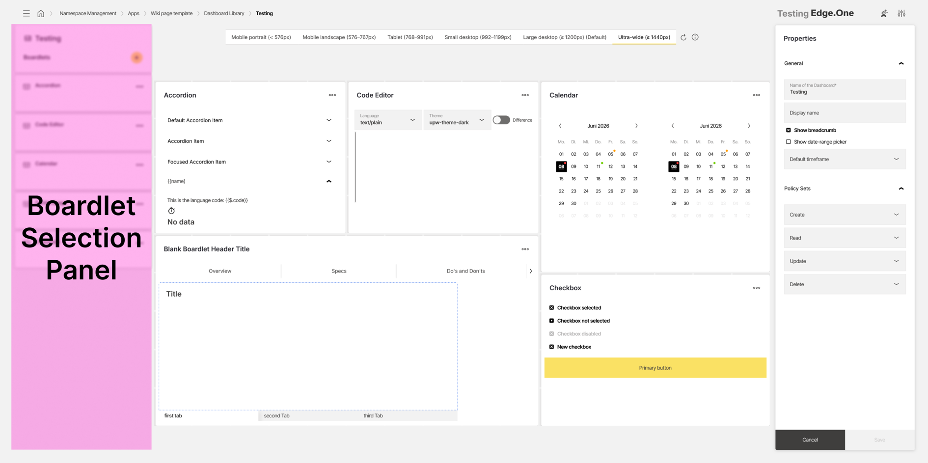
Properties panel
The properties panel is used to edit properties of the entire dashboard. The available properties are grouped into two sections:
- General
- Policy sets
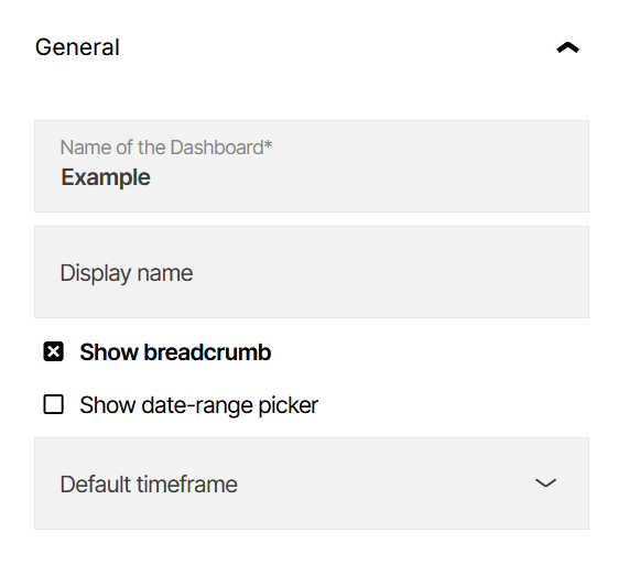
General
The General section contains basic dashboard settings.
The Name property defines the technical name of the dashboard inside namespace management. This name is used in areas such as the Dashboard Library. The Display name property defines the name shown outside namespace management, for example in the navigation or in the header when the dashboard is opened inside the application.
The Show breadcrumb property controls whether the breadcrumb is displayed in the header when the dashboard is active.
The Show date-range picker property controls whether the date-range picker is displayed in the header when the dashboard is active. When the date-range picker is enabled, a Default time frame can be selected. This defines the standard time frame that is active when the dashboard is opened.
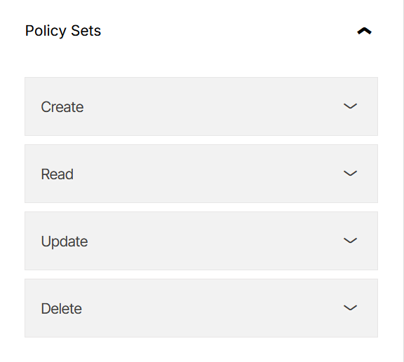
Policy sets
The Policy sets section is used to assign permissions for the dashboard. Create, read, update, and delete permissions can be assigned to roles that are created in Policy Settings inside the application.
Saving changes
At the bottom of the properties panel, two actions are available:
- Cancel: Reverts unsaved changes.
- Save: Saves the changes and confirms the update with a global notification.
When navigation away from the editor is triggered while unsaved changes exist, a confirmation modal is shown.