Box Plot Chart
Overview
- The Dynamic Box Plot Chart visualizes statistical data with box plot diagrams.
- It lets users analyze distributions, outliers, and summary statistics.
- It supports both mock and real data sources.
- It is customizable in behavior and visuals, including a custom tooltip template.
- It can render child dynamic elements such as overlays or annotations.
Specs
Tokens
| Token | Description |
|---|---|
| displayName | Display name in the structure panel. |
| id | Unique identifier of the component. |
| dataTestId | Testing hook ID. |
| useMockData | Toggles between mock data and real data. |
| dataSourceId | ID of the configured data source used by the chart. |
| getEntityCollectionHttpRequestParametersMap | HTTP request parameters mapping for data fetching. |
| chartConfiguration | Configuration model for axis, series, and constant lines. |
| elements | Child dynamic elements rendered within the chart container. |
| events | Configures events the component can trigger. |
| ON_INIT (Events) | Event fired when the chart initializes. |
| ON_DESTROY (Events) | Event fired when the chart is destroyed. |
| paddingClass | Spacing via CSS classes. |
| visibilityPolicySetId | Policy-set–based visibility control. |
| displayConditions | Conditions controlling component display. |
| customTooltipTemplate | Enables a custom tooltip template. |
Structure
- elements - contains child dynamic elements to be rendered within the chart component. This allows for extensibility, such as adding overlays or annotations.
(Configured in General Properties)
- displayName - Sets the display name of the component shown in the structure panel. For example, “Monthly Sales Box Plot” allows for easy identification of the chart’s purpose in the component structure.
Styling
(Configured in Visual Properties)
- customTooltipTemplate - Enables a custom tooltip template for the chart. When set to true, you can provide a custom Angular component to display additional information on hover.
(Configured in Layout)
- paddingClass - Configures spacing around the form using CSS classes. For example, “p-4” adds medium padding on all sides of the form container.
Datasource
(Configured in Datasource)
- useMockData - determines whether the chart displays mock data or fetches real data from a data source.
- dataSourceId - specifies the ID of the data source from which the chart fetches its data. This should match a configured data source in your system.
- getEntityCollectionHttpRequestParametersMap - configures HTTP request parameters for fetching data from the data source. This allows mapping of query, path, or body parameters as needed by the backend API.
Data Configuration
(Configured in Data Configuration)
- chartConfiguration - Configures the box plot chart’s settings, such as axis, series, and constant lines. This property is required and should match the expected configuration model.
- dataPathExpression – Defines the path to access the actual data array when the response has a nested structure. For example, "data.analysis.distribution" allows accessing deeply nested data structures.
- constantLinesExpression - Defines the path to access styling configurations for the constant line.
Actions
(Configured in Event Actions)
- events - Configures the events that the component can trigger. Supported events include:
- ON_INIT - Triggered when the chart is initialized.
- ON_DESTROY - Triggered when the chart is destroyed.
Tests
(Configured in Testing hooks)
- id - Specifies a unique identifier for the component.
- dataTestId - Sets the testing hook ID for automated testing. For example, setting to "submit-order-btn" allows test scripts to reliably locate and interact with this button during automated testing.
Authorization
(Configured in Authorization)
- visibilityPolicySetId - Determines the visibility of the component based on specified policy sets.
Visibility
(Configured in Visibility)
- displayConditions - Defines conditions for displaying the component.
Links
- Figma: tba
- Live style guide: https://e1-dev.k8s.myapp.de/live-style-guide/other-components/box-plot
Guidelines
Usage
- Use the chart to visualize distribution summaries (min/low, Q1, median, Q3, high) when your data conforms to the expected shap.
- Add reference lines with labels (e.g., targets, medians) using
chartConfiguration.constantLines[].label.text. - Render contextual overlays/annotations inside the chart area by adding child dynamic
elements.
Sizing & Layout
- Apply spacing with
paddingClass. - Name the instance clearly for authors using
displayName(structure-panel only). - Apply additional colors sparingly, distinct from brand/primary action colors. Aim for strong contrast as indicated in the theme guidance.
Tooltips
- Enable a custom tooltip with
customTooltipTemplatefor concise, supplemental details (e.g., exact quartile values); keep critical context visible in-plot (e.g., viaconstantLines). - Keep tooltip content short and driven by the same data path to avoid mismatches.
Visibility & Authorization
- Gate visibility with
visibilityPolicySetIdfor restricted data. - Control runtime show/hide rules with
displayConditions.
Content & Localization
- Surface user-facing copy inside the chart using
elements; localize those elements per their own capabilities. - If using a custom tooltip, localize any strings within that template; enable via
customTooltipTemplate.
Dos & Don’ts
| Do | Don’t | Article setting(s) |
|---|---|---|
| Add a labeled median/target as a constant line so it’s always visible. | Put key thresholds only inside a tooltip. | chartConfiguration.constantLines |
Use useMockData to validate configuration before wiring data. | Point to a live dataSourceId before the chart is configured. | useMockData, dataSourceId, chartConfiguration |
| Render an in-chart empty/error overlay via child elements. | Leave a blank area when data is missing. | elements |
| Gate the chart for restricted audiences. | Show the chart and rely on backend errors to block access. | visibilityPolicySetId |
| Show the chart only when inputs are ready. | Flash the chart while inputs are unresolved. | displayConditions |
| Give the instance a meaningful authoring name. | Keep a generic label that obscures its purpose. | displayName |
| Keep padding consistent with your spacing tokens. | Pack content tightly against the container edges. | paddingClass |
| Provide test hooks for automation. | Target the chart with brittle selectors. | dataTestId, id |
Accessibility
- Provide textual labels for reference lines to avoid color-only meaning (
chartConfiguration.constantLines[].label.text). - Offer supplemental numeric details on hover via a custom tooltip (
customTooltipTemplate). - When data is absent, show a concise, explanatory overlay within the chart (
elements). - Expose stable handles for audits and automated checks (
dataTestId,id). - Prevent focus/attention flicker by delaying render until inputs are ready (
displayConditions).
Datasource Requirements
Data for a box plot chart stems from a box plot series.
Within this series there is an array called data for the data points inside the chart. This array has different requirements based on the type of box plot chart, which is defined in box plot series.
In addition to the chart data, the box plot series can optionally include an array with style settings for the box plot chart. The path to this array is set with the token constantLinesExpression and chartConfiguration. More information on this in "Data Configuration".
Box Plot Series
The box plot series is an array with the following possible properties.
| Property | Data type | Required | Description |
|---|---|---|---|
| type | string | yes | 'boxplot'/'scatter' as input to render as Box Plot or Scatter Chart |
| data | array | yes | array of data points (see below) |
| color | string | no | main color of the data point series |
| fillColor | string | no | default fill color of the boxes |
| medianColor | string | no | color of the median line; if undefined, the general color applies |
| medianWidth | number | no | pixel width of the median line |
| stemColor | string | no | color of the stem, the vertical line extending from the box to the whiskers |
| whiskersColor | string | no | color of the whiskers, the horizontal lines marking low and high values |
| wiskersWidth | number | no | line width of the whiskers, the horizontal lines marking low and high values |
| tooltip | array | no | options for the tooltip that appears when the user hovers over a series or point |
Example data:
{
    "type": "boxplot",
    "data": [],
    "tooltip": {},
    "color": "black",
    "fillColor": "#F0F0E0",
    "medianColor": "black",
    "medianWidth": 1,
    "stemColor": "black",
    "whiskerColor": "black",
    "whiskerWidth": 1
},
Data in Box Plot Chart Type
For the data points in a box plot chart type, the chart expects an array of box plot series data. Each data point requires the following properties:
| Property | Data type | Required | Description |
|---|---|---|---|
| x | number | yes | location of the data point on the x-axis |
| low | number | yes | low value for the data point, signifying the loright value in the sample set |
| q1 | number | yes | lower quartile for the data point |
| median | number | yes | median for the data point |
| q3 | number | yes | higher quartile for the data point |
| high | number | yes | high value for the data point, signifying the highest value in the sample set |
| name | string | yes | name of the point as shown in the legend, tooltip, dataLabels, etc. |
| fillColor | string | yes | fill color or gradient for the area; when null, the series' color is used with the series' |
Example data:
"data": [
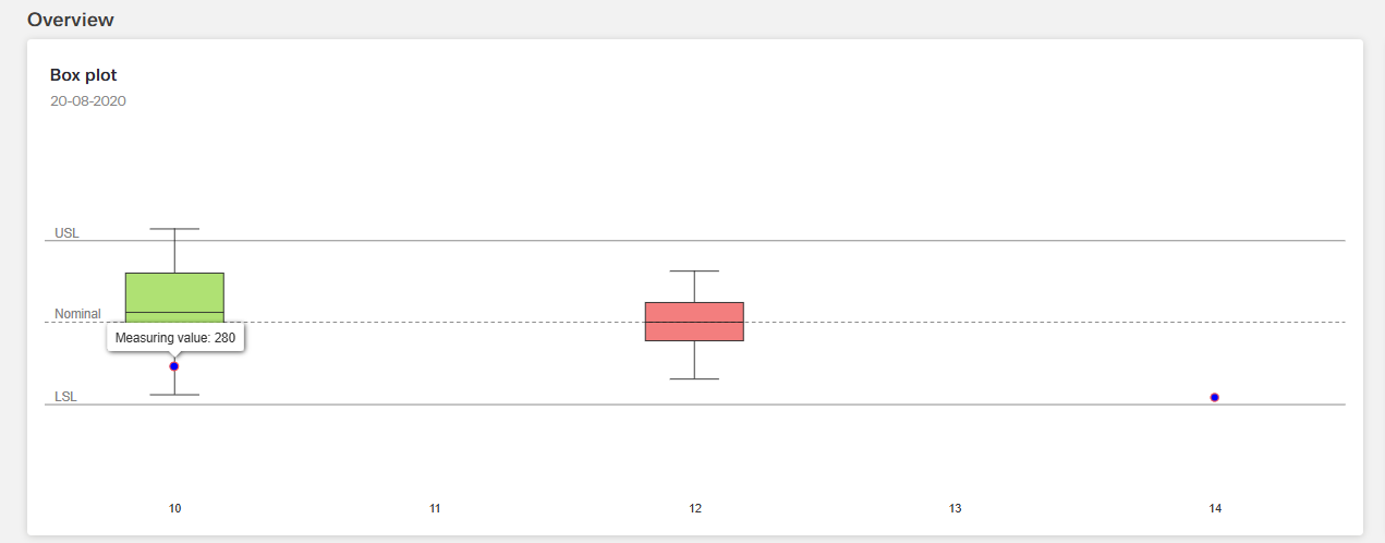
{
"x": 10,
"low": 214,
"q1": 320,
"median": 409,
"q3": 500,
"high": 603,
"name": "Example 1",
"fillColor": "#9FDB57"
},
{
"x": 12,
"low": 250,
"q1": 340,
"median": 384,
"q3": 430,
"high": 503,
"name": "Example 2",
"fillColor": "#F06464"
}
],Data in Scatter Chart Type
For the data points in a scatter chart type, the chart expects an array of box plot series data. Each data point requires the following properties:
| Property | Data type | Required | Description |
|---|---|---|---|
| x | number | yes | location of the data point on the x-axis |
| y | number | yes | location of the data point on the y-axis |
| name | string | yes | name of the point as shown in the legend, tooltip etc. |
| color | string | yes | main color of the point |
| marker | array | yes | options for the point markers; properties like fillColor, lineColor and lineWidth define the visual appearance of the markers |
Example data:
"data": [
    {
    "x": 10,
    "y": 280,
    "name": "Scatter",
    "color": "blue",
    "marker": {
        "fillColor": "blue",
        "lineWidth": 1,
        "lineColor": "#F55150"
    }
    },
    {
    "x": 14,
    "y": 207,
    "name": "Scatter",
    "color": "blue",
    "marker": {
        "fillColor": "blue",
        "lineWidth": 1,
        "lineColor": "#F55150"
    }
    }
],
Data Configuration
An array with styling for the constant line can be included in the box plot series. The token constantLinesExpression is used to excess this information.
| Property | Data type | Required | Description |
|---|---|---|---|
| value | number | no | position of the line in axis units |
| color | string | no | color of the line |
| dashStyle | string | no | dash or dot style for the plot line |
| width | number | no | width or thickness of the plot line |
| zIndex | number | no | z index of the plot line within the chart |
| label | array | no | text labels for the plot bands |
Example data:
{
  "dataPathExpression": "seriesData",
  "constantLinesExpression": "constantLines",
  "constantLines": [
    { "label": { "text": "Median" }, "value": 50 }
  ]
}