Label
Overview
- The Label component displays text, numbers, or dates.
- It supports formatting options such as font size, weight, and padding.
- Icons, tooltips, and ellipsis handling can be added for improved clarity.
- Conditional rules allow the label to show different text based on data thresholds.
- This makes it useful for presenting status information or contextual messages.
Specs
Tokens
| Token | Description |
|---|---|
| displayName | Display name of the component shown in the structure panel |
| textTranslations | Sets label text with multi-language support and template expressions |
| rules | Conditional formatting rules that change label text based on data conditions |
| fontSize | Font size of the label text in pixels |
| fontWeight | Boldness of the label text (normal, semi-bold, bold) |
| widthAuto | Controls if the label automatically sizes to fit its content |
| leftIcon | Icon displayed to the left of the label text |
| rightIcon | Icon displayed to the right of the label text |
| ellipsisMode | Truncates overflowing text with an ellipsis (…) |
| showTooltip | Enables showing a tooltip when hovering |
| tooltipText | Text displayed inside the tooltip |
| tooltipPlacement | Position of the tooltip relative to the label (top, bottom, left, right) |
| tooltipDelay | Delay in ms before tooltip appears |
| type | Defines content type (text, number, date-time) |
| format | Formatting pattern for date-time values |
| paddingClass | CSS classes that configure spacing around the label |
| displayConditions | Defines conditions for displaying the component |
| visibilityPolicySetId | Controls visibility based on policy sets |
| events | Configures events that the component can trigger or respond to |
| ON_INIT (Events) | Event triggered when the label is initialized |
| ON_DESTROY (Events) | Event triggered when the label is removed |
| id | Unique identifier for programmatic access |
| dataTestId | Identifier for automated testing |
| enableAsHotspot | Enables the label as a guided tour hotspot |
| guidedTourHotSpotTitle | Title for the guided tour hotspot |
| guidedTourHotSpotDescription | Description for the guided tour hotspot |
Structure
(Configured in General Properties)
- displayName – Sets the display name of the component shown in the structure panel. For example, "Status Label" allows for easy identification of this label's purpose in the component structure, making it easier for developers to locate and work with this component.
(Configured in Visual Properties)
- rules – Configures conditional formatting rules that change the label's text based on conditions. Each rule contains a field name, operator, threshold value, and label translations to display when the condition is met.
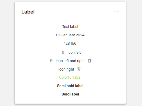
- type – Specifies the data type of the label content for proper formatting. Options are "text" (standard text display), "number" (numeric formatting), or "date-time" (date and time formatting).
- format – Determines the formatting pattern for date-time values when type is set to "date-time". For example, "dd.MM.yyyy" displays dates as "01.01.2024", while "HH:mm" displays times as "14:30". This property is only applicable when type is "date-time".
(Configured in Visibility)
- displayConditions – Defines conditions for displaying the component. This allows showing or hiding the label based on complex rules involving other form values, user roles, or application state. For example, the label might only be shown for orders with specific statuses.
Tooltip
(Configured in Visual Properties)
- showTooltip – Controls whether a tooltip should be displayed when hovering over the label. When set to true, the tooltip will show the text specified in the tooltipText property.
- tooltipText – Sets the text to display in the tooltip when hovering over the label. This is useful for providing additional information about what the label represents.
- tooltipPlacement – Determines the position of the tooltip relative to the label. Options include "top", "bottom", "left", and "right". For example, "top" places the tooltip above the label.
- tooltipDelay – Sets the delay in milliseconds before the tooltip appears when hovering over the label. For example, setting to "500" will delay the tooltip appearance by half a second.
Styling
(Configured in Visual Properties)
- textTranslations – Sets the text to display in the label with support for multiple languages. For example, {"en-US": "Order Status", "de-DE": "Bestellstatus"} ensures proper localization of the label. This property supports template expressions to display dynamic content from the context, such as ${context.statusText}.
- fontSize – Sets the font size of the label text in pixels. For example, setting to "14" creates a label with standard-sized text, while "18" would create larger, more prominent text.
- fontWeight – Determines the boldness of the label text. Options include "normal" (standard weight), "semi-bold" (moderately bold), or "bold" (heavily weighted). For example, "bold" can be used for emphasis on important status indicators.
- widthAuto – Controls whether the label should automatically size to fit its content. When set to true, the label will take only as much width as needed for the text; when false, it will fill the available space in its container.
- leftIcon – Specifies an icon to display to the left of the label text. For example, setting to "warning-triangle" would display a warning icon before the text, useful for alert or status indicators.
- rightIcon – Specifies an icon to display to the right of the label text. For example, setting to "chevron-right" would display an arrow after the text, useful for navigation indicators.
- ellipsisMode – Determines whether text that exceeds the available space should be truncated with an ellipsis (...). When enabled, long text will be cut off with an ellipsis rather than wrapping to multiple lines.
- paddingClass – Configures spacing around the label using CSS classes. For example, "p-2" adds light padding on all sides of the component, improving its visual spacing within its container.
Actions & Variants
(Configured in Events)
- events – Configures the events that the component can trigger and respond to.
- ON_INIT – Triggered when the label component is initialized. Can be used to perform setup operations like setting initial context values.
- ON_DESTROY – Triggered when the label component is removed from the DOM. Useful for cleanup operations and releasing resources.
Authorization
(Configured in Authorization)
- visibilityPolicySetId – Determines the visibility of the component based on specified policy sets. For example, setting to "publicInformation" restricts the label visibility to contexts where the public information policy is satisfied.
Testing
(Configured in Testing Hooks)
- id – Specifies a unique identifier for the component used for programmatic access. For example, "orderStatusLabel" enables targeted manipulation of this specific label component.
- dataTestId – Sets the testing hook ID for automated testing. For example, setting to "order-status-label" allows test scripts to reliably locate this component.
- enableAsHotspot – Enables the component as a guided tour hotspot. When enabled, the label can be highlighted during onboarding or tutorial flows to explain its meaning to users.
- guidedTourHotSpotTitle – Sets the title for the guided tour hotspot, supporting translations. For example, {"en-US": "Order Status", "de-DE": "Bestellstatus"} provides clear identification during guided tours.
- guidedTourHotSpotDescription – Sets the description for the guided tour hotspot, supporting translations. For example, {"en-US": "This label shows the current status of the order", "de-DE": "Dieses Label zeigt den aktuellen Status der Bestellung"} provides detailed context during guided tours.
Links
- Figma: https://www.figma.com/design/yck1tcUXgdQ5aYX6iUAwrO/GE---Astronaut-Design-System?node-id=11613-45085&t=ftfrOGkPzlG2GaTo-1
- Live style guide: https://e1-dev.k8s.myapp.de/live-style-guide/id8/3-label
Guidelines
Usage
- Use for short standalone text, numbers, or dates.
- Add icons to reinforce meaning, but keep clear text for the primary message.
Sizing & Layout
- Adjust text size and weight to control prominence.
- Let the control size to its content or stretch to fill, depending on context.
- Apply internal padding to maintain legibility and alignment.
- When space is tight, keep it single-line and truncate with an ellipsis.
Tooltips
- Use a tooltip for definitions, abbreviations, or to reveal truncated content.
- Position it so it doesn’t obscure the label.
- Add a brief delay to reduce accidental activations.
- Keep tooltips supplemental; critical information must remain visible.
Data-Driven / Conditional Behavior
- Define mutually exclusive conditions and provide a sensible default.
- Choose the correct content type (text, number, date-time) for predictable rendering.
- Specify a date/time pattern when showing dates for consistent output.
Visibility & Authorization
- Show the label only when the current UI state calls for it.
- Restrict visibility for specific audiences or roles when necessary.
Content & Localization
- Keep copy concise and localize it for supported languages.
- Use template expressions for dynamic content when the text depends on context.
- In guided tours, provide a short title and a one-line description that explains the label’s purpose.
- Give the label a clear internal name and a stable test hook for automation.
Dos & Don’ts
| Do | Don’t |
|---|---|
| Choose the correct content type and format dates deterministically. | Leave dates or numbers as raw text with inconsistent rendering. |
| Keep labels short; truncate if space is limited. | Write long sentences that wrap unpredictably. |
| Use icons to reinforce meaning while keeping clear text. | Replace the label entirely with an icon. |
| Define targeted rules with a default fallback. | Manually toggle text outside the component’s rule system. |
| Add a tooltip for definitions or truncated text. | Put critical information only in a tooltip. |
| Adjust emphasis with text size/weight. | Depend on ALL CAPS or ad-hoc styling hacks. |
| Restrict visibility for sensitive content. | Show restricted information and rely on wording alone. |
| Show the label only when relevant to the current state. | Keep it visible regardless of context. |
| Use lifecycle hooks for setup and cleanup. | Initialize late and forget to release resources. |
| Use stable test hooks for automation. | Target the label by visible text that may change. |
Accessibility
- Provide concise, localized visible text so assistive tech announces meaningful content without relying on a tooltip.
- Avoid color-only meaning by pairing clear wording with optional icons when helpful.
- Reveal truncated content via a tooltip on hover or an appropriate trigger.
- Normalize date/time and numeric output so screen readers announce predictable patterns.
- Expose stable identifiers for automated accessibility checks and programmatic control.
- Place tooltips where they don’t obscure the label; use a short delay to prevent accidental triggers.
- Hide irrelevant or restricted labels to reduce noise for assistive technologies.