Stacked Bar Chart
Overview
- The Dynamic Stacked Bar Chart Component visualizes data as horizontal bars stacked on top of each other.
- It helps compare contributions of categories to a total and shows the composition of each entity.
- The component connects to data sources for dynamic data retrieval.
- It offers multiple configuration options for appearance and behavior.
Specs
Tokens
| Token | Description |
|---|---|
| showLegend | Show or hide the legend |
| barPadding | Spacing between bars (number) |
| barWidth | Width of individual bars (number) |
| ignoreEmptyPoints | Omit empty/null data points |
| chartConfiguration | Series and visual configuration |
| paddingClass | Component padding via CSS classes |
| useMockData | Use sample data instead of source |
| dataSourceId | Data source identifier |
| getEntityCollectionHttpRequestParametersMap | HTTP request parameters map |
| events | Configurable component events |
| ON_INIT (Events) | Event on component initialization |
| ON_DESTROY (Events) | Event on component removal |
| displayName | Display name in structure panel |
| visibilityPolicySetId | Policy-based component visibility |
| displayConditions | Conditions to show the chart |
| id | Unique component identifier |
| dataTestId | Testing hook identifier |
| enableAsHotspot | Enable guided tour hotspot |
| guidedTourHotSpotTitle | Title for guided tour hotspot |
| guidedTourHotSpotDescription | Description for guided tour hotspot |
| Series | Data fields represented as stacked bars |
| Category field | Field with category labels (y-axis) |
| Series colors | Color per series customization |
| Tooltip templates | Tooltip content customization |
Structure
- Data is displayed as horizontal bars, each bar representing a category placed along the vertical axis.
- Bars are divided into stacked segments that together show the category’s total, with each segment representing a series.
- A legend can be included to explain the colors and meaning of each series.
(Configured in General Properties)
- displayName – Sets the display name of the component shown in the structure panel. For example,
"Regional Sales Breakdown"clearly identifies the purpose of this specific chart in the component structure.
(Configured in Visibility)
displayConditions – Defines conditions under which the chart is displayed. This allows for context-aware visibility, showing the chart only when certain conditions are met (e.g., when a specific product category is selected).
chartConfiguration – Configures the series and visual aspects of the chart. This includes settings for each data series, colors, tooltips, and more. This property uses a detailed configuration object to control how data is mapped to visual elements.
(Configured in Visual Properties)- Series: Define which data fields should be represented as stacked bars
- Category field: Specify which field contains the category labels (displayed on the y-axis)
- Series colors: Customize the color of each series for better visual distinction
- Tooltip templates: Customize what information appears when hovering over bars
Datasource
(Configured in Datasource)
- useMockData – Determines whether sample data is used instead of an actual data source. When enabled, the chart displays pre-defined sample data, which is useful for design and testing purposes.
- dataSourceId – Specifies the data source ID for retrieving chart data. For example,
"api/sales-by-region"connects the chart to an endpoint that provides the appropriate data structure for visualization. - getEntityCollectionHttpRequestParametersMap – Configures HTTP request parameters for fetching data. This allows for customizing query parameters, path variables, or body parameters that are sent when requesting data from the specified source.
Styling
(Configured in Visual Properties)
- showLegend – Determines whether the legend is displayed alongside the chart. When enabled, a legend with all series names and their corresponding colors will be displayed, providing context for the data representation.
- barPadding – Sets the padding between bars in the chart, specified as a number. For example, setting this to
"5"adds moderate spacing between bars for better visual separation. - barWidth – Defines the width of individual bars in the chart, specified as a number. For example, setting this to
"30"creates bars with a width of 30 pixels, allowing for control over the chart's density. - ignoreEmptyPoints – Determines whether empty or null data points are displayed in the chart. When enabled, missing data points are omitted rather than shown as zeros, helping focus on actual data.
- paddingClass – Configures the padding around the component using CSS classes. For example,
"p-3"adds medium padding on all sides of the chart component.
Actions & Variants
(Configured in Events)
- events – Configures events that the component can trigger and respond to.
- ON_INIT – Triggered when the component is initialized. This event can be used to perform setup operations or initial data processing.
- ON_DESTROY – Triggered when the component is removed from the DOM. This event can be used for cleanup operations or resource release.
Tests
(Configured in Testing Hooks)
- id – Specifies a unique identifier for the component, useful for programmatic access in testing or custom code.
- dataTestId – Sets a testing hook ID for automated testing, allowing test scripts to reliably identify this chart component.
- enableAsHotspot – Enables the component as a guided tour hotspot. When enabled, this chart can be highlighted during onboarding tours.
- guidedTourHotSpotTitle – Sets the title text displayed when this component is highlighted in a guided tour, with support for translations.
- guidedTourHotSpotDescription – Sets the descriptive text explaining the chart's purpose during a guided tour, with support for translations.
Authorization
(Configured in Authorization)
- visibilityPolicySetId – Determines the visibility of the component based on user permissions and policy sets. For example, setting to
"salesTeamPolicy"restricts the chart to users with sales team privileges.
Links
- Figma: tba
- Live style guide: https://e1-dev.k8s.myapp.de/live-style-guide/other-components/stacked-bar
Guidelines
Usage
- Use to compare each category’s part-to-whole composition with horizontal stacks by mapping fields in
chartConfiguration(Series,Category field). - Name the component clearly for authors via
displayNameso it’s identifiable in the structure panel.
Sizing & Layout
- Control visual density with
barWidth(thicker bars for short category lists, thinner for long lists). - Improve legibility between categories with
barPadding. - Add outer breathing room around the component using
paddingClass.
Color & Contrast
- Assign distinct colors per segment using
chartConfiguration → Series colorsto differentiate series. - Ensure adjacent stacks are distinguishable by picking sufficiently contrasting
Series colors. - Avoid color-only meaning by combining
showLegendwith descriptiveTooltip templates.
Tooltips
- Provide concise, structured details for each segment using
chartConfiguration → Tooltip templates. - Keep tooltips supplemental; ensure essential identifiers are visible through
showLegendand the axis labels given byCategory field. - Localize or format values inside the template directly in
Tooltip templates(e.g., units/percentages).
Data-Driven / Conditional Behavior
- Map the categorical axis using
chartConfiguration → Category fieldand define all stack contributors inchartConfiguration → Series. - Keep stacks comparable by using consistent series keys across categories in
chartConfiguration.Series. - Prefer omitting missing values to avoid misleading totals by enabling
ignoreEmptyPoints.
Visibility & Authorization
- Gate visibility by role/policy with
visibilityPolicySetId. - Show or hide the chart based on runtime rules using
displayConditions.
Content & Localization
- Provide guided tour copy per locale with
guidedTourHotSpotTitleandguidedTourHotSpotDescription. - Use
displayNamefor authoring clarity without affecting end-user labels.
Dos & Don’ts
| Do | Don’t | Article setting(s) |
|---|---|---|
| Define a fixed series order so stacks are comparable across categories. | Let series order vary between renders. | chartConfiguration.Series, events.ON_INIT |
Use ignoreEmptyPoints to omit nulls so totals aren’t misread. | Render nulls as zero-length segments. | ignoreEmptyPoints |
| Turn on the legend when multiple series exist. | Force users to guess segment meaning from color alone. | showLegend, chartConfiguration.Series colors |
| Use tooltip templates for supplemental details. | Put critical identifiers only in tooltips. | Tooltip templates, showLegend, Category field |
| Adjust bar width/padding to fit the category count. | Keep default sizing that causes overlap or sparse layouts. | barWidth, barPadding |
| Hide the chart until prerequisites are met. | Show an empty/misleading chart before data is ready. | displayConditions, dataSourceId, useMockData |
Accessibility
- Convey series meaning textually by enabling the legend (
showLegend) with clear series names inchartConfiguration.Series, and pair with conciseTooltip templates; choose high-contrastSeries colors. - Reduce misinterpretation by omitting missing data points with
ignoreEmptyPoints. - Offer guided assistance during onboarding with localized
guidedTourHotSpotTitleandguidedTourHotSpotDescription. - Keep tooltip content short and localized in
Tooltip templates; never rely on tooltips as the sole source of critical information. - Maintain consistent series order using
chartConfiguration.Seriesso users don’t have to relearn mappings per view.
Datasource Requirements
The foundation of the stacked bar chart is a combination of categories with (multiple sets of) values. All categories and (sets of) values are delivered in the form of a data-source-array.
The categories build the points on the x axis. Which field of the data source object provides the category is deffined with the argumentField property.
The values provide the respective data point to each category on the y axis. Each group of values can be configured separately with the series-array.
A histogram chart can include constant lines. They are delivered in the constant line array.

Example data:
{
    "dataSource": [],
    "series": [],
    "valueAxis": [],
    "argumentField"= "state"
}
Stacked Bar Data
The data source array of the stacked bar chart component expects data in the following format.
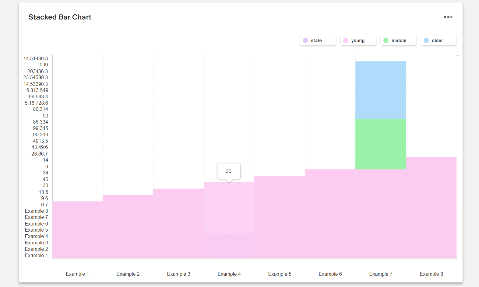
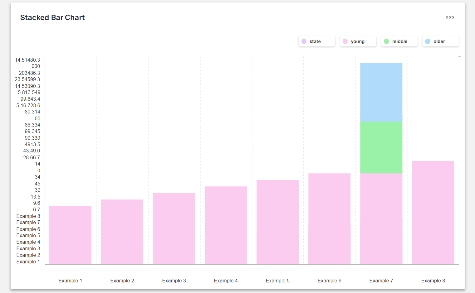
Example Data: json [ { "state": "Example 1", "young": 6.7, "middle": 28.6, "older": 5.1 }, { "state": "Example 2", "young": 9.6, "middle": 43.4, "older": 9 }, { "state": "Example 3", "young": 13.5, "middle": 49, "older": 5.8 } ]
Stacked Bar Series
The chart series is an array. If a stacked bar chart has multiple sets of values, it requires multiple chart series arrays.
| Property | Data type | Required | Description |
|---|---|---|---|
| valueField | string | yes | which data source field provides values for series points |
| name | string | yes | name that identifies the series |
| color | string | yes | color of the series |
| visible | boolean | yes | whether the series is visible or not |
| pane | string | no | which pane the series should belong to |
Example data:
  [
  {
      "valueField": "young",
      "name": "young",
      "visible": true,
      "color": "#9FDB57"
  },
  {
      "valueField": "middle",
      "name": "middle",
      "visible": true,
      "color": "#FDB225"
  },
  {
      "valueField": "older",
      "name": "older",
      "visible": true,
      "color": "#F06464"
  }
  ]
Stacked Bar Value Axis
The value axis array configures the value/y-axis of a stacked bar chart.
| Property | Data type | Required | Description |
|---|---|---|---|
| pane | string | no | which pane the series should belong to |
| name | string | no | name that identifies the pane |
| tickInterval | number | no | specifies the interval between major ticks. Does not apply to discrete axes |
| visualRange | array | no | defines the axis' displayed range, cannot be wider than the wholeRange |
| visible | boolean | no | makes the value axis line visible |
| constantLines | string | no | constant line is a straight line that extends over the entire chart and indicates an axis value |
| labelVisible | boolean | no | shows/hides value axis labels |
| title | string | yes | title for axis |
Example data:
  [
  {
      "title": "Sum",
      "visible": false,
      constantLines: []
  }
  ]
Optional: Common Series Settings
The following properties can be set as common settings for all series in the chart.
| Property | Data type | Required | Description |
|---|---|---|---|
| barPadding | number | no | padding and consequently the width of all bars in a series using relative units, values 0 to 1 |
| barWidth | number | no | fixed width for all bars in a series, measured in pixels |
| ignoreEmptyPoints | boolean | no | whether the series should ignore null data points |
| type | string | no | the type for all series |
Example data (optional options included):
{
    "dataSource": [],
    "series": [],
    "argumentField": "state",
    "panes":[],
    "barPadding": 0.1,
    "barWidth": 30,
    "ignoreEmptyPoints": true,
    "type": "stackedBar"
}
Optional: Chart Panes
One stacked bar chart component may have multiple panes. These will result in multiple charts built out of the same data set. If a chart has multiple panes, all properties related to panes in the arrays mentioned above become mandatory.
| Property | Data type | Required | Description |
|---|---|---|---|
| name | string | no | which pane the series should belong to |
| height | number | no | the pane's height |
{
  "panes": [
    { "name": "topPane", "height": 60 },
    { "name": "bottomPane", "height": 40 }
  ]
}