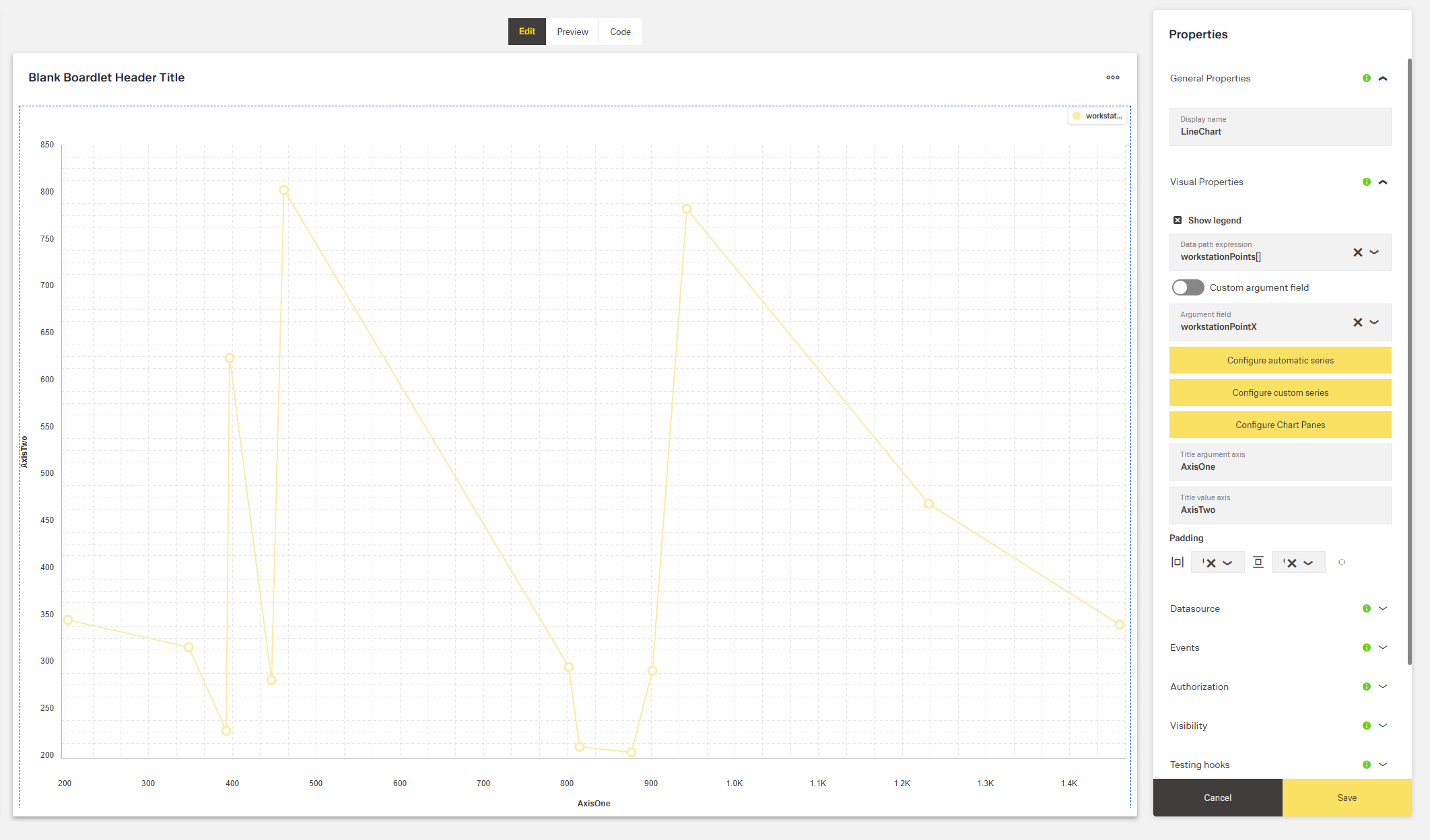
Line Chart
Overview
- The Dynamic Line Chart component displays data as lines on a chart.
- It is designed to visualize trends over time or relationships between data points.
- The chart supports multiple data series with customizable styling and configuration.
- Data can come from various sources, including APIs or mock data for testing.
- Custom axes, panes, and labels provide context for the information displayed.
Specs
Tokens
| Token | Description |
|---|---|
| showLegend | Controls whether the legend is displayed. |
| chartConfiguration | Defines chart settings including series and argument field. |
| chartPanesConfiguration | Configures panes that split the chart vertically. |
| argumentAxisTitle | Title for the X-axis. |
| valueAxisTitle | Title for the Y-axis. |
| paddingClass | Sets CSS padding classes for spacing. |
| useMockData | Uses mock data instead of API data. |
| dataSourceId | Identifier for the chart data source. |
| getEntityCollectionHttpRequestParametersMap | Configures HTTP request parameters for API calls. |
| events | Configurable component events. |
| ON_INIT (Events) | Event triggered on initialization. |
| ON_DESTROY (Events) | Event triggered on removal. |
| visibilityPolicySetId | Controls visibility via authorization policy. |
| displayConditions | Defines when the chart is displayed. |
| displayName | Display name shown in the structure panel. |
| id | Unique identifier for the component. |
| dataTestId | Testing hook ID. |
| enableAsHotspot | Enables the chart as a guided tour hotspot. |
| guidedTourHotSpotTitle | Title for guided tour hotspot. |
| guidedTourHotSpotDescription | Description for guided tour hotspot. |
Structure
- The chart has a plotting area where one or more data lines are drawn, supported by horizontal and vertical axes that provide categories, time values, and numerical scales.
- It can include multiple panes stacked vertically, allowing different sets of series to be displayed in separate sections.
- A legend identifies each data series and helps users distinguish between the plotted lines.
(Configured in General Properties)
- displayName – Sets the display name of the chart component, shown in the structure panel. This helps identify the component within the application structure. Example:
"Monthly Sales Chart".
(Configured in Visual Properties)
- chartConfiguration – Configures the general settings of the chart, including series and argument field. This property allows defining which data fields are displayed as lines and what field is used for the X-axis. Example:
- chartPanesConfiguration – Defines the configuration for chart panes, which allow splitting the chart into multiple vertical sections. Each pane can contain different series and has configurable height. Example:
Datasource
(Configured in Datasource)
- useMockData – Determines whether the chart should display mock data instead of fetching from an API. When set to true, predefined sample data is used, useful for testing and development. Example: false.
- dataSourceId – Specifies the identifier for the data source that provides the chart data. This connects the chart to the specific API endpoint that returns the data to visualize. Example:
"api/sales/monthly".- getEntityCollectionHttpRequestParametersMap – Configures HTTP request parameters for fetching data from the API. This allows customizing parameters like filters, sorting, and other request options. Example:
(Configured in Visibility)
- displayConditions – Defines conditions for displaying the component. This allows showing the chart only when certain conditions are met, like when specific data is available.
Styling
(Configured in Visual Properties)
- showLegend – Controls whether the legend is displayed on the chart. When set to true, a legend showing all series names appears, helping users identify each data line. Example: true.
- paddingClass – Configures the padding for the component using CSS classes. For example,
"p-4"adds medium padding on all sides of the chart. - argumentAxisTitle – Sets the title for the X-axis of the chart. This provides context for what the horizontal axis represents, like "Date" or "Time Period". Example: "Months".
- valueAxisTitle – Sets the title for the Y-axis of the chart. This helps users understand what values are being measured, such as "Sales (USD)" or "Temperature (°C)". Example: "Amount ($)".

Actions & Events
(Configured in Events)
- events – Configures the events that the component can trigger and respond to:
- ON_INIT – Triggered when the chart component is initialized. Can be used to perform setup operations.
- ON_DESTROY – Triggered when the chart component is removed from the DOM. Useful for cleanup operations.
Tests
(Configured in Testing Hooks)
- id – Specifies the unique identifier for the component, used for programmatic access. Example:
"salesTrendsChart". - dataTestId – Sets the testing hook ID for automated testing. Example:
"sales-chart-component". - enableAsHotspot – Enables the chart as a guided tour hotspot. When set to true, the chart can be highlighted during guided tours. Example: true.
- guidedTourHotSpotTitle – Sets the title for the guided tour hotspot, supporting translations.
- guidedTourHotSpotDescription – Sets the description for the guided tour hotspot, supporting translations.
Authorization
(Configured in Authorization)
- visibilityPolicySetId – Determines whether the chart is displayed based on a policy set. This allows showing the chart only to users with specific permissions. Example:
"dashboardViewerPolicy".
Links
- Figma: tba
- Live style guide: https://e1-dev.k8s.myapp.de/live-style-guide/other-components/line-chart
Guidelines
Usage
- Use for continuous trends or sequential categories configured via
chartConfiguration(maps the X-axis argument and Y-series). - Display multiple metrics in one view; distinguish them by naming each series in
chartConfiguration.series[].nameand enablingshowLegend. - Separate signals with different units/scales by defining vertical panes with
chartPanesConfiguration. - For demos or development, simulate data with
useMockData.
Sizing & Layout
- Add outer spacing using
paddingClass. - Prevent crowding by assigning series across panes with
chartPanesConfiguration(e.g., high-variance metrics in a dedicated pane).
Color & Contrast
- Assign distinct
chartConfiguration.series[].colorvalues per metric and keep those colors consistent across sessions/panes. - Pair color with text labels by setting
chartConfiguration.series[].nameand showing them viashowLegend.
Visibility & Authorization
- Gate visibility by role/policy with
visibilityPolicySetId. - Hide the chart until required runtime context exists using
displayConditions.
Content & Localization
- Convey axis purpose and units using
argumentAxisTitleandvalueAxisTitle. - Provide readable series labels via
chartConfiguration.series[].name; surface them by enablingshowLegend. - Localize guided tour text with
guidedTourHotSpotTitleandguidedTourHotSpotDescription.
Dos & Don’ts
| Do | Don’t | Article setting(s) |
|---|---|---|
| Label axes with purpose and units (e.g., “Date”, “Sales (USD)”). | Leave axes unlabeled or rely on external context. | argumentAxisTitle, valueAxisTitle |
| Turn on the legend for multi-series charts and name each series. | Show multiple colored lines without labels or a legend. | showLegend, chartConfiguration.series[].name |
| Separate metrics with different scales into vertical panes. | Overlay vastly different ranges on one pane. | chartPanesConfiguration, chartConfiguration.series[] |
| Bind the X argument and Y values explicitly. | Depend on implicit or positional fields. | chartConfiguration.argumentField, chartConfiguration.series[].valueField |
| Point to the nested array before binding fields. | Bind to parent objects and get an empty chart. | chartConfiguration.dataPathExpression |
| Render only when data is ready. | Display an empty frame that looks broken. | displayConditions |
| Use mock data for demos/dev; disable it for production. | Ship with mock data enabled. | useMockData |
| Expose stable test selectors. | Select elements by volatile text. | dataTestId, id |
| Clean up on unmount. | Leave intervals/listeners running. | events.ON_DESTROY |
Accessibility
- Axis context conveyed via
argumentAxisTitleandvalueAxisTitle(include units where applicable). - Non-color identification through
chartConfiguration.series[].namesurfaced viashowLegendwhen comparing multiple series. - Stable selectors for automated/a11y checks via
dataTestIdandid. - Onboarding context available through localized
guidedTourHotSpotTitleandguidedTourHotSpotDescriptionwhenenableAsHotspotis active. - Ensure sufficient visual distinction between lines by choosing clearly differentiable
series[].colorvalues in addition to names. - Prefer short, plain-language labels and titles; avoid abbreviations unless common.
- Avoid misleading empty frames by using
displayConditionsto defer rendering until a data-ready flag is true.
Datasource Requirements
The foundation of the line chart component is an data source array. The array might be nested. In that case, the dataPathExpression is used to point to the right array.
This array is a list of arguments (values used for Y-axis) combined with more than one value (values used for X-axis) per argument. Which field of the data source object provides the arguments is deffined with the argumentField property. If only one line is required, use the histogram chart with the "line" type.
Example data:
{
  "content": [],
  "series": [],
  "constantLines": [],
  "argumentField": "createdOn",
  "dataPathExpression": "content"
}
Line Chart Data
The data source array has a number of elements. Each element consists of one argumentField and multiple seriesField. These properties can have a custom name. In addition, the elements may also have a pointColor.
| Property | Data type | Required | Description |
|---|---|---|---|
| (argumentField) | string/number | yes | the argument (position on the x-axis) of the data point |
| (seriesField) | number | yes | value (position on the y-axis) of the data point |
| pointColor | string | no | color of the point |
Example data:
[
  {
    "createdOn": "2019-11-29T23:00:00.000Z",
    "point1": 0,
    "point2": 0,
    "pointColor": "green"
  },
  {
    "createdOn": "2019-11-30T23:00:00.000Z",
    "point1": 4,
    "point2": 3,
    "pointColor": "green"
  },
  {
    "createdOn": "2019-12-04T23:00:00.000Z",
    "point1": 5,
    "point2": 3,
    "pointColor": "yellow"
  },
  {
    "createdOn": "2019-12-05T23:00:00.000Z",
    "point1": 4,
    "point2": 1,
    "pointColor": "yellow"
  },
  {
    "createdOn": "2019-12-06T23:00:00.000Z",
    "point1": 5,
    "point2": 2,
    "pointColor": "red"
  }
]
Line Chart Series
The line series array configures the line between a series of seriesField values.
| Property | Data type | Required | Description |
|---|---|---|---|
| valueField | string | yes | which seriesField field provides values for series points |
| name | string | yes | name that identifies the series |
| color | string | yes | color of the series |
| visible | boolean | yes | whether the series is visible or not |
| type | string | yes | type of the series: line, bar, stackedBar |
| pane | string | no | which pane the series should belong to |
Example data:
[
  {
    "valueField": "point1",
    "name": "Area 1",
    "visible": true,
    "color": "#4b6bf4",
    "type": "line"
  },
  {
    "valueField": "point2",
    "name": "Area 2",
    "visible": true,
    "color": "#65d0f7",
    "type": "line"
  }
]
Constant Lines
In case a line chart has horizontal constant lines, they are configured in the constant line array.
| Property | Data type | Required | Description |
|---|---|---|---|
| color | string | yes | color of the line |
| type | string | yes | type of the line: solid, dash, longDash or dot |
| value | number | yes | value of the line |
| text | string | yes | name that identifies the line |
Example data:
[
  {
    "color": "red",
    "value": 20,
    "type": "solid",
    "text": "USL"
  },
  {
    "color": "green",
    "value": 2,
    "type": "dash",
    "text": "USL"
  }
]
Optional: Chart Panes
One line chart component may have multiple panes. These will result in multiple charts built out of the same data set. If a chart has multiple panes, all properties related to panes in the arrays mentioned above become mandatory.
| Property | Data type | Required | Description |
|---|---|---|---|
| name | string | no | which pane the series should belong to |
| height | number | no | the pane's height |
{
  "panes": [
    { "name": "topPane", "height": 60 },
    { "name": "bottomPane", "height": 40 }
  ]
}