Action Placement
Actions trigger functions, such as saving or deleting a business object. They can also trigger navigation to another dashboard, where the action can be executed, described in detail or checked further. Actions are displayed in the form of action icons or buttons.
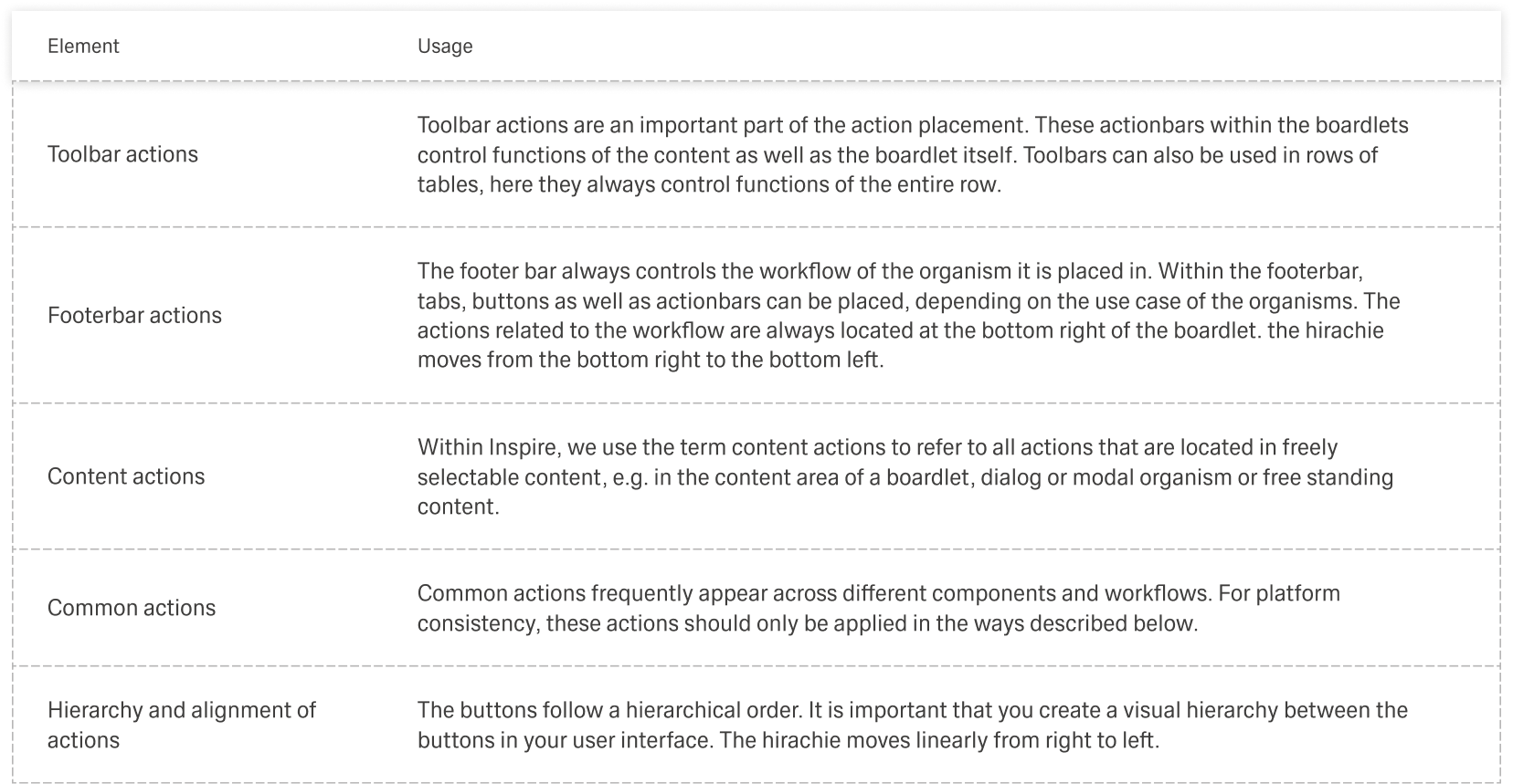
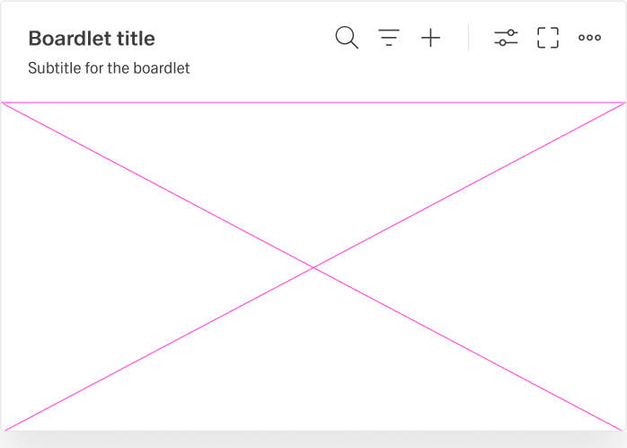
Actions that refer to a content are displayed at the top of the boardlet, next to the title that identifies the object. Actions that relate to the task workflow are located at the bottom right of the boardlet and can be performed after you work through the boardlet content.
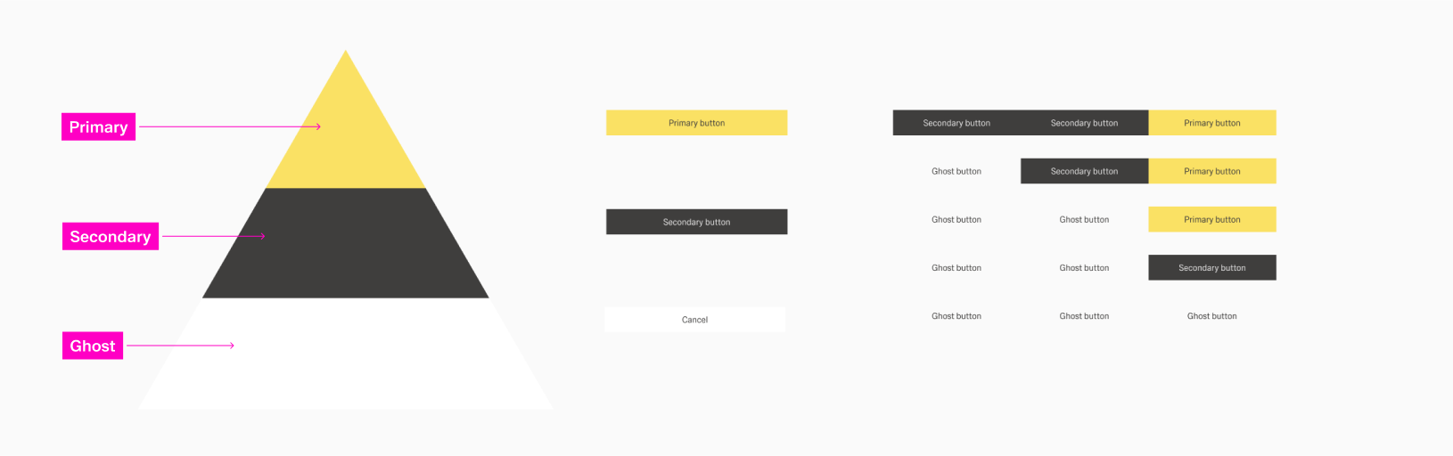
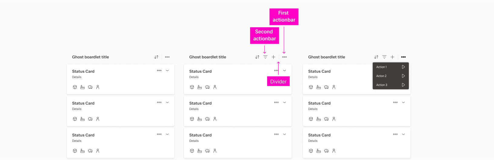
To make actions easier to organise and find, they are usually placed in toolbars. Depending on the content that is affected by the action, different toolbars are available. Within the tool bars, some actions are usually more important than others. Refer to the arrangements in the below examples for better understanding.
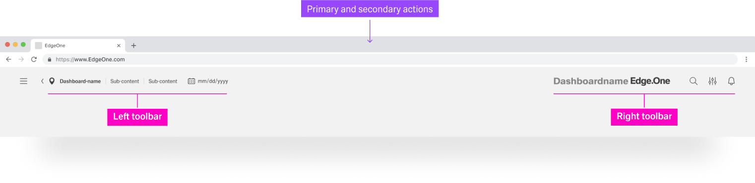
Actions are always distinguished from pure navigation. Navigation functions are always on the left, such as Home or Breadcrumbs, while actions in toolbars are aligned on the right.
Placements in Distinct Elements
Header Toolbar
Boardlet Toolbar
Ghost Boardlet Toolbar
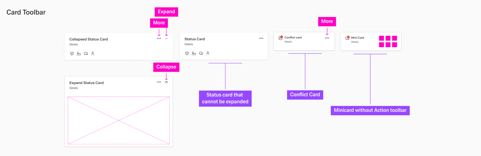
Card Toolbar
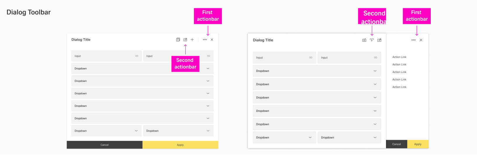
Dialogs Toolbar
Hierarchy of Actions