Input
Overview
- The Input component is a flexible form control for single-line text.
- It provides a customizable interface for capturing user input.
- The component supports validation, custom styling, and events.
- It is suited for short text entries such as names, email addresses, or references.
Specs
Tokens
| Token | Description |
|---|---|
| displayName | Display name in the structure panel |
| labelTranslations | Label text with multi-language support |
| counterVisible | Shows a character counter below the input |
| customIconName | Displays a custom icon inside the input field |
| hidden | Controls whether the component is visible |
| saveInLocalStorage | Preserves entered value in local storage |
| defaultValue | Sets the initial text value on load or reset |
| readonly | Displays value but prevents editing |
| paddingClass | Spacing around the input using CSS classes |
| dataField | Field name used when submitting form data |
| controlsRequestType | Defines how the field data is sent (BODY, HEADER, PATH) |
| validation | Configures validation rules |
| required | Field must have a value before submission |
| Validates input as a properly formatted email | |
| maxLength | Sets maximum number of characters allowed |
| minLength | Sets minimum number of characters required |
| pattern | Regular expression pattern the input must match |
| authorizationDisable | Disables the input based on user permissions |
| visibilityPolicySetId | Controls visibility based on policy sets |
| displayConditions | Conditions for displaying the input field |
| events | Configures component events |
| ON_VALUE_CHANGE (Events) | Event triggered when input value changes |
| ON_INIT_BASED_ON_USER_VIEW (Events) | Event triggered when component initializes in user view mode |
| ON_INIT (Events) | Event triggered when input is initialized |
| ON_DESTROY (Events) | Event triggered when component is removed from DOM |
| id | Unique identifier for programmatic access |
| dataTestId | Testing hook ID for automated tests |
| enableAsHotspot | Enables input as guided tour hotspot |
| guidedTourHotSpotTitle | Title for guided tour hotspot |
| guidedTourHotSpotDescription | Description for guided tour hotspot |
Structure
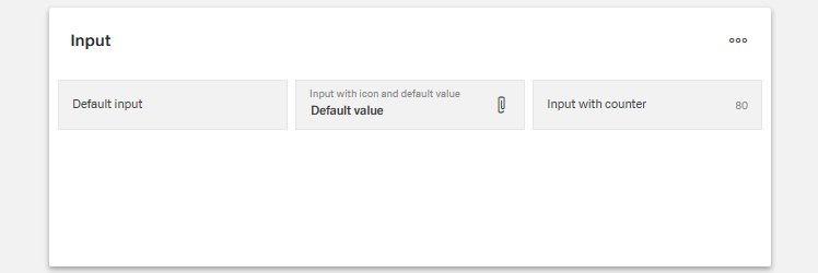
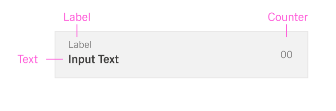
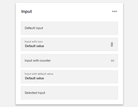
- The component visually consists of a single-line text field, optionally with a label and icon.
- Supporting elements such as a character counter or data bindings may appear below or around the field.
(Configured in General Properties)
- displayName – Sets the display name of the component shown in the structure panel. For example, "Customer Email" allows for easy identification of the component's purpose in the application structure, making it easier for developers to locate and work with this specific input field.
(Configured in Non-Visual Properties)
- dataField – Defines the field name that will be used when submitting form data. For example, setting to "customerEmail" ensures the input value is submitted with this field name in the data object, making it clear what the data represents on the server side.
- controlsRequestType – Specifies how the field data is sent in HTTP requests: 'BODY', 'HEADER', or 'PATH'. For example, setting to "BODY" includes the input value in the request body, which is standard for most form submissions.
(Configured in Visibility)
- displayConditions – Defines conditions for displaying the component. This allows showing or hiding the input field based on complex rules involving other form values, user roles, or application state.
Styling
(Configured in Visual Properties)
- label - Sets the label text displayed above the input field.
- labelTranslations – Gives support for multiple languages. For example, {"en-US": "Email Address", "de-DE": "E-Mail-Adresse"} ensures proper localization of the field label based on the user's language settings.
- counterVisible – Determines whether a character counter is displayed below the input field.
- defaultValue – Sets the initial text value that will be used when the form is reset. For example, setting to "example@domain.com" would pre-populate the field with this value when a form is first loaded or reset.
- customIconName – Specifies a custom icon to display within the input field. For example, setting to "email" would show an envelope icon, providing a visual cue about the expected input type while enhancing the user interface.
- paddingClass – Configures spacing around the input component using CSS classes. For example, "p-4" adds medium padding on all sides of the component to improve visual spacing within its container.
Actions & Variants
(Configured in Events)
- events – Configures the events that the component can trigger and respond to:
- ON_VALUE_CHANGE – Triggered when the input value changes. Can be used to perform immediate actions based on user input, such as validating data, updating related fields, or triggering API calls.
- ON_INIT_BASED_ON_USER_VIEW – Triggered specifically when the component initializes in user view mode rather than edit mode.
- ON_INIT – Triggered when the input component is initialized. Can be used to perform setup operations like loading default values or setting initial states.
- ON_DESTROY – Triggered when the component is removed from the DOM. Useful for cleanup operations and releasing resources.
(Configured in Visual Properties)
- hidden – Controls whether the component is visible in the form. When set to true, the component remains in the form structure but is not displayed, which is useful for conditional input fields that should only appear in specific scenarios.
- readonly – Controls whether the text can be edited by users. When set to true, the input field displays the value but prevents changes, which is useful for display-only scenarios or when values are determined programmatically.
Validation
(Configured in Validation)
- validation – Configures validation rules for the input field. This object supports several validation types:
- required – When set to true, the field must contain a value before the form can be submitted.
- email – When set to true, validates that the input is a properly formatted email address.
- maxLength – Sets the maximum number of characters allowed in the input field.
- minLength – Sets the minimum number of characters required in the input field.
- pattern – Defines a regular expression pattern that the input must match to be valid.
Authorization
(Configured in Authorization)
- authorizationDisable – Specifies a policy set that determines when the component should be disabled based on user permissions. For example, setting to "readOnlyPolicy" will disable the input for users who don't have edit permissions according to the specified policy.
- visibilityPolicySetId – Determines the visibility of the component based on specified policy sets. For example, setting to "adminOnlyPolicy" restricts the input visibility to users with admin privileges.
Tests
(Configured in Testing Hooks)
- id – Specifies a unique identifier for the component used for programmatic access. For example, "customerEmailInput" enables targeted manipulation of this specific input field.
- dataTestId – Sets the testing hook ID for automated testing. For example, setting to "email-input" allows test scripts to reliably locate this component for automated testing of form functionality.
- enableAsHotspot – Enables the component as a guided tour hotspot. When enabled, the input field can be highlighted during onboarding or tutorial flows to explain its purpose to new users.
- guidedTourHotSpotTitle – Sets the title for the guided tour hotspot, supporting translations. For example, {"en-US": "Email Address Input", "de-DE": "E-Mail-Adresse Eingabe"} provides clear identification during guided tours.
- guidedTourHotSpotDescription – Sets the description for the guided tour hotspot, supporting translations. For example, {"en-US": "Enter your primary email address here", "de-DE": "Geben Sie hier Ihre primäre E-Mail-Adresse ein"} provides detailed instructions during guided tours.
Links
- Figma: https://www.figma.com/design/yck1tcUXgdQ5aYX6iUAwrO/GE---Astronaut-Design-System?node-id=11628-199694&t=ftfrOGkPzlG2GaTo-1
- Live style guide: https://e1-dev.k8s.myapp.de/live-style-guide/id3/1-text-input
Guidelines
Usage
- Use for single-line text capture; bind the value name and transport with
dataFieldandcontrolsRequestType. - Provide a clear, localized label using
labelTranslations(sentence case).- Always provide clear and concise labels to help users understand input fields.
- Use sentence-style capitalization for labels (capitalize only the first word unless it’s a proper noun).
- Offer help through tooltips, placeholder text, or helper text for clarity.
- Text inputs should allow free-form entry where appropriate.
- Pre-fill known values with
defaultValue. - Add an optional contextual cue with
customIconName(supplemental to text).
Sizing & Layout
- Adjust outer spacing using
paddingClass. - When enforcing length limits, show a live character budget with
counterVisiblealongsidemaxLength/minLength. - Hide the control when not applicable using
hidden.
States & Feedback
- Switch to a read-only state with
readonlyfor review scenarios. - Configure validation via
validation(required,email,maxLength,minLength,pattern); tie feedback timing toON_VALUE_CHANGE(see Interactions). - Preserve in-progress input with
saveInLocalStorage.
Data-Driven / Conditional Behavior
- Drive runtime visibility from state using
displayConditions; use disjoint expressions to avoid rapid show/hide oscillation.
Visibility & Authorization
- Hide for restricted audiences with
visibilityPolicySetIdorhidden. - Keep the field visible but non-editable when awareness is important using
authorizationDisable.
Content & Localization
- Localize end-user strings with
labelTranslations. - Enable onboarding aids with
enableAsHotspot,guidedTourHotSpotTitle, andguidedTourHotSpotDescription.
Dos & Don’ts
| Do | Don’t | Article setting(s) |
|---|---|---|
| Localize the label (sentence case) for each target locale. | Hard-code an English label or rely on an icon alone. | labelTranslations, label, customIconName |
| Bind the input to a named field and correct request placement. | Send unnamed values or rely on server defaults. | dataField, controlsRequestType |
| Pre-fill when you know the value; keep it editable. | Force users to retype data you already have. | defaultValue, readonly |
| Turn on the counter when enforcing length limits. | Hide limits until submit. | counterVisible, maxLength, minLength |
| Validate on change for immediate feedback. | Wait until submit to reveal basic errors. | validation, ON_VALUE_CHANGE |
Enforce format using pattern or email. | Depend on placeholder/tooltip (not provided) to teach format. | pattern, email, validation |
| Disable when users can see but not change the value; hide when they must not see it. | Show a restricted field as editable or visible to all. | readonly, authorizationDisable, visibilityPolicySetId |
| Gate visibility on prerequisites and state. | Keep the field visible regardless of form state. | displayConditions, hidden |
| Persist progress locally for long edits. | Clear the field on accidental navigation. | saveInLocalStorage |
| Use test hooks for automation. | Target the control by visible text. | id, dataTestId |
Accessibility
- Provide localized, descriptive labels with
labelTranslationsfor correct announcement. - Prevent non-functional interaction by using
readonlyorauthorizationDisablewhen edits are not allowed. - Communicate constraints without color reliance using
counterVisible,maxLength,minLength, andpattern/emailwithinvalidation. - Keep components discoverable and predictable with
displayConditionsandhidden. - Prefer
visibilityPolicySetIdto fully hide restricted fields; useauthorizationDisableto present read-only awareness when visibility is appropriate. - Persist progress with
saveInLocalStorageto reduce re-entry burden.