Content Switch
Overview
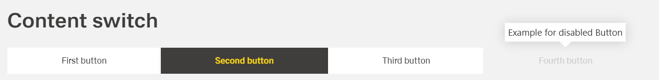
- A Content Switch lets users toggle between views in the same area.
- It groups related content under simple, labeled buttons.
- Only one view shows at a time; switching keeps the page in place.
- The active choice is clearly marked to guide the user.
- It can trigger actions when the user switches views.
Specs
Tokens
| Token | Description |
|---|---|
| displayName | Label shown in structure panel. |
| elements | Defines elements and their configs. |
| elements.id | Unique ID for an element. |
| elements.disabled | Disables element interaction. |
| elements.ON_CONTENT_SWITCH_CLICK (Events) | Fires on content-switch select. |
| activeButtonIndicator | Sets active switch by ID. |
| displayConditions | Show/hide rules for visibility. |
| showTooltip | Toggle tooltip on hover. NYI |
| tooltipText | Tooltip text. NYI |
| tooltipPlacement | Tooltip position (top/bottom/left/right). NYI |
| tooltipDelay | Delay before tooltip appears (ms). NYI |
| type | Visual style: DEFAULT/GHOST. |
| events | Container for component events. |
| ON_INIT (Events) | Fires on component initialization. |
| ON_DESTROY (Events) | Fires when component is removed. |
| visibilityPolicySetId | Visibility via policy set. |
| tests.id | Component test identifier. |
| dataTestId | Testing hook selector. |
| enableAsHotspot | Enable guided-tour hotspot. |
| guidedTourHotSpotTitle | Hotspot title (i18n). |
| guidedTourHotSpotDescription | Hotspot description (i18n). |
Structure
(Configured in General Properties)
- displayName – Sets the display name of the component shown in the structure panel. For example, "Warehouse Layout" allows for easy identification of the component's purpose in the component structure, making it easier for developers to work with this specific raster component.
(Configured in Visual Properties)
- elements - Defines all columns in the table with their individual configurations.
- id - Specifies a unique identifier for a element used for programmatic access.
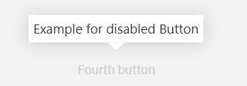
- disabled - Disables the button/element and prevents interaction
- ON_CONTENT_SWITCH_CLICK - This event is emitted when the content switch button is selected and made active. Additional returns all information about selected content switch button.
- activeButtonIndicator - This field set contentSwitchButton active by id.
(Configured in Visibility)
- displayConditions – Defines conditions for displaying the component. This allows showing or hiding the label based on complex rules involving other form values, user roles, or application state. For example, the label might only be shown for orders with specific statuses.
Tooltip
(not jet implemented)
- showTooltip – Controls whether a tooltip should be displayed when hovering over the label. When set to true, the tooltip will show the text specified in the tooltipText property.
- tooltipText – Sets the text to display in the tooltip when hovering over the label. This is useful for providing additional information about what the label represents.
- tooltipPlacement – Determines the position of the tooltip relative to the label. Options include "top", "bottom", "left", and "right". For example, "top" places the tooltip above the label.
- tooltipDelay – Sets the delay in milliseconds before the tooltip appears when hovering over the label. For example, setting to "500" will delay the tooltip appearance by half a second.
Styling
(Configured in Visual Properties)
- type – Sets the visual appearance of the date picker between "DEFAULT" (highlighting the active tab via background color) and "GHOST" (not highlighting the active tab).
Actions & Variants
(Configured in Events)
- events – Configures the events that the component can trigger and respond to:
- ON_INIT – Triggered when the video player component is initialized. Can be used to perform setup operations or record analytics about video availability.
- ON_DESTROY – Triggered when the video player component is removed from the DOM. Useful for cleanup operations and releasing resources.
Authorization
(Configured in Authorization)
- visibilityPolicySetId – Determines the visibility of the component based on specified policy sets. For example, setting to "premiumContentAccess" restricts the video player visibility to users with premium content access privileges according to the specified policy.
Tests
(Configured in Testing Hooks)
- id – Specifies a unique identifier for the component used for programmatic access. For example, "productDemoVideo" enables targeted manipulation of this specific video player component through scripts or automated testing.
- dataTestId – Sets the testing hook ID for automated testing. For example, setting it to "product-demo-video" allows test scripts to reliably locate this component during automated testing.
- enableAsHotspot – Enables the component as a guided tour hotspot. When enabled, the video player can be highlighted during onboarding or tutorial flows to draw user attention to important video content.
- guidedTourHotSpotTitle – Sets the title for the guided tour hotspot, supporting translations. For example, {"en-US": "Product Demo Video", "de-DE": "Produktdemo-Video"} provides clear identification during guided tours.
- guidedTourHotSpotDescription – Sets the description for the guided tour hotspot, supporting translations. For example, {"en-US": "Watch this video to learn how to use the product", "de-DE": "Sehen Sie sich dieses Video an, um zu erfahren, wie Sie das Produkt verwenden"} provides detailed instructions during guided tours.
Links
- Figma: https://www.figma.com/design/yck1tcUXgdQ5aYX6iUAwrO/GE---Astronaut-Design-System?node-id=11524-14777&t=ExcQFUXKvr1QdxTm-1
- Live style guide: https://e1-dev.k8s.myapp.de/live-style-guide/id2/3-content-switch
Guidelines
Usage
- Use Content Switch to toggle between related views in the same area; define each choice in
elements[]and ensure only one is active viaactiveButtonIndicator(value = anelements.id). - Choose visual emphasis with
type:DEFAULT(visible active highlight) when clarity is critical;GHOSTfor low-emphasis contexts. - Prevent unavailable choices with
elements.disabled: true. - Use
displayNameto keep the component recognizable in the structure panel during authoring.
Sizing & Layout
- Order switches intentionally by arranging items in
elements[]; keep the order stable. - Map
activeButtonIndicatorto an ID that exists inelements[]to avoid ambiguous states.
States & Feedback
- Represent the current view with
activeButtonIndicator; update it onelements.ON_CONTENT_SWITCH_CLICK. - Disable nonfunctional choices with
elements.disabled. - Select
type="DEFAULT"when the active state must be highly visible;type="GHOST"only when reduced emphasis won’t harm clarity.
Visibility & Authorization
- Show or hide the component using
displayConditionsbased on app state. - Gate visibility by policy with
visibilityPolicySetIdwhen access must be restricted.
Content & Localization
- For onboarding, enable hotspots with
enableAsHotspotand provide localized text viaguidedTourHotSpotTitleandguidedTourHotSpotDescription. - Tooltips are not yet implemented; avoid relying on
showTooltip,tooltipText,tooltipPlacement, ortooltipDelay.
Dos & Don’ts
| Do | Don’t | Article setting(s) |
|---|---|---|
Wire logic to elements.ON_CONTENT_SWITCH_CLICK to update the view and activeButtonIndicator. | Depend on implicit navigation without handling the click event. | elements.ON_CONTENT_SWITCH_CLICK, activeButtonIndicator |
Disable unavailable choices with elements.disabled: true. | Let users select options that will error or show empty content. | elements.disabled |
Use type="DEFAULT" when the active state needs a visible highlight. | Use type="GHOST" where users must always see what’s active. | type |
| Hide the component for users without access. | Show it to all users and rely on downstream errors. | visibilityPolicySetId |
Render the switch only when relevant using displayConditions. | Show it briefly and then hide it after initialization (visual flicker). | displayConditions |
Keep the order of options stable by managing elements[] deterministically. | Add/remove/reorder options unpredictably mid-session. | elements |
| Provide stable automation handles. | Change test IDs between builds. | dataTestId, tests.id |
| Guide users with localized hotspot text when onboarding. | Put critical instructions into tooltips (they are NYI). | enableAsHotspot, guidedTourHotSpotTitle, guidedTourHotSpotDescription |
| Clean up on teardown. | Leave timers/listeners active after removal. | ON_DESTROY |
Accessibility
- Maintain a single, unambiguous active state using
activeButtonIndicator; update it on selection viaelements.ON_CONTENT_SWITCH_CLICK. - Prevent interaction with unavailable choices using
elements.disabled. - Provide stable hooks for accessibility testing via
dataTestIdand/ortests.id. - Avoid relying on tooltip tokens, which are NYI (
showTooltip,tooltipText,tooltipPlacement,tooltipDelay). - Prefer
type="DEFAULT"when the active state must be visually evident; pair it withactiveButtonIndicator. - Keep the order predictable by maintaining
elements[]deterministically. - Use hotspots to supplement (not replace) visible labels, with localized
guidedTourHotSpotTitleandguidedTourHotSpotDescription.