Dialog Editor
Introduction
The Dialog Editor is used to create and edit dialogs. It is integrated with the Action Editor and the Data Source Library, allowing actions and data sources to be connected directly to dialog components.
The initial structure of a dialogs depends on the dialog type and template selected during creation in the Dialog Library. Templates may include predefined sections and components.
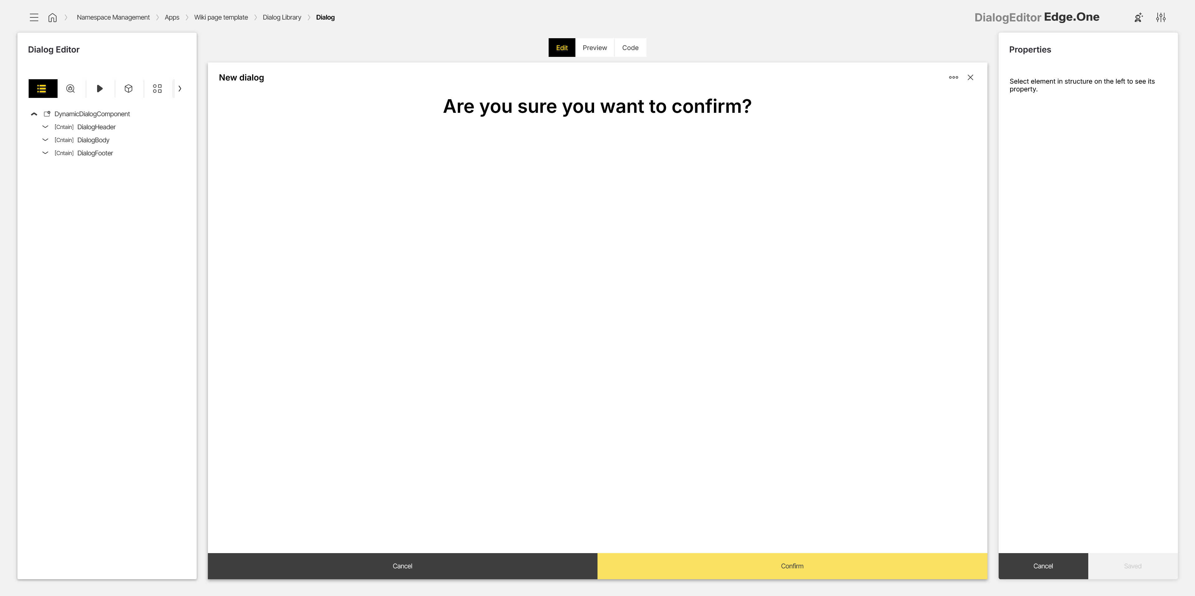
The editor is divided into three areas:
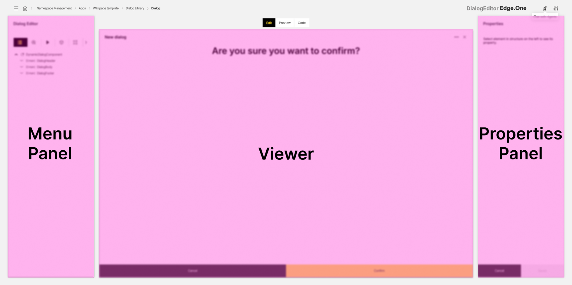
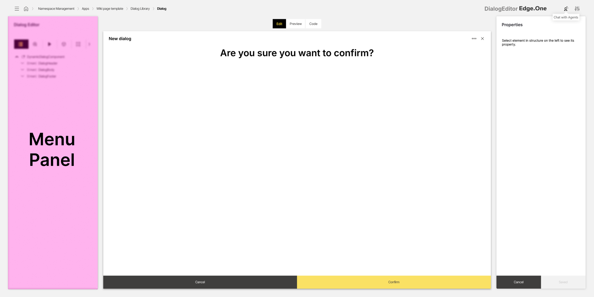
- Menu panel: Navigation for structure, issues, events, data sources, component library, test IDs, and translations
- Viewer: Dialogs representation for editing, simulation, and code inspection
- Properties panel: Property configuration for the selected component
The editor supports the following capabilities:
- Editing dialog and their components.
- Connecting data sources and actions to components.
- Testing dialog behavior in a simulated runtime.
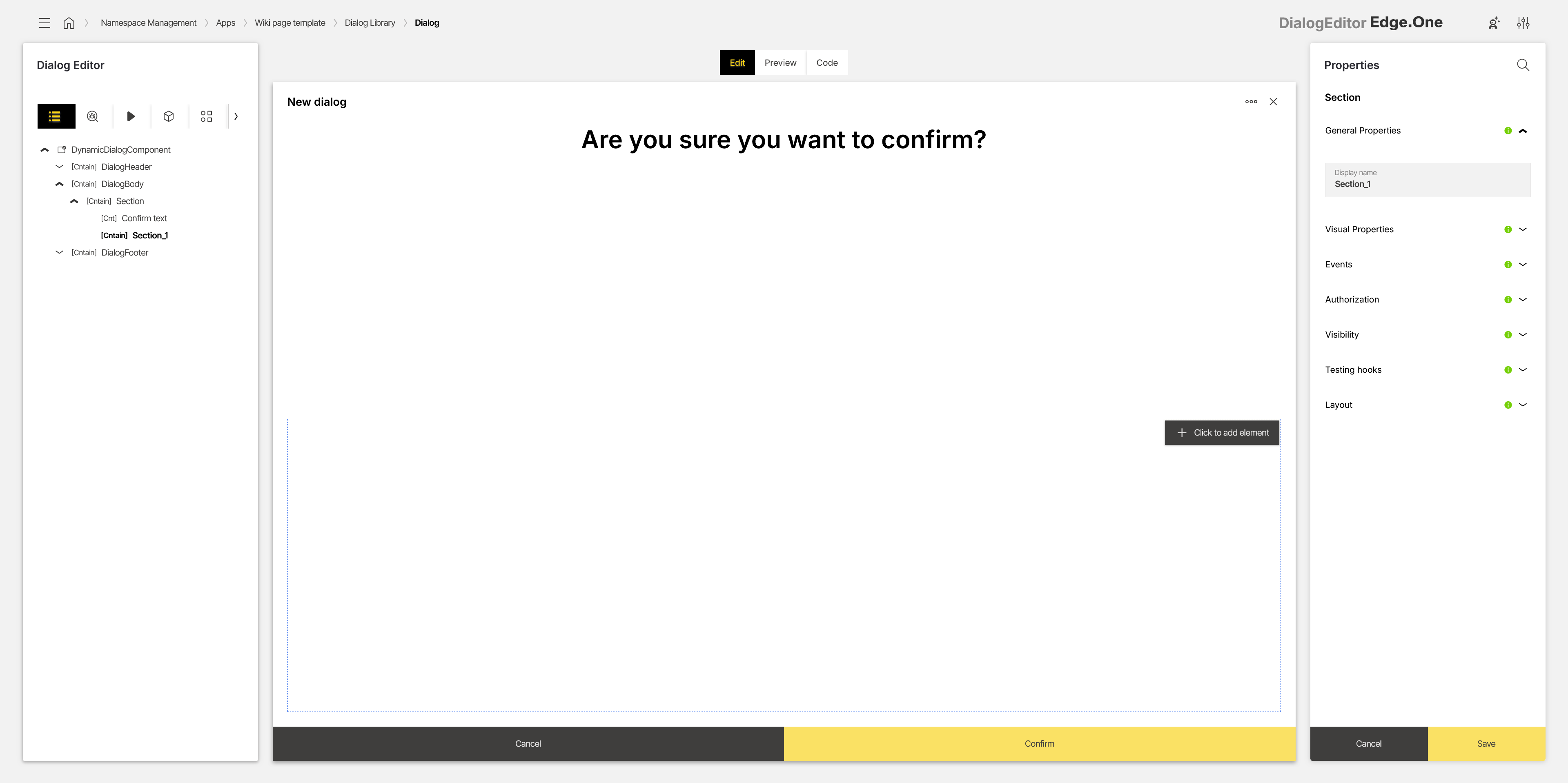
Menu panel
The menu panel provides navigation across the Structure, Issues, Events, Data Sources, Library, Test IDs and Translations tabs. These tabs retain their selection, even when not actively selected. They are described in further detail below.
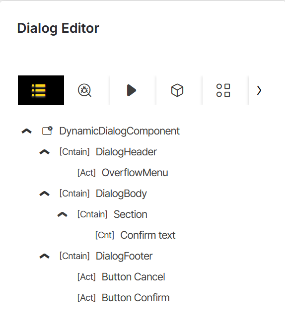
Structure
The Structure section displays the dialog hierarchy as a tree. This view represents the wrapper, content area, and optional header elements that make up the dialog.
The root wrapper is typically the DialogComponent. It defines dialog-level settings such as title, type, and whether a header and/or footer is shown.
The content area is represented by DialogBody. In the standard dialog template this area is empty. When templates are used, the body may already contain sections or components.
If enabled, the DialogtHeader is shown above the body. It displays the dialog title, optional icons, and an overflow menu on the right.
The optional DialogFooter is exclusively reserved for Footerbar Actions. It can be disabled, if the desired dialog has no footerbar actions.
Issues
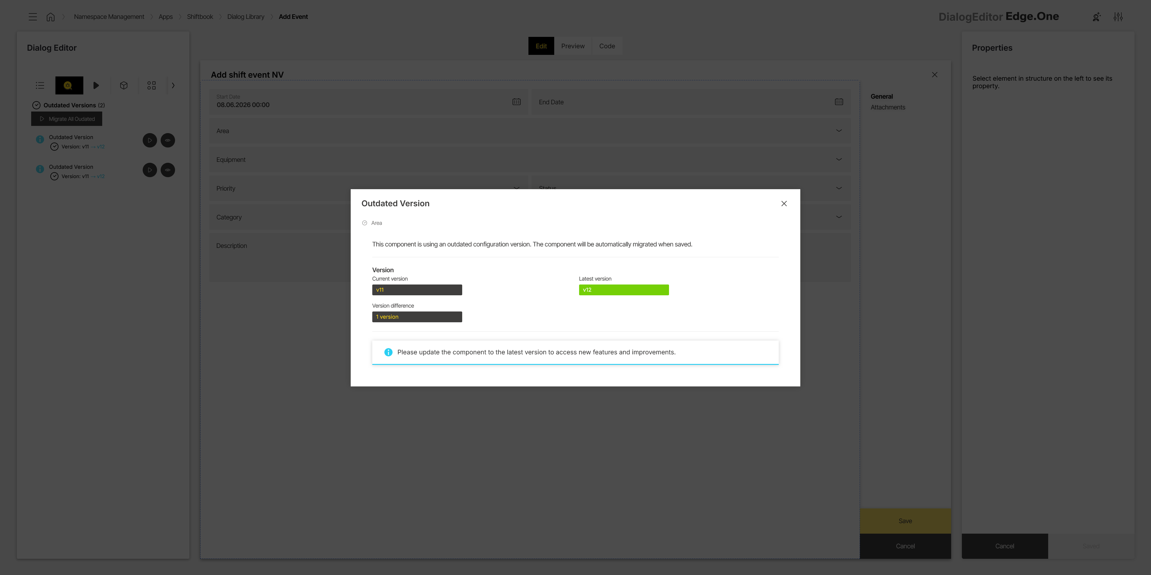
The Issues section extends content health by listing outdated components and properties. Entries are grouped by severity.
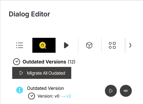
- An Error indicates that an update is required immediately.
- A Warning indicates that an update should be performed soon because bugs or unexpected behavior may occur.
- An Info entry indicates that a component or property is outdated or deprecated, but the dialog can still function. Updating remains optional in this case.
A Details action opens a modal with additional information about the selected entry. Selecting an entry also navigates to the affected component and opens the relevant property in the Properties Panel.
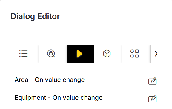
Events
The Events section lists events configured within the dialog. Selecting an entry navigates to the related component. The Edit action opens the event configuration in the Action Editor.
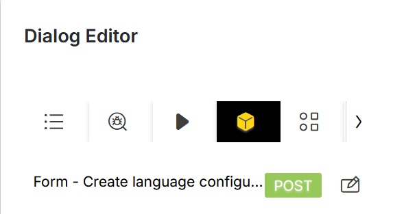
Data sources
The Data sources section lists all data sources referenced in the dialog. Selecting a data source navigates to the component that consumes it. The Edit icon opens the Data Source Library with the referenced data source selected.
Events that use data sources are also shown to support quick navigation to the related component and property.
Library
The Library section provides access to all components available in App Composer. Components are grouped into categories such as containers, actions, content, controls, data, and charts. A search field is provided for filtering by name.
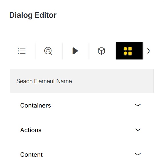
Components can be inserted via drag and drop. During placement, valid drop targets are highlighted in the Viewer.
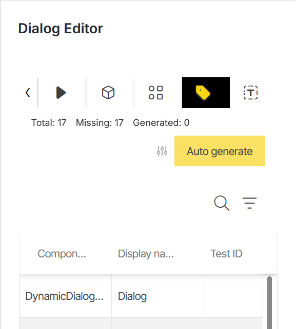
Test IDs
The Test IDs section provides an overview of the test IDs for all components inside the dialog that support a test ID property. This helps identify which components can be targeted in automated tests.
Entries are displayed in a table. The table shows the affected component, the display name used in the Structure panel, and the assigned test ID, if one has already been created. Test IDs can be edited directly in the table. A copy action at the end of each row copies the corresponding test ID to the clipboard.
A tally at the top summarizes the current test ID status. Total shows all components that provide a test ID property. Missing shows all components that do not yet have a test ID. Generated shows all components that currently have a test ID.
Test IDs can be generated automatically by using the generation action at the top of the section. Generated names can be adjusted by defining a prefix and/or suffix. An additional checkbox allows a new test ID generation to overwrite the previously generated test IDs.
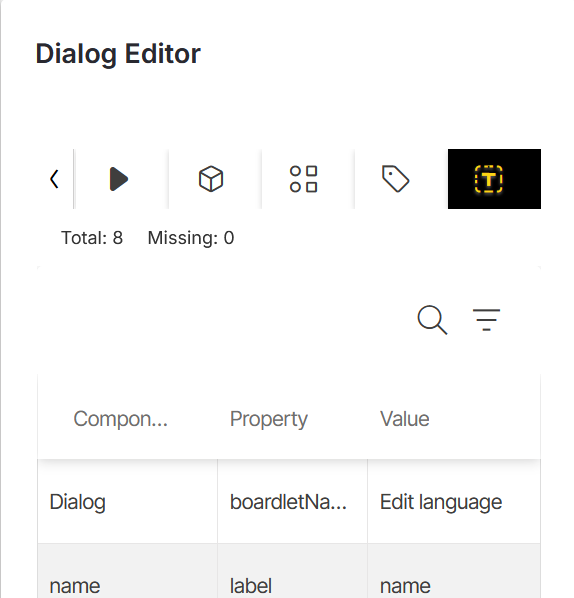
Translations
The Translations section provides an overview of the translations for component titles and translatable text values inside the dialog.
Entries are displayed in a table. The table shows the affected component, the related component property, such as Title or Text translation, and the translation in the active user language. Selecting a translation opens the translation modal. From there, the translation can be reviewed and edited.
A tally at the top summarizes the current translation status. Total shows all components that have a valid translation. Missing shows all components that do not yet have a valid translation.
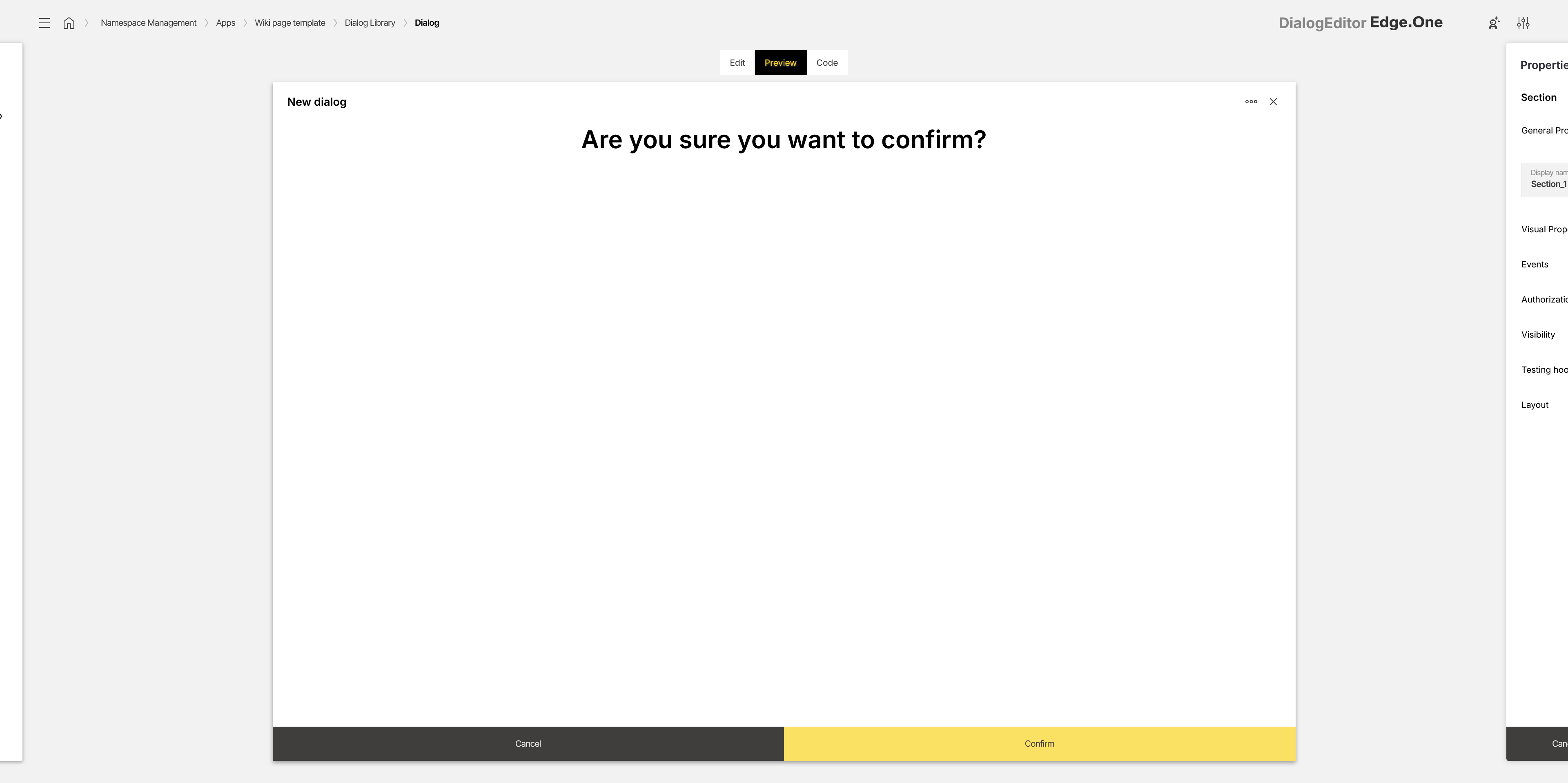
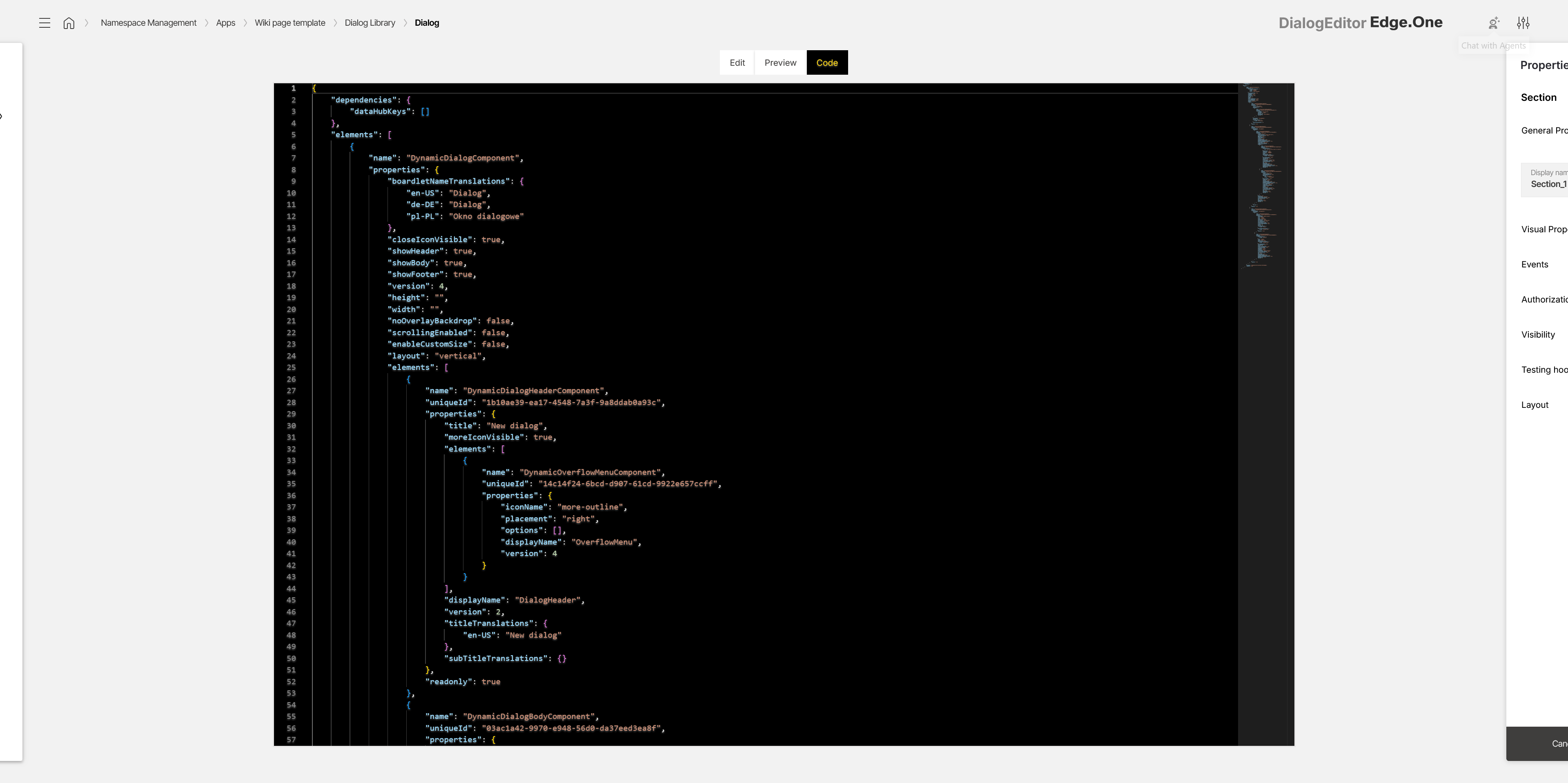
Viewer
The viewer renders a visual representation of the dialog. It provides three tabs: Edit, Preview, and Code.
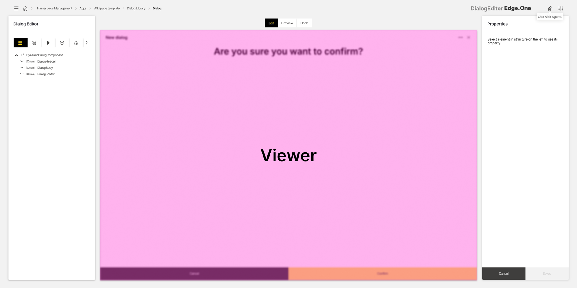
Edit
The Edit tab is used for layout work and component selection. Components can be selected by clicking in the viewer. When a container component is selected, an additional action (for example Click to add element) may be shown to open the insertion menu.
Interactions are not executed in this mode. The view is intended for selecting components and arranging structure. The active selection is reflected in the Properties panel.
Preview
The Preview tab is used for runtime-like simulation. The side panels are hidden to increase the available space and interaction is enabled, including triggering events and clicking controls.
This mode is considered a full simulation. Depending on the configured actions and data sources, backend data may be updated.
Code
The Code tab displays the dialog definition as code. The side panels are hidden to increase the available space and the complete dialog code base is shown. Copying and editing are supported.
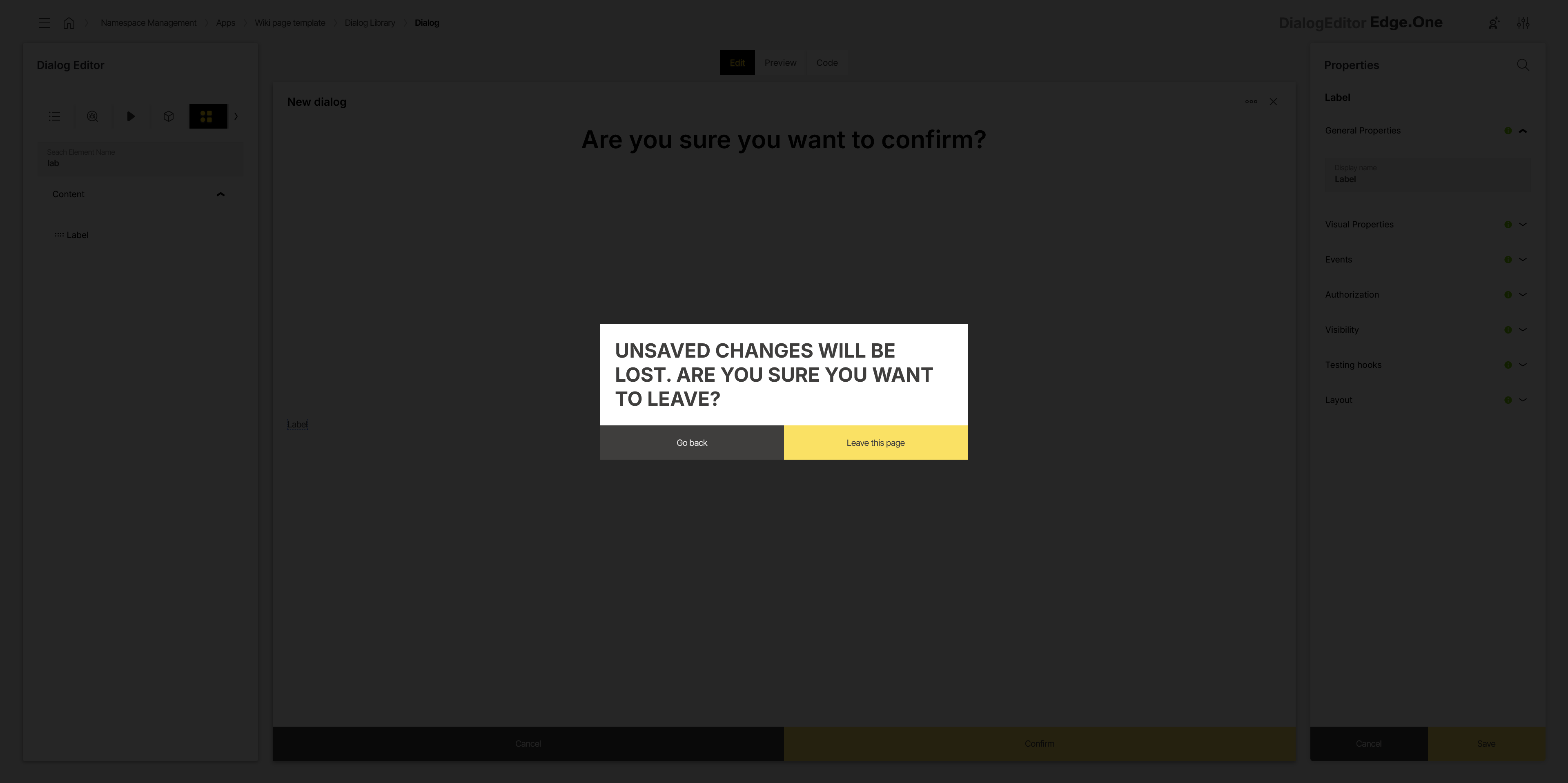
Properties panel
The properties panel displays configuration options for the currently selected component. The set of available properties depends on the selected component type.
A search field is provided to locate properties by name. Properties are grouped into categories (for example General). More details on property groups are described in the properties documentation.
At the bottom of the panel, Cancel reverts unsaved changes and Save applies changes and confirms the update via a global notification. When navigation away from the editor is triggered with unsaved changes, a confirmation modal is shown.
Data source property
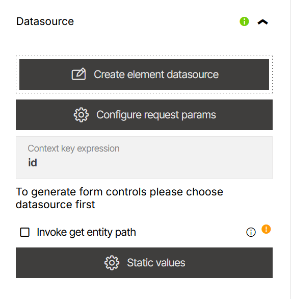
Some components expose a Data source property to connect the component to a data source. After selection, the connected data source is displayed and quick navigation to the referenced data source is available via the Data Source Library.
A Create element datasource action may be available. This opens the Data Source Editor, where request parameters can be configured.
Events and actions
Event properties define which actions run when specific events occur, such as clicking a button. Adding an event listener opens the Action Editor, where the event configuration is created or updated.
Configured events are listed in the properties panel. The Edit action opens the configured action in the Action Editor. The Delete action opens a confirmation dialog and removes the action from the component.
Some components may additionally provide component-specific action configuration properties.