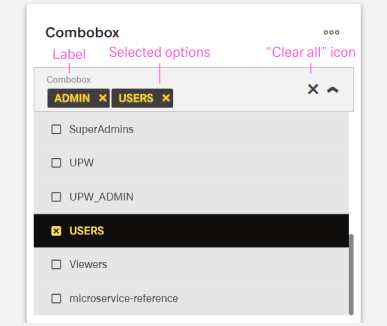
Combobox
WARNING
This article contains information on the Combobox and Multi Combobox. It therefor might be misleading.
Overview
- The Dynamic Combobox Component is a form control with a dropdown selection interface.
- It allows users to select a single value from a list of options.
- It supports both static data and dynamic data from server endpoints.
- Features include search, pagination, and customizable display formats.
Specs
Tokens
| Token | Description |
|---|---|
| displayName | Sets the display name of the component in the structure panel. |
| labelTranslations | Sets the field label with multilingual support. |
| showClearIcon | Controls whether an "x" button clears the selected value. |
| saveInLocalStorage | Determines if the selected value is preserved in local storage. |
| defaultValue | Sets the initial value when the combobox is first rendered. |
| readonly | Controls whether the combobox allows user interaction. |
| useStaticData | Determines whether static or API data is used. |
| staticData | Defines the list of dropdown options when using static data. |
| dataSourcePath | Specifies the path in the API response for options. |
| dataField | Defines the field name used in submitted form data. |
| controlsRequestType | Specifies whether the field data is sent in BODY or HEADER. |
| dataSourceId | Specifies the data source ID for retrieving options. |
| getEntityCollectionHttpRequestParametersMap | Configures HTTP parameters for API requests. |
| modelValue | Defines the field used as the option value. |
| modelDisplayValue | Defines the field shown as the option label. |
| searchKey | Specifies which field is used for filtering during typing. |
| emitObject | Controls whether the whole object is emitted or just the key field. |
| pageSize | Sets the number of items loaded per page when fetching data. |
| loadAll | Determines if all data is loaded at once or via pagination. |
| validation | Configures validation rules for the combobox. |
| required (Validation) | Ensures a selection is made before form submission. |
| events | Defines the events the combobox can trigger or respond to. |
| ON_INIT (Events) | Event triggered when the combobox is initialized. |
| ON_DESTROY (Events) | Event triggered when the combobox is removed. |
| ON_VALUE_CHANGE (Events) | Event triggered when the user selects a different option. |
| ON_INIT_BASED_ON_USER_VIEW (Events) | Event triggered when the component initializes in user view mode. |
| dataTestId | Testing hook ID for automated testing. |
Structure
- The Combobox connects to either static data or external data sources through the Data Management configuration.
- The structure ensures that the selected value is stored and submitted consistently with other form fields.
(Configured in Genereal Properties)
- displayName – Sets the display name of the component shown in the structure panel. For example,
"Customer Type Selector"allows for easy identification of the component's purpose in the component structure.
(Configured in Non-Visual Properties)
- saveInLocalStorage – Determines whether the combobox's selected value is preserved in local storage. When enabled, the user's selection persists between page reloads or browser sessions, improving user experience.
Data Management
(Configured in Non-Visual Properties)
- useStaticData – Determines whether the component uses static data defined in the component configuration or fetches data from an API endpoint. When set to true, the component will use the data provided in the
staticDataproperty rather than calling an API.- staticData – Defines the list of options that will be available in the dropdown when
useStaticDatais enabled. For example,[{"value": "corporate", "text": "Corporate Customer"}, {"value": "individual", "text": "Individual Customer"}]provides two selectable customer types.
- staticData – Defines the list of options that will be available in the dropdown when

Datasource
(Configured in Datasource)
- dataSourcePath – Specifies the path within the response data where the list of options is located. For example, if the API returns data in a nested structure, setting this to
"data.customers.types"will extract the options from that location.- getEntityCollectionHttpRequestParametersMap – Configures HTTP parameters for data fetching. This object maps additional parameters needed for the API request, such as filters or sorting options.
- dataSourceId – Specifies the data source ID for retrieving dropdown options. For example,
"api/customerTypes"connects the combobox to the customer types API endpoint. This property is used whenuseStaticDatais false.
Data Field
(Configured in Non-Visual Properties)
- dataField – Defines the field name that will be used when submitting form data. For example, setting to
"customerType"ensures the selected value is submitted with this field name in the form data. - controlsRequestType – Specifies how the field data is sent in HTTP requests:
'BODY'(in request body) or'HEADER'(in request headers). For example, setting to"BODY"includes the field data in the request body, which is standard for most form submissions.
(Configured in Datasource)
- modelDisplayValue – Defines the field in the returned data objects that should be displayed in the dropdown. For example, setting to
"name"will display thenameproperty of each data object to the user.
Filtering Data
(Configured in Datasource)
- modelValue – Defines the field in the returned data objects that should be used as the value when an option is selected. For example, setting to
"id"will use theidproperty of each data object as the value. - searchKey – Specifies which field in the data objects should be used for filtering when users type in the combobox. For example, setting to
"name"will search through thenameproperty of data objects. - emitObject – Controls whether the entire selected object is emitted as the value, rather than just the key field. When enabled, the complete data object is available in form submissions rather than just the ID value.
Loading Strategy
(Configured in Datasource)
- pageSize – Sets the number of items loaded per page when fetching data from the server. For example, setting to
"20"will load 20 records at a time, with pagination controls allowing access to additional pages.- loadAll – Determines whether all available data should be loaded at once rather than using pagination. When enabled, the component will attempt to fetch all records in a single request, which can be useful for smaller datasets.
Styling
(Configured in Visual Properties)
- label - Sets the field label.
- labelTranslations – Sets the field label with support for multiple languages. For example,
{"en-US": "Customer Type", "de-DE": "Kundentyp"}ensures proper localization of the field label.
- labelTranslations – Sets the field label with support for multiple languages. For example,
- showClearIcon – Controls whether an icon is displayed to clear the selected value. When enabled, a small "x" button appears in the combobox when a value is selected, allowing users to quickly reset their selection.
- defaultValue – Sets the initial value of the combobox when first rendered. For example, setting to
"corporate"would pre-select the corporate customer option. - pageSize – Sets the number of items loaded per page when fetching data from the server. For example, setting to
"20"will load 20 records at a time, with pagination controls allowing access to additional pages.- loadAll – Determines whether all available data should be loaded at once rather than using pagination. When enabled, the component will attempt to fetch all records in a single request, which can be useful for smaller datasets.
Actions & Variants
(Configured in Events)
- events – Configures the events that the component can trigger and respond to:
- ON_INIT – Triggered when the combobox component is initialized.
- ON_DESTROY – Triggered when the component is removed from the DOM.
- ON_VALUE_CHANGE – Triggered when the user selects a different option.
- ON_INIT_BASED_ON_USER_VIEW – Triggered when the component initializes in user view mode.
(Configured in Visual Properties)
- readonly – Controls whether the combobox allows user interaction. When set to true, the combobox will display its value but not allow changes, useful for display-only scenarios.
Tests
(Configured in Testing Hooks)
- dataTestId – Sets the testing hook ID for automated testing. For example, setting it to
"customer-type-selector"allows test scripts to reliably locate this component.
Validation
(Configured in Validation)
- validation – Configures validation rules for the combobox, including:
- required – When set to true, the field must have a selection before the form can be submitted.
Links
- Figma: https://www.figma.com/design/yck1tcUXgdQ5aYX6iUAwrO/GE---Astronaut-Design-System?node-id=11523-164008&t=ftfrOGkPzlG2GaTo-1
- Live style guide: https://e1-dev.k8s.myapp.de/live-style-guide/id3/3-dropdown/multi-combobox
Guidelines
Usage
- Use the combobox when a user must choose one value from a list that can be static or API-driven.
- Provide a default only when it prevents busywork; set
defaultValue, and avoid preselecting when an explicit choice is required withvalidation.required. - Let users undo optional selections with a clear affordance by enabling
showClearIcon. - Persist the selection across sessions only when beneficial by using
saveInLocalStorage. - Keep option content simple and scannable by ensuring the field mapped to
modelDisplayValuecontains concise, single-line text; avoid composing multi-line or compound labels inside the list. - When “no value” is a valid outcome, include an explicit “None” option in
staticData(or via your API), keepvalidation.required: false, and enableshowClearIconto make reversal easy.
Sizing & Layout
- Keep visible option text concise and scannable by mapping it to a human-readable field through
modelDisplayValue. - Order options logically (alphabetical, numerical, or by expected frequency) by pre-ordering
staticDataor requesting a sort viagetEntityCollectionHttpRequestParametersMapon the field shown bymodelDisplayValue.
Data-Driven / Conditional Behavior
- Match data volume to UX: paginate large collections with
pageSize, and useloadAllonly for small datasets. - Provide predictable filtering while typing by aligning
searchKeywith a user-recognizable field (often the one used bymodelDisplayValue). - Emit the payload your consumer expects: submit just the key with
emitObject: false(usingmodelValue) or the full object withemitObject: true. - For static lists, ensure each option includes fields used by
modelValueandmodelDisplayValueinstaticData.
Content & Localization
- Provide a clear, localized field label with
labelTranslations. Use sentence-style capitalization, avoid colons, and keep labels brief (1–2 words where possible). - Help authors find the control during authoring by naming it clearly with
displayName.
Dos & Don’ts
| Do | Don’t | Article setting(s) |
|---|---|---|
| Localize the field label for all supported locales and keep it short in sentence-style capitalization. | Hardcode the label in one language or add punctuation like colons. | labelTranslations |
| Map option value and label explicitly to the correct fields. | Swap value/label and confuse submissions. | modelValue, modelDisplayValue |
| Write option labels as short, parallel phrases and ensure the displayed text comes from a concise field. | Mix long sentences, inconsistent parts of speech, or jargon across options. | modelDisplayValue, staticData |
| Include a “None” option when no selection is valid, make the field not required, and allow easy clearing. | Force a choice when “no value” is acceptable. | staticData, validation.required, showClearIcon |
| Sort options in a logical, scannable order (e.g., alphabetical) via data order or server sort. | Leave options in an arbitrary order that slows scanning. | staticData, getEntityCollectionHttpRequestParametersMap |
| Filter on a field users recognize. | Search by an internal ID that users don’t understand. | searchKey, modelDisplayValue |
| Provide a default only when useful. | Preselect when an explicit decision is required. | defaultValue, validation.required |
| Persist only when appropriate for the same user/session. | Persist sensitive or context-specific choices. | saveInLocalStorage |
| Emit the payload shape your consumer expects. | Break integrations by switching payload shapes silently. | emitObject, dataField |
| Initialize deterministically before interaction and clean up on removal. | Defer setup until first click or leave dangling listeners. | ON_INIT, ON_INIT_BASED_ON_USER_VIEW, ON_DESTROY |
Accessibility
- Provide a localized, explicit label so assistive tech announces the control meaningfully (
labelTranslations). - Prefer human-readable labels for both display and filtering (
modelDisplayValue,searchKey); keep them short and parallel. - Prevent non-functional interaction in read-only contexts with
readonly. - Keep submission semantics unambiguous by mapping value/label correctly (
modelValue,modelDisplayValue). - Avoid forcing a choice unnecessarily by pairing
validation.requiredappropriately withdefaultValueandshowClearIcon. - Provide an easy way to undo choices for optional fields (
showClearIcon). - Keep list order predictable by sorting labels (server-side or in data) so screen-reader users can anticipate positions (
staticData,getEntityCollectionHttpRequestParametersMap).